Effective inventory management and profit analysis tools or templates are very important to use for any business growth. Using such templates or tools, you can see the quick insights of your business. You can take the necessary action accordingly like – Purchase the product if it is going out of stock etc. In this article, we have explained how to create a Inventory Management and Profit Analysis Dashboard in Google sheet. We have used the Sales, Purchase, and Inventory Sheet in Google sheet. This is a ready to use template for your Inventory Management and Sale, Purchase entries.
Also See the Inventory Management in Excel
Click to buy Inventory Management and Profit Analysis Dashboard in Google Sheet
Key Benefits of Effective Inventory Management
- Reduced Holding Costs: Proper inventory control minimizes the costs associated with storing unsold goods.
- Enhanced Cash Flow: Efficient stock management ensures that funds are not tied up unnecessarily, improving overall cash flow.
- Increased Customer Satisfaction: Having the right products at the right time enhances customer service and loyalty.
- Streamlined Operations: Improved inventory tracking leads to smoother operations and reduces the risk of errors.
Transitioning to Google Sheets for Inventory and Profit Analysis
Google Sheets offers a dynamic platform for managing inventory and analyzing profit with minimal investment in specialized software. Its flexibility, real-time collaboration features, and extensive customization options make it an ideal choice for businesses of all sizes.
How to Set Up Your Dashboard
In this dashboard, we have 4 worksheets as given below-
1) Product Master:
First sheet tab is Product Master. Here, we are capturing the Product Id, Product Name, Purchase Price, Sales Price and Profit Per Unit. Profit Per Unit is a formula as given below-
Profit Per Unit = Sales Price – Purchase Price

Click to buy Inventory Management and Profit Analysis Dashboard in Google Sheet
2) Purchase:
In this worksheet, we are maintaining the Purchase entries. Whenever, you purchase the goods from supplier, you need to enter the data here. In this worksheet, you have to enter the information for Date, Product ID, Product Name, Purchase Price, Qty, Purchase Value. We have put the formula for Product Name and Purchase Price as VLOOKUP from the Product Master. For Purchase Value, we have put Purchase Price * Qty

Click to buy Inventory Management and Profit Analysis Dashboard in Google Sheet
3) Sales:
In this worksheet, we are maintaining the Sales entries. You should enter the information here whenever you made any sales. In this worksheet, you have to enter the information for Date, Product ID, Product Name, Sales Price, Qty, Sale Value and Profit. We have put the formula for Product Name and Sales Price as VLOOKUP from the Product Master. For Sales Value, we have put Sales Price * Qty. Profit column is also on the basis of formula as Profit per unit (Lookup from Product Master) * Qty.

Click to buy Inventory Management and Profit Analysis Dashboard in Google Sheet
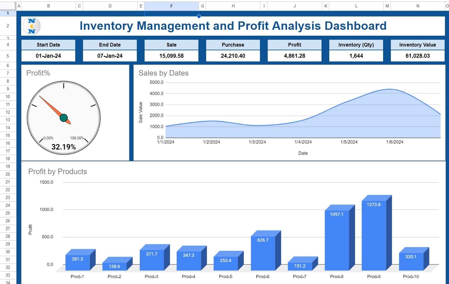
4) Dashboard:
Click to buy Inventory Management and Profit Analysis Dashboard in Google Sheet
This is the main sheet wherein we are visualizing the data. In the top section of the dashboard, we are showing the below information:
- Start Date: You need to select the start date to select the date range for the dashboard.
- End Date: Just double click and select the End date to complete the date range for the dashboard.
- Sale: This is formula-based value. Here, we are showing the Total Sales amount for given date range.
- Purchase: Again, This is a formula. We are displaying the Total Purchase value for the selected date range.
- Profit: Here, we are showing the Profit amount between the Start Date and End Date.
- Inventory (Qty): This is the total available stock quantity for all products as of selected End date.
- Inventory (Amount): This is the Value of total available stock for all products as of selected End date.
Below this top section, we are showing the few charts as given below:
Profit Gauge chart:
This is a gauge chart. Here, we are showing the Profit%. We are taking the Profit% on the basis of Sales Amount. We have used the formula as Profit/Sales Value
Sales by Dates Trend chart:
In this chart, we are showing the Sales amount by dates using an Area Chart. These dates will be between selected Start Date and End Date.
Profit by Product:
This is 3D column chart. Here, we are displaying the Profit Amount by the different Product between selected date range.
Conclusion
Click to buy Inventory Management and Profit Analysis Dashboard in Google Sheet
Google sheets is very useful to use such template because it is available online. You can see our other Google sheet templates also to use in your business. This inventory management and Profit Analysis dashboard is quite handy, and use get it from the link given below.
Visit our YouTube channel to learn step-by-step video tutorials
Youtube.com/@NeotechNavigators