IT Services Dashboard in HTML is a powerful, ready-to-use analytics tool designed for IT departments, service desk managers, and support teams who need complete visibility into their IT service operations. Built as a single standalone HTML file, this dashboard provides real-time insights into service requests, SLA compliance, technician performance, customer satisfaction, and time trends — all without requiring any server setup, database connection, or specialized BI software. Simply open the file in your browser and start making data-driven decisions.
Whether you manage a small internal helpdesk or a large-scale IT service operation handling thousands of requests, this HTML Dashboard Template gives you everything you need in one lightweight, browser-based solution. Built with Chart.js and Sheets, it delivers beautiful visualizations with fast performance.
Click here to Purchase IT Services Dashboard in HTML
Key Features of IT Services Dashboard in HTML
This dashboard packs a comprehensive feature set that rivals expensive BI tools. Here is what makes it stand out:
- 5 Interactive Dashboard Pages — Overview, Service Analysis, Team Performance, Time Trends, and Data View provide a 360-degree view of your IT service operations.
- 6 Critical KPI Cards — Track Total Requests, Average Response Time, Average Resolution Time, Average Customer Rating, Closed Requests, and SLA Compliance at a glance.
- Dynamic Slicers and Filters — Filter the entire dashboard by department, region, priority, service type, and more for focused analysis.
- CSV Data Export — Export filtered records from the Data View page for further analysis in Excel or Google Sheets.
- Search, Sort, and Pagination — Navigate through large datasets effortlessly on the Data View page.
- Zero Installation — No server, no database, no software installation. Just open index.html in Chrome, Edge, or Firefox.
- Works Offline — Once downloaded, the dashboard works without an internet connection.
- Responsive Design — Optimized for desktop and tablet viewing.
If you are looking for the same IT service analytics experience in other platforms, check out the IT Services Dashboard in Power BI for advanced drill-through capabilities, or the IT Support Ticket Dashboard in Excel for a familiar spreadsheet-based approach.
Dashboard Pages Explained
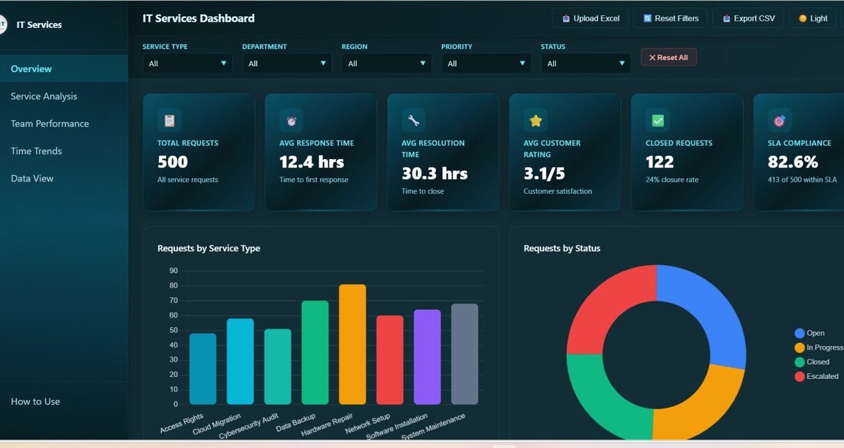
1. Overview Page
The Overview page is your command center for IT service operations. At the top, 6 KPI cards provide instant clarity on the most critical metrics: Total Requests shows the overall volume of service tickets, Avg Response Time measures how quickly your team acknowledges incoming requests, Avg Resolution Time tracks how long it takes to close tickets, Avg Customer Rating reflects end-user satisfaction, Closed Requests shows completed work, and SLA Compliance indicates the percentage of tickets meeting service level agreements.
Below the cards, five interactive charts provide deeper analysis. Requests by Service Type breaks down tickets across categories like network support, hardware repair, and software installation. Requests by Status shows the distribution of open, in-progress, and resolved tickets. Requests by Department highlights which business units generate the most IT work. Requests by Priority reveals the urgency distribution across your ticket queue. Requests by Region maps service demand geographically. Multiple slicers at the top allow you to filter the entire dashboard instantly.
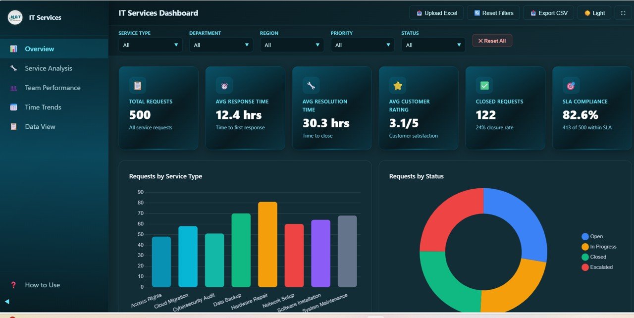
IT Services Dashboard Overview
2. Service Analysis Page
The Service Analysis page takes a deeper look at how different service categories perform. It features four focused charts that help you identify strengths and weaknesses across your service portfolio.
Avg Response Time by Service Type reveals which service categories experience delays in initial acknowledgment. Avg Resolution Time by Service Type shows how long different types of issues take to resolve — helping you allocate resources and set realistic SLA targets. Avg Customer Rating by Service Type measures satisfaction levels across service categories, revealing where your team excels and where improvement is needed. SLA Compliance by Service Type tracks adherence to service level agreements for each category, making it easy to spot underperforming areas.
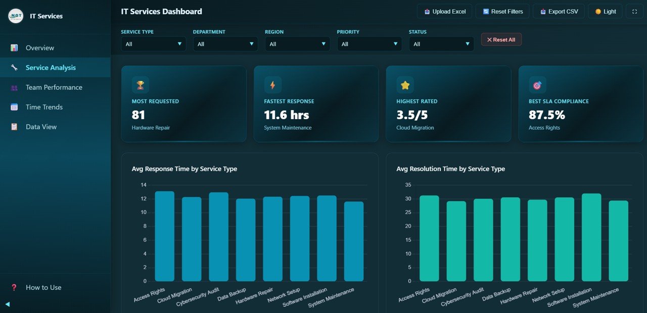
IT Services Dashboard — Service Analysis
3. Team Performance Page
The Team Performance page shifts focus to individual technician metrics — essential for workforce management and performance reviews. Four charts evaluate your team members from different angles.
Requests by Technician shows the workload distribution across your team, helping managers identify uneven assignments. Avg Customer Rating by Technician measures how satisfied end-users are with each technician’s service quality. Avg Resolution Time by Technician compares how efficiently each team member resolves tickets. Escalation Rate by Technician reveals which technicians escalate the most tickets, which could indicate training needs or complex specialization areas.
For more granular IT team analytics, you may also want to explore the IT Support Ticket Dashboard in Power BI which includes decomposition tree analysis for root-cause investigations.
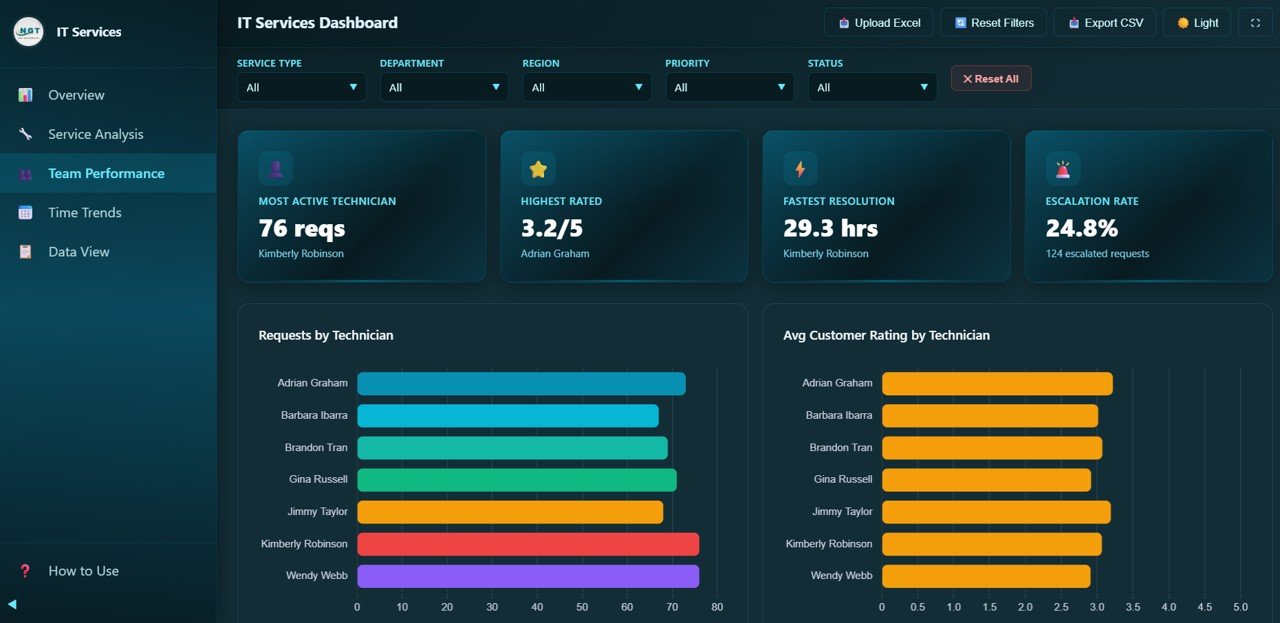
IT Services Dashboard — Team Performance
4. Time Trends Page
The Time Trends page provides temporal analysis that is critical for capacity planning and strategic decision-making. Four time-series charts reveal how your IT service metrics evolve month over month.
Monthly Request Volume shows ticket intake patterns across months, helping you identify peak periods and seasonal trends. Avg Response Time by Month tracks whether your team is getting faster or slower at acknowledging requests over time. Avg Customer Rating by Month reveals satisfaction trends that can validate (or challenge) operational changes. Monthly Status Distribution shows the proportion of open, in-progress, and closed tickets for each month, providing a visual timeline of operational health.
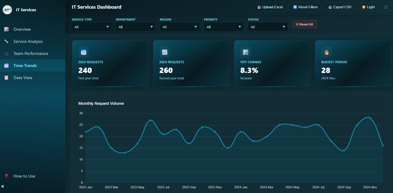
IT Services Dashboard — Time Trends
5. Data View Page
The Data View page is a detailed data table showing all individual service request records. Unlike the visual dashboard pages, this page gives you direct access to raw data with powerful navigation tools. You can search across all columns to find specific tickets, sort any column in ascending or descending order, and use pagination to browse through large datasets efficiently. The CSV export feature lets you download filtered data for further analysis in Excel, Google Sheets, or any spreadsheet tool.
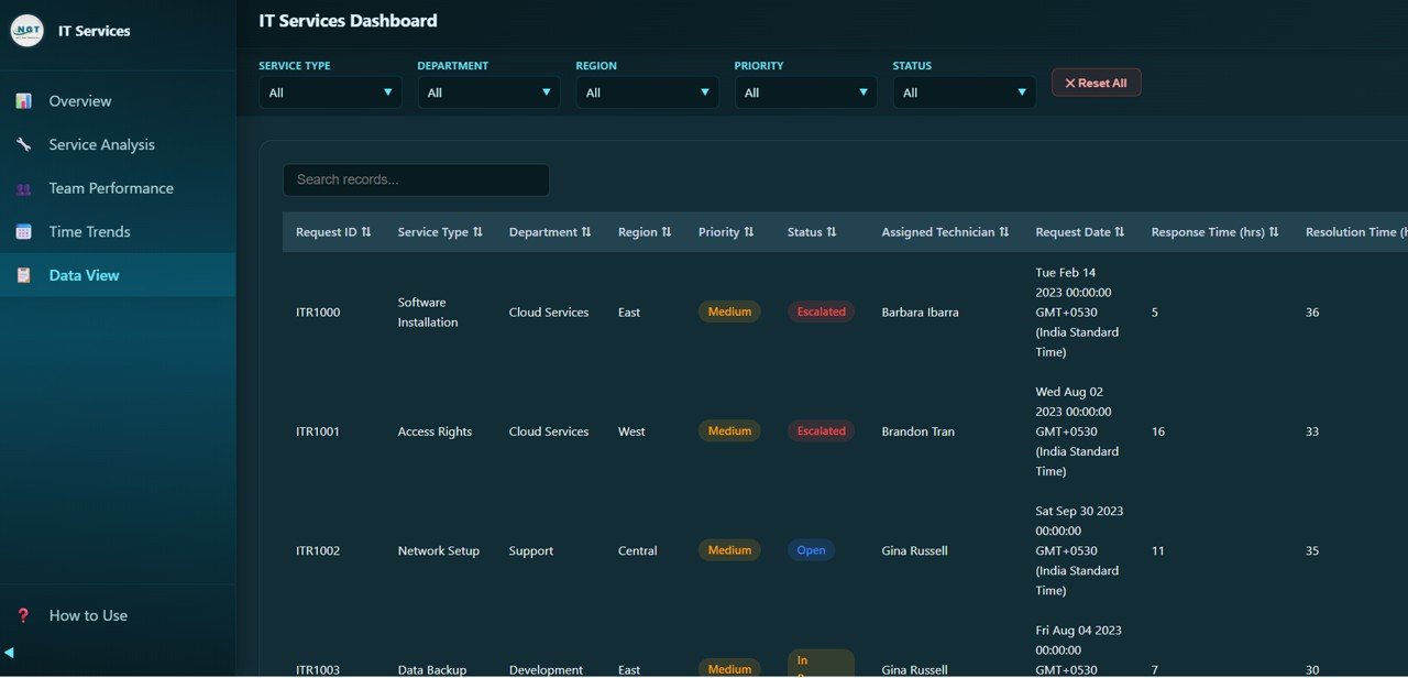
IT Services Dashboard — Data View
Advantages of IT Services Dashboard in HTML
- No Software Dependencies: Unlike Power BI or Tableau, this dashboard runs entirely in your web browser. There is nothing to install, configure, or maintain.
- Complete Data Privacy: All data stays on your local machine. No cloud uploads, no third-party servers, and no privacy concerns.
- Instant Deployment: Download, unzip, and open — you can be analyzing IT service data within 60 seconds.
- Cost-Effective: A one-time purchase replaces expensive monthly BI subscriptions for basic IT service reporting needs.
- Portable: Share the dashboard file via email, USB drive, or internal file share. Recipients can open it immediately without any setup.
- Customizable: Developers can modify the HTML, CSS, and JavaScript to add custom features or branding.
Opportunities for Improvement
- Adding direct Excel or CSV upload functionality would allow non-technical users to refresh data without editing the data file manually.
- A print-friendly or PDF export mode for individual dashboard pages would be valuable for stakeholders who prefer static reports.
- Email alert integration for SLA breaches could help managers respond proactively.
- Adding technician-level drill-through from the Overview page would streamline navigation between summary and detail views.
Best Practices for Using the IT Services Dashboard
- Update Data Regularly: Keep your data file current with weekly or monthly data refreshes for accurate insights.
- Use Slicers Strategically: Combine multiple filters (e.g., a specific department + high priority) to uncover hidden patterns.
- Review Time Trends Monthly: Regular trend analysis helps you spot deteriorating response times or satisfaction scores early.
- Benchmark Technician Performance: Use the Team Performance page during weekly team meetings to recognize top performers and identify coaching opportunities.
- Export and Share: Use the CSV export to create custom reports or feed data into other analytics tools.
- Set SLA Targets: Use the SLA Compliance charts to establish realistic targets and track improvement over time.
Explore Relevant Templates
If you need IT service analytics in different platforms or want to expand your IT monitoring capabilities, explore these related templates from NextGenTemplates:
- IT Services Dashboard in Power BI — The same comprehensive IT service analytics built in Power BI Desktop with advanced drill-through and DAX-powered calculations.
- IT Support Ticket Dashboard in Excel — A fully interactive Excel dashboard for tracking IT support tickets, technician performance, and satisfaction scores.
- IT Infrastructure KPI Dashboard in Excel — Monitor server uptime, network health, storage usage, and IT infrastructure performance metrics.
- IT Support Ticket Dashboard in Power BI — Advanced IT ticket analysis with decomposition tree visuals and drill-down capabilities.
- IT Infrastructure KPI Dashboard in Power BI — Enterprise-grade IT infrastructure monitoring with real-time data integration.
Click here to Purchase IT Services Dashboard in HTML
Frequently Asked Questions
What is the best HTML dashboard template for tracking IT service requests?
The IT Services Dashboard in HTML by NextGen Templates is one of the best options available. It includes 5 interactive pages tracking 6 key KPIs including total requests, SLA compliance, response times, resolution times, customer ratings, and technician performance — all in a single HTML file that runs in any browser without installation.
How do I use the IT Services Dashboard in HTML?
Simply download the zip file, extract it, and open index.html in any modern browser like Chrome, Edge, or Firefox. The dashboard loads instantly with sample data. Replace the sample data with your own IT service records and all charts and KPIs update automatically.
Can I track SLA compliance with this IT Services Dashboard?
Yes. The dashboard tracks SLA Compliance as one of the 6 main KPI cards on the Overview page. Additionally, the Service Analysis page provides SLA Compliance broken down by Service Type, allowing you to identify which service categories are falling below SLA targets.
Does the IT Services Dashboard work offline?
Yes, the dashboard works completely offline once downloaded. It is a self-contained HTML file with all CSS, JavaScript, and chart libraries embedded. No internet connection or server is required after download.
How is this HTML dashboard different from Power BI or Excel dashboards?
The HTML dashboard requires zero software installation — it runs directly in your web browser. Power BI requires Power BI Desktop, and Excel dashboards require Microsoft Excel. The HTML version is lightweight, portable, and ideal for teams that want instant analytics without additional software costs or IT setup.
Can I customize this IT Services Dashboard?
Yes. Since it is built with standard HTML, CSS, and JavaScript (Chart.js), developers can modify the code to add custom features, change colors, add new charts, or integrate with your organization’s branding. Non-technical users can simply replace the sample data to personalize the dashboard.
Conclusion
The IT Services Dashboard in HTML is an ideal solution for IT teams that want powerful service analytics without the complexity and cost of enterprise BI tools. With 5 interactive pages, 6 key KPI cards, dynamic filters, and CSV export capability, it provides everything you need to monitor IT service requests, track SLA compliance, evaluate technician performance, and identify time-based trends. The best part? It requires zero installation and works entirely in your web browser.
Whether you are a small business IT manager or a service desk leader at a large enterprise, this dashboard empowers you to make data-driven decisions that improve service quality, reduce response times, and boost customer satisfaction.
Click here to Purchase IT Services Dashboard in HTML
Visit our YouTube channel to learn step-by-step video tutorials
👉 Youtube.com/@NeoTechNavigators