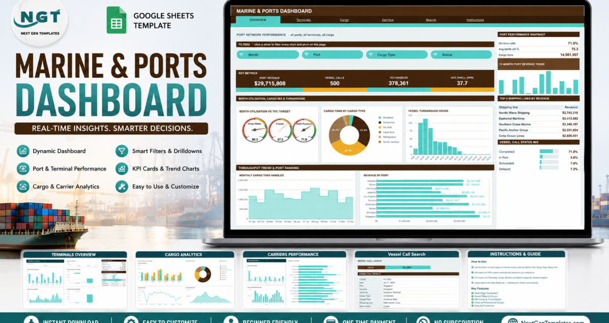
The Marine & Ports Dashboard in Google Sheets reports 16 headline KPIs across 6 linked tabs, using 18 charts driven by native pivot tables and 15 slicers spread over four analysis pages. Every pivot, slicer and formula in the file is already stretched to 1,000 data rows, so the whole dashboard updates the moment you paste a new batch of vessel calls. The download ships with 500 demo vessel calls purely to show the layout working.
Port and terminal reporting usually splits badly: the operational data sits in one spreadsheet, someone rebuilds the same pivot table by hand every month, and the charts are stale by the time they reach a board pack. This template closes that loop. It is a reporting layer over a vessel call log you maintain yourself – not a terminal operating system, and not a live tracking feed.
Get the Marine & Ports Dashboard in Google Sheets
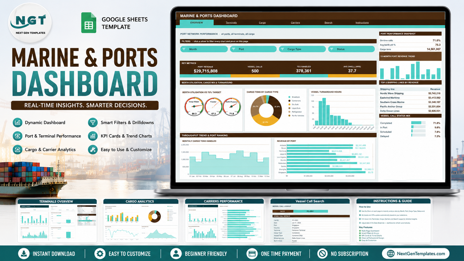
Key Features of the Marine & Ports Dashboard in Google Sheets
- Six linked tabs – Overview, Terminals, Cargo, Carriers, Search and Instructions, each carrying the same navigation bar so you can move between them in one click.
- Native pivot tables behind every chart. Each chart reads a real pivot table parked to the right of its page past a wide spacer column. Scroll right and you can read the exact numbers behind any visual – no hidden formula chain.
- Fifteen slicers in a Filters strip. Clicking one re-filters every chart, pivot and Top 5 panel on that page at once. Slicers are per-page, so the other tabs keep their own view.
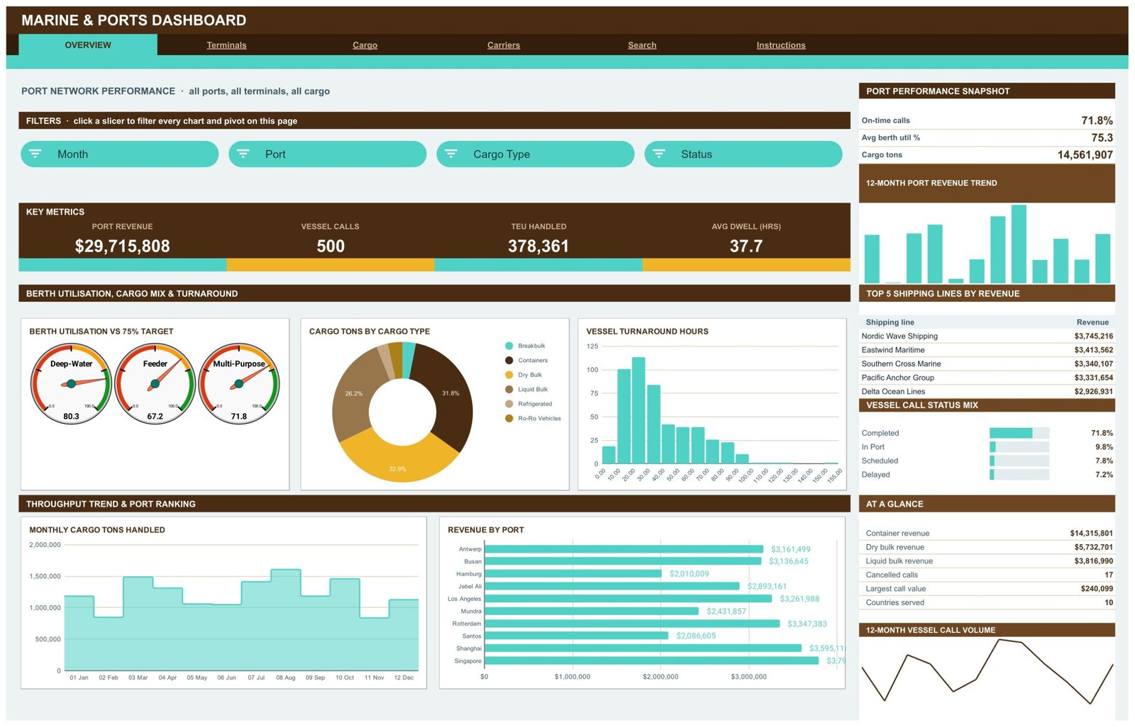
- Berth utilisation gauges against a 75% target for Deep-Water, Feeder and Multi-Purpose berth classes.
- Turnaround and dwell analysis – a Vessel Turnaround Hours distribution plus a Dwell Hours vs Call Revenue scatter that shows whether the slowest calls are also the most valuable ones.
- A Call ID search page that returns the complete record for a single vessel call.
- Auto-expansion to 1,000 rows already built into every pivot, slicer and formula.
Dashboard Pages Explanation
Overview – Port Network Performance
The landing page carries four headline KPI cards – Port Revenue, Vessel Calls, TEU Handled and Avg Dwell (Hrs) – with a Port Performance Snapshot for on-time calls, average berth utilisation and total cargo tons. Its charts are Berth Utilisation vs 75% Target, Cargo Tons by Cargo Type, Vessel Turnaround Hours, Monthly Cargo Tons Handled and Revenue by Port, plus a Top 5 Shipping Lines by Revenue table and a Vessel Call Status Mix bar set showing the completed, in-port, scheduled and delayed split.
Terminals – Terminal and Berth Operations
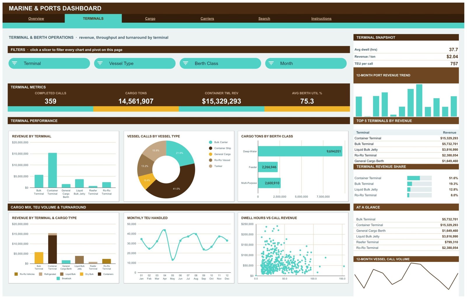
This page reports Completed Calls, Cargo Tons, Container Terminal Revenue and Avg Berth Util %, alongside a Terminal Snapshot for average dwell hours, revenue per ton and TEU per call. The charts are Revenue by Terminal, Vessel Calls by Vessel Type, Cargo Tons by Berth Class, Revenue by Terminal & Cargo Type, Monthly TEU Handled and Dwell Hours vs Call Revenue, with a Top 5 Terminals by Revenue table and a Terminal Revenue Share bar set in the sidebar.
Cargo – Global Cargo Flow
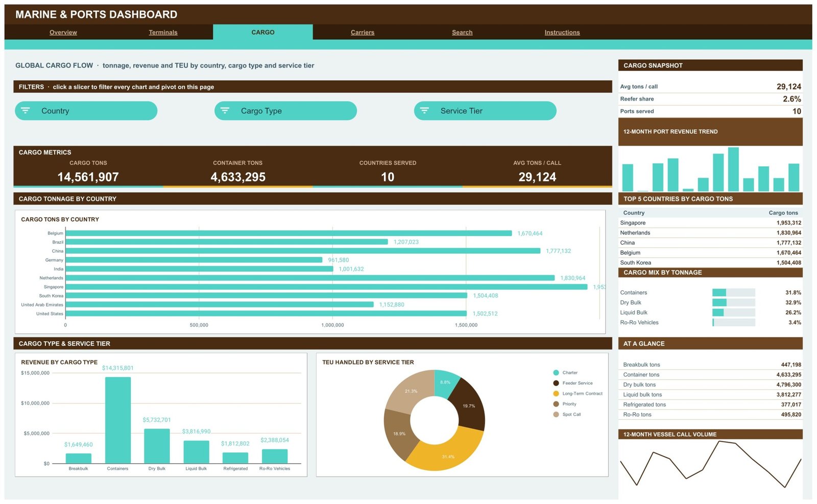
The Cargo page reports Cargo Tons, Container Tons, Countries Served and Avg Tons / Call, with a Cargo Snapshot for reefer share and ports served. Charts are Cargo Tons by Country, Revenue by Cargo Type and TEU Handled by Service Tier. A Top 5 Countries by Cargo Tons table and a Cargo Mix by Tonnage bar set break the volume down across containers, dry bulk, liquid bulk and Ro-Ro vehicles. The Instructions tab notes that this page ranks on the Country column, so keep real country names there when you load your own data.
Carriers – Shipping Line and Service Tier Performance
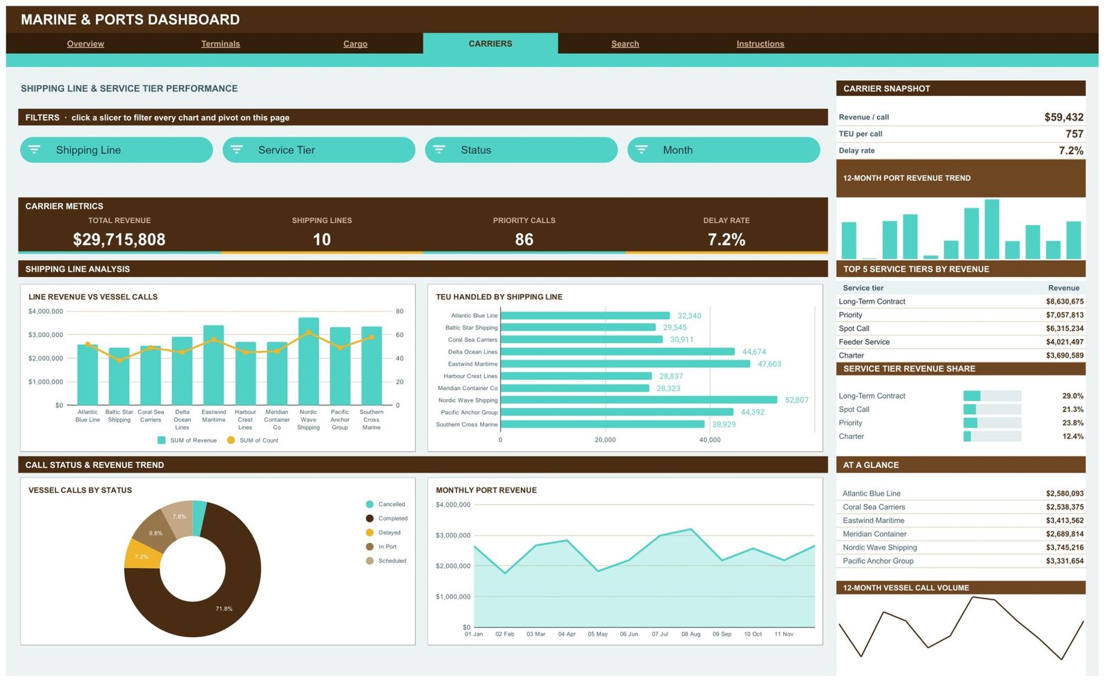
Total Revenue, Shipping Lines, Priority Calls and Delay Rate sit at the top, with a Carrier Snapshot for revenue per call and TEU per call. Charts are Line Revenue vs Vessel Calls – a combo chart pairing revenue bars with a call-count line – plus TEU Handled by Shipping Line, Vessel Calls by Status and Monthly Port Revenue. A Top 5 Service Tiers by Revenue table and a Service Tier Revenue Share bar set show how the book splits between long-term contract, spot call, priority, charter and feeder service.
Search – Vessel Call Lookup
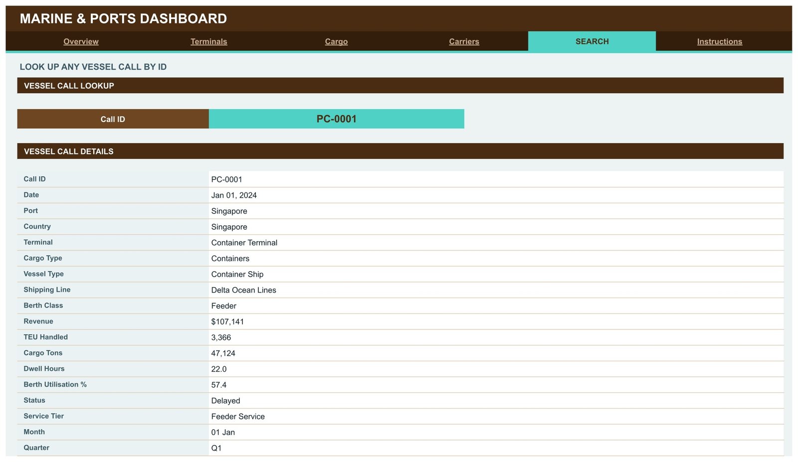
Pick a Call ID and the Vessel Call Details panel returns the full record: date, port, country, terminal, cargo type, vessel type, shipping line, berth class, revenue, TEU handled, cargo tons, dwell hours, berth utilisation %, status, service tier, month and quarter. It saves scrolling the raw data sheet when someone asks about one specific arrival.
Instructions – How This Dashboard Works
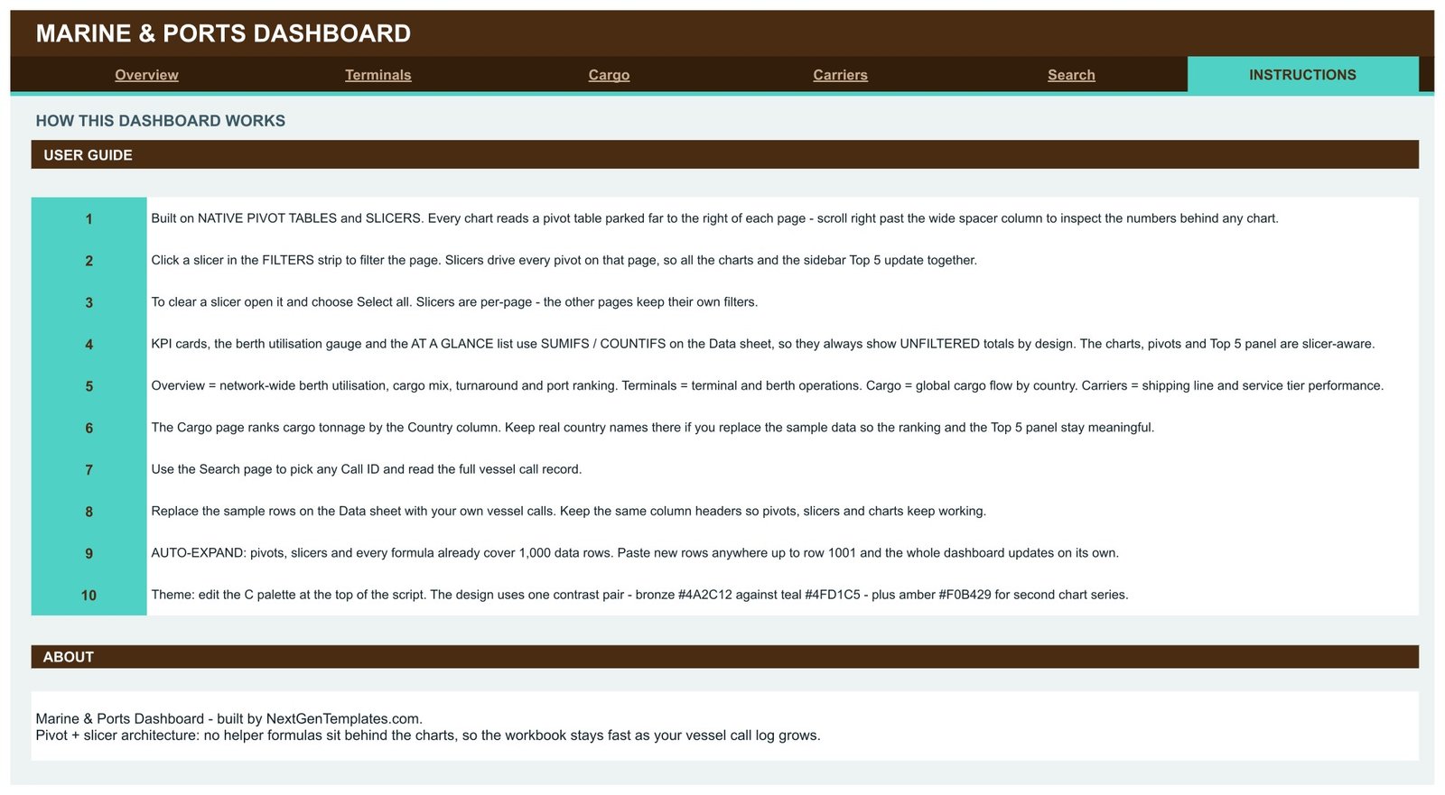
A 10-step user guide covering the pivot and slicer architecture, how to clear a slicer with Select all, why the KPI cards stay unfiltered, how the 1,000-row auto-expand works, and where the colour palette lives if you want to rebrand it. Behind these six tabs sits the Data sheet holding the vessel call log itself.
Marine & Ports Dashboard in Google Sheets vs. Microsoft Excel Dashboard vs. Terminal Operating SaaS – Feature Comparison
| Feature | Marine & Ports Dashboard in Google Sheets | Microsoft Excel Dashboard | Terminal Operating SaaS (Navis / Octopi) |
|---|---|---|---|
| Cost | $9.99 one-time ✅ | $13.99-$24.99 one-time | Quoted annually, typically five figures |
| Platform | Any browser, no install ✅ | Microsoft Excel desktop | Vendor-hosted web app |
| Setup time | Under 10 minutes ✅ | Under 15 minutes | Weeks of implementation |
| Real-time team collaboration | Built in via Google Drive ✅ | Needs OneDrive co-authoring | ✅ Built in |
| Mobile access | Google Sheets app ✅ | Excel mobile, limited slicers | ✅ Vendor app |
| Customisable fields and charts | Fully editable ✅ | ✅ Fully editable | Vendor-controlled |
| Share with a link | ✅ One Drive link | File attachment or OneDrive | ✅ Per-seat login |
| Runs live berth and yard operations | No – reporting only | No – reporting only | ✅ Yes |
| Year-1 cost at 5 users | $9.99 total ✅ | $13.99-$24.99 total | Five figures and up |
For port, terminal and shipping teams that want a shared operations picture without a terminal-system implementation project, the Marine & Ports Dashboard in Google Sheets sits in the sweet spot.
Who Should Use This Template
Perfect for:
- Port and terminal operations managers reporting monthly throughput, revenue and turnaround upward
- Shipping agency and liner analysts comparing revenue, TEU and delay rates across carriers and service tiers
- Freight forwarders and 3PL teams needing cargo tonnage by country and cargo type
- Consultants and students building a port performance model from a spreadsheet of call records
- Small terminals whose data already lives in a spreadsheet
Not a fit if:
- You need a terminal operating system – this does not plan berths, allocate yard slots or issue gate moves
- You want live AIS or vessel-tracking feeds – this reports on data you enter or export
- You need it for safety, customs, certification or regulatory submissions – it makes no compliance or conformance claims of any kind
- Your dataset runs well past 1,000 vessel calls and you do not want to extend the ranges yourself
- You need SSO, audit logging or role-based permissions inside the file
Real-World Use Cases
Ana, operations manager at a mid-size container terminal. Each month she exports the previous month’s vessel calls from the terminal log and pastes them over the Data sheet. The Terminals page then gives her revenue per ton and average berth utilisation across her six berths without a single manual pivot rebuild. The chart she actually presents is Dwell Hours vs Call Revenue – it makes the argument about which long-dwell calls earned their berth time far faster than a table of numbers does.
Diego, commercial reporting at a regional shipping agency. He lives on the Carriers page, ranking ten shipping lines by revenue and TEU and filtering by service tier to see how much of the book is long-term contract versus spot call. The Line Revenue vs Vessel Calls combo chart is the one that surfaces a carrier sending many low-value calls, which a revenue-only ranking would hide.
Priya, supply chain consultant advising a port authority. She uses the Cargo page to show tonnage by country and the cargo mix split across containers, dry bulk, liquid bulk and Ro-Ro. Because the file lives in Google Drive, she shares a single link with the client team instead of emailing versions back and forth, and the client can click the slicers themselves during the review call.
Advantages of the Marine & Ports Dashboard in Google Sheets
The cost case is the obvious one: $9.99 once, with no per-seat fee, against annual contracts for terminal analytics software. But the practical advantage is the pivot-and-slicer architecture. Because every chart reads a real pivot table rather than a chain of helper formulas, the file stays fast as the call log grows, and anyone who knows Google Sheets pivot tables can audit a number by scrolling right and reading the pivot directly.
The time saving comes from the 1,000-row auto-expand. Paste new rows anywhere up to row 1001 and the pivots, slicers, charts and KPI formulas all already cover that range – there is no “extend the range” step that people forget and then quietly report wrong totals for a month. And because it runs in the browser, a colleague on a phone at the quayside can open the same view as the office.
Opportunities for Improvement
Two honest limitations. First, the KPI cards, berth utilisation gauges and At a Glance lists use SUMIFS and COUNTIFS against the Data sheet, so they deliberately show unfiltered totals and do not respond to slicers. Only the charts, pivots and Top 5 panels are slicer-aware. That is documented on the Instructions tab, but it surprises people on day one.
Second, the 1,000-row ceiling is a real ceiling. A large terminal recording several thousand calls a year will need to extend the pivot source ranges and the formula ranges by hand. Beyond roughly ten thousand rows, a spreadsheet is the wrong container and a database-backed tool is the better answer.
It is also worth repeating that the shipped figures – the ports, carriers, tonnages and revenue values you see in the screenshots above – are demo data generated to make the layout legible. They are not real port statistics and should never be quoted as such.
Best Practices
- Read the Instructions tab before touching anything – it takes two minutes and explains why the KPI cards behave the way they do.
- Keep the column headers on the Data sheet exactly as shipped. The pivots, slicers and charts are bound to those names.
- Use real country names in the Country column so the Cargo ranking and Top 5 panel stay meaningful.
- Clear a slicer with Select all rather than deleting it – deleting the slicer breaks the page’s filter strip.
- Take a copy before a big data load, so you have a clean version to fall back to.
- Edit the colour palette at the top of the script once, rather than recolouring charts individually.
Explore Relevant Templates
Ports rarely sit alone in a supply chain. The Shipping Dashboard in Google Sheets picks up the freight leg once cargo leaves the gate, and the Transportation Services Dashboard in Google Sheets covers inland fleet movements. For rail-served terminals the Railways Dashboard in Google Sheets is the closest neighbour, while bulk and tanker terminals often pair this with the Oil & Gas Dashboard in Google Sheets or the Power Generation Dashboard in Google Sheets.
Also available as: Marine & Ports Dashboard in Excel and Marine & Ports Dashboard in Power BI – the same subject in a different tool. Browse the full Google Sheets Dashboards catalogue for more.
If you would like to get better at building reports like this, the Excel Pivot Tables & Dashboards course on NextGenTemplates Academy covers pivots, charts and dashboard layout with practice files.
Get the Marine & Ports Dashboard in Google Sheets
Frequently Asked Questions
What KPIs does the Marine & Ports Dashboard in Google Sheets track?
The Marine & Ports Dashboard in Google Sheets tracks 16 headline KPIs including port revenue, vessel calls, TEU handled, average dwell hours, completed calls, cargo tons, average berth utilisation %, countries served, average tons per call, priority calls and delay rate, plus 12 sidebar snapshot metrics.
How long does setup take?
Under 10 minutes. Open the PDF in your download, click the copy link, then paste your vessel call records over the demo rows on the Data sheet using the same column headers. Every pivot, slicer and chart in the Marine & Ports Dashboard in Google Sheets recalculates on its own.
Is the sample data real port statistics?
No. The 500 vessel calls shipped with the Marine & Ports Dashboard in Google Sheets are demo data created to show the layout working. The ports, carriers, tonnages and revenue figures are illustrative only and must be replaced with your own records before you report anything.
Does this template help with maritime safety or customs compliance?
No. The Marine & Ports Dashboard in Google Sheets is a reporting template for data you enter yourself. It makes no claims about maritime safety, customs or regulatory compliance, vessel certification, or conformance with any maritime standard, and is not suitable for regulatory submissions.
How does this compare to a terminal operating system like Navis or Octopi?
A terminal operating system runs live operations – berth planning, yard moves, gate control – on an annual contract. The Marine & Ports Dashboard in Google Sheets is a $9.99 one-time reporting layer over call records you already keep. It reports performance; it does not run the terminal.
Why do the KPI cards not respond to the slicers?
By design. In the Marine & Ports Dashboard in Google Sheets the KPI cards, berth utilisation gauges and At a Glance list use SUMIFS and COUNTIFS on the Data sheet, so they always show unfiltered totals. The charts, pivot tables and Top 5 panels are the slicer-aware parts of each page.
Can I add more than 1,000 vessel calls?
Yes, but you extend the ranges yourself. Pivots, slicers and formulas in the Marine & Ports Dashboard in Google Sheets cover 1,000 data rows out of the box; paste anywhere up to row 1001 and everything updates automatically. Past that you widen the pivot source and formula ranges manually.
About the Author
Built by PK – Microsoft Certified Professional with 15+ years of Excel, Google Sheets and Power BI experience. Founder of NextGenTemplates, reaching 300K+ subscribers across YouTube channels. Every template is hand-built and tested before release.
Conclusion
If your vessel call data already lives in a spreadsheet and the monthly reporting pass is done by hand, the Marine & Ports Dashboard in Google Sheets replaces that pass with a paste. Six tabs, 16 KPI cards, 18 pivot-driven charts and 15 slicers, all wired to a single Data sheet that grows with you to 1,000 rows.
Instant download · One-time payment · No subscription
Last updated: August 2026