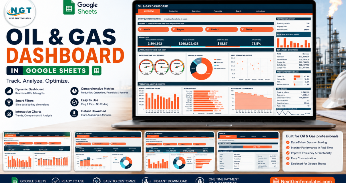
The Oil & Gas Dashboard in Google Sheets is a six-tab reporting file built on native Google Sheets pivot tables and slicers. It carries 16 KPI cards, 18 charts and 15 slicers, and every pivot, slicer and formula already reaches row 1,001 — so pasting your own well records is the entire setup. It opens with 500 rows of clearly labelled demo data so nothing looks empty on first open.
Most production and cost reporting in small and mid-size operators still lives in a pile of hand-rebuilt spreadsheets: one for volumes, one for downtime, one for revenue, each reworked every month. This template collapses that into one log and four analysis pages that filter together. It is a reporting layer over your own numbers — nothing in it is a compliance, regulatory or engineering system, and the sample figures are invented.
Get the Oil & Gas Dashboard in Google Sheets
Key Features of the Oil & Gas Dashboard in Google Sheets
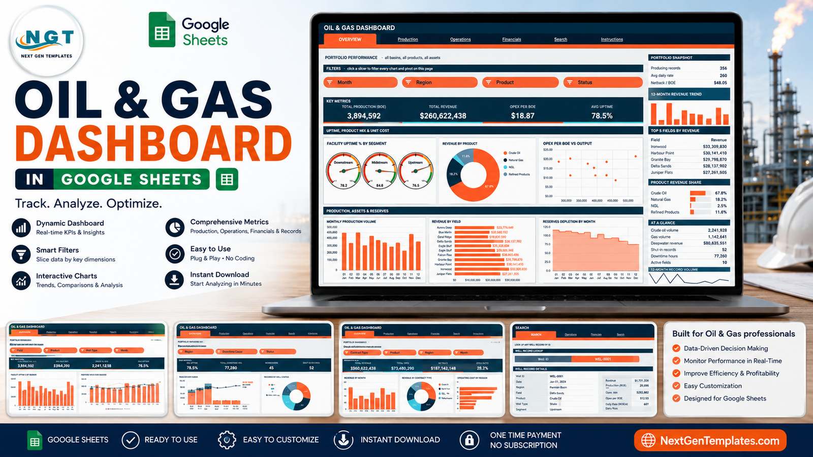
- Six linked tabs — Overview, Production, Operations, Financials, Search and Instructions, each with a navigation strip so you never scroll to switch pages.
- 16 KPI cards — four on each of the four analysis pages, covering production volume, revenue, unit cost, uptime, downtime, workovers, netback and opex ratio.
- 18 pivot-driven charts — gauges, donuts, stacked columns, a scatter plot, area charts and a bar-plus-line combo, every one of them reading a real pivot table rather than a hidden formula chain.
- 15 native slicers — Month, Region, Product, Status, Field, Well Type, Downtime Cause and Contract Type, arranged per page so each tab keeps its own filter state.
- A Search tab that returns all 18 fields for any single Well ID.
- 1,000-row capacity out of the box, raised in one line of Apps Script if you need more.
- One editable palette — a deep ink against an orange accent plus a cyan for second chart series; change it once and the whole file restyles.
The pivot-first architecture is the design decision that matters most. Because each chart reads a pivot table parked to the right of its page, you can scroll past the spacer column and inspect the exact numbers behind any visual. Google’s own documentation on pivot tables and slicers covers the underlying mechanics if you want to extend the file yourself.
Dashboard Pages Explanation
Page 1: Overview — Portfolio Performance
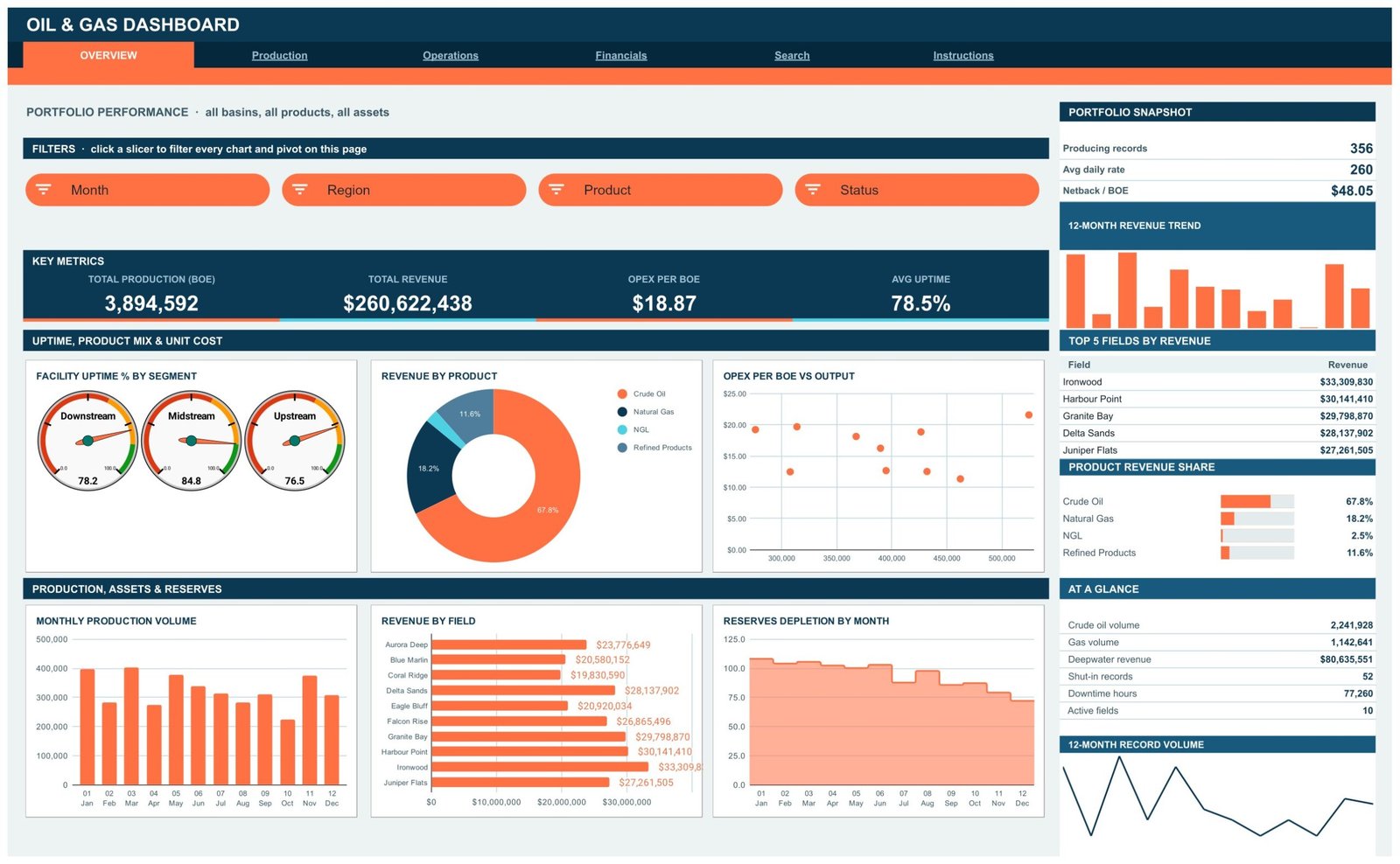
The portfolio-wide view across all basins, products and assets. Four KPI cards — Total Production (BOE), Total Revenue, Opex per BOE and Avg Uptime — sit above six charts: Facility Uptime % by Segment shown as three gauges for Downstream, Midstream and Upstream; Revenue by Product; Opex per BOE vs Output as a scatter; Monthly Production Volume; Revenue by Field; and Reserves Depletion by Month. A right-hand sidebar carries a Portfolio Snapshot, a 12-Month Revenue Trend, Top 5 Fields by Revenue, a Product Revenue Share bar list and an At a Glance table.
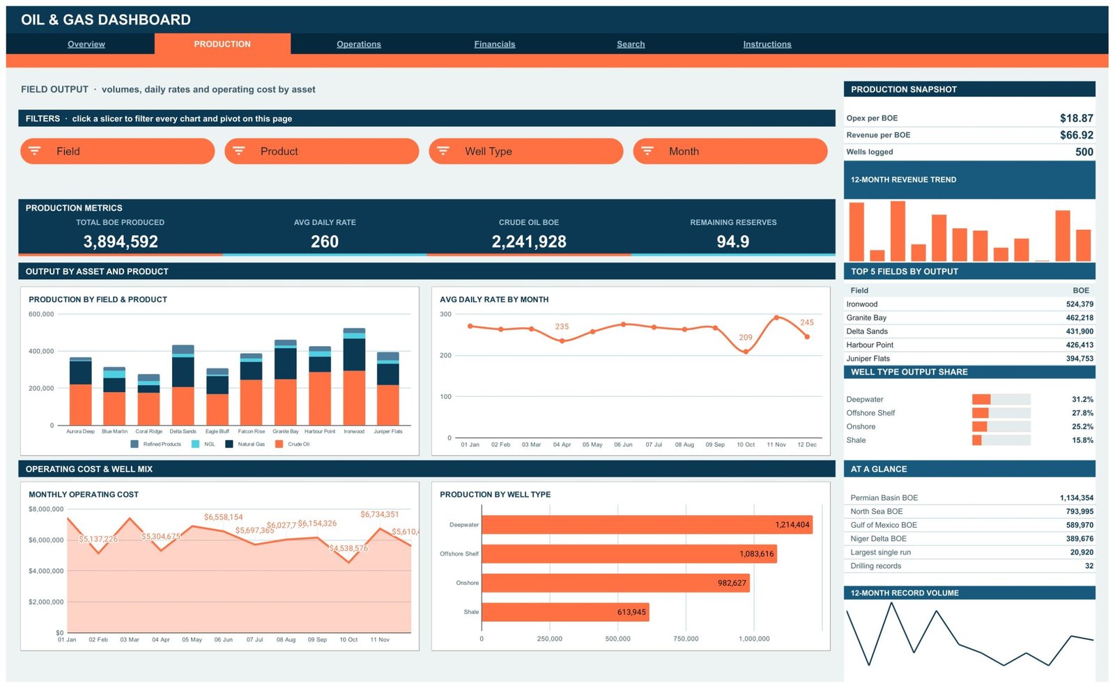
Page 2: Production — Field Output
Volumes, daily rates and operating cost by asset. Charts are Production by Field & Product, Avg Daily Rate by Month, Monthly Operating Cost and Production by Well Type. KPI cards show Total BOE Produced, Avg Daily Rate, Crude Oil BOE and Remaining Reserves. The sidebar ranks Top 5 Fields by Output and shows Well Type Output Share across Deepwater, Offshore Shelf, Onshore and Shale, alongside a per-region BOE list.
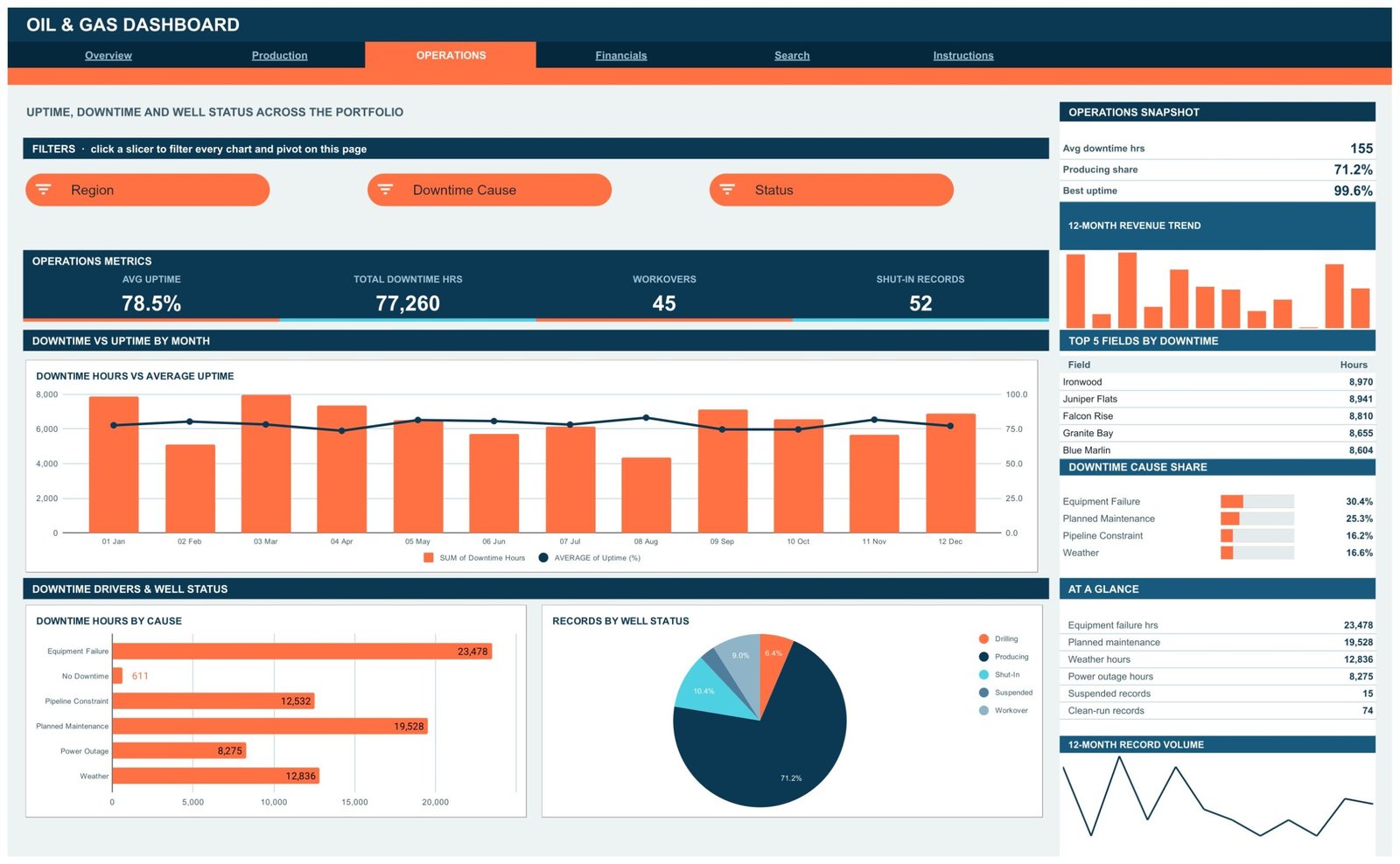
Page 3: Operations — Uptime, Downtime and Well Status
Downtime Hours vs Average Uptime pairs monthly downtime bars against an uptime line on a second axis. Downtime Hours by Cause and Records by Well Status sit below, with the sidebar listing Top 5 Fields by Downtime and the Downtime Cause Share across Equipment Failure, Planned Maintenance, Pipeline Constraint and Weather. Read this page as a summary of the hours you logged — it is not an HSE system, a well-integrity assessment or a reliability-engineering model.
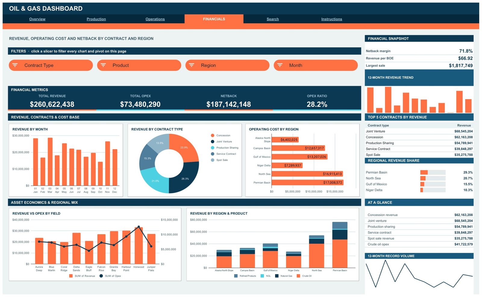
Page 4: Financials — Revenue, Opex and Netback
Revenue by Month, Revenue by Contract Type, Operating Cost by Region, Revenue vs Opex by Field and Revenue by Region & Product. KPI cards show Total Revenue, Total Opex, Netback and Opex Ratio, and the sidebar ranks Top 5 Contracts by Revenue with a Regional Revenue Share list. Netback here is revenue minus the operating cost you enter — a management figure from your own inputs, not an audited or standards-based measure, and not a basis for pricing or hedging decisions.
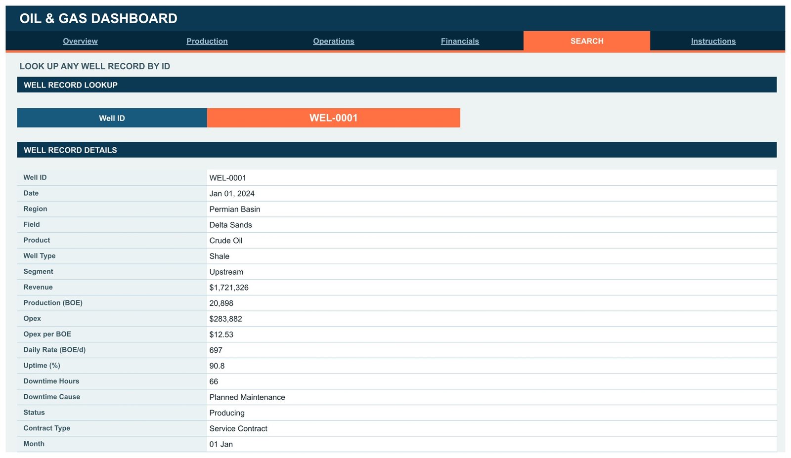
Page 5: Search — Well Record Lookup
Pick a Well ID from the dropdown and the Well Record Details panel prints that single record in full: Date, Region, Field, Product, Well Type, Segment, Revenue, Production (BOE), Opex, Opex per BOE, Daily Rate, Uptime %, Downtime Hours, Downtime Cause, Status, Contract Type and Month. It is the page you open when someone asks about one specific well rather than a trend.
Page 6: Instructions — User Guide
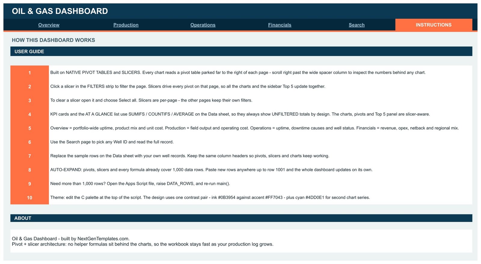
Ten numbered steps explaining the pivot-and-slicer architecture, how to clear a slicer with Select all, why the KPI cards and the At a Glance list deliberately stay unfiltered, how to swap the sample rows for your own, the 1,000-row auto-expand limit and how to raise DATA_ROWS, and how to re-theme the whole file from one palette.
The Data sheet
One flat table sits behind all of it, with columns for Well ID, Date, Month, Region, Field, Product, Well Type, Segment, Revenue, Production (BOE), Opex, Opex per BOE, Daily Rate, Uptime %, Downtime Hours, Downtime Cause, Status and Contract Type. The 500 shipped rows use invented field names such as Ironwood, Delta Sands and Harbour Point. They are demo data — not real production figures for any operator, basin or asset — and exist purely so the charts are populated before you have loaded anything.
Oil & Gas Dashboard in Google Sheets vs. an Excel Dashboard vs. Paid Energy Analytics SaaS
| Feature | Oil & Gas Dashboard in Google Sheets | Microsoft Excel Dashboard | Enverus / Quorum / P2 Energy |
|---|---|---|---|
| Cost | $9.99 one-time ✅ | $18-25 one-time | Quoted annually, typically five figures |
| Platform | Any browser, no install ✅ | Excel desktop licence | Vendor cloud plus onboarding |
| Setup time | Under 10 minutes ✅ | Under 15 minutes | Weeks of implementation |
| Real-time team collaboration | Built in via Google Drive ✅ | Needs OneDrive co-authoring | Yes |
| Mobile access | Google Sheets app ✅ | Excel mobile, limited | Vendor app |
| Customisable fields and charts | Fully editable, you own the file ✅ | Fully editable | Change requests via vendor |
| Share with a link | Yes, one Drive link ✅ | File attachment or OneDrive | Per-seat login |
| Year-1 cost at 5 users | $9.99 total ✅ | $18-25 total | Five figures and up |
| Well record lookup | Built-in Search tab, 18 fields ✅ | Usually needs a separate query | Yes |
For operators and analysts who want a clean production and cost view without a vendor implementation, the Oil & Gas Dashboard in Google Sheets sits in the sweet spot.
Who Should Use This Template
Perfect for:
- Production and operations analysts at small to mid-size operators reporting monthly volumes, uptime and unit cost
- Energy consultants who need a presentable client deliverable the same day
- Finance teams tracking revenue, opex and netback by field, region and contract type
- Service companies and asset managers who want a shareable snapshot without a platform licence
- Trainers and students working through upstream metrics on a populated example
Not a fit if:
- You need statutory or regulatory reserves reporting — this file does not implement SEC or SPE-PRMS reserve definitions, and the reserves numbers are simply what you type in
- You need HSE, flaring, emissions or environmental compliance reporting — there is no such module and no conformance claim of any kind
- You need well integrity monitoring, SCADA or real-time surveillance — it reads a manually maintained log, not sensor feeds
- You want commodity price forecasting, hedging or trading support — there is no price model, and nothing here is trading or investment advice
- Your reporting layer needs SSO, audit trails or SOC 2 controls
- Your dataset runs to tens of thousands of rows, where a database and a BI tool are the right answer
Real-World Use Cases
Daniel, production analyst at a 60-person independent operator. He keeps one monthly log of well records and uses the Oil & Gas Dashboard to show which fields moved volumes, where opex per BOE drifted, and how uptime tracked across Upstream, Midstream and Downstream. Three hand-rebuilt spreadsheets became one file that he filters live in the monthly review instead of re-cutting beforehand.
Priya, principal at a four-person energy advisory practice. She copies the template per client, drops their production log onto the Data sheet, and hands back a filtered Overview and Financials pack the same day. No platform licence, no implementation call, and the client keeps the working file afterwards rather than losing access when the engagement ends.
Marcus, who teaches an upstream economics module. He gives students the populated demo file so they can see how netback, opex ratio and daily rate move against each other before building anything themselves. The Instructions tab means the first session is about the metrics, not about the mechanics of the spreadsheet.
Advantages of the Oil & Gas Dashboard in Google Sheets
The obvious advantage is cost: a one-time $9.99 file against annual contracts for energy data platforms. But the practical advantages are smaller and more day-to-day. Because it is a Google Sheet, sharing is a Drive link and collaboration is native — no version emailed round, no co-authoring setup. Because the charts read pivot tables, anyone can audit a number by scrolling right instead of asking you how it was calculated.
The 1,000-row headroom means the first month of use requires no configuration at all, and the single-palette theming means an internal rebrand takes a minute rather than an afternoon of clicking through chart editors. Exporting a monthly pack is File then Download, and the PDF comes out clean because the layout is built to page width.
Opportunities for Improvement
Being straight about the limits: the 1,000-row default is a real ceiling, and while raising DATA_ROWS in the Apps Script file is a one-line change, it does require opening the script editor — not every buyer will be comfortable there. Google Sheets also slows noticeably once a file carries tens of thousands of rows and many pivots, so this is a monthly-log tool rather than a daily-record-at-scale tool.
The KPI cards and the At a Glance panel are deliberately unfiltered — they use SUMIFS, COUNTIFS and AVERAGE against the full Data sheet, so they show portfolio totals while the charts beside them respond to slicers. That is documented on the Instructions tab, but it does surprise people the first time. There is also no year-on-year or variance-to-plan view; comparisons are within the 12 months you load. And there is no data-entry form — records arrive by paste.
Best Practices
- Keep the column headers exactly as shipped. Pivots, slicers and charts are bound to those names, and renaming one quietly empties a chart.
- Delete the demo rows before you share the file with anyone. Leaving invented figures next to real ones is how a sample number ends up in a board pack.
- Load a full 12 months where you can — the trend charts and the 12-Month Revenue Trend sparkline are built for a year.
- Use one tab’s slicers per question. Because slicers are per-page, you can leave Operations filtered to one region while Financials stays portfolio-wide.
- Duplicate the file per period or per client rather than overwriting, so you keep a readable history.
- If you extend it, add your new field to the Data sheet first, then refresh the pivot on the page you want it to appear on.
Explore Relevant Templates
If you report across a wider energy and industrial estate, the Power Generation Dashboard in Google Sheets covers generation and load, and the Chemical Manufacturing Dashboard in Google Sheets covers downstream plant output. The Steel & Metals Dashboard in Google Sheets and the Renewable Energy Dashboard in Google Sheets complete an energy-transition reporting set.
Also available as: a broader industry view in the Oil and Gas Analysis Dashboard in Google Sheets, with Excel and Power BI editions of the same topic. Browse the whole Google Sheets Dashboard templates collection for more.
If you want to go deeper on building dashboards like this, the Excel Pivot Tables & Dashboards course on NextGenTemplates Academy teaches pivots, charts and reporting layouts with practice files.
Get the Oil & Gas Dashboard in Google Sheets
Frequently Asked Questions
What KPIs does the Oil & Gas Dashboard in Google Sheets track?
The Oil & Gas Dashboard in Google Sheets tracks 16 KPI cards across four pages: total production in BOE, total revenue, opex per BOE, average uptime, average daily rate, crude oil BOE, remaining reserves, total downtime hours, workovers, shut-in records, total opex, netback and opex ratio, plus revenue per BOE and netback margin in the sidebars.
Is the sample data real production data?
No. The Oil & Gas Dashboard in Google Sheets ships with 500 rows of invented demo records using fictional field names. They exist only so the charts are populated when you open the file. Replace them with your own well records before using the dashboard for any real reporting.
How long does setup take?
Under 10 minutes. Open the PDF, click the copy link, delete the demo rows on the Data sheet and paste your own records under the same headers. Every pivot, slicer and chart in the Oil & Gas Dashboard updates on its own — there are no add-ons or macros to configure.
Can I use this for reserves or emissions compliance reporting?
No. The Oil & Gas Dashboard in Google Sheets is a management reporting template fed entirely by your own numbers. It does not implement SEC or SPE-PRMS reserve definitions, has no emissions or HSE module, and makes no compliance claim. Keep statutory filings in your official systems.
How does this compare to Enverus or Quorum?
Those are full energy data suites with vendor implementation and annual contracts covering subsurface, land and accounting. The Oil & Gas Dashboard in Google Sheets is a $9.99 one-time file you own and can edit freely, focused on monthly production, uptime, cost and netback reporting.
How many rows can it handle?
Pivots, slicers and every formula already cover 1,000 data rows, so you can paste up to row 1001 with no edits. Beyond that, open the Apps Script file, raise the DATA_ROWS value and re-run main() — the dashboard rebuilds at the new size.
Do I need Excel or an add-on?
No. The Oil & Gas Dashboard in Google Sheets runs entirely in Google Sheets in any modern browser, using native pivot tables, native slicers and standard SUMIFS, COUNTIFS and AVERAGE formulas. No add-ons, no macros and no subscription.
About the Author
Built by PK — Microsoft Certified Professional with 15+ years of Excel, Google Sheets and Power BI experience. Founder of NextGenTemplates, reaching 300K+ subscribers across YouTube channels. Every template is hand-built and tested before release.
Conclusion
If your production and cost reporting is currently three spreadsheets rebuilt every month, the Oil & Gas Dashboard in Google Sheets replaces them with one log and four pages that filter together — 16 KPI cards, 18 pivot-driven charts, 15 slicers and a per-well lookup, in a file you own outright. It reports what you feed it, and nothing more: no compliance module, no reserves standard, no price model.
Instant download · One-time payment · No subscription
Last updated: August 2026