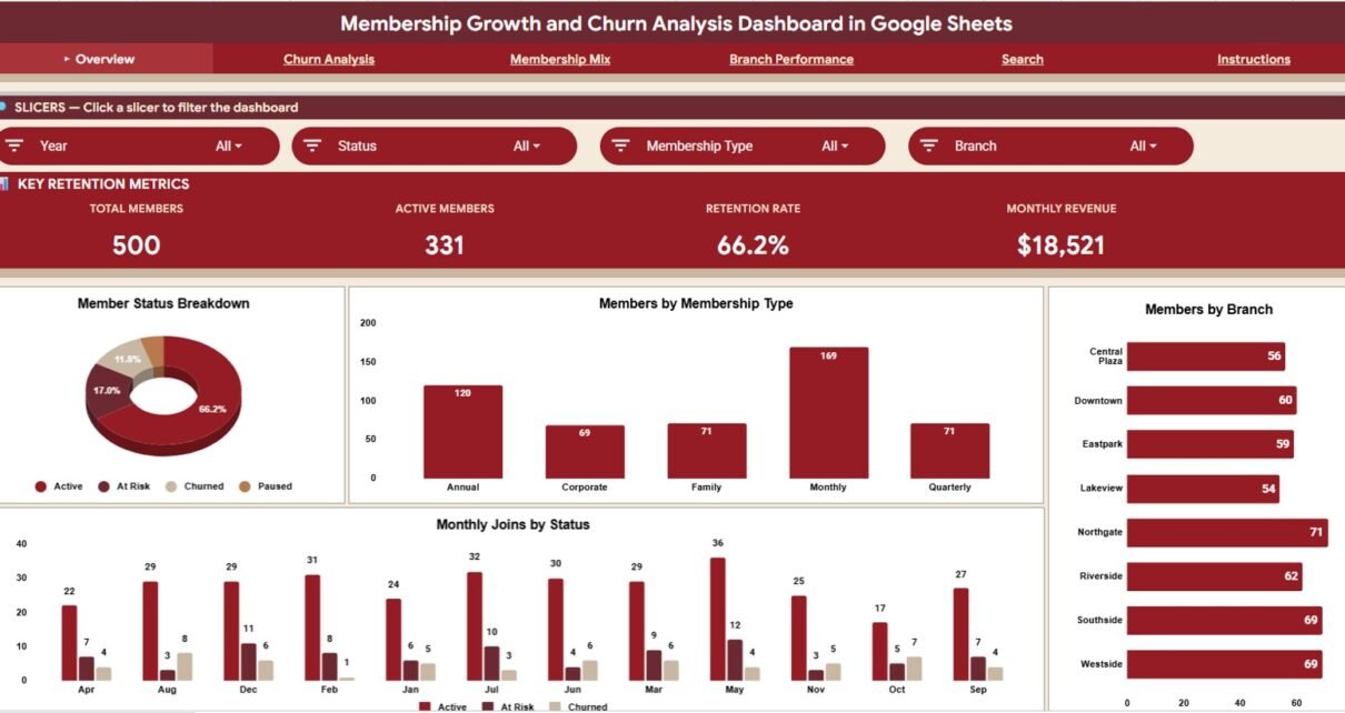
Membership businesses do not grow from new signups alone. They grow when members stay, renew, upgrade, visit regularly and keep paying each month. The Membership Growth and Churn Analysis Dashboard in Google Sheets is built for that problem: it tracks membership growth, churn, revenue, member mix, branch performance and individual member records in one shareable spreadsheet.
The file has four analysis pages (Overview, Churn Analysis, Membership Mix and Branch Performance), each with four KPI cards, four slicers and four charts, plus a Member ID search page, an Instructions tab and a Data Sheet. Retention deserves this attention: research by Bain & Company, summarised in Harvard Business Review, found that raising customer retention by 5% can lift profits by 25% to 95%, depending on the business.
🎥 Watch the Video Tutorial
Get the Membership Growth and Churn Dashboard
Key Features of the Membership Growth and Churn Analysis Dashboard
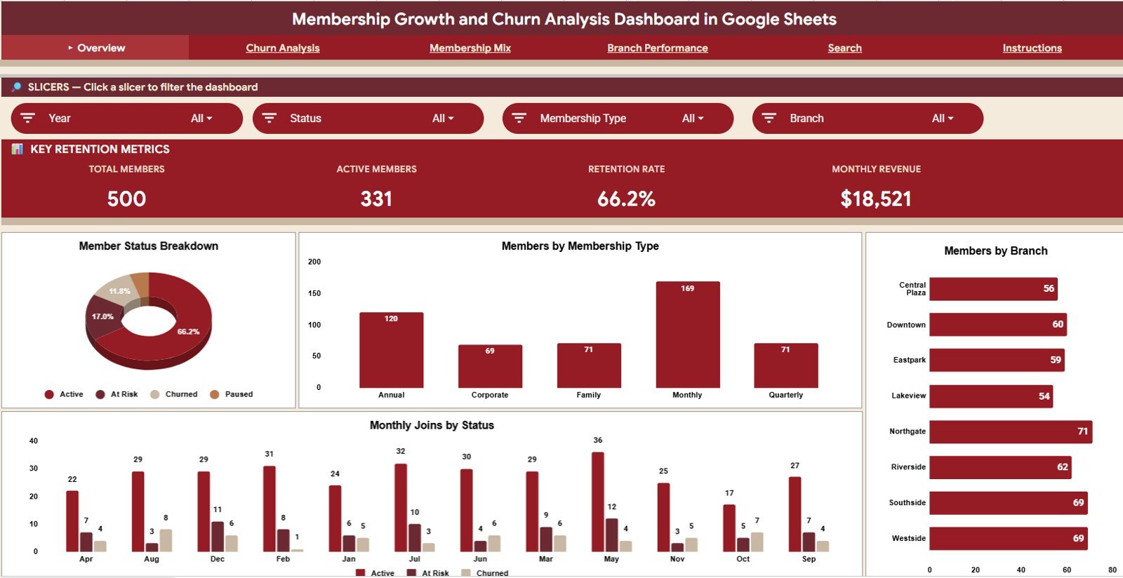
- Overview page with Total Members, Active Members, Retention Rate and Monthly Revenue cards.
- Slicers on every page (for example Year, Status, Membership Type and Branch on the Overview) to filter the charts.
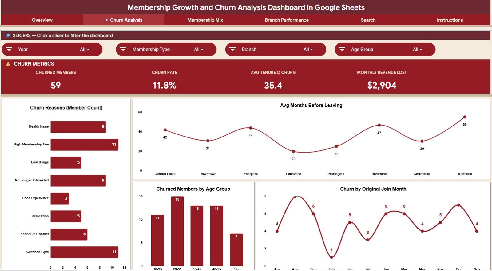
- Churn Analysis page covering churn reasons, average months before leaving by branch, churn by age group and churn by original join month.
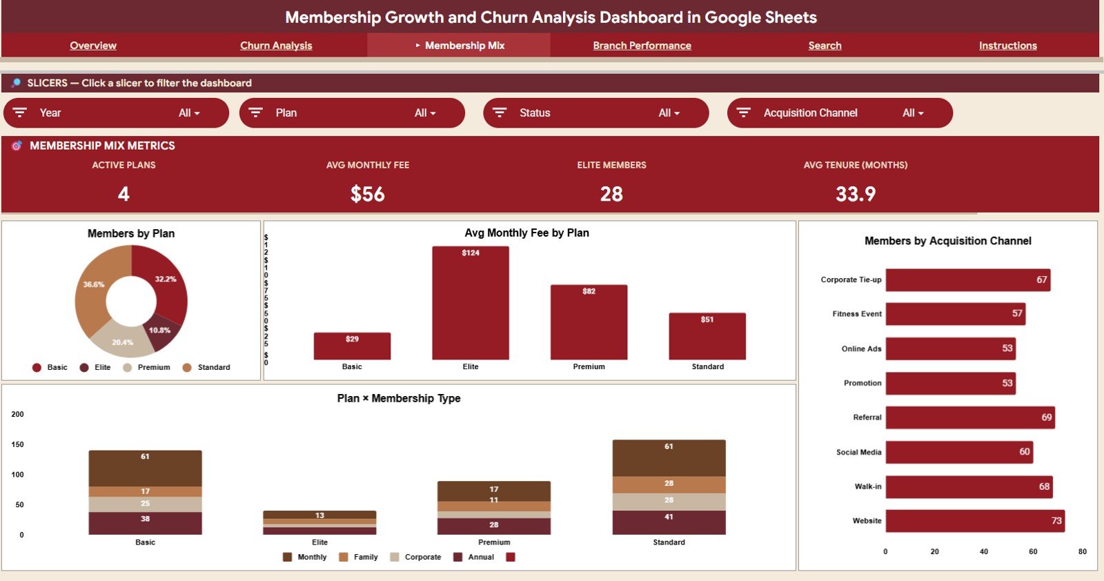
- Membership Mix page for plan distribution, average monthly fee by plan, acquisition channel and plan by membership type.
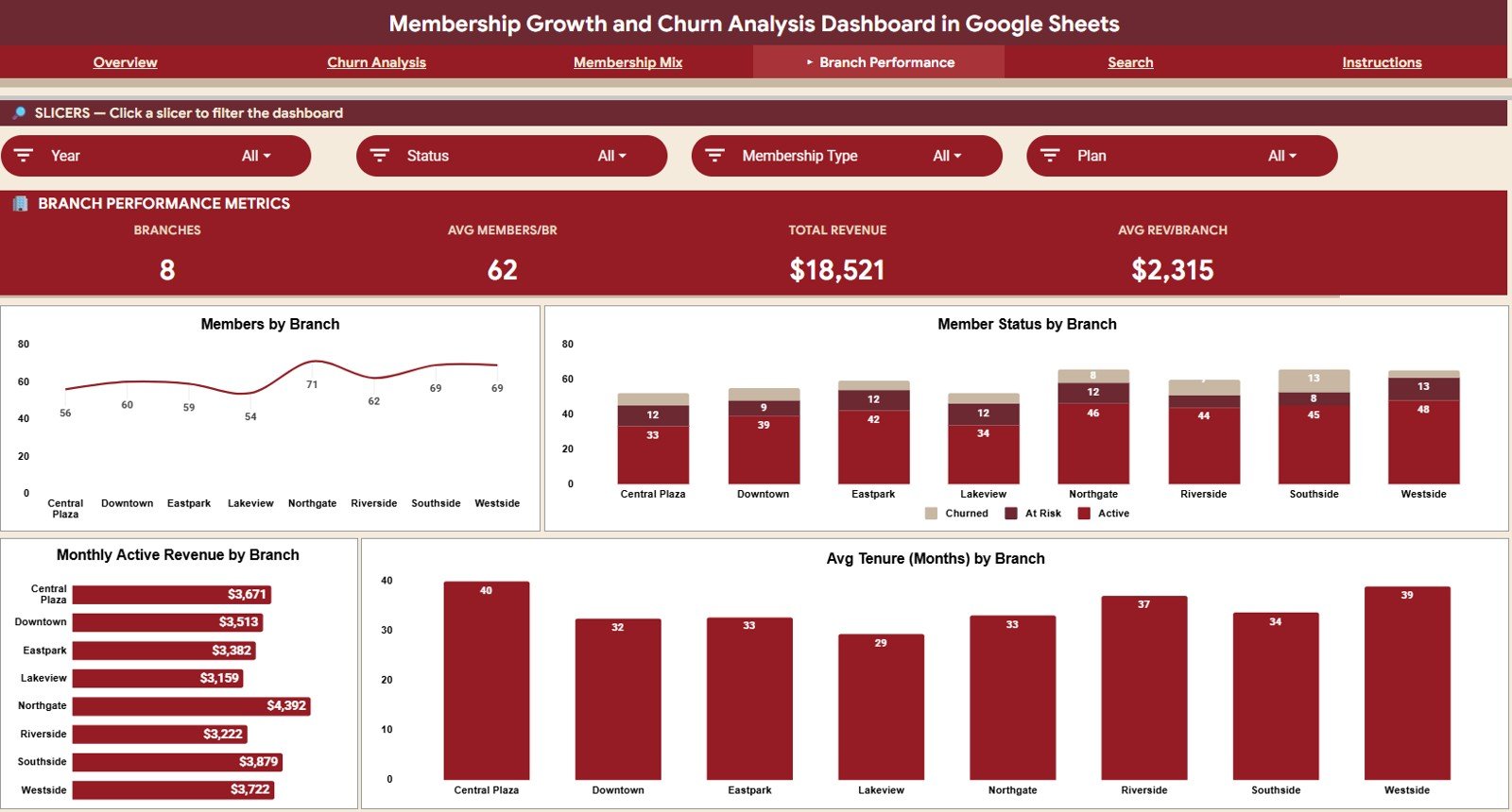
- Branch Performance page comparing members, member status, monthly active revenue and average tenure across eight branches.
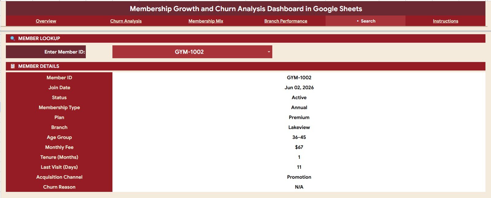
- Search page that shows a member’s key details after you pick a Member ID.
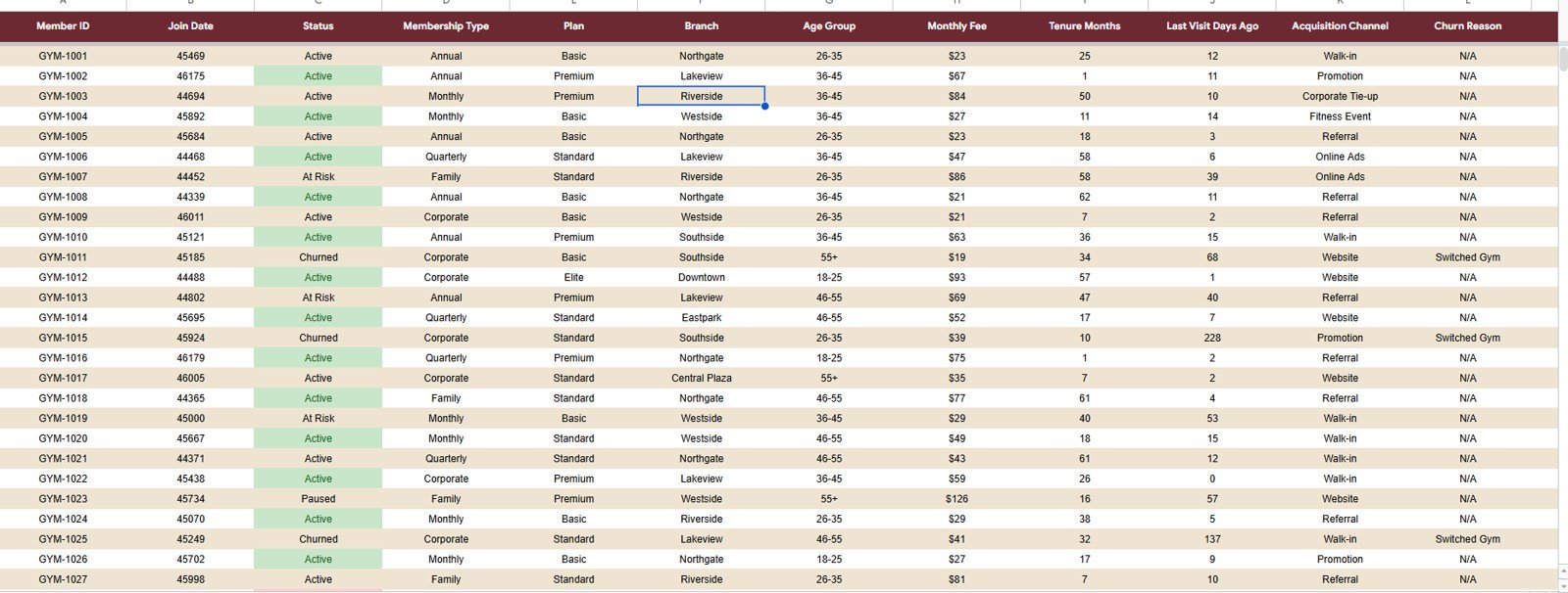
- Data Sheet structured for clean member records.
KPI Cards on Each Page
These are the cards exactly as they appear in the template, with the sample values from the screenshots. Where the calculation is clear from the numbers, it is shown.
| Page | KPI | Sample value | How it works out | Better when |
|---|---|---|---|---|
| Overview | Total Members | 500 | Count of member records | Higher |
| Overview | Active Members | 331 | Members with status Active | Higher |
| Overview | Retention Rate | 66.2% | Active ÷ Total = 331 ÷ 500 | Higher |
| Overview | Monthly Revenue | $18,521 | Total monthly fee revenue shown on the card | Higher |
| Churn Analysis | Churned Members | 59 | Members with status Churned | Lower |
| Churn Analysis | Churn Rate | 11.8% | Churned ÷ Total = 59 ÷ 500 | Lower |
| Churn Analysis | Avg Tenure @ Churn | 35.4 | Average tenure in months of members who churned | — |
| Churn Analysis | Monthly Revenue Lost | $2,904 | Monthly revenue no longer collected from churned members | Lower |
| Membership Mix | Active Plans, Avg Monthly Fee, Elite Members, Avg Tenure (Months) | 4, $56, 28, 33.9 | Values as shown on the cards; the four plans are Basic, Elite, Premium and Standard | — |
| Branch Performance | Branches, Avg Members/BR, Total Revenue, Avg Rev/Branch | 8, 62, $18,521, $2,315 | Avg Rev/Branch = $18,521 ÷ 8 | — |
Retention Rate = Active Members / Total Members      → 331 / 500 = 66.2%
Churn Rate     = Churned Members / Total Members     → 59 / 500  = 11.8%
Dashboard Pages Explained
Member statuses in the sample data are Active, At Risk, Churned and Paused. Membership types are Annual, Corporate, Family, Monthly and Quarterly, and the four plans are Basic, Elite, Premium and Standard.
Overview Page
The Overview page gives managers a fast snapshot, filtered by Year, Status, Membership Type and Branch.
- Member Status Breakdown: the share of Active, At Risk, Churned and Paused members.
- Members by Membership Type: where the member base is concentrated (Monthly is the largest group in the sample).
- Members by Branch: member counts for Central Plaza, Downtown, Eastpark, Lakeview, Northgate, Riverside, Southside and Westside.
- Monthly Joins by Status: how many people joined each month and how those members are doing now.
Churn Analysis
The Churn Analysis page explains why members leave and where churn risk appears. Its slicers are Year, Membership Type, Branch and Age Group.
- Churn Reasons (Member Count): Health Issue, High Membership Fee, Low Usage, No Longer Interested, Poor Experience, Relocation, Schedule Conflict and Switched Gym. This separates avoidable churn (fees, experience, usage) from external reasons like relocation.
- Avg Months Before Leaving: how long members typically stay at each branch before leaving.
- Churned Members by Age Group: churn across 18-25, 26-35, 36-45, 46-55 and 55+.
- Churn by Original Join Month: whether certain joining cohorts churn more.
Membership Mix
The Membership Mix page shows which plans, channels and membership types shape the business, with slicers for Year, Plan, Status and Acquisition Channel.
- Members by Plan: plan popularity across Basic, Elite, Premium and Standard.
- Avg Monthly Fee by Plan: connects the plan mix to recurring revenue ($29 Basic up to $124 Elite in the sample).
- Members by Acquisition Channel: Corporate Tie-up, Fitness Event, Online Ads, Promotion, Referral, Social Media, Walk-in and Website.
- Plan × Membership Type: how each plan splits across membership types such as Monthly, Family, Corporate and Annual, which helps spot upgrade opportunities.
Branch Performance
The Branch Performance page is for multi-location teams, with slicers for Year, Status, Membership Type and Plan.
- Members by Branch: location size.
- Member Status by Branch: whether one branch has a higher Churned or At Risk share.
- Monthly Active Revenue by Branch: recurring revenue contribution per location.
- Avg Tenure (Months) by Branch: where members stay longest, which can point to better onboarding, programming or service.
Search Page
The Search page is built for quick member lookup. Pick a Member ID and see Member ID, Join Date, Status, Membership Type, Plan, Branch, Age Group, Monthly Fee, Tenure (Months), Last Visit (Days), Acquisition Channel and Churn Reason.
Data Sheet
The Data Sheet stores one row per member with the columns Member ID, Join Date, Status, Membership Type, Plan, Branch, Age Group, Monthly Fee, Tenure Months, Last Visit Days Ago, Acquisition Channel and Churn Reason (N/A for members who have not left). Add your records in the same layout so the cards, charts, slicers and search keep working.
How to Use It With Your Own Data
- Make your own copy of the file in Google Drive and read the Instructions tab.
- Agree on fixed names for statuses, plans, branches, channels and churn reasons before you load data.
- Export members from your membership software and paste them into the Data Sheet in the same column order.
- Check the Overview cards against a number you know, such as current active members.
- Refresh the data on a fixed weekly or monthly schedule and review the Churn Analysis page each time.
Manual Spreadsheet vs This Dashboard
| Reporting need | Manual spreadsheet | This Google Sheets dashboard |
|---|---|---|
| High-level membership KPIs | Manual formulas and formatting | Cards for members, retention and revenue |
| Churn diagnosis | Often hidden in cancellation notes | Charts by reason, age group, branch and join month |
| Branch comparison | Separate branch files drift apart | One structure compares eight branches side by side |
| Member lookup | Scrolling or filtering raw data | Search page by Member ID |
| Team sharing | Version control gets messy | One shared Google Sheets file |
Who Should Use This Dashboard?
- Gym owners and fitness studios tracking member growth and cancellations.
- Clubs, associations and community groups managing recurring memberships.
- Subscription-based service businesses reviewing retention and plan mix.
- Branch managers comparing member health across locations.
- Consultants preparing membership reports for clients.
It is less suited to businesses that need automatic syncing with a membership system, payment processing or member messaging; those stay in your membership software, and this file is the reporting layer.
Real-World Use Cases
A gym owner checks the Overview during weekly reporting to see whether active members and monthly revenue are improving. A branch manager uses Branch Performance to see whether one location has shorter average tenure than the others. A membership coordinator opens the Search page before calling an At Risk member, checking tenure, last visit days and plan in a few seconds.
The dashboard also helps with campaign reviews. If a promotion brings in many new members who then churn quickly, Monthly Joins by Status and Churn by Original Join Month make that pattern visible.
Advantages and Limitations
- Runs in Google Sheets with no extra dashboard software.
- Combines acquisition, retention, churn, revenue, branch and member lookup views.
- A structured Data Sheet keeps updates simple.
Like any spreadsheet template, it depends on clean source data, so standardise churn reasons, membership types, channels and branch names first. Advanced teams could extend the file with cohort retention tables, lifetime value or automated imports.
Best Practices
- Update member records on a consistent weekly or monthly schedule.
- Use the same names for branches, plans, channels and churn reasons every time.
- Review churn reason trends before changing pricing or offers.
- Compare branches on both member count and tenure, not one metric alone.
- Use Google Sheets filter views when team members need their own temporary view of the same data.
To build or adapt dashboards like this yourself, the Excel Pivot Tables & Dashboards course on NextGenTemplates Academy covers pivots, slicers and chart design step by step.
For more retention reporting, see the Gym Retention Dashboard in Google Sheets, the Membership Management KPI Dashboard and the Customer Churn KPI Dashboard. If you also need to manage day-to-day check-ins and renewals, the Gym and Fitness Center Membership Management System Web App covers the operational side.
Related templates: Gym Retention Dashboard in Google Sheets.
Frequently Asked Questions
Is this dashboard beginner-friendly?
Yes. The structure is ready-made; you mainly keep the Data Sheet updated in the required format and use the slicers to filter.
How is the retention rate calculated?
In the sample data it is Active Members divided by Total Members: 331 ÷ 500 = 66.2%. The churn rate on the Churn Analysis page works the same way with churned members: 59 ÷ 500 = 11.8%.
Can I customise the charts and fields?
Yes. In your copy you can adjust labels, formulas, chart colours and formatting to match your business.
Can this be used for more than gyms?
Yes. It can be adapted for clubs, associations, studios, online communities and other membership-based organisations by renaming plans, branches and channels.
Does the dashboard include member-level search?
Yes. The Search page shows 12 fields for any Member ID you select.
Do I need paid BI software?
No. The dashboard runs entirely in Google Sheets.
About the Author
Built by PK, a Microsoft Certified Professional with 15+ years of Excel, Google Sheets and Power BI experience and founder of NextGenTemplates. NeoTechNavigators publishes practical templates and dashboard guides for teams that want cleaner reporting.
Wrapping Up
The Membership Growth and Churn Analysis Dashboard in Google Sheets gives membership-based businesses a clear way to track growth, retention, churn, branch performance, plan mix and individual member details. Load your member export, check the retention and churn rates, then use the Churn Analysis page to decide which reasons are worth acting on first.
Get the Membership Growth and Churn Dashboard
📅 Last updated: October 2026