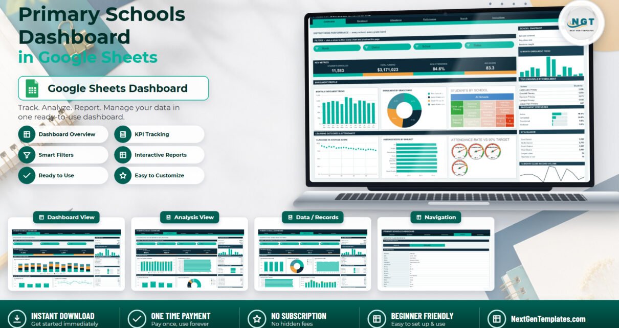
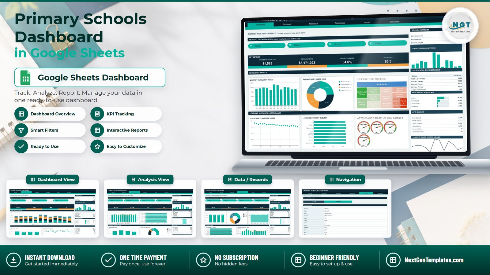
Most primary-school reporting still happens the same way: somebody exports the class register, pastes it into a fresh workbook, rebuilds the same eight charts, screenshots them, and emails the pack around. Next month, the same job again. The Primary Schools Dashboard in Google Sheets replaces that rebuild with a paste. It is a six-tab file carrying 16 KPI cards, 21 charts and gauges, 15 slicers and a Record ID lookup, all reading native Google Sheets pivot tables rather than a layer of hidden helper formulas. The demo file ships with 500 sample class records across 18 columns – 12 schools, 4 districts, 4 primary grade bands, 8 subjects and a full 12 months.
Before anything else, a plain statement about the data, because this subject involves children. Every row in this template is a class record, not a pupil record. The 18 columns are Record ID, Date, District, School, Grade Band, Class Section, Subject, Funding, Students, Sessions, Teacher, Attendance %, Status, Avg Score, Month, Year, Term and Count. There is no pupil name, no date of birth, no address, no contact detail, no SEN or safeguarding flag and no free-school-meal field anywhere in the file. “Students” is a headcount for a class, not a list of children. The single personal-name column is Teacher, which arrives filled with ten invented demo names; if you replace those with your real staff, that column becomes staff personal data and belongs under your own school’s data policy.
Equally plainly: this is a business reporting template. It is not a school management information system, not a pupil record system and not a safeguarding system, and it makes no claim about safeguarding, child protection, SEN provision, attainment prediction, pupil-outcome measurement, inspection readiness or statutory reporting. It is also static – there is no live connection to any MIS or database. The numbers change when somebody pastes new rows into the Data sheet, and at no other time.
Get the Primary Schools Dashboard in Google Sheets
Key Features of the Primary Schools Dashboard in Google Sheets
- Six tabs – Overview, Enrolment, Attendance, Performance, Search and Instructions.
- 16 KPI cards, four on each analysis page, covering Students Enrolled, Total Funding, Avg Attendance, Avg Score, Class Records, Early Years Intake, Waitlisted, Sessions Taught, Classes Below 85%, Active Records, Mathematics Score, Reading Score and Funding / Student.
- 15 slicers – four on Overview, three on Enrolment, four on Attendance and four on Performance.
- 21 charts and gauges on the four analysis pages, including four attendance gauges read against a 90% reference line, plus a repeating trend pair in every sidebar.
- Native pivot tables parked to the right of each page – scroll past the spacer column and you can audit the numbers behind any chart.
- A Search tab returning all 16 fields of any class record from its Record ID.
- 1,000-row auto-expansion – pivots, slicers and formulas already reach row 1001.
- An editable palette at the top of the bundled Apps Script – ink #0E2A38, accent #00B39F, amber #F2A03D.
Dashboard Pages Explanation
Overview – the district-wide picture
Four KPI cards head the page. In the demo data they read 11,583 Students Enrolled, $3,171,023 Total Funding, 84.6% Avg Attendance and an 83.3 Avg Score – sample figures, replaced the moment you paste your own. Below sit a monthly enrolment trend, an enrolment-by-grade-band donut splitting Early Years (K-1), Lower Primary (2-3), Middle Primary (4) and Upper Primary (5-6), and a students-by-school treemap across all 12 schools. The lower band pairs a class size versus average score scatter with an average score by subject bar chart and the four attendance gauges. Month, District, School and Status slicers drive the whole page. The sidebar carries a School Snapshot strip, a 12-month enrolment trend, a Top 5 Schools by Enrolment table, an enrolment status mix and a six-line At A Glance panel.
Enrolment – intake by month, grade band and district
This page answers where the children are coming in. A stacked monthly column chart splits every month by grade band; a students-by-district column chart compares the four districts; a sessions-taught line tracks teaching volume month by month. District, Grade Band and Term slicers filter it. The sidebar adds an Intake Snapshot (average class size, class sections, funding per student), a Top 5 Grade Bands table, a grade band share list and term-by-term totals.
Attendance – rates against teaching volume
A monthly attendance-versus-sessions combo chart puts rate and volume on one canvas. An attendance rate by school bar chart ranks all 12 schools. A students-by-grade-band column chart and a class records by status donut – Active, Completed, Transferred, Waitlisted, Withdrawn – fill the lower band. School, Grade Band, Month and Status slicers apply. The sidebar holds best and lowest attendance, sessions per class, a Top 5 Schools by Sessions table, attendance by grade band and term-level attendance.
Performance – scores, teaching and funding
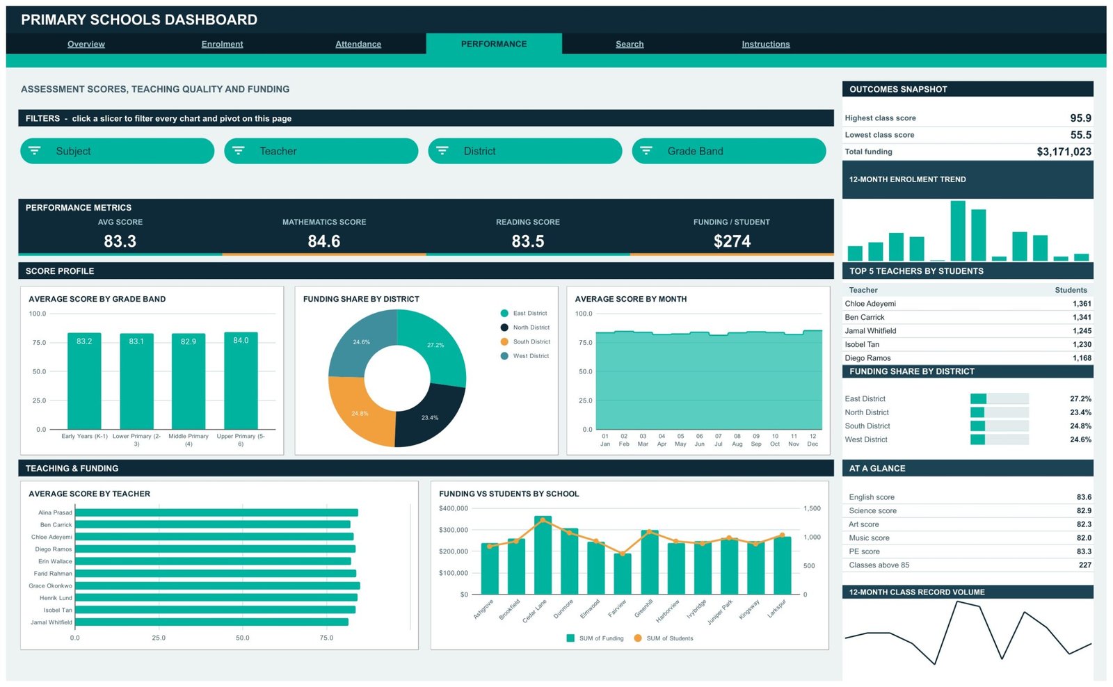
Average score by grade band, funding share by district, average score by month, average score by teacher and a funding-versus-students combo across the 12 schools. Subject, Teacher, District and Grade Band slicers drive it, and the sidebar carries highest and lowest class scores, total funding, a Top 5 Teachers by Students table, the district funding split and per-subject averages.
Search – one class record at a time
Pick a Record ID and the page prints Date, District, School, Grade Band, Class Section, Subject, Funding, Students, Sessions, Teacher, Attendance %, Status, Avg Score, Month and Term. It is the fastest way to check a figure that looks odd on a chart.
Instructions – the file explains itself
A ten-step user guide sits inside the workbook, describing the pivot-and-slicer architecture, how to clear a slicer, why the KPI cards stay unfiltered, and how to raise the row cap.
Primary Schools Dashboard in Google Sheets vs. Excel vs. a Paid BI Subscription – Feature Comparison
| This template (Google Sheets) | The same build in Microsoft Excel | A paid BI suite subscription | |
|---|---|---|---|
| Cost | 9.99 once | Around 13.99-17.99 once | Roughly 10-14 per user per month |
| Platform | Any browser, free Google account | Desktop Excel | Vendor cloud plus desktop authoring |
| Setup time | Copy the sheet, paste your rows | Download, open, paste your rows | Model design, refresh schedule, publishing |
| Real-time collaboration | Yes, built into Drive | Only via a shared cloud location | Yes, with licensed viewers |
| Mobile access | Sheets app or browser | Limited | Vendor mobile app |
| Customisable fields | Edit headers, re-run the script | Edit headers, refresh pivots | Needs a model change |
| Share with a link | Yes, view-only or edit | File attachment | Viewer licence usually required |
| Year-1 cost at 5 users | 9.99 | 13.99-17.99 | 600-840 |
| Data connection | None – you paste the rows | None – you paste the rows | Scheduled connectors |
| Row capacity out of the box | 1,000 (raise DATA_ROWS for more) | Sheet-limit | Millions |
One clarification worth making, because school buyers ask it: a school management information system is a different category of product. An MIS holds pupil records, registers, admissions and statutory returns. Nothing in this template does any of that, and nothing here replaces it. This sits alongside whatever you already run, taking figures you have produced and making them readable.
Who Should Use This Template
It suits a trust or district office assembling a monthly pack across several primary schools, a school business manager who currently rebuilds the same charts by hand each term, and an education consultant who needs a client-shareable view without buying anybody a licence.
It does not suit you if you need a live feed from your MIS, if you need pupil-level tracking, SEN provision mapping or safeguarding records, or if you need statutory returns or inspection evidence. The column list simply does not support those jobs, and the template makes no claim that it does.
Real-World Use Cases
Ravi, a trust data lead with nine primary schools. Each half term he pastes the class export into the Data sheet, screenshots Overview and Attendance, and sends the pack out. The rebuild he used to do by hand has gone.
Amara, a school business manager. Before a budget meeting she works the Performance page’s funding-versus-students chart, using the Subject and Grade Band slicers to see where funding per class sits relative to average scores.
Tom, an independent education consultant. He copies the sheet per client, drops in their figures and shares a view-only Drive link. Nobody needs a licence to read it.
Advantages of the Primary Schools Dashboard in Google Sheets
The numbers are auditable. Because every chart reads a real pivot table parked beside the page rather than a chain of helper cells, you can scroll right and see exactly what produced a bar. If you are new to that architecture, Google’s own guide to pivot tables in Google Sheets covers the mechanics.
Sharing is a link, not a licence. Drive handles distribution; there is no viewer seat to buy.
It stays fast as the register grows, precisely because no helper formulas sit behind the charts.
The design is one editable palette. Change three hex values at the top of the script and the whole file re-themes.
The privacy surface is small by construction – class-level rows, no child-level fields.
Opportunities for Improvement
It is static. If you want a nightly refresh from your MIS, that is an integration project this template does not attempt.
The KPI cards ignore the slicers. They use SUMIFS, COUNTIFS and AVERAGEIFS against the whole Data sheet, so they show unfiltered totals by design. It surprises people the first time; the Instructions tab says so explicitly, and the charts, pivots and Top 5 panels are the slicer-aware parts.
1,000 rows out of the box. Beyond that you open the bundled Apps Script, raise DATA_ROWS and re-run main() – straightforward, but it is a step.
One year of demo data. The sample set covers 2024 only, so multi-year comparisons need your own rows.
Best Practices
Keep the 18 column headers exactly as they are – the pivots, slicers and charts key off them. Paste class-level rows, never child-level rows; the template has no field for the latter and adding one would defeat the point. Decide before you start whether real teacher names belong in your copy, and if they do, share the file view-only rather than edit. Use one row per class per period so the Count column keeps meaning what it says. Clear slicers with Select all before you screenshot a page, so the pack you send is not accidentally filtered. And keep a clean master copy in Drive – copy it per term or per client rather than overwriting.
Explore Relevant Templates
- Primary Schools Dashboard in Excel – the same subject for desktop Excel.
- Primary Schools Dashboard in Power BI – the Power BI build.
- Primary Schools KPI Dashboard in Excel – a different product: a month-picker KPI scorecard with traffic lights, not this analytical dashboard.
- EdTech Dashboard in Google Sheets – the same architecture for education technology.
- School Admin Dashboard in Power BI – administration-side reporting.
Related Templates
More related walkthroughs on this blog: Music School Dashboard in Google Sheets, School Admin Dashboard in Google Sheets and Driving School Dashboard in Google Sheets. Each is a separate template with its own layout and sample data.
Anyone who wants to understand the pivot tables behind a report like this can follow the Excel Pivot Tables & Dashboards course on NextGenTemplates Academy, which comes with practice files.
Get the Primary Schools Dashboard in Google Sheets
Frequently Asked Questions
Does this template hold any pupil personal data?
No. Every row is a class record. Across all 18 columns there is no pupil name, date of birth, address, contact detail, SEN or safeguarding flag, and no free-school-meal field. Students is a headcount. The only personal-name column is Teacher, which ships with ten invented demo names.
Is it connected to our MIS or student system?
No. It is a static Google Sheet with no live connection to anything. The figures change only when someone pastes new rows into the Data sheet.
Can it produce statutory returns or inspection evidence?
No, and it does not try to. It is a reporting template for figures you already hold. It makes no claim about statutory reporting, inspection readiness, attainment prediction, SEN provision or pupil-outcome measurement.
Why don’t the KPI cards change when I click a slicer?
By design. The KPI cards and the At A Glance lists read the whole Data sheet through SUMIFS, COUNTIFS and AVERAGEIFS, so they always show unfiltered totals. The charts, pivots and Top 5 panels respond to slicers.
How many rows can I paste?
1,000 without changing anything. For more, open the Apps Script file, raise DATA_ROWS and re-run main().
Can I change the schools, districts, subjects and grade bands?
Yes. They are values in the Data sheet, not hard-coded lists. Type your own and the pivots, slicers and charts follow.
Do I need a paid Google account?
No. A free Google account is enough, and there is no subscription attached to the template.
About the Author
Built by PK – Microsoft Certified Professional with 15+ years of Excel, Google Sheets, and Power BI experience. Founder of NextGenTemplates, reaching 300K+ subscribers across YouTube channels. Every template is hand-built and tested before release.
Conclusion
If your primary-school reporting is currently a spreadsheet somebody rebuilds every term, the Primary Schools Dashboard in Google Sheets replaces the rebuild with a paste. Six tabs, 16 KPI cards, 21 charts and gauges, 15 slicers and a Record ID lookup – all reading pivots you can audit, all shareable from Drive with as many colleagues as you like, and all working from class-level figures rather than anything about an individual child.
Instant download · One-time payment · No subscription
Last updated: September 2026