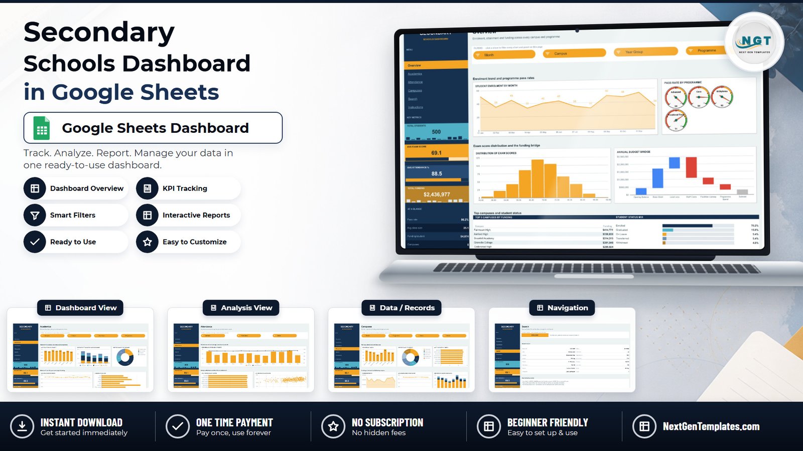
Most secondary schools already have the numbers. They come out of an MIS as a flat export, land in a spreadsheet, and then somebody spends an evening turning them into slides for a governors’ meeting. The Secondary Schools Dashboard in Google Sheets is the reporting layer that step keeps recreating: 500 sample student rows in 16 columns, feeding five linked pages, 18 charts and 15 slicers, with room for 1,000 records before anything needs extending.
It is a plain Google Sheets file. No add-ons, no Apps Script, no macros. And before anything else, because this template reports on children, it is worth being exact about what it holds.
What the file actually holds about students
I opened the live sheet and checked all 16 columns across all 500 rows. The Data tab is: Student ID, Date, Campus, Subject, Teacher, Year Group, District, Programme, Status, Class Size, Attendance %, Exam Score, Funding, Pass Rate, Month, Count.
Students appear only as a coded ID. The Student ID column holds 500 unique codes of the form STU-0001. There is no pupil name, no date of birth, no address, no phone number or email, no parent or guardian field, no SEN or safeguarding flag, no free-school-meal status, no behaviour or exclusion record, and no medical or ethnicity column anywhere in the workbook.
That is not the same as saying the file is anonymous. Every row is a pupil-level record: one coded ID carrying that student’s attendance percentage, exam score, class size, funding figure and enrolment status. The moment a school maps those codes back to real children in a key it holds, the file becomes personal data about minors and the usual data-protection duties apply to it in full. The practical advice is short: keep the code, keep the key somewhere else, and never paste pupil names into the Student ID column. The Teacher column is the same point for staff – the sample uses 12 initial-plus-surname codes, and real names typed there are staff personal data.
Google Sheets is a general-purpose spreadsheet, not a system designed to hold sensitive records about children, and this template does not change that. Decide where the pupil-level detail lives before you load anything.
Key Features of the Secondary Schools Dashboard in Google Sheets
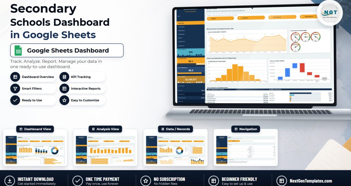
- A navigation rail on every page carrying four KPI cards – Total Students 500, Avg Exam Score 69.1, Avg Attendance % 88.5, Total Funding $2,436,977 – each with its own sparkline.
- An “At a glance” strip below them: Pass rate 86.2%, Avg class size 25.1, Funding/student $4,874, Campuses 8.
- 15 slicers across four pages, four on Overview, four on Academics, three on Attendance and four on Campuses, each page holding its own independent view.
- 18 charts, including gauges, a histogram, a waterfall, a bar-and-line combo and a 500-point scatter.
- A Student ID lookup page that resolves all 16 fields by INDEX/MATCH wrapped in IFERROR.
- A written Instructions tab covering loading data, filtering, navigation and rebranding.
Dashboard Pages Explanation
Overview
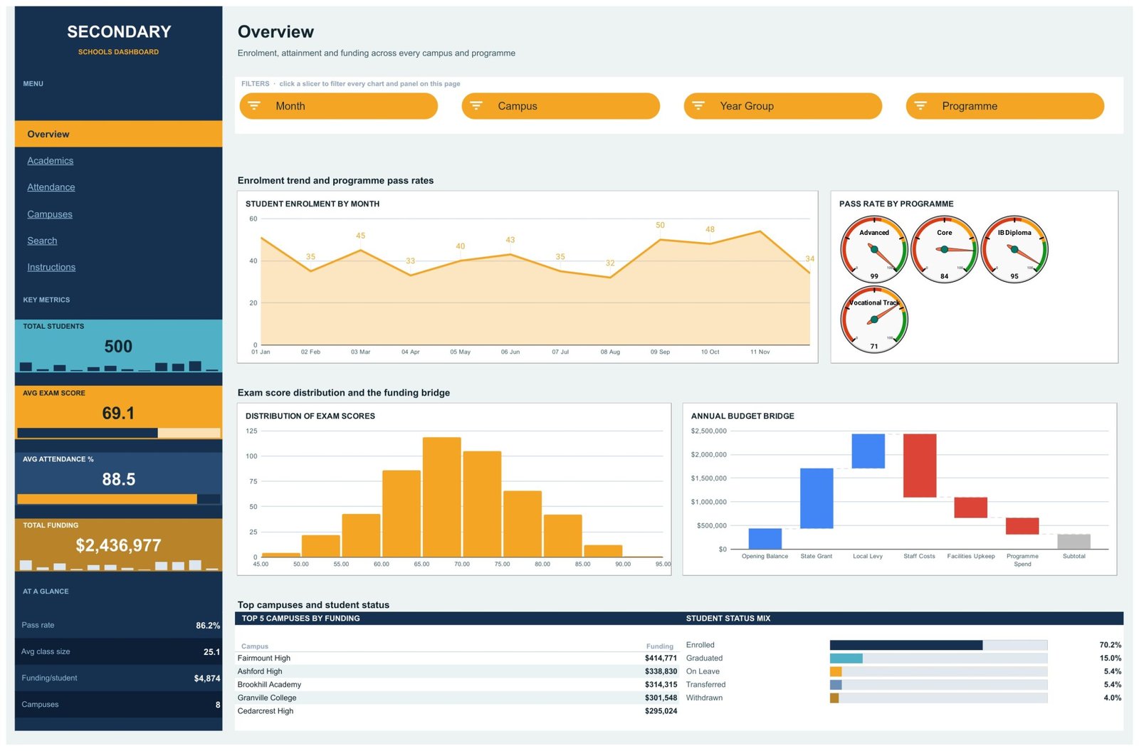
Four slicers – Month, Campus, Year Group, Programme – sit under the title. Below them, Student Enrolment by Month plots a labelled area chart running from 51 in January to a 50 in September. Pass Rate by Programme puts four gauges side by side: Advanced Studies 99, Core Curriculum 84, IB Diploma 95, Vocational Track 71. Distribution of Exam Scores is a histogram from 45 to 95 that peaks in the 65-70 band. Annual Budget Bridge is a waterfall over Opening Balance, State Grant, Local Levy, Staff Costs, Facilities Upkeep, Programme Spend and a Subtotal. Underneath, Top 5 Campuses by Funding ranks Fairmount High at $414,771 down to Cedarcrest High at $295,024, next to a Student Status Mix bar reading Enrolled 70.2%, Graduated 15.0%, On Leave 5.4%, Transferred 5.4%, Withdrawn 4.0%.
One honest note about the waterfall: it apportions the Funding column total into those inflow and outflow bands using fixed percentage splits written into the sheet, not a reconciliation of a real ledger. It is a shape-of-budget illustration, and the ratios are yours to change.
Academics
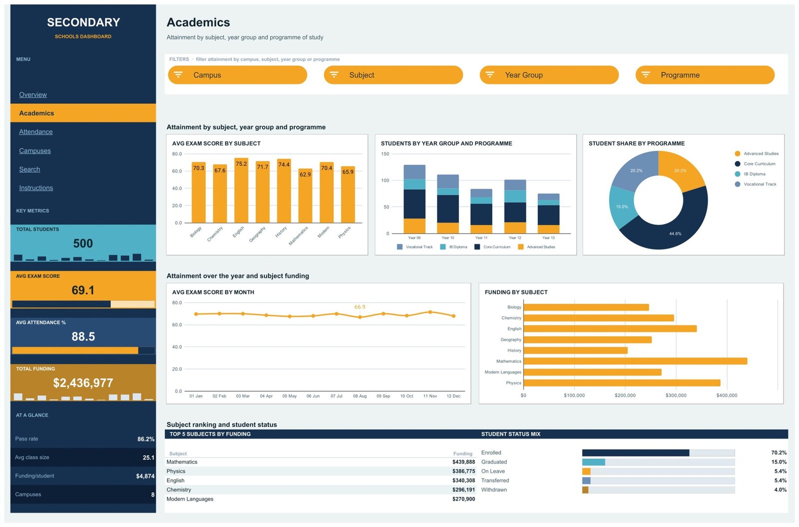
Slicers here are Campus, Subject, Year Group and Programme. Avg Exam Score by Subject runs across eight subjects with English top at 75.2 and Mathematics bottom at 62.9. Students by Year Group and Programme stacks the four programmes across Years 09 to 13. Student Share by Programme is a donut – Core Curriculum 44.6%, Advanced Studies 20.2%, Vocational Track 20.2%, IB Diploma 15.0%. Below, Avg Exam Score by Month tracks a flat line just under 70, and Funding by Subject is a horizontal bar led by Mathematics. The ranking panel switches to Top 5 Subjects by Funding, with Mathematics at $439,888 and Modern Languages at $270,900.
Attendance
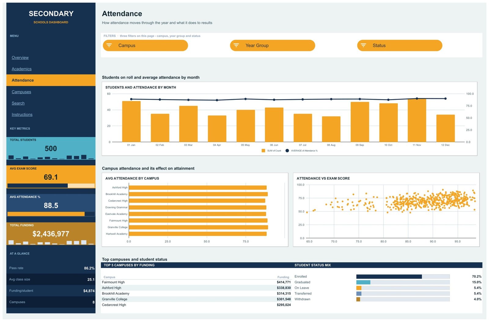
This page carries three slicers – Campus, Year Group and Status. Students and Attendance by Month is a combo: orange bars for the record count, a navy line for the average attendance percentage on a second axis. Avg Attendance by Campus compares all eight campuses. Attendance vs Exam Score is a scatter of every record, attendance on the x-axis and exam score on the y-axis.
The scatter is a picture of the spread, and nothing more. It plots two figures you supplied against each other; it draws no trend line, calculates no coefficient and makes no claim that one causes the other. Read it as a conversation starter for a review meeting, not as evidence about any individual student.
Campuses
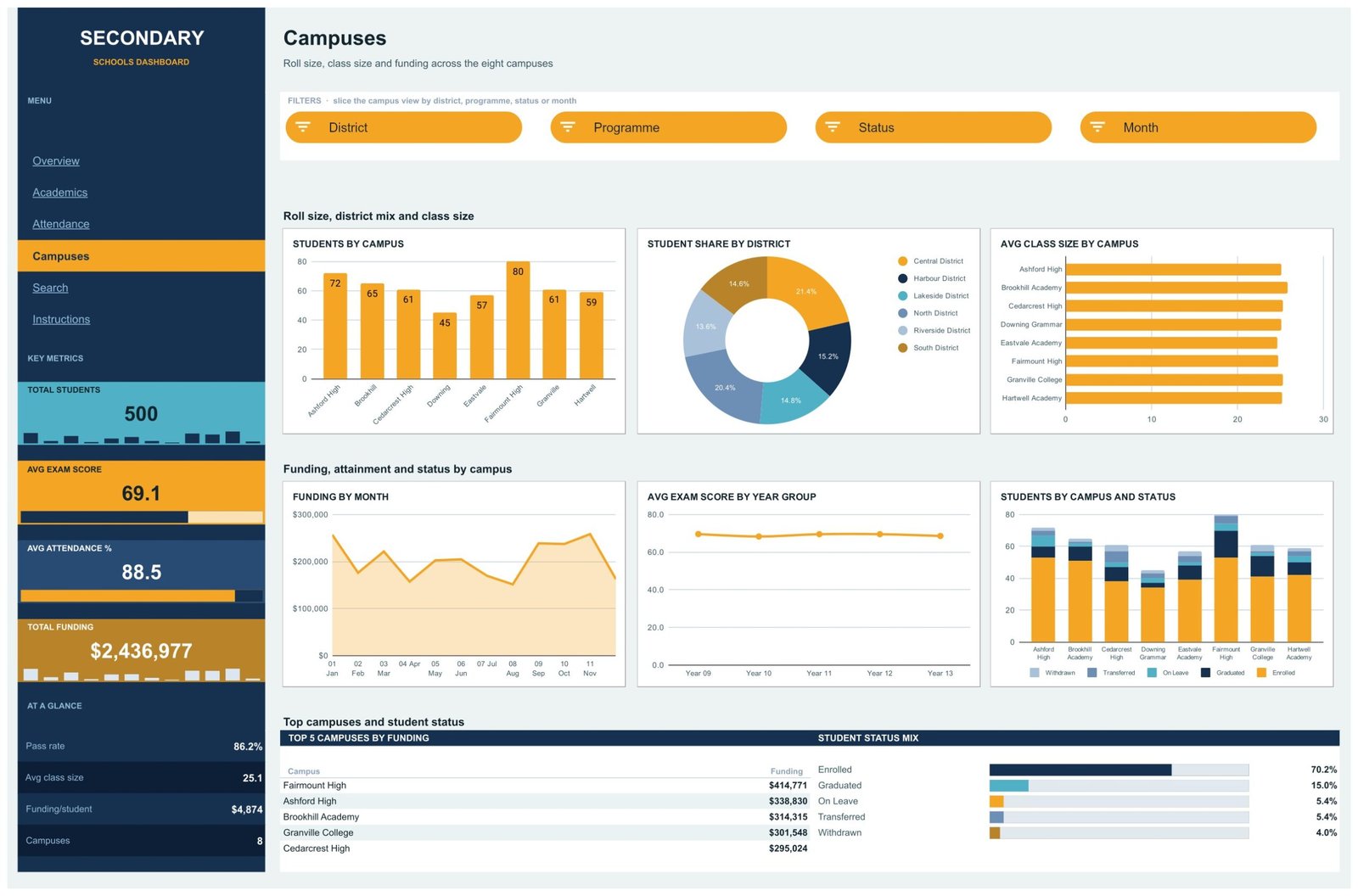
Four slicers – District, Programme, Status and Month. Students by Campus gives the roll for each of the eight sites (72, 65, 61, 45, 57, 80, 61, 59, adding to 500). Student Share by District splits the six districts, Central at 21.4% and Riverside at 13.6%. Avg Class Size by Campus sits beside them. The lower band holds Funding by Month, Avg Exam Score by Year Group and Students by Campus and Status, a stacked column that shows the enrolment mix per site.
Search
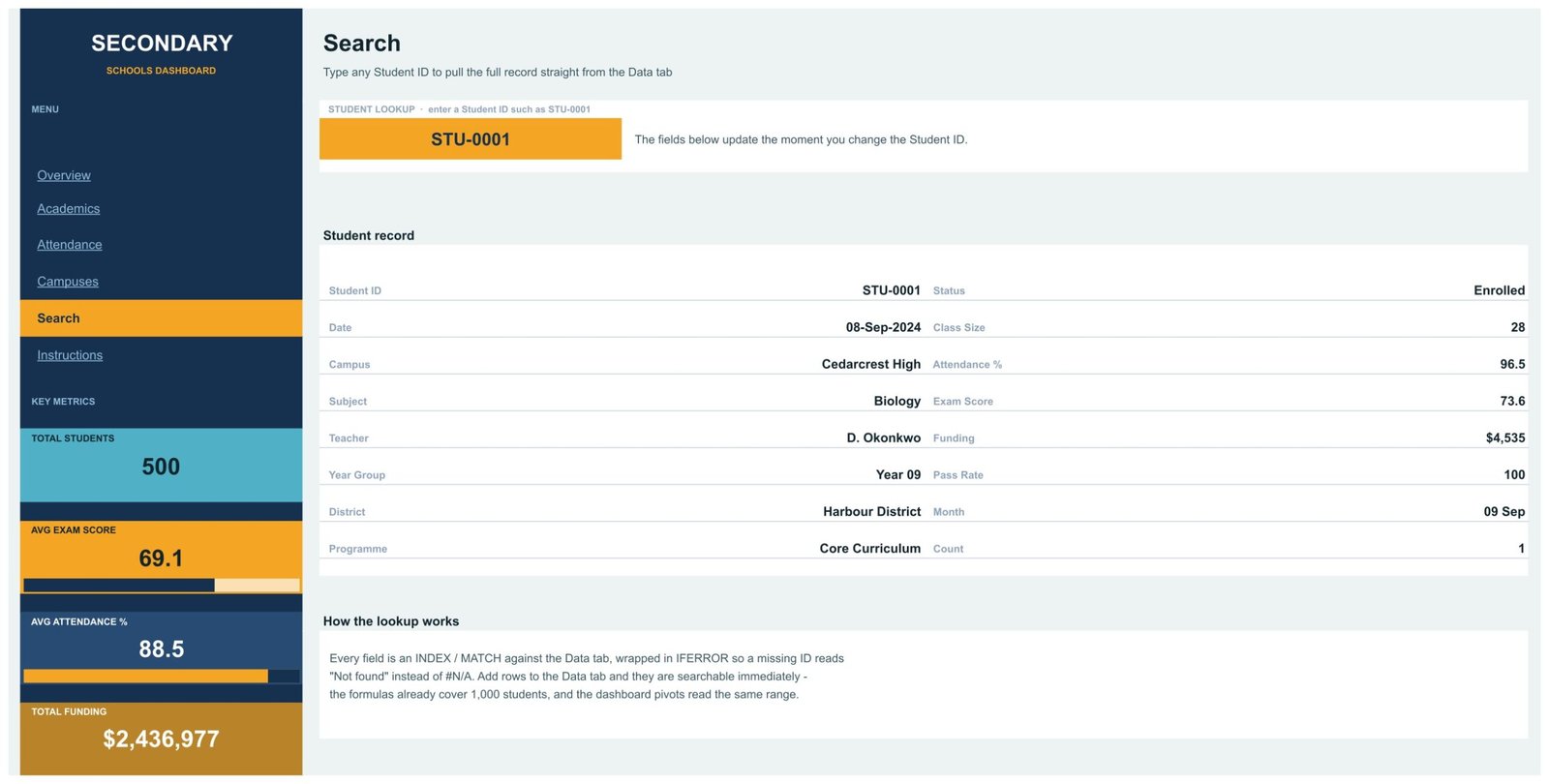
No slicers here – one orange input cell. Type STU-0001 and the record resolves to 08-Sep-2024, Cedarcrest High, Biology, Year 09, Harbour District, Core Curriculum, Enrolled, class size 28, attendance 96.5, exam score 73.6, funding $4,535, pass rate 100. Every field is an INDEX/MATCH against the Data tab wrapped in IFERROR, so an unknown code reads “Not found” rather than throwing #N/A across the page.
Secondary Schools Dashboard in Google Sheets vs. Excel vs. a Paid BI Suite – Feature Comparison
| This template (Google Sheets) | Excel dashboard build | Paid BI suite (Tableau / Power BI Pro class) | |
|---|---|---|---|
| Cost | $9.99 once | $19.99 once for the Excel edition, plus Microsoft 365 | $10-$70 per user per month |
| Platform | Google Sheets, any browser | Desktop Excel | Desktop authoring plus a cloud service |
| Setup time | Minutes – copy, paste your rows | Minutes, once Excel is installed | Days to weeks, plus a data model |
| Real-time team collaboration | Yes, native | Only via OneDrive co-authoring | Yes |
| Mobile access | Yes, app or browser | Limited | Yes, dedicated apps |
| Customizable fields | Every column, chart and colour | Yes | Yes, with modelling work |
| Share with link | Yes, standard Drive sharing | File send or OneDrive link | Licensed viewers only |
| Year-1 cost at 5 users | $9.99 | $19.99 plus licences | $600-$4,200 |
| Connects to a school MIS | No – you paste or import rows | No | Possible with a connector and IT work |
| Pupil-level detail held | Coded Student ID only | Same | Whatever you load into it |
A school MIS – the SIMS, Arbor or PowerSchool class of system – is a different category of product and is deliberately not a column here. Those systems hold the statutory pupil record, run registration and manage safeguarding workflow. This workbook does none of that.
Who Should Use This Template
It suits a business manager, bursar, head of department or trust operations lead who already exports a table from another system and wants a shareable reporting layer over it. It suits anyone running two to eight campuses who wants roll size, class size, attainment and funding on one screen. And it suits teams who live in Google Workspace and want leadership to open a link on a phone rather than download an attachment.
It does not suit you if you need a live feed from your MIS, register or exam board – the file is static and imports nothing on its own. It does not suit you if you need to store names, contact details, SEN records or safeguarding notes; that belongs in your MIS. And it is not the tool if you want attainment prediction, results forecasting or an inspection-readiness score: it reports the numbers you give it and models nothing.
Real-World Use Cases
The trust board pack. A business manager pastes one row per pupil per subject each half-term and takes the Campuses page straight to the board – roll size, class size and funding per site, with the district donut answering the catchment question before it is asked.
The departmental bid. A head of mathematics filters Academics to Mathematics and Year 11, reads the average against the other seven subjects, and uses the Funding by Subject bar to frame a resourcing request in the same numbers the finance lead already sees.
The termly attendance review. An attendance lead uses the combo chart to show how the monthly average moved across the year, then the scatter to show how widely attendance and results spread across the cohort – as context for a discussion, not as a judgement on anyone.
Advantages of the Secondary Schools Dashboard in Google Sheets
The obvious one is the collaboration model. A Google Sheet is a link, so a head, a bursar and a chair of governors can all be looking at the same filtered view at once without anyone emailing a version. The second is that nothing is hidden: every KPI is a visible formula over the Data tab, so if a governor asks how the 86.2% pass rate is calculated, you can click the cell and show them – it is the average of a 0-or-100 flag on each row. The third is capacity without effort: the pivots already read A1:P1001, so 1,000 students work with no range editing. And the fourth is that it is a one-off purchase, which for a school budget is a materially different proposition from a per-seat subscription.
Opportunities for Improvement
Three things are worth knowing before you buy, and they are all visible in the file.
The rail KPI cards do not follow the slicers. Total Students, Avg Exam Score, Avg Attendance % and Total Funding all read the full Data!2:1001 range, as does the At-a-glance strip. Filter the Overview page to one campus and the charts change while the headline cards stay put. That is deliberate – the Instructions tab says the headline numbers travel with you – but it surprises people who expect a filtered KPI.
The budget bridge is illustrative. As noted above, the six bands are fixed percentage splits of your Funding total, not a real income and expenditure breakdown. Overwrite the ratios with your own before the waterfall means anything.
Sample data is a calendar year, not an academic one. The 500 rows run 01-Jan-2024 to 28-Dec-2024, and the Month slicer is calendar months. If your reporting year runs September to August, you will want to relabel or re-sort the Month column to match.
Best Practices
- Decide your coding scheme first. Pick a Student ID format, hold the mapping to real pupils outside this workbook, and never let a name reach the Data tab.
- Keep all 16 headers exactly as they are. The pivots, the KPI formulas and the Search page all address the columns by position and name.
- Never leave Student ID blank. It is the key the pivots use to ignore empty rows, so a blank ID quietly drops the row from every chart.
- Share view-only. Google’s own guidance on sharing files from Google Drive covers restricting a link to specific people, which is what you want for anything pupil-level.
- Recolour before you circulate. The rail, the KPI cards and the chart palette all take a school or trust brand in a few minutes, and a branded pack gets read.
Explore Relevant Templates
The same dashboard exists in other tools if your team is not on Google Workspace: the Secondary Schools Dashboard in Excel and the Secondary Schools Dashboard in Power BI. If you want a month-picker scorecard with traffic lights rather than these analysis pages, the Secondary Schools KPI Dashboard in Excel and the Power BI version are different templates, not duplicates of this one.
Staying in Google Sheets, look at the School Admin Dashboard in Google Sheets, the Student Academic Insights Dashboard in Google Sheets, the Education Services Dashboard in Google Sheets and the Attendance Tracker in Google Sheets. The Education & School Management Bundle collects eight education templates in one purchase.
More related walkthroughs on this blog: Music School Dashboard in Google Sheets, School Admin Dashboard in Google Sheets and Driving School Dashboard in Google Sheets. Each is a separate template with its own layout and sample data.
If you would like to practise the pivot and chart techniques behind a dashboard like this, the Excel Pivot Tables & Dashboards course on NextGenTemplates Academy includes practice files to work through.
Frequently Asked Questions
Does the file hold pupil names or personal details?
Not in the sample. Students appear only as coded IDs such as STU-0001, and there is no name, date of birth, address, contact detail, guardian, SEN flag, free-school-meal status or behaviour record in any of the 16 columns. Each row is still a pupil-level record, though, so if you map codes to real children the file becomes personal data about minors. Keep the mapping key outside the workbook.
Is this a school MIS or a pupil record system?
No. It is a business reporting template. It does not hold the statutory pupil record, take registration, manage admissions, or run any safeguarding or child-protection workflow, and it is not a substitute for a system that does.
Does it connect to my MIS or exam board?
No. The workbook is static and has no live connection to anything. You paste or import rows into the Data tab and the dashboard recalculates from what is there.
Can it predict attainment or forecast results?
No. Every figure is arithmetic over the rows you supply – averages, counts, sums and shares. There is no model, projection or forecast anywhere in the file.
Will it help with an inspection or a statutory return?
It makes no claim of that kind. It produces no census, no funding return and no regulatory submission, and it confers no compliance or inspection standing of any sort. It is a way of looking at numbers you already hold.
How many students can it handle?
The pivots and formulas read A1:P1001, so 1,000 student rows work with no changes. Beyond that you extend the ranges yourself.
Do I need any add-ons or scripts?
No. It is a plain Google Sheets file – pivot tables, slicers, native charts, sparklines and INDEX/MATCH. Nothing to install and no permissions to grant.
About the Author
Built by PK – Microsoft Certified Professional with 15+ years of Excel, Google Sheets, and Power BI experience. Founder of NextGenTemplates, reaching 300K+ subscribers across YouTube channels. Every template is hand-built and tested before release.
Conclusion
The Secondary Schools Dashboard in Google Sheets does one job well: it takes a table you already export and gives it five pages, 18 charts and 15 slicers, so the reporting conversation starts from a picture instead of a spreadsheet. It is honest about its limits – static, coded IDs only, no MIS connection, no forecasting, no compliance claim – and those limits are what make it safe to hand to a governor.
Get the Secondary Schools Dashboard in Google Sheets for $9.99 – one payment, instant download, 30-day refund policy.
For more Google Sheets dashboard walkthroughs, subscribe to NeoTechNavigators on YouTube.