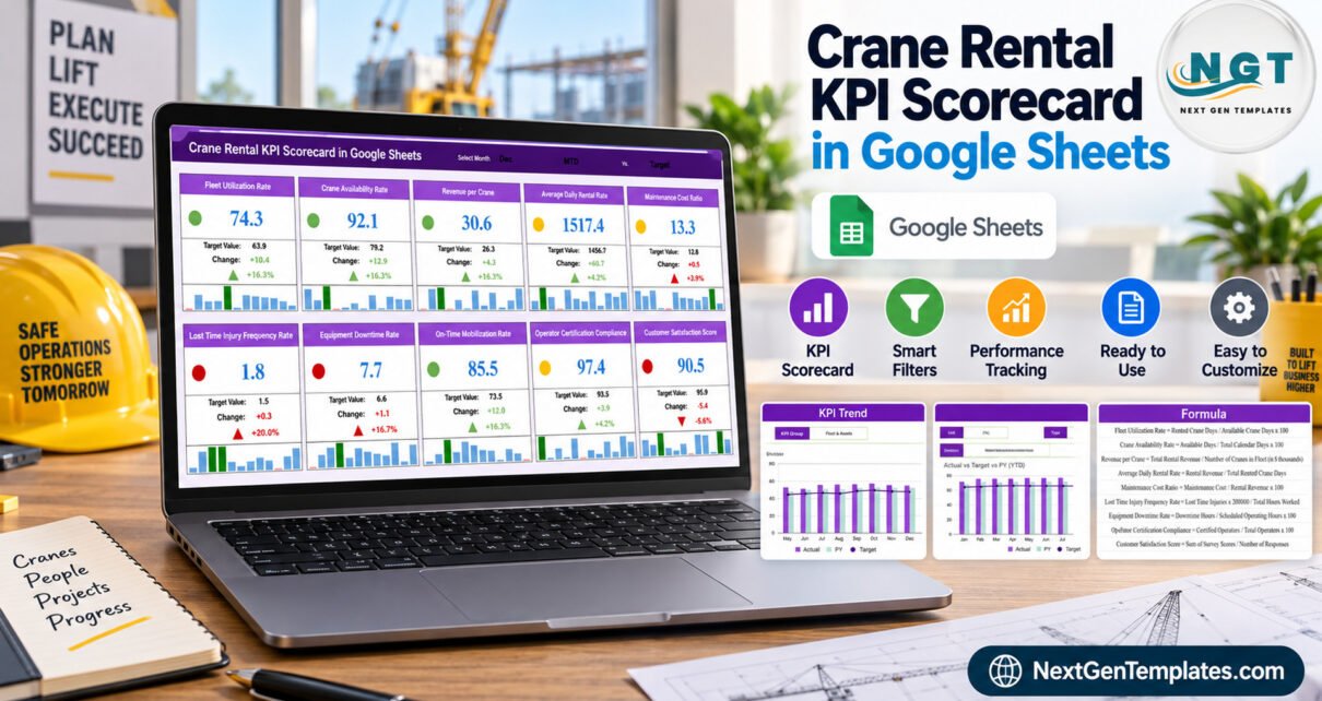
The Crane Rental KPI Scorecard in Google Sheets puts 10 crane-hire metrics on a single graded page: 4 working sheets, 5 KPI groups, a red / amber / green light on every metric, and 12 months of month-to-date and year-to-date history with a prior-year column for each one. Change the month in the header and all 10 cards, both trend charts and the underlying data page restate together. First-month setup runs to about 10 minutes.
Most crane hire yards already have the numbers. Utilisation lives in the hire diary, downtime lives in the fitter’s notebook, revenue lives in the accounts package, and the safety figures live in a folder somebody updates after an incident. Nobody disagrees about the data. What is missing is one page each month that says, plainly, which of those numbers is on target and which is not. That is the job this template does, and the only job it does.
Get the Crane Rental KPI Scorecard in Google Sheets
A reporting template, not a compliance tool
This needs to come before the feature list rather than after it, because cranes are lifting equipment governed by strict inspection and certification regimes and the wrong assumption here is expensive.
This file is a Google Sheets reporting template over data the buyer types in. It does not certify, inspect, test or prove the condition of any crane, hoist, sling, rigging or lifting accessory. It does not establish compliance with OSHA 1926 subpart CC, ASME B30, LOLER, PUWER, EN 13000, or CPCS and NCCCO operator certification, nor with any thorough-examination regime or local lifting and plant regulation. It is not a lift plan, a load chart, a ground-bearing assessment, a maintenance record of legal standing, or an inspection or test certificate, and it does not replace a competent person’s statutory duties.
Every figure in the screenshots on this page is fictional demo data, supplied so you can see the layout. That includes the safety and certification figures. A KPI such as Operator Certification Compliance reports only what somebody typed into the data sheet, and it must never be presented as evidence that a crane is safe to lift. For the actual regulatory position, work from your regulator’s own material, such as the OSHA cranes and derricks pages or the UK HSE guidance on LOLER, and keep your statutory records where your regulator and insurer require them.
Key features of the Crane Rental KPI Scorecard in Google Sheets
- 10 crane-hire KPIs, already defined – Fleet Utilization Rate, Crane Availability Rate, Revenue per Crane, Average Daily Rental Rate, Maintenance Cost Ratio, Lost Time Injury Frequency Rate, Equipment Downtime Rate, On-Time Mobilization Rate, Operator Certification Compliance and Customer Satisfaction Score. Each arrives with a written formula, a unit and a one-line definition.
- Five KPI groups – Fleet & Assets holds 3 metrics, Financial 2, Operations 2, Safety & Compliance 2 and Customer 1. Ten in total, which is exactly the number of cards on the scorecard page.
- Traffic lights driven by target attainment – green at 110% of target or better, amber between 95% and 110%, red below 95%. Lower-is-better metrics are scored in reverse, so a rising Equipment Downtime Rate goes red rather than green.
- MTD and YTD held separately – each KPI carries 12 months of Actual, Target and prior-year figures on both bases, so a good month inside a poor year is visible as exactly that.
- Upper-The-Better and Lower-The-Better typing – each metric is tagged, and the tag is what tells the scoring which direction counts as good.
- Plain formulas only – no macros, no Apps Script, no add-ons. It opens in any browser on a free Google account and behaves like any other sheet, as described in the Google Sheets help centre.
The four pages explained
Four pages ship in the file, and all four are working pages. There is no “Get More Templates” advertising page in this build, so nothing has been quietly excluded from the gallery below.
Page 1: the scorecard
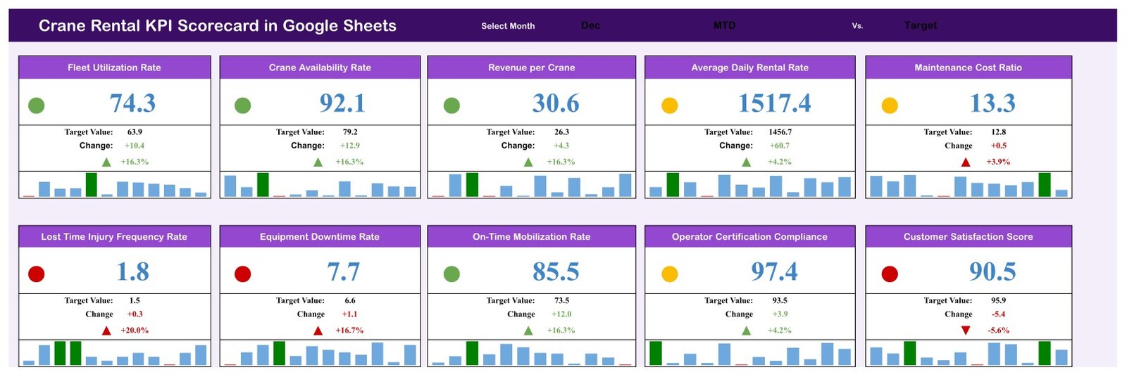
The header strip carries Select Month, which reads Dec in the sample, an MTD selector and a Vs. Target comparison label. Below it sit 10 KPI cards in two rows of five. Each card shows a status dot, the current value, the Target Value, the absolute Change, the percentage change with a direction arrow, and a 12-month sparkline. In the demo month Fleet Utilization Rate reads 74.3 against a 63.9 target, a change of +10.4 or +16.3%, and takes a green dot. Customer Satisfaction Score reads 90.5 against a 95.9 target, -5.4 or -5.6%, and takes a red one.
Page 2: KPI Trend
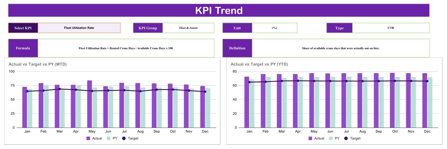
A drill-down for one KPI at a time. Selecting a metric fills in its KPI Group, Unit, Type, Formula and Definition, then draws two 12-month grouped column charts side by side: Actual vs Target vs PY (MTD) on the left and Actual vs Target vs PY (YTD) on the right. Actual and prior year are columns, target is a line running across them.
Page 3: KPI definitions
One row per KPI, carrying its number, KPI Group, KPI Name, Unit, Formula, Definition and Type. This is the dictionary the rest of the file reads from. Rename a metric here, or rewrite its formula text, and the scorecard and trend pages pick the change up.

Page 4: KPI data
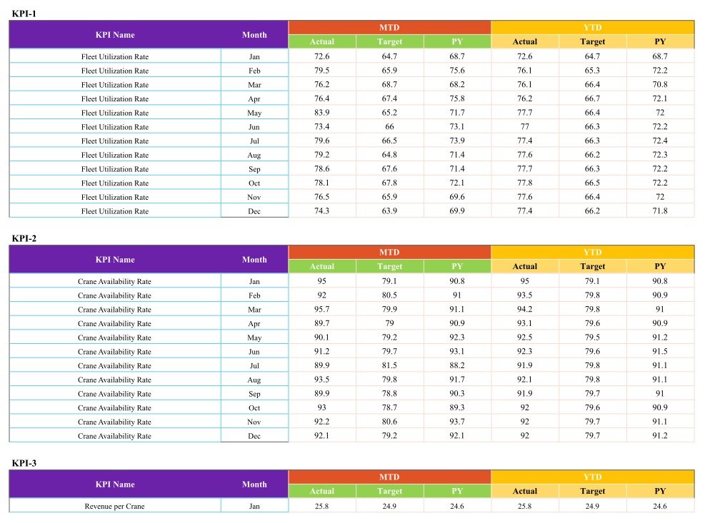
The only page you type into. It holds one 12-month block per KPI, labelled KPI-1 through KPI-10, each with a Month column plus MTD Actual, Target and PY and YTD Actual, Target and PY. Replace the sample figures month by month and everything upstream follows.
Do the numbers actually reconcile?
Worth checking before you trust any template, so here is what a cross-page read of the shipped build shows. The 10 cards on page 1 match the 10 rows on the definitions page, and the group counts on page 3 (3 + 2 + 2 + 2 + 1) sum to the same 10. December’s card values match December’s rows on the data page: Fleet Utilization Rate 74.3 against 63.9, Crane Availability Rate 92.1 against 79.2. The Change and percentage figures are arithmetically right on all 10 cards, and the trend chart on page 2 plots the same month-by-month series that page 4 holds for that KPI. Nothing in this build contradicts itself.
One behaviour is worth understanding rather than fixing. Because the amber band runs from 95% to 110% of target, a KPI that beats its target by a small margin still shows amber. In the sample month, Operator Certification Compliance at 97.4 against a 93.5 target is amber, and so is Average Daily Rental Rate at 1517.4 against 1456.7, even though both are ahead. Amber here means “close to target”, not “missed target”. If your management team reads amber as failure, widen the green band before you circulate the first pack.
Crane Rental KPI Scorecard vs. an Excel scorecard vs. rental SaaS
| Feature | Crane Rental KPI Scorecard (Google Sheets) | Excel scorecard workbook | Crane / equipment rental SaaS |
|---|---|---|---|
| Cost | $8.99 one-time | One-time | Recurring subscription, quoted per site |
| Platform | Browser, nothing to install | Microsoft Excel licence needed | Vendor-hosted web app |
| Setup time | Under 10 minutes | Under 10 minutes | Days to weeks, usually with onboarding |
| Real-time collaboration | Built in, several editors at once | Only via OneDrive co-authoring | Yes |
| Mobile access | Google Sheets mobile app | Excel mobile app | Yes |
| Edit KPIs and formulas | Fully open | Fully open | Only what the vendor exposes |
| Share with a link | Native Google sharing | File send or OneDrive link | Per-seat login |
| Year-1 cost at 5 users | $8.99 total | One-time plus Office licences | Recurring, per seat or per site |
| Dispatch, contracts, invoicing, inspection records | Not included, reporting only | Not included | Yes |
For a crane hire firm that wants a monthly management scorecard without buying rental software it does not yet need, this template sits in the sweet spot, and the SaaS is still there if the yard outgrows it.
Who should use this template
Perfect for:
- Owners and operations managers at crane hire or lifting-services firms running roughly 3 to 60 machines
- Plant and fleet managers already assembling utilisation and downtime figures by hand each month
- Finance leads who want revenue per crane and maintenance cost ratio next to utilisation on one page
- Depot managers who present a monthly or quarterly performance pack upward
Not a fit if:
- You need an inspection, thorough-examination or certification record. This template produces none, and must never stand in for one
- You want live telematics, GPS or load-cell feeds. Every figure here is typed in
- You need dispatch, hire contracts, load charts, lift planning or invoicing. This is a reporting layer only
- You need row-level permissions or an audit trail. Google Sheets sharing is file-level
Real-world use cases
Marcus runs a 14-crane hire yard in the Midlands. On the first working day of each month he fills in the data page, then takes the scorecard straight into his Monday operations meeting. The amber dot on Maintenance Cost Ratio starts the right conversation faster than a folder of raw invoices ever did.
Priya is finance director at a lifting-services group with three depots. She keeps one copy per depot, compares Revenue per Crane and Average Daily Rental Rate across all three, and uses the YTD chart to show her board where the year is genuinely landing against plan rather than where one strong month suggested it would.
Dan is plant manager at a mid-sized contractor that owns its cranes. He hires nothing out, so he deletes the two financial KPIs on the definitions page, substitutes two of his own, and runs the remainder as an internal utilisation and downtime scorecard.
Advantages
The obvious one is cost: $8.99 once against a recurring subscription. The less obvious one is that the whole thing is legible. Every formula is visible on page 3 in plain English, so when a depot manager challenges a number in a meeting you can open the definition and settle it in ten seconds. Rental software is faster at the operational job and considerably worse at this one, because the calculation sits behind a vendor’s UI.
The second real advantage is the target column. Plenty of crane yards track utilisation. Far fewer write down what utilisation was supposed to be that month, which is the number that turns a figure into a judgement.
Opportunities for improvement
Honest limitations, because they matter more than the feature list when you are deciding.
- Everything is manual. There is no import from a hire system or a telematics feed. Somebody types 12 numbers per KPI.
- The amber band is wide. As described above, 95% to 110% covers both narrowly missing and modestly beating target. Adjust it before your first circulation if that reads badly in your business.
- One fleet per copy. Multi-depot groups need one copy per depot and a manual roll-up.
- Ten KPIs is the shipped shape. You can substitute metrics freely, but adding an eleventh block means extending the data page yourself.
- No commentary field. There is nowhere on the scorecard to record why a KPI went red, which most monthly packs eventually want.
Best practices
- Set targets for all 12 months before you start, not month by month. Targets set after seeing the actual are not targets.
- Fill the prior-year column even if you have to estimate it once. Without it, the trend charts lose half their value.
- Agree the traffic-light bands with whoever reads the pack, in writing, before the first issue.
- Keep one copy per depot and never share edit rights with the whole yard. File-level sharing means one person can overwrite a month.
- Retire a KPI that nobody has acted on for two quarters. Ten graded metrics that get discussed beat twenty that get scrolled past.
Explore relevant templates
Other scorecards on the same engine, for adjacent trades:
- Scaffolding Services KPI Scorecard in Google Sheets – access and scaffold hire, same monthly format.
- Paving Contractor KPI Scorecard in Google Sheets – a site-trade edition with its own 10 metrics.
- Glass Installation KPI Scorecard in Google Sheets – installation-side KPIs on the same layout.
- Interior Fit-Out KPI Scorecard in Google Sheets – fit-out projects, same scoring approach.
- Fencing Contractor KPI Dashboard in Google Sheets – an example of the analytical dashboard style, if charts and slicers suit you better than a graded scorecard.
An Equipment Rental Business KPI Scorecard in Google Sheets, covering a mixed hire fleet rather than cranes specifically, is currently being prepared and will be listed shortly.
If you would like to understand the reporting side better, the Excel Pivot Tables & Dashboards course on NextGenTemplates Academy teaches KPI reporting step by step, with practice files.
Get the Crane Rental KPI Scorecard in Google Sheets
Frequently asked questions
Does this certify our cranes or make our lifting operations compliant?
No. The Crane Rental KPI Scorecard in Google Sheets is a management reporting template over figures you type in. It issues no inspection, examination, test or certification record, proves nothing about the condition of any crane, and satisfies no lifting regulation. Statutory inspection and certification remain entirely with your competent person and your existing records.
Are the numbers in the screenshots real crane data?
No. Every value shown on all four pages is fictional sample data included to demonstrate the layout and the traffic-light behaviour. Delete it and enter your own figures on the data page. Nothing in the file is measured, imported or verified by the template itself.
Which 10 KPIs does the scorecard track?
Fleet Utilization Rate, Crane Availability Rate, Revenue per Crane, Average Daily Rental Rate, Maintenance Cost Ratio, Lost Time Injury Frequency Rate, Equipment Downtime Rate, On-Time Mobilization Rate, Operator Certification Compliance and Customer Satisfaction Score, grouped into Fleet & Assets, Financial, Operations, Safety & Compliance and Customer.
Why does a KPI show amber when it is above target?
Because the amber band runs from 95% to 110% of target, green starts at 110% and red sits below 95%. Operator Certification Compliance at 97.4 against a 93.5 target therefore shows amber despite beating target. Amber means close to target rather than missed, and the bands are editable.
How does this compare with crane rental software?
Rental SaaS handles dispatch, contracts, invoicing and inspection records, and charges a recurring subscription for it. The Crane Rental KPI Scorecard in Google Sheets does none of that. It costs $8.99 once and produces the monthly management page those systems report on poorly. Many yards run both.
How long does setup take, and do I need add-ons?
Roughly 10 minutes for the first month once you have your figures to hand. There are no macros, no Apps Script and no add-ons, only plain Google Sheets formulas, so it runs in any browser on a free Google account.
Can I change the KPIs?
Yes. The definitions page holds one editable row per metric and the data page holds one 12-month block per metric. Rename a KPI, change its formula text or unit, or flip its Upper-The-Better or Lower-The-Better type, and the scorecard and trend pages follow.
About the author
Built by PK, a Microsoft Certified Professional with 15+ years of Excel, Google Sheets and Power BI experience. Founder of NextGenTemplates, reaching 300K+ subscribers across three YouTube channels. Every template is hand-built and tested before release.
Conclusion
If your crane yard already knows its numbers but has no single page that grades them, this is a cheap and honest way to get one. Ten metrics, five groups, four pages, a target beside every figure, and no pretence that a spreadsheet can tell you whether a crane is fit to lift.
Instant download · One-time payment · No subscription
Last updated: September 2026