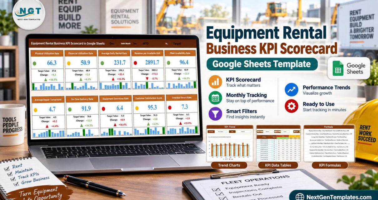
The Equipment Rental Business KPI Scorecard in Google Sheets puts 10 rental KPIs on 4 pages, each one scored against its own target with a traffic light, a variance figure, a percentage change and a twelve-month spark strip. The file ships with a full year of demo data for every KPI — 120 monthly MTD rows and 120 YTD rows — so every card, chart and table is populated before you type a thing. Setup takes under ten minutes.
Most rental and plant-hire businesses already know their numbers. What they usually do not have is one page that says, for this month, whether each of those numbers beat its target or missed it — and shows the twelve-month shape behind it so nobody over-reacts to a single bad month. That is the job this scorecard does, and it is deliberately a narrow job.
Get the Equipment Rental Business KPI Scorecard in Google Sheets

Scorecard, Dashboard or KPI Dashboard? Which One This Is
This matters because three template families carry nearly identical names, and buying the wrong one is annoying. This listing is the KPI Scorecard.
- A scorecard (this one) is a target-versus-actual card wall. Ten named KPIs, each with a target, a variance, a red/amber/green light and a trend, read one month at a time. It answers “did we hit target”.
- An analytical dashboard slices transaction-level records by customer, site, asset class and period. It answers “why”. Our Heavy Machinery Dashboard in Google Sheets is that kind.
- A KPI dashboard sits between the two, mixing scored cards with analytical charts on one page.
An Equipment Rental KPI Dashboard and an Equipment Rental Business KPI Scorecard are not duplicates of each other. They are different reading experiences built for different meetings.
Key Features of the Equipment Rental Business KPI Scorecard
- Ten KPIs in five groups. Fleet Utilization holds Physical Utilization Rate and Financial Utilization Rate. Revenue holds Average Daily Rental Rate and Revenue per Available Unit. Asset Readiness holds Fleet Availability Rate and Average Repair Turnaround. Operations holds On-Time Delivery Rate and Equipment Downtime Rate. Customer holds Customer Satisfaction Score and Overdue Return Rate.
- Mixed units, handled properly. Six KPIs are percentages, two are dollar amounts, one is measured in days and one is an index. Nothing is forced onto a single scale.
- Direction-aware scoring. Seven KPIs are flagged UTB (upper is better) and three are flagged LTB (lower is better) — Average Repair Turnaround, Equipment Downtime Rate and Overdue Return Rate. The traffic light and the arrow both follow that flag, so downtime creeping up shows red rather than green.
- One month picker for the whole page. Change the month and all ten cards rewrite from the data page. The shipped sample sits on December.
- MTD and YTD, Actual vs Target vs Prior Year. Twelve months of all six series for every KPI, with the YTD figure calculated as a running average of the months to date.
- Published formulas. Every KPI’s arithmetic is written out on its own page, so “utilisation” means the same thing to the depot manager and the finance lead.
Template Pages Explanation
Page 1: KPI Scorecard
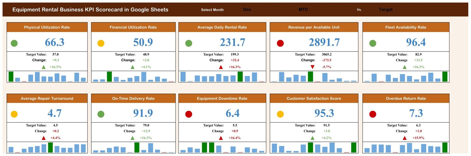
The review page. Ten cards in two rows of five, each with a traffic light, the value, Target Value, Change, the change percentage and a twelve-bar monthly spark strip. The header carries the Select Month picker and the MTD Vs. Target basis. In the demo data, Physical Utilization Rate reads 66.3 against a target of 57.0 (+9.3, +16.3%, green) while Revenue per Available Unit reads 2891.7 against 3065.2 (-173.5, -5.7%, red).
Page 2: KPI Trend
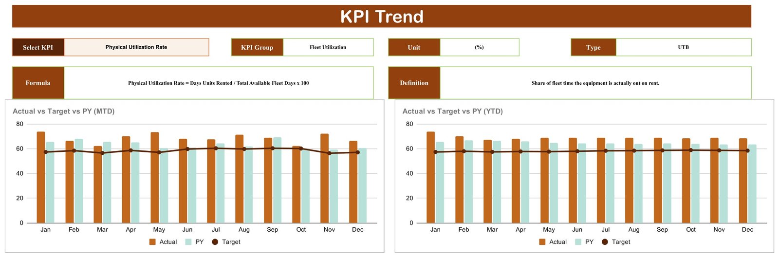
One KPI, one year. The selector strip returns the chosen KPI’s Group, Unit and Type, and the panel below prints its Formula and Definition — for Physical Utilization Rate, “Days Units Rented / Total Available Fleet Days x 100” and “Share of fleet time the equipment is actually out on rent”. Two charts follow: Actual vs Target vs PY (MTD) and Actual vs Target vs PY (YTD), each with twelve monthly Actual and Prior Year bars against a Target line.
Page 3: KPI Definitions
A ten-row reference table: number, KPI Group, KPI Name, Unit, Formula, Definition and Type. This is where you edit the KPI list to match your own business, and it is the page to print when someone challenges a number in a review.

Page 4: KPI Data
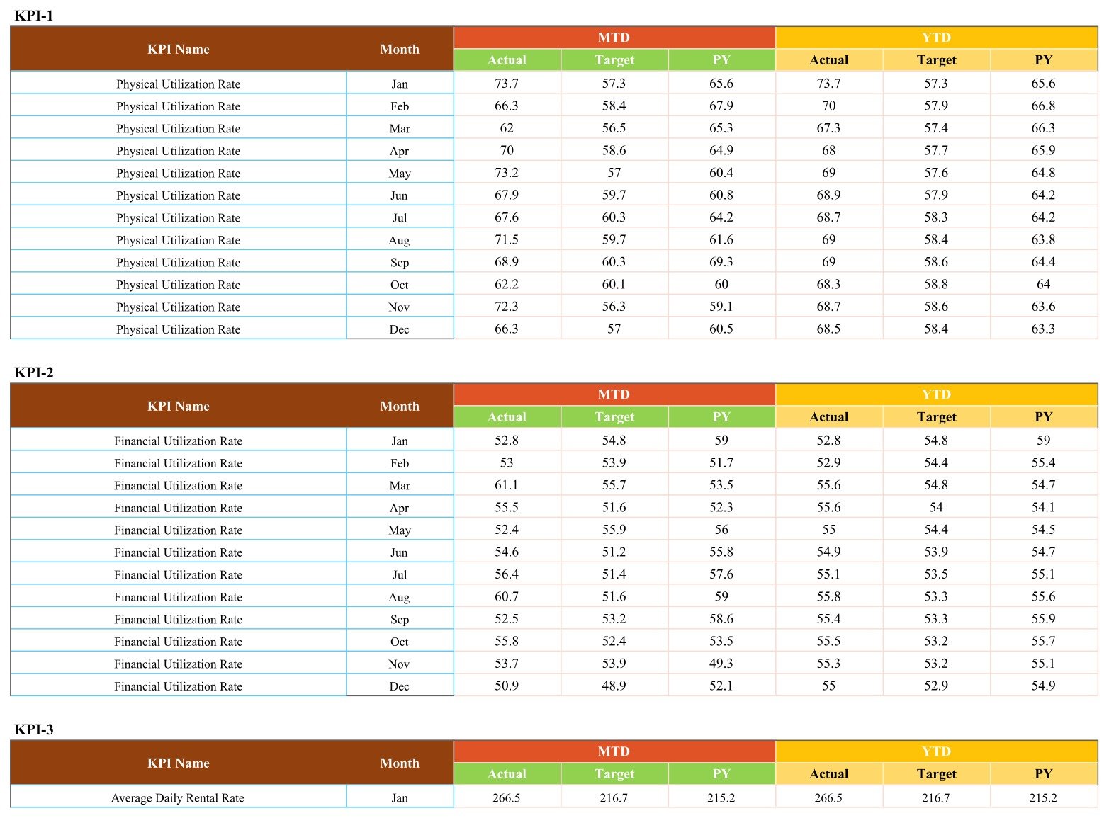
The entry page. One block per KPI, labelled KPI-1 through KPI-10, twelve month rows each, with an MTD group (Actual, Target, PY) and a YTD group (Actual, Target, PY). Paste your own figures over the demo numbers and the scorecard and trend pages follow automatically.
Those are all four pages. There is no “Get More Templates” or upsell page padding out this file.
What This Template Does Not Do
Equipment rental is a safety-sensitive business, and this needs saying plainly. The Equipment Rental Business KPI Scorecard in Google Sheets is a reporting template over numbers that you type in. Every figure in the sample file and in the screenshots above is demo data generated to make the pages readable.
- It does not certify, inspect, test or prove the condition or roadworthiness of any machine, attachment, sling or lifting accessory.
- It does not establish compliance with OSHA, ASME B30, LOLER or PUWER, thorough-examination regimes, EN standards, operator certification schemes, or any local plant, lifting or hire regulation.
- It is not a maintenance record of legal standing, an inspection or test certificate, a hire contract, or a damage-liability determination.
- It does not replace a competent person’s statutory duties.
Utilisation, availability, downtime, repair-turnaround and overdue-return figures here are commercial reporting numbers. None of them is evidence that a machine is safe to use. Keep statutory inspection and examination records where your regulator and insurer expect them, and run this scorecard alongside as the commercial review.
Equipment Rental KPI Scorecard vs. Microsoft Excel vs. Paid Rental SaaS — Feature Comparison
| Feature | Equipment Rental Business KPI Scorecard (Google Sheets) | Microsoft Excel KPI scorecard | Point of Rental / EZRentOut |
|---|---|---|---|
| Cost | $8.99 one-time | $10-20 one-time | $60-200 / user / month |
| Platform | Google Sheets, browser only | Excel desktop or Microsoft 365 | Vendor cloud |
| Setup time | Under 10 minutes | Under 10 minutes | 2-8 weeks with onboarding |
| Real-time collaboration | Native, multi-editor | Only via OneDrive co-authoring | Yes |
| Mobile access | Google Sheets app | Excel mobile, limited | Dedicated app |
| Edit the KPI list and formulas | Yes, all 10 rows | Yes | Fixed vendor metrics |
| Share with a link | Yes, view or edit | File attachment | Seat required per viewer |
| Contracts, asset register, invoicing | No — reporting only | No | Yes |
| Year-1 cost at 5 users | $8.99 | ~$15 + Office licences | $3,600-12,000 |
For a hire business that already runs contracts somewhere else and just wants an honest monthly target-versus-actual page, this scorecard sits in the sweet spot.
Who Should Use This Template
Perfect for:
- Owners and branch managers of equipment rental, plant hire and tool hire businesses running roughly 20-500 units, who hold a monthly performance review.
- Fleet and asset managers who can already export utilisation and downtime from a rental system and need somewhere clean to present it.
- Operations managers at construction, events, agriculture or industrial-services firms that hire out their own kit.
- Finance and commercial leads tracking Revenue per Available Unit and Financial Utilization Rate against target without adding another SaaS seat.
Not a fit if:
- You need an inspection, certification or compliance record. This file is not one, and no amount of configuration makes it one.
- You need live contracts, bookings, an asset register or invoicing. That is a rental management system.
- You want transaction-level slicing by customer, site or asset class. Use a dashboard instead.
- You expect automatic ingestion from telematics or a rental ERP. The data page is typed or pasted into.
Real-World Use Cases
Marcus runs a 140-unit plant hire depot. On the first working day of each month he exports utilisation and downtime from his rental system, pastes them into the KPI Data page, and walks his supervisors through the ten cards. The month Revenue per Available Unit went red while Physical Utilization Rate stayed green, he worked out the yard was renting cheap kit hard and leaving the high-book-rate machines standing.
Priya is commercial manager at a four-branch tool hire chain. She keeps one copy of the scorecard per branch, all four shared read-only with the owners. She watches Average Repair Turnaround and Overdue Return Rate hardest, because both are lower-is-better and both quietly eat availability before anyone notices.
Dan runs operations at an events company that hires out staging and lifting kit. He lives on the KPI Trend page — one KPI, twelve months, actual against target against last year — and prints it straight to PDF for the board pack.
Advantages of the Equipment Rental Business KPI Scorecard in Google Sheets
- It is a scoring tool, not a chart gallery. Every number carries a target and a verdict, which is what a monthly review actually needs.
- The cross-page arithmetic holds up. Working through the sample data, the December card values match the December rows on the data page for every KPI, the Change column is Actual minus Target, the percentage is that change over target, and the YTD column is genuinely the running average of the monthly actuals — the twelve Physical Utilization Rate months average 68.49, and the sheet prints 68.5.
- Lower-is-better KPIs behave correctly. Repair turnaround, downtime and overdue returns all score red when they rise, which is the detail cheap scorecard templates usually get wrong.
- No licence tax. One purchase, a free Google account, and read-only sharing with as many people as you like.
- It is yours to change. Ten KPI rows with editable names, groups, units, formulas and direction flags.
Opportunities for Improvement
An honest list, from working through the shipped file page by page:
- The trend charts are not filtered by the month picker. Both charts on the KPI Trend page always plot the full January-to-December year regardless of the month selected on the scorecard page. That is reasonable for a trend view, but it does mean the two pages are answering different questions at the same time.
- Number formatting is inconsistent on the data page. Values that land on a whole number print without a decimal place — you will see 70, 62, 53 and 55 sitting in a column next to 73.7 and 66.3. It is cosmetic, and a column format fixes it in seconds, but it looks untidy next to otherwise careful work.
- The spark strip’s highlight rule is undocumented. Each card’s twelve-bar strip picks out the year’s high and low months in colour. For the upper-is-better KPIs that reads naturally; for the three lower-is-better KPIs the shipped page images do not make it possible to confirm whether the colours invert. Check it against your own data before you rely on the colour.
- Data entry is manual. There is no connector, import macro or API. You type or paste twelve rows per KPI.
- Ten KPIs is the frame. Adding an eleventh means extending the definitions table, the data blocks and the card layout by hand.
Best Practices
- Fix the definitions before you touch the data. Decide what counts as an available day and a downtime hour, write it into the Definition column, and only then start entering numbers.
- Set targets once a year, not once a month. A target you move whenever you miss it is not a target.
- Keep prior-year figures populated. The PY series is what stops a seasonal dip being mistaken for a problem.
- Share view-only. Give edit rights to the one person who owns the data page and read-only links to everyone else.
- Read the spark strip before you act. A red card in a month that sits mid-range on the twelve-month strip is a different story from a red card at the year’s worst point.
- Keep compliance records somewhere else. Inspection and examination evidence does not belong in a commercial reporting sheet. See the section above.
Explore Relevant Templates
If you are building out a reporting stack for a hire or fleet operation, these pair well:
- Heavy Machinery Dashboard in Google Sheets — the analytical companion to this scorecard.
- Fleet Maintenance Calendar in Google Sheets — schedule the servicing that keeps availability green.
- Scaffolding Services KPI Scorecard in Google Sheets — the same scorecard shape for a neighbouring trade.
- Elevator Maintenance KPI Dashboard in Google Sheets — another asset-uptime template, dashboard-style.
- Interior Fit-Out KPI Scorecard in Google Sheets — for contractors on the other side of the hire relationship.
- Septic Tank Service KPI Scorecard in Google Sheets — a service-business take on the same layout.
A Crane Rental KPI Scorecard in Google Sheets is in preparation and will join the same range shortly.
If you want to extend the sheet yourself, Google’s own Google Sheets function list is the reference to keep open.
To go deeper on KPI reporting, the Excel Pivot Tables & Dashboards course on NextGenTemplates Academy covers it step by step, with practice files you can follow along with.
Get the Equipment Rental Business KPI Scorecard in Google Sheets
Frequently Asked Questions
Does this certify our equipment or make our hire operation compliant?
No. The Equipment Rental Business KPI Scorecard in Google Sheets is a reporting template over numbers you type in. It does not inspect, test or certify any machine or lifting accessory, it does not establish compliance with OSHA, ASME B30, LOLER, PUWER or any hire regulation, and it does not replace a competent person’s statutory duties.
Are the figures in the screenshots real rental data?
No. Every value on the four pages is demo data generated so the cards, charts and tables would be readable. Physical Utilization Rate at 66.3 and Fleet Availability Rate at 96.4 are placeholders. Replace them on the KPI Data page with your own numbers.
Which ten KPIs does the scorecard track?
Physical Utilization Rate, Financial Utilization Rate, Average Daily Rental Rate, Revenue per Available Unit, Fleet Availability Rate, Average Repair Turnaround, On-Time Delivery Rate, Equipment Downtime Rate, Customer Satisfaction Score and Overdue Return Rate. Each carries a published formula and a direction flag.
Can I swap in my own KPIs?
Yes. KPI names, groups, units, formulas and the upper-is-better or lower-is-better flag are all editable cells on the KPI Definitions page, and the twelve-month data blocks follow them. You are not locked into the ten shipped.
How long does setup take?
Under ten minutes to get it running on the demo data. Budget about an hour the first time you map your own KPIs and paste in a year of history, then a few minutes each month.
How does this compare to Point of Rental or EZRentOut?
Those are rental management systems handling contracts, assets and invoicing at $60-200 per user per month. This scorecard does none of that. It is the monthly management review page that sits on top, bought once for $8.99, and it works perfectly well alongside a rental system you already pay for.
Do I need Microsoft Excel to use it?
No. It runs entirely in Google Sheets in a browser, plus the Google Sheets mobile app. A free Google account is all that is required.
About the Author
Built by PK — Microsoft Certified Professional with 15+ years of Excel, Google Sheets and Power BI experience. Founder of NextGenTemplates, reaching 300K+ subscribers across YouTube channels. Every template is hand-built and tested before release.
Conclusion
If your hire business already has the numbers and just needs one honest page a month that says whether each of them beat target, this is a cheap and well-behaved way to get it. The scoring is direction-aware, the arithmetic reconciles across pages, the formulas are written down, and the limitations are listed above rather than buried.
Instant download · One-time payment · No subscription
Last updated: September 2026