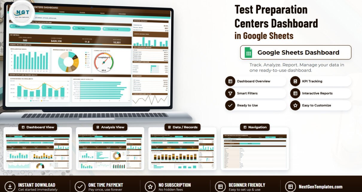
The Test Preparation Centers Dashboard in Google Sheets turns a flat enrollment log into a six-tab reporting pack. The sample build reports on 500 enrollments across 8 centers, 8 test types, 6 course formats and 5 program tiers, with 15 native slicers, 12 KPI cards and 21 charts and side panels. Every chart is driven by a pivot table rather than a helper column, and the whole model already covers 1,000 data rows.
Most test-prep and coaching centres already keep enrollments in a spreadsheet. What they usually do not have is the layer on top: revenue by centre, score gain by instructor, completion and withdrawal rates, and a per-tier revenue split that says whether the scholarship seats are actually reaching the students they were meant for. That reporting layer is what this Google Sheets dashboard adds, without changing where the data lives.
Get the Test Preparation Centers Dashboard in Google Sheets
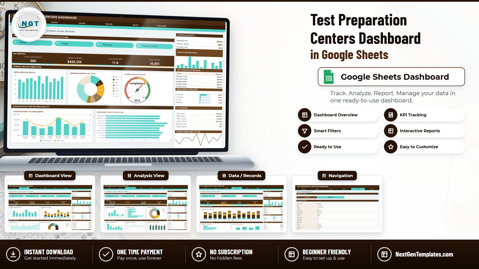
Key Features of the Test Preparation Centers Dashboard in Google Sheets
- Six tabs in a fixed order — Overview, Centers, Courses, Students, Search and Instructions, with a top navigation strip on every page.
- 15 native Google Sheets slicers across four analysis pages. Overview filters on Month, Center, Test Type and Course Format; Centers adds Program Tier; Courses filters on Course Format, Test Type, Program Tier and Instructor; Students filters on Grade Level, Program Tier and Month.
- 12 KPI cards — four on each analysis page, covering enrollments, course revenue, average score gain, study hours, completed courses, withdrawal rate, unique students, average baseline score and scholarship seats.
- Score-gain analysis built in. Score Gain is Final Score minus Baseline Score. Only Completed and In Progress rows carry a gain; Enrolled, Deferred and Withdrawn rows are zero by design, so the averages are not diluted.
- A Search tab that returns all 17 fields behind any Enrollment ID.
- Pivot-first architecture. Each chart reads a pivot table parked to the right of its page, past a wide spacer column, so there are no volatile helper formulas behind the visuals.
- Auto-expand to 1,000 rows. Pivots, slicers and formulas already cover rows 2 to 1001, so pasting new enrollments needs no re-ranging.
Dashboard Pages Explanation
Page 1: Overview — Network-Wide Performance
The whole network at a glance: Total Enrollments, Course Revenue, Avg Score Gain and Study Hours across the top, then Enrollments by Month, Revenue Share by Test Type, Course Completion Rate on a gauge, Center Revenue vs Enrollments as a combined column-and-line chart, and Avg Score Gain by Instructor. The right rail carries a Network Snapshot, a 12-Month Revenue Trend, Top 5 Centers by Revenue, an Enrollment Status Mix and an At a Glance list of test-type revenue.

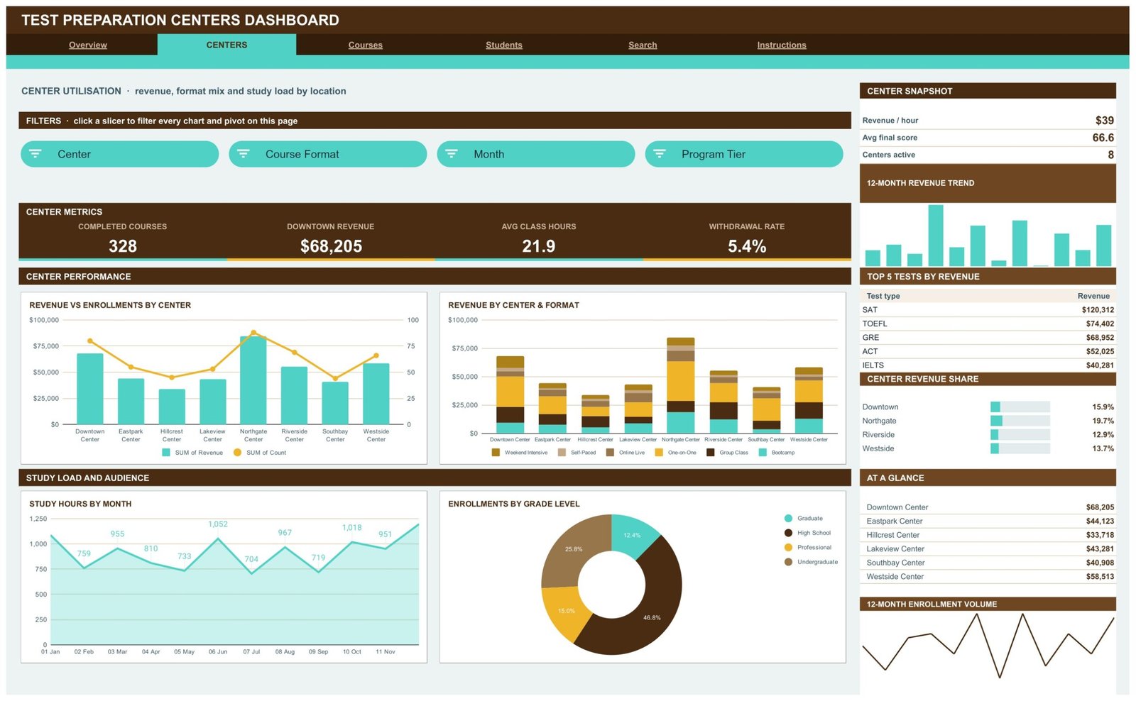
Page 2: Centers — Revenue, Format Mix and Study Load by Location
Location performance for all eight centres. Cards report Completed Courses, Downtown Revenue, Avg Class Hours and Withdrawal Rate. Charts cover Revenue vs Enrollments by Center, Revenue by Center & Format as a stacked column, Study Hours by Month and Enrollments by Grade Level. The rail adds a Center Snapshot, Top 5 Tests by Revenue and a Center Revenue Share list.
Page 3: Courses — Format, Test Type and Program Tier Performance
The commercial page. Cards report One-on-One Revenue, Bootcamp Seats, Elite Tier Revenue and Avg Final Score. Charts include Revenue by Course Format, Enrollments by Test Type, Revenue by Program Tier, Avg Study Hours vs Score Gain, Monthly Course Revenue and Baseline vs Final Score by Format. The rail lists Top 5 Instructors by Revenue and the Format Revenue Share.

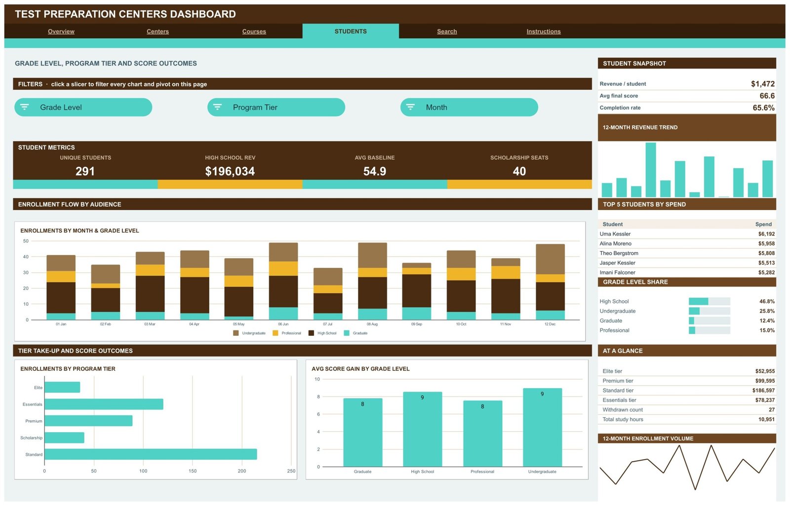
Page 4: Students — Grade Level, Program Tier and Score Outcomes
The audience view. Cards report Unique Students, High School Rev, Avg Baseline and Scholarship Seats. Charts cover Enrollments by Month & Grade Level, Enrollments by Program Tier and Avg Score Gain by Grade Level. The rail holds a Student Snapshot, Top 5 Students by Spend, a Grade Level Share and tier-by-tier revenue.
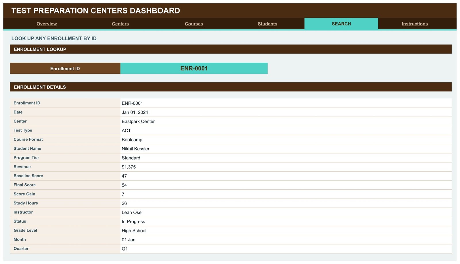
Page 5: Search — Look Up Any Enrollment by ID
Pick an Enrollment ID and the page returns Date, Center, Test Type, Course Format, Student Name, Program Tier, Revenue, Baseline Score, Final Score, Score Gain, Study Hours, Instructor, Status, Grade Level, Month and Quarter. It is the fastest way to answer a parent or student query without scrolling the raw data.
Page 6: Instructions — How the Dashboard Works
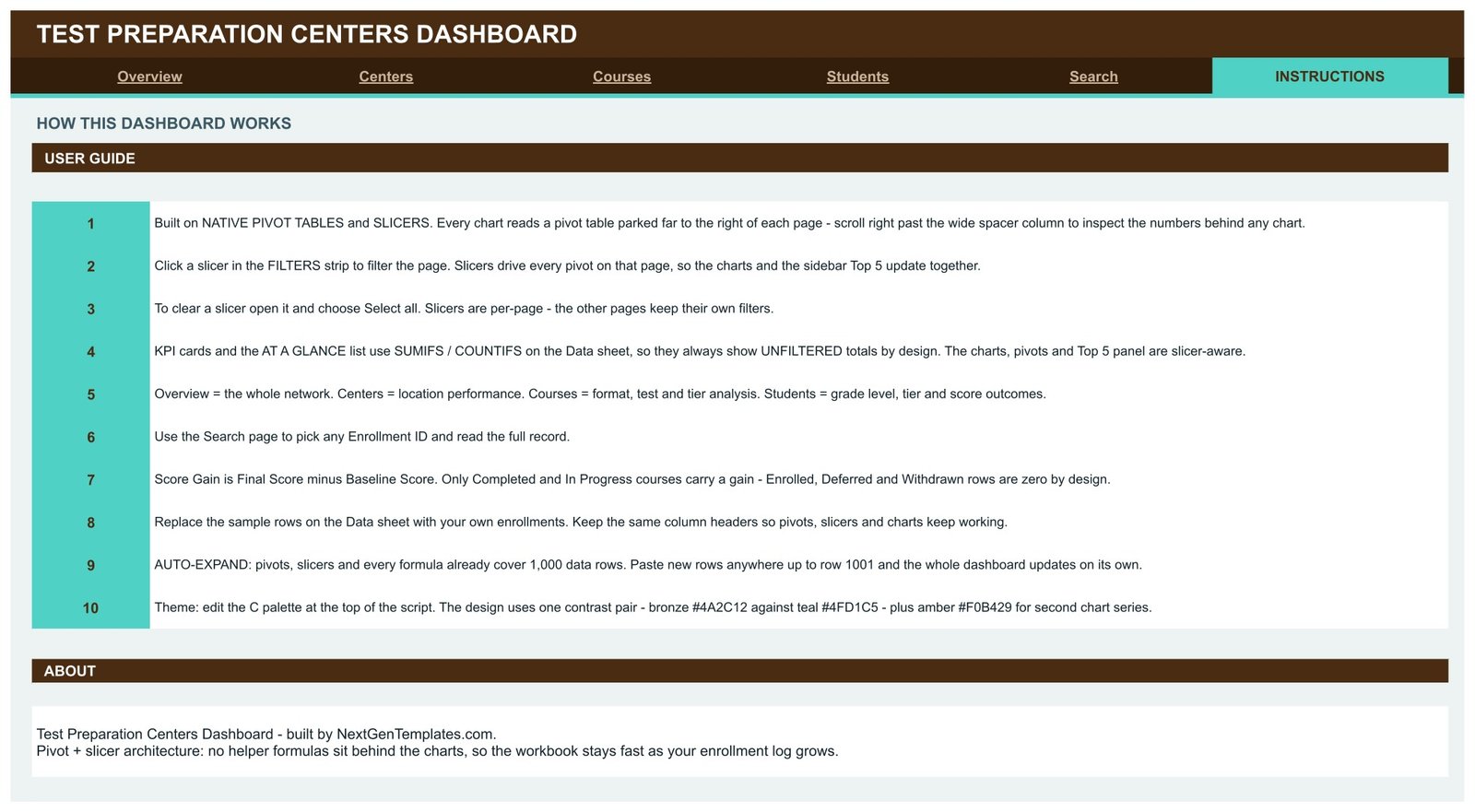
A ten-point guide covering the pivot and slicer architecture, clearing a slicer with Select all, which numbers are slicer-aware, how Score Gain is calculated, how to swap in your own data and how to change the colour theme.
Test Preparation Centers Dashboard in Google Sheets vs. Microsoft Excel Dashboard vs. Paid Tutoring SaaS — Feature Comparison
| Feature | Test Preparation Centers Dashboard in Google Sheets | Microsoft Excel Dashboard | TutorCruncher / Teachworks / Pike13 |
|---|---|---|---|
| Cost | ✅ $9.99 one-time | $19.99 one-time | $39-$199 / month |
| Platform | ✅ Browser, nothing to install | Microsoft Excel licence needed | Vendor-hosted web app |
| Setup time | ✅ Under 10 minutes | Under 10 minutes | Days — onboarding and data import |
| Real-time team collaboration | ✅ Built into Google Drive | Only via OneDrive co-authoring | ✅ Yes, per seat |
| Mobile access | ✅ Google Sheets app | Excel mobile app | ✅ Native apps |
| Customisable fields and charts | ✅ Every pivot and chart is editable | ✅ Fully editable | Limited to vendor’s report builder |
| Share with a link | ✅ Any Drive share link | File must be sent or synced | Login required |
| Baseline vs final score analysis | ✅ Built in on 3 pages | ✅ Built in | Usually an add-on module |
| Year-1 cost at 5 users | ✅ $9.99 total | $19.99 total | $2,340-$11,940 |
For a centre owner who wants enrollment, revenue and score-gain reporting without a per-seat subscription, the Test Preparation Centers Dashboard in Google Sheets sits in the sweet spot.
Who Should Use This Template
Perfect for:
- Owners and directors of test-prep, coaching or tutoring centres running 1 to 15 locations
- Centre managers reporting monthly revenue, enrollments and completion rates upward
- Academic leads comparing average score gain by instructor, course format and program tier
- Franchise operators watching centre-by-centre revenue share and withdrawal rates
- Anyone already logging enrollments in a spreadsheet who wants analysis without a new tool
Not a fit if:
- You need booking, invoicing or payment collection — this reports on enrollment data, it does not capture it
- You need a live connection to a student information system; data is pasted or imported by you
- You need SSO, audit trails or permission roles beyond what Google Drive sharing provides
- You want predictive score forecasting; every number in this dashboard is descriptive, not predictive
- You must hold identifiable student records under a formal data-protection regime and have not yet decided where the file will live and who it will be shared with
Real-World Use Cases
Priya runs a four-branch SAT and ACT coaching chain. Each month she opens the Centers page, compares revenue share and withdrawal rate across branches, and reads Revenue by Center & Format to decide which branch should add a bootcamp cohort next term. What used to be an hour of manual pivoting is now one slicer click.
Daniel is academic head at a single-site test-prep centre. He filters the Courses page by Instructor and reads Avg Study Hours vs Score Gain alongside Baseline vs Final Score by Format. Instructor reviews now rest on measured score movement rather than student feedback alone.
Meera manages admissions for a graduate-exam programme. She works from the Students page, tracking Grade Level Share and Scholarship Seats to check whether the scholarship tier reaches its intended audience, then exports the tab as a PDF for the trustees’ quarterly pack.
Advantages of the Test Preparation Centers Dashboard in Google Sheets
- One payment instead of a monthly seat fee. A five-user tutoring platform subscription runs into four figures in year one; this is a single purchase.
- No software to install. It runs in a browser on a free Google account, so a branch manager on a borrowed laptop can still open it.
- Fast at scale. Because the charts read pivot tables and not chains of helper formulas, the file stays responsive as the enrollment log fills toward 1,000 rows.
- Genuinely editable. Every pivot, chart, slicer and colour is yours; you are not limited to a vendor’s report builder.
- Sharing is a link. Google Drive handles view or edit access, so a board pack is a URL rather than an attachment.
Opportunities for Improvement
Two things are worth knowing before you buy. First, the KPI cards and the At a Glance lists deliberately use SUMIFS and COUNTIFS against the whole Data sheet, which means they always show unfiltered totals. Only the charts, pivots and Top 5 panels react to slicers. That is documented on the Instructions tab and is a design decision, not a bug, but it does surprise people the first time they click a slicer and watch the top row stay still.
Second, slicers are per page. Filtering Overview to one centre does not filter the Centers tab, so a comparison across two pages means setting the same filter twice. And the dashboard is descriptive only — there is no forecasting, no cohort projection and no automatic import from a booking system. If your reporting needs any of those, this is the wrong starting point.
Best Practices
- Keep the column headers on the Data sheet exactly as shipped. The pivots, slicers and formulas all key off them.
- Paste new enrollments within rows 2 to 1001 so the pre-built ranges pick them up automatically.
- Record Baseline Score and Final Score for every completed course — the score-gain analysis on three pages depends on both being present.
- Use Status honestly. Enrolled, Deferred and Withdrawn rows are meant to carry a zero gain; forcing a number there distorts every average.
- Clear slicers with Select all before sharing a tab, so the next reader does not inherit your filter.
- Keep a duplicate of the untouched file as a reference copy before you start editing pivots.
- If you store real student names, decide first who the Drive file is shared with. Google’s own guide to sharing files and folders is worth ten minutes before the first share.
Explore Relevant Templates
The same topic is already published on other platforms: the Test Preparation Centers Dashboard in Excel for teams that live in Excel, and the Test Preparation Centres KPI Dashboard in Power BI for a scorecard-style read of the same business.
For a wider view of a coaching operation, look at the Tutoring Business Dashboard in Google Sheets and the Education Services Dashboard in Google Sheets. For learner outcomes and platform metrics, the Student Academic Insights Dashboard in Google Sheets and the EdTech Dashboard in Google Sheets go deeper.
Two more education dashboards are being added to the Google Sheets range alongside this one — the Coaching & Tutoring Dashboard in Google Sheets and the Language Schools Dashboard in Google Sheets. Browse the whole set of Google Sheets Dashboards if you want to compare.
More on this blog: SQL EXISTS Operator: Test Whether a Subquery Returns Rows, IT Dashboard in Google Sheets and NPS Dashboard in Google Sheets.
Want to build dashboards like this step by step? The Excel Pivot Tables & Dashboards course on NextGenTemplates Academy walks you through it with practice files.
Frequently Asked Questions
What KPIs does the Test Preparation Centers Dashboard track?
The Test Preparation Centers Dashboard in Google Sheets tracks total enrollments, course revenue, average score gain, study hours, completion rate, withdrawal rate, revenue per student, revenue per hour, average baseline and final score, scholarship seats and unique students across four analysis pages.
How long does setup take?
Under 10 minutes. Open the copy link in the PDF, make your own copy in Google Drive, then paste your enrollment rows over the sample data on the Data sheet. Pivots and slicers already cover 1,000 rows, so nothing needs re-ranging.
Do I need Excel or any paid software?
No. The Test Preparation Centers Dashboard in Google Sheets runs entirely in a browser on a free Google account. There is no add-on to install, no Apps Script to authorise and no macro to enable.
Why do the KPI cards not respond to the slicers?
By design. The KPI cards and At a Glance lists use SUMIFS and COUNTIFS across the whole Data sheet, giving a stable unfiltered reference. The charts, pivot tables and Top 5 panels are the slicer-aware parts of each page, and the Instructions tab says so.
How does this compare to TutorCruncher or Teachworks?
Those platforms handle scheduling, invoicing and payments for $39 to $199 a month. The Test Preparation Centers Dashboard in Google Sheets is reporting only and costs once, so it is the cheaper choice when you already keep an enrollment log and need analysis on top of it.
Can I add more centers, test types or course formats?
Yes. The pivots read whatever values appear in the Data sheet columns, so a ninth centre or a seventh course format needs no formula changes. Refresh the page and the new value shows up in the slicers, charts and Top 5 panels.
Is the sample student data real?
No. All 500 rows in the Test Preparation Centers Dashboard in Google Sheets, including every student and instructor name, are fictional demo data built for this template. Replace them with your own records and review your privacy obligations before storing identifiable student information in a shared file.
About the Author
Built by PK — Microsoft Certified Professional with 15+ years of Excel, Google Sheets and Power BI experience. Founder of NextGenTemplates, reaching 300K+ subscribers across YouTube channels. Every template is hand-built and tested before release.
Conclusion
If you run a test-prep, coaching or tutoring centre and your enrollment log is already a spreadsheet, the reporting layer is the missing piece — not another platform. The Test Preparation Centers Dashboard in Google Sheets gives you six tabs, 15 slicers, 12 KPI cards and a full score-gain analysis on top of the data you already keep, and it is yours to edit down to the last pivot.
Get the Test Preparation Centers Dashboard in Google Sheets
Instant download · One-time payment · No subscription
Last updated: September 2026