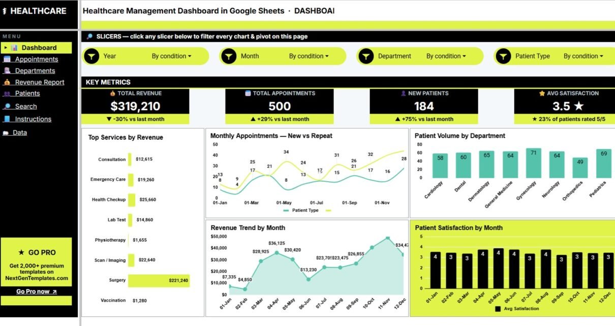
Healthcare teams often review appointments, revenue, departments, patient mix, wait time, and satisfaction from different exports or disconnected tabs. The Healthcare Management Dashboard in Google Sheets brings those operating signals into one editable dashboard with 4 KPI cards, 7 sheet tabs, 21 chart views, interactive slicers, an Appointment ID search sheet, and a structured Data Sheet for new records.Healthcare Management Dashboard in Google Sheets
Because the template runs in Google Sheets, users can create a browser-based copy, share it with authorized team members, and collaborate through Google Drive permissions. For official sharing guidance, see Google’s help article on collaborating in Sheets.
Get the Healthcare Management Dashboard
Key Features of Healthcare Management Dashboard in Google Sheets
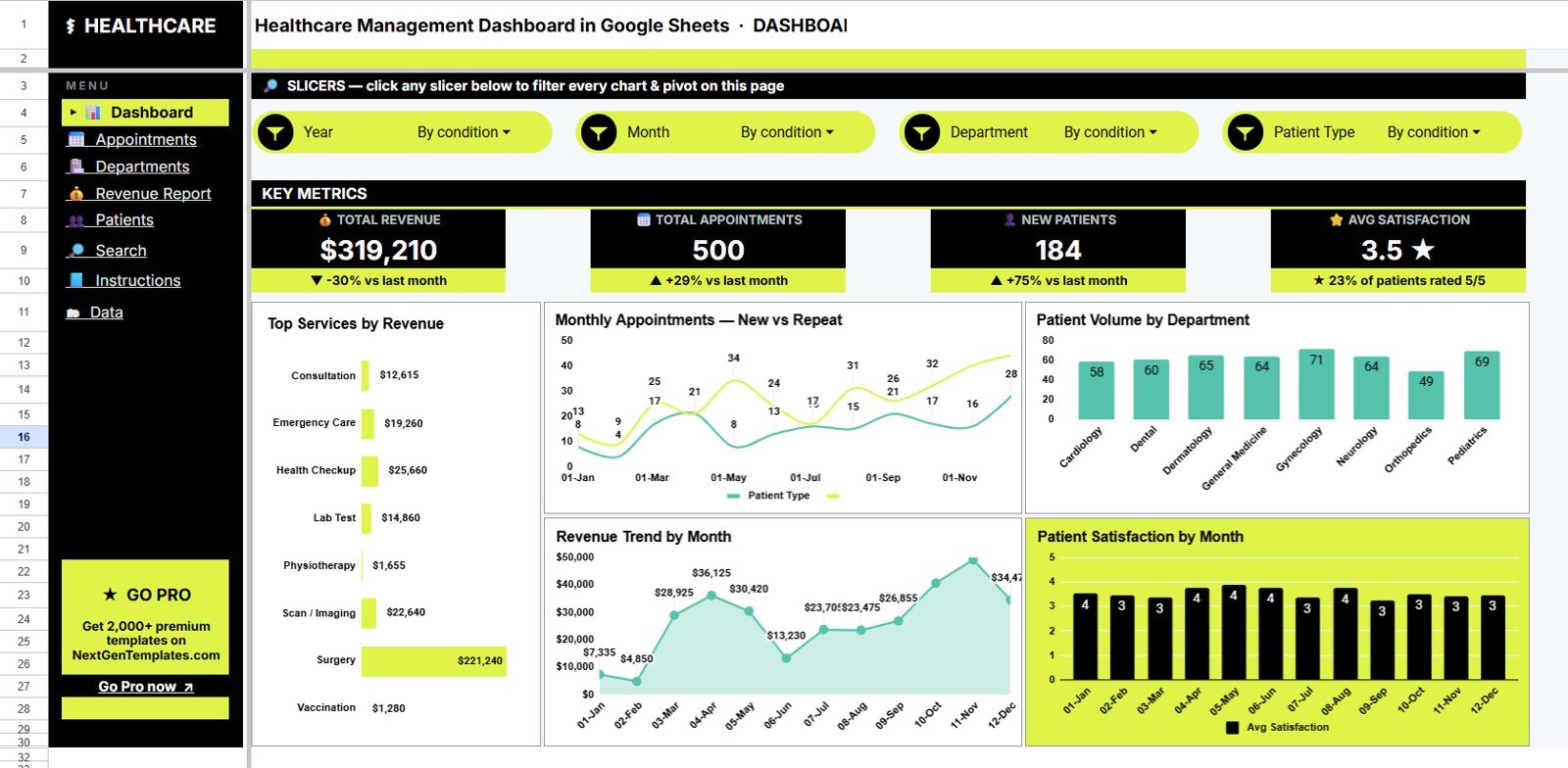
Four KPI cards: The Overview page highlights Total Revenue, Total Appointments, New Patients, and Avg Satisfaction so managers can see the headline position before reviewing deeper charts.Healthcare Management Dashboard in Google Sheets
Seven Google Sheets tabs: The workbook includes Overview, Appointments, Departments, Revenue Report, Patients, Search Sheet, and Data Sheet tabs.
Twenty-one chart views: The dashboard covers revenue by service, appointment status, doctor workload, wait time, department revenue, patient city, age group, gender, payment method, and satisfaction trends.Healthcare Management Dashboard in Google Sheets
Interactive slicers: Users can filter dashboard pages quickly by available fields, making the file practical for monthly reviews, department meetings, and ad hoc analysis.
Appointment ID lookup: The Search Sheet lets users choose one Appointment ID and instantly view the full appointment record without scrolling through raw data.
Dashboard Pages Explanation
The workbook is organized around the way healthcare managers usually review performance: a high-level Overview first, followed by appointment operations, department analysis, revenue reporting, patient analysis, record lookup, and source data entry.
1. Overview Page
The Overview page shows Total Revenue, Total Appointments, New Patients, and Avg Satisfaction at the top. These cards give leadership a fast read on financial performance, demand, patient growth, and experience quality.
Revenue by Service: This chart shows which services generate the most revenue. It helps finance and operations teams understand the service mix behind revenue performance.
Appointments by Month and Patient Type: This chart compares monthly appointment demand for new and repeat patients. It helps managers review growth, repeat engagement, and scheduling pressure.
Patient Volume by Department: This chart shows which departments are handling the most patient activity. It supports staffing, room planning, and department-level management.
Revenue by Month: This chart tracks revenue movement across months. It helps teams see seasonality, growth, and weak periods quickly.
Avg Satisfaction by Month: This chart shows how patient satisfaction changes over time. It helps managers connect patient experience changes with operational decisions.
Click here to buy the Healthcare Management Dashboard in Google Sheets.
2. Appointments
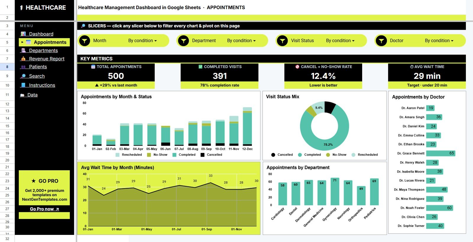
The Appointments tab focuses on appointment volume, status, doctor workload, wait time, and department demand. It is useful for daily operations review and weekly scheduling discussions.
Appointments by Month and Visit Status: This chart shows how completed, cancelled, pending, or other visit statuses move over time. It helps teams spot status issues before they become routine backlog.
Appointments by Visit Status: This chart summarizes the current status mix. It gives managers a quick view of completion rate and appointment follow-up needs.
Appointments by Doctor: This chart compares appointment volume by doctor. It helps review provider workload and capacity distribution.
Avg Wait Time by Month: This chart tracks how wait time changes month by month. It supports patient flow improvement and scheduling review.
Appointments by Department: This chart compares demand by department. It helps identify high-volume areas that may need staffing or process attention.
3. Departments
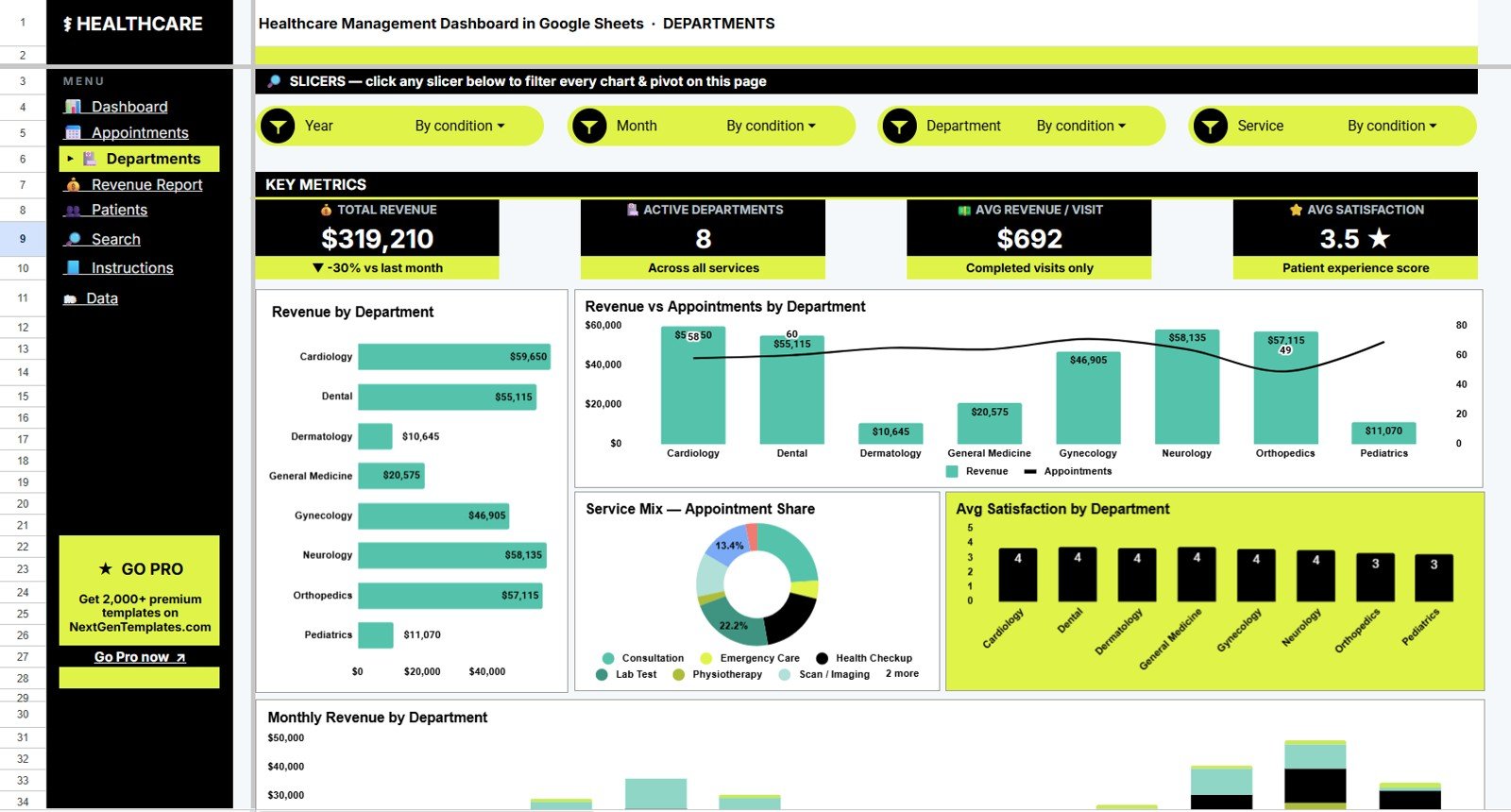
The Departments tab reviews department revenue, appointments, service share, satisfaction, and monthly revenue movement. It is useful for service-line leaders and administrators.
Revenue by Department: This chart ranks departments by revenue. It helps finance teams understand where income is concentrated.
Revenue and Appointments by Department: This chart compares money and volume together. It shows whether high-volume departments are also high-revenue departments.
Appointment Share by Service: This chart explains how appointments are distributed across services. It helps teams understand the service mix behind department demand.
Avg Satisfaction by Department: This chart compares satisfaction across departments. It helps leadership identify strong service areas and improvement opportunities.
Monthly Revenue by Department: This chart tracks department revenue over time. It helps managers see which departments are growing, declining, or fluctuating.
Click here to buy the Healthcare Management Dashboard in Google Sheets.
4. Revenue Report
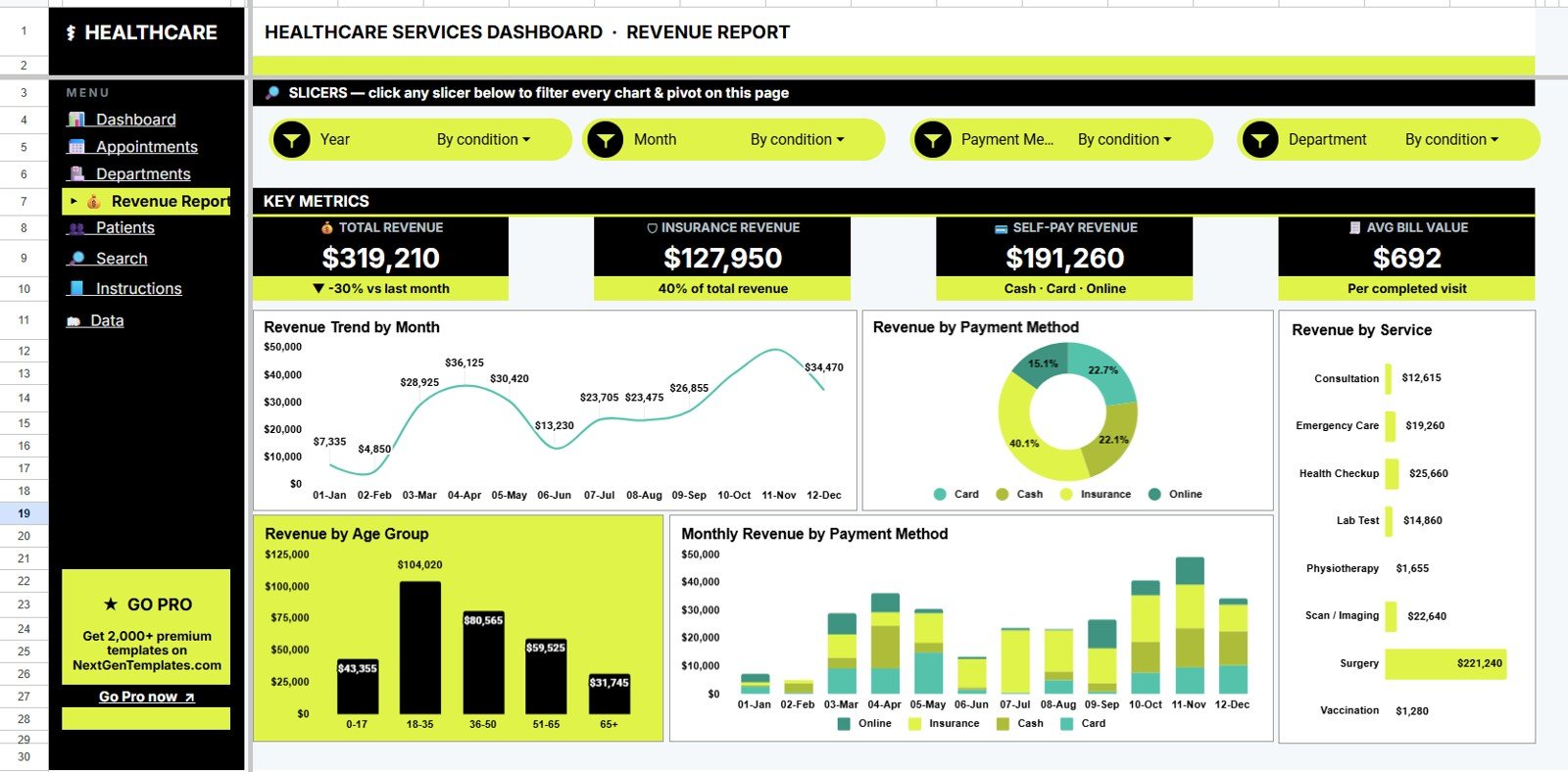
The Revenue Report tab is built for billing and finance review. It explains revenue by month, payment method, service, age group, and payment method over time.
Revenue by Month: This chart gives a monthly revenue trend. It helps managers compare current performance with previous months.
Revenue by Payment Method: This chart shows how revenue is collected across payment channels. It supports cash, card, insurance, and other payment-method review.
Revenue by Service: This chart ranks services by revenue. It helps teams identify high-value services and service areas needing attention.
Revenue by Age Group: This chart breaks revenue down by age group. It supports demographic and service planning.
Monthly Revenue by Payment Method: This chart tracks payment method trends by month. It helps finance teams see whether payment behavior is changing.
5. Patients
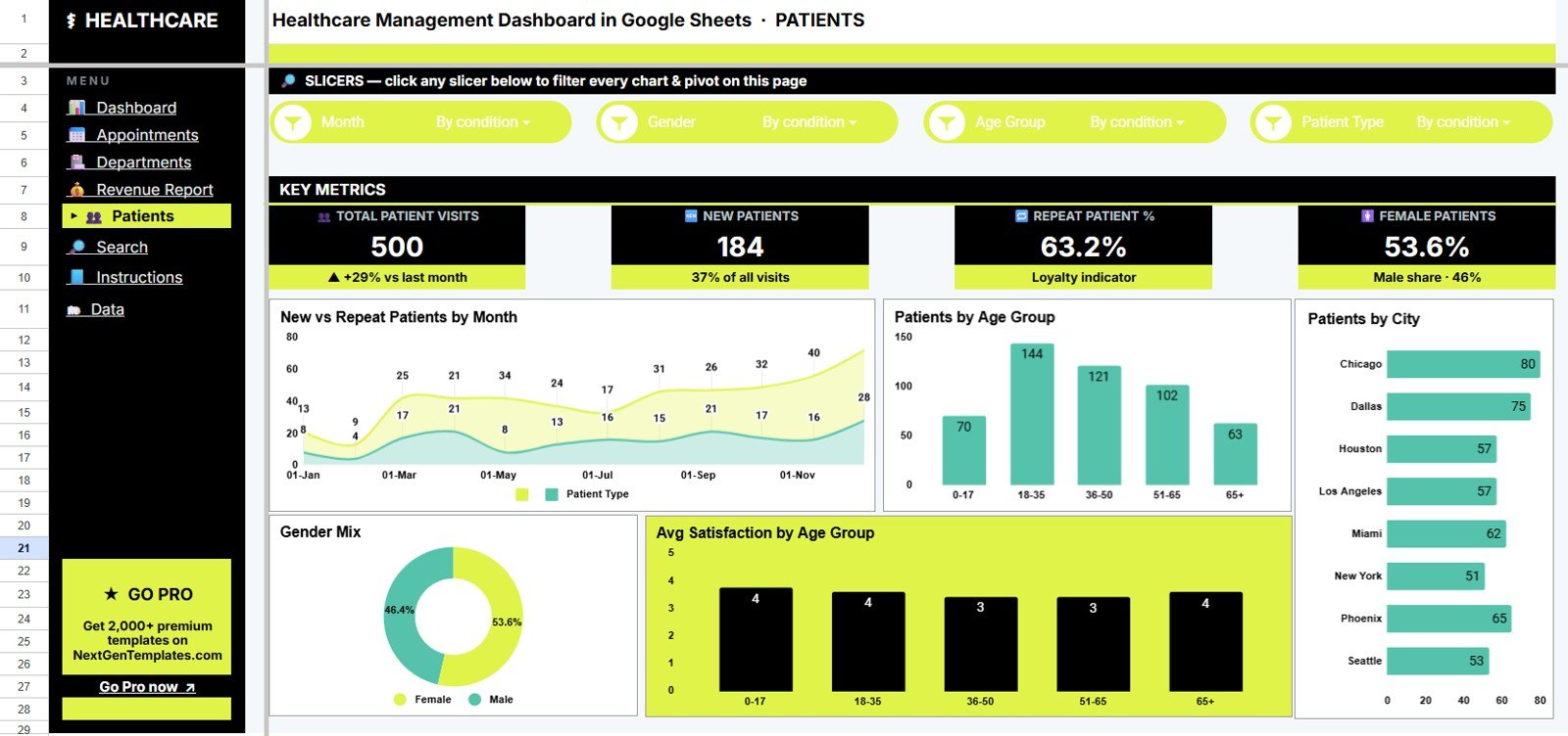
The Patients tab focuses on new versus repeat patients, age group, city, gender, and satisfaction. It helps teams understand patient mix and experience signals.
New and Repeat Patients by Month: This chart shows how patient type changes over time. It helps review acquisition and retention together.
Patients by Age Group: This chart shows the age distribution of patients. It helps teams understand the demographic mix behind service demand.
Patients by City: This chart shows where patients are coming from. It supports outreach planning and local service review.
Patient Share by Gender: This chart summarizes gender share. It gives a quick demographic view for management reporting.
Avg Satisfaction by Age Group: This chart compares satisfaction across age groups. It helps teams spot where experience may differ by patient segment.
Click here to buy the Healthcare Management Dashboard in Google Sheets.
6. Search Sheet Tab
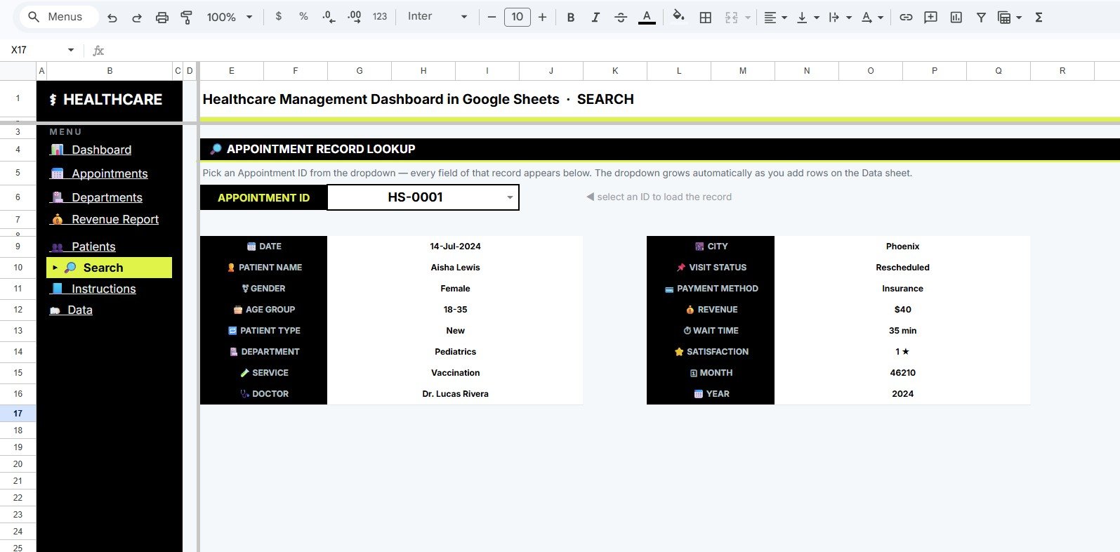
The Search Sheet lets users select an Appointment ID from a dropdown and instantly view the complete record details: date, patient name, gender, age group, patient type, department, service, doctor, city, visit status, payment method, revenue, wait time, satisfaction, month, and year.
7. Data Sheet Tab
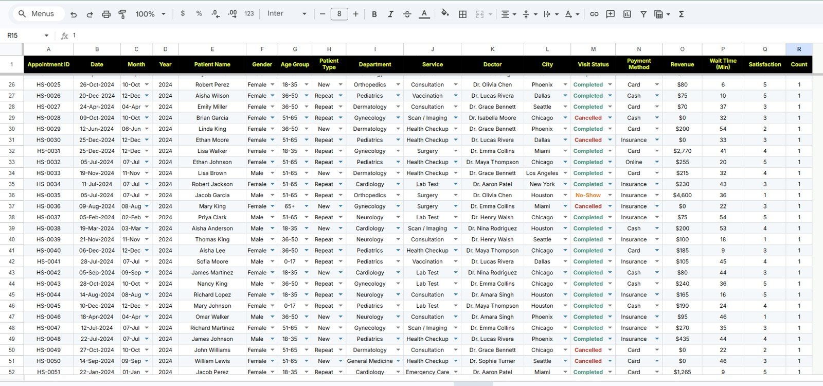
The Data Sheet is the input layer. Users add appointment records in the same format as the sample data so KPI cards, charts, slicers, and the Search Sheet continue to work correctly.
Click here to buy the Healthcare Management Dashboard in Google Sheets.
Healthcare Management Dashboard in Google Sheets vs. Microsoft Excel vs. Paid CRM/SaaS – Feature Comparison
| Feature | Healthcare Management Dashboard in Google Sheets | Microsoft Excel dashboard | Paid healthcare SaaS |
|---|---|---|---|
| Cost | $9.99 one-time | Template cost plus Excel access | Monthly or annual subscription |
| Platform | Google Sheets in browser | Excel desktop or web | Vendor-hosted cloud app |
| Setup time | Create a copy and replace sample data | Open workbook, replace data, refresh | Implementation and onboarding |
| Real-time team collaboration | Built into Google Drive sharing | Requires OneDrive or SharePoint | Usually included by plan |
| Mobile access | Google Sheets app or browser | Excel app or browser | Vendor app or portal |
| Customizable fields | Editable sheet structure | Editable workbook | Limited by vendor setup |
| Share with link | Yes, through Drive permissions | Limited unless stored online | Account-based access |
| Year-1 cost at 5 users | $9.99 plus Google Workspace, if used | Template plus licensing | Often hundreds or thousands |
| Appointment ID lookup | Included | Possible with formulas | Depends on system search tools |
| Best fit | Fast internal reporting | Offline reporting | System-of-record workflows |
Who Should Use This Template
This template is useful for clinic managers, healthcare administrators, department heads, practice managers, finance analysts, operations leads, and consultants who need a clean Google Sheets reporting layer for appointments and revenue.
It is especially helpful when a team already exports data from another system and wants a shareable dashboard before investing in a full BI rollout or paid healthcare analytics subscription.
It is not a replacement for an EHR, EMR, billing system, patient portal, claims system, or compliance platform. Sensitive patient data should only be used according to your organization’s privacy and access-control policies.
Real-World Use Cases
Click here to buy the Healthcare Management Dashboard in Google Sheets.
Clinic operations manager: Reviews appointment volume, status, wait time, and department demand before weekly staffing meetings.
Healthcare finance analyst: Compares revenue by month, service, payment method, age group, and department to explain financial performance.
Department head: Uses department revenue, appointment share, and satisfaction charts to prepare service-line updates.
Healthcare consultant: Builds a quick reporting layer for a client that exports appointment records but does not yet need a full custom dashboard project.
Advantages of Healthcare Management Dashboard in Google Sheets
The main advantage is speed. Users can create a copy, replace sample appointment records, and start reviewing healthcare management performance without building formulas and charts from scratch.
The second advantage is collaboration. Google Sheets makes it easier for authorized users to work from the same dashboard file, especially when managers, analysts, and consultants need shared visibility.
The third advantage is focus. The template centers on revenue, appointments, patients, departments, services, doctors, wait time, satisfaction, search lookup, and raw data instead of overwhelming users with unrelated metrics.
Opportunities for Improvement
This is a spreadsheet dashboard, so it depends on clean input data. Inconsistent department names, missing Appointment IDs, duplicated rows, incomplete satisfaction ratings, or changed column headers can affect the charts.
Teams with larger analytics needs may eventually want automated imports, controlled refresh, Power BI reporting, formal data governance, or direct integration with operational systems. This template is best used as a practical reporting layer, not the system of record.
Best Practices
- Keep the Data Sheet column structure consistent.
- Use standard naming for doctors, departments, services, cities, payment methods, and visit statuses.
- Review the Overview page first, then use the detailed tabs to explain what changed.
- Use the Search Sheet for individual Appointment ID lookup instead of broad performance analysis.
- Limit access to authorized users and avoid storing unnecessary sensitive data in the sheet.
Explore Relevant Templates
- Healthcare Management Dashboard in Google Sheets – Product page for this template.
- Healthcare & Hospital Management Bundle – Healthcare template bundle for Excel, Power BI, VBA, and dashboard users.
- Healthcare Services Dashboard in Google Sheets – Related healthcare services reporting dashboard.
- Medical Practice Dashboard in Google Sheets – Clinic visit, revenue, and patient analytics.
- Telehealth Dashboard in Google Sheets – Virtual care consult reporting.
- Healthcare KPI Dashboard in Google Sheets – KPI-focused healthcare reporting.
- Browse all Google Sheets Dashboard Templates.
Frequently Asked Questions
Click here to buy the Healthcare Management Dashboard in Google Sheets.
What does the Healthcare Management Dashboard in Google Sheets include?
It includes Overview, Appointments, Departments, Revenue Report, Patients, Search Sheet, and Data Sheet tabs, with KPI cards, slicers, charts, and Appointment ID lookup.
Can I use my own appointment data?
Yes. Replace the sample records in the Data Sheet tab using the same format as the template.
Does this dashboard connect directly to an EHR?
No. It is a Google Sheets dashboard template. Export or prepare your data, then add it to the Data Sheet.
Can multiple team members view the dashboard?
Yes. After creating your own copy, you can share it through Google Drive permissions.
Is this dashboard editable?
Yes. You can edit labels, colors, formulas, charts, sheet names, and structure after creating your own copy.
Is this a HIPAA-compliant tool?
The template alone does not guarantee HIPAA compliance. Compliance depends on your Google Workspace configuration, access controls, internal policies, and data handling practices.
About the Author
Built by PK – Microsoft Certified Professional with 15+ years of Excel, Google Sheets, and Power BI experience. Founder of NextGenTemplates, reaching 300K+ subscribers across YouTube channels. Every template is hand-built and tested before release.
Conclusion
The Healthcare Management Dashboard in Google Sheets gives healthcare teams a practical way to review revenue, appointments, new patients, satisfaction, departments, services, doctors, wait time, patient demographics, Appointment ID lookup, and raw records in one editable dashboard. It is best for teams that want a fast, shareable reporting layer without committing to a large SaaS implementation.
Click here to buy the Healthcare Management Dashboard in Google Sheets.
For step-by-step spreadsheet and dashboard tutorials, visit YouTube.com/@NeoTechNavigators.
Last updated: July 13, 2026.