Arts and Culture Dashboard in Google Sheets is built for cultural teams that need a practical way to monitor exhibitions, concerts, festivals, visitors, revenue, costs, artists, venues, and program impact without moving into an expensive reporting platform. Arts reporting can become scattered quickly: one sheet for events, another file for artists, ticketing exports in a folder, and finance numbers somewhere else. This dashboard gives teams one clean Google Sheets structure for recurring review.Arts and Culture Dashboard in Google Sheets
The need is real. The BEA and NEA Arts and Cultural Production Satellite Account reported that arts and cultural production contributed $1.17 trillion to U.S. GDP in 2023. Americans for the Arts also reported $151.7 billion in nonprofit arts and culture economic activity in 2022. When cultural organizations are asked to explain activity, reach, and financial impact, a dashboard can make the story much easier to see.
View the Arts and Culture Dashboard in Google Sheets on NextGenTemplates.
Why Use a Google Sheets Arts Dashboard?
Google Sheets is familiar, shareable, and flexible. It works well when an arts team needs a dashboard but does not want to commit to a full SaaS implementation. Because Google Sheets supports browser-based collaboration and sharing, teams can keep reporting accessible for program managers, venue coordinators, finance leads, and leadership reviewers. Google also highlights real-time editing as a core Workspace collaboration feature, which makes it a useful fit for small teams that need quick reporting access.
This template is especially useful when you want to replace ad hoc reporting with a repeatable monthly or weekly dashboard. You can paste or maintain your event records in the Data Sheet tab, then use the dashboard pages to review performance from several angles.
What This Dashboard Tracks
- Exhibitions, concerts, festivals, and other cultural events.
- Total visitors, sessions, recent events, and featured artists.
- Event pipeline progress, monthly event volume, and average visitors.
- Venue performance, in-person events, revenue share, shows, and ticket value.
- Artist engagement, program mix, workshops, and student reach.
- Revenue by audience, monthly costs, cost trends, and net margin.
- A structured Data Sheet tab for updating the source records in the same format.Arts and Culture Dashboard in Google Sheets
Dashboard Pages Included
The template includes multiple dashboard pages so each team can focus on the level of detail they need. Leadership can start with the Overview Page, while operations, programming, venue, and finance teams can use the deeper tabs.
1. Overview Page
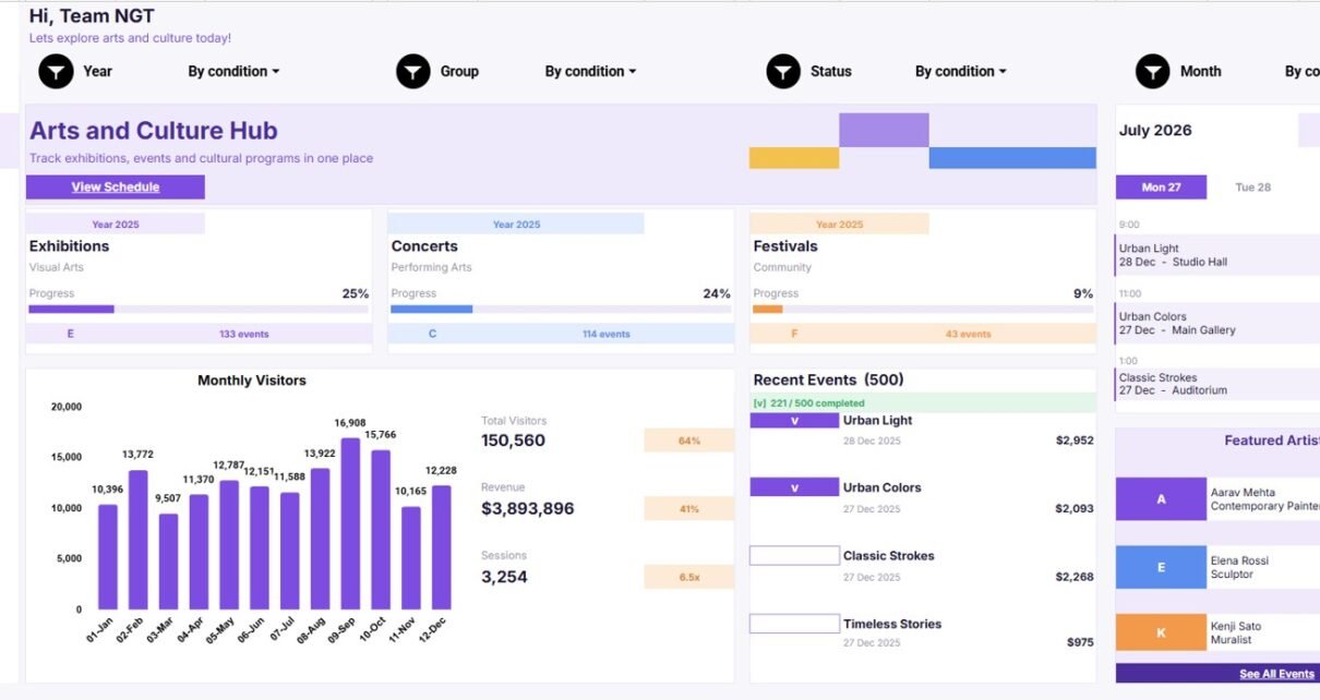
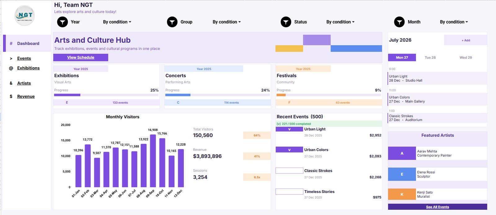
The Overview Page is the high-level dashboard view. At the top, it includes cards for Exhibitions, Concerts, Festivals, Total Visitors, Revenue, Sessions, Recent Events, and Featured Artists. These cards help reviewers understand the current reporting period before looking into detailed charts.
- Event Progress by Category: This chart compares cultural activity across categories so you can see which areas are moving forward. It is helpful for reviewing exhibitions, concerts, festivals, workshops, and program progress together.
- Monthly Visitors by Month: This trend shows visitor activity across months. Use it to understand seasonality, campaign impact, and audience movement over time.
- Recent Events by Event Name: This chart keeps specific recent events visible. It helps teams connect top-line numbers back to exhibitions, concerts, launches, or community sessions.Arts and Culture Dashboard in Google Sheets
- Featured Artists by Artist: This view highlights artist participation. It is useful when programming teams want to understand which artists are most visible in the current dashboard period.Arts and Culture Dashboard in Google Sheets
2. Event Command Center
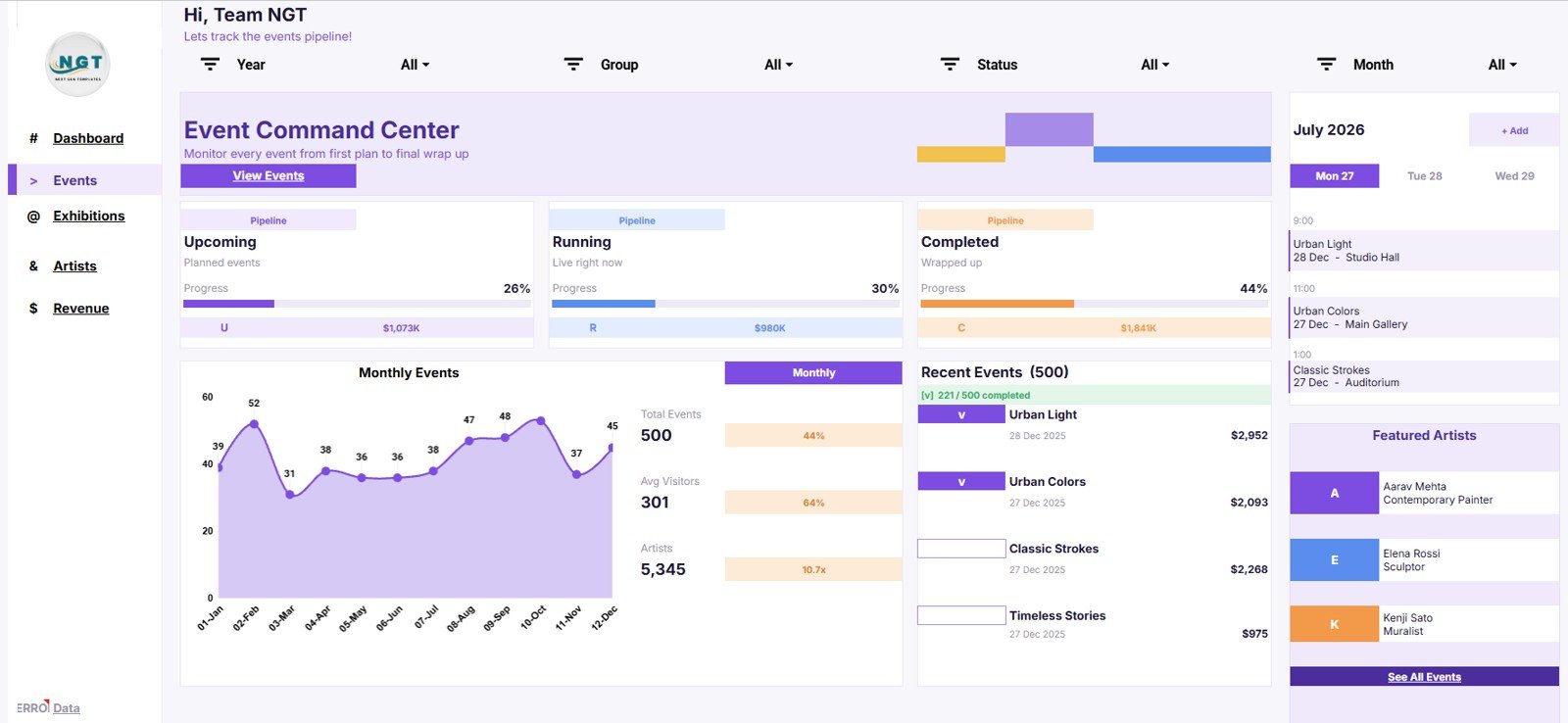
The Event Command Center focuses on event planning and event performance. This page helps teams understand pipeline distribution, monthly activity, average visitors, artist involvement, and recent event movement.
- Events by Pipeline: This chart shows how events are distributed across pipeline stages. It helps managers spot whether too many events are stuck in planning, active work, or follow-up.
- Monthly Events by Month: This view shows event activity by month. It helps cultural teams balance schedules and avoid months that are overloaded or underused.
- Total Events by Month: This chart summarizes total monthly event count. It is useful for capacity planning and simple period-over-period event comparisons.
- Average Visitors by Month: This analysis compares average attendance by month. It helps teams review audience strength without relying only on total event volume.
- Artists by Event Pipeline: This view connects artist involvement to event stages. It gives programming teams a quick way to see where artist participation is concentrated.
- Recent Events by Event Name: This chart shows the latest event records. It helps teams move from summary performance back to the actual events behind the numbers.
3. Exhibition and Venue Hub
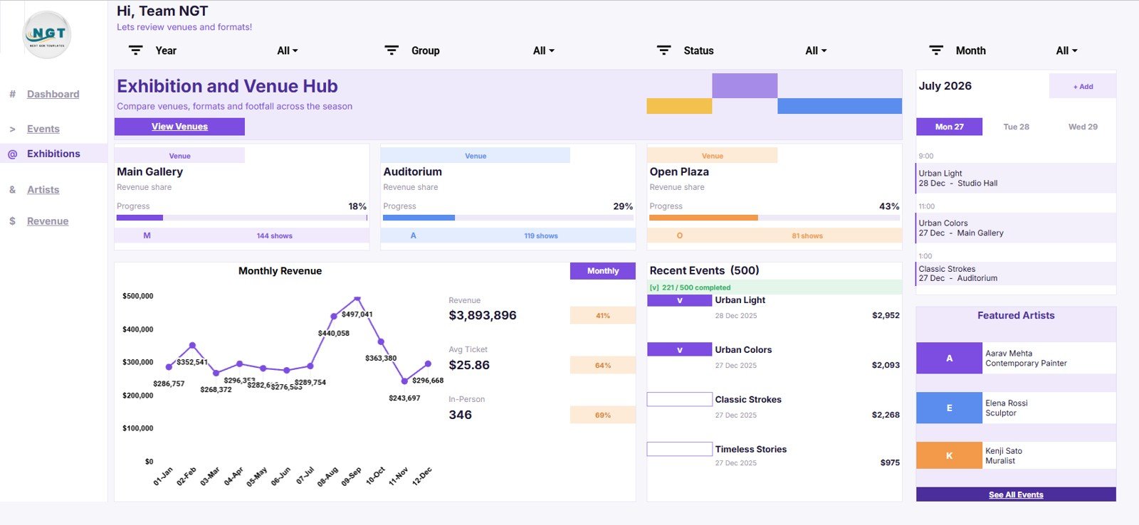
The Exhibition and Venue Hub is designed for teams that need to compare venue output and venue value. It supports reviews across revenue, show count, monthly revenue, ticket value, in-person events, and recent event activity.
- Revenue Share by Venue: This chart shows which venues contribute the largest share of revenue. It helps teams identify high-value spaces and understand revenue concentration.
- Shows by Venue: This view compares show or event volume by location. It supports venue utilization reviews and helps teams balance calendars across spaces.
- Monthly Revenue by Month: This trend displays revenue movement over time. Use it to connect seasonal exhibitions, festivals, and events to financial performance.
- Average Ticket by Month: This chart tracks ticket value by month. It can reveal pricing changes, discount effects, audience mix changes, or premium event performance.
- In-Person Events by Venue: This analysis focuses on physical event activity by location. It helps teams understand which venues drive in-person engagement.
- Recent Events by Event Name: This view keeps current venue-linked events visible. It helps teams investigate venue results through specific event examples.
4. Artists and Programs
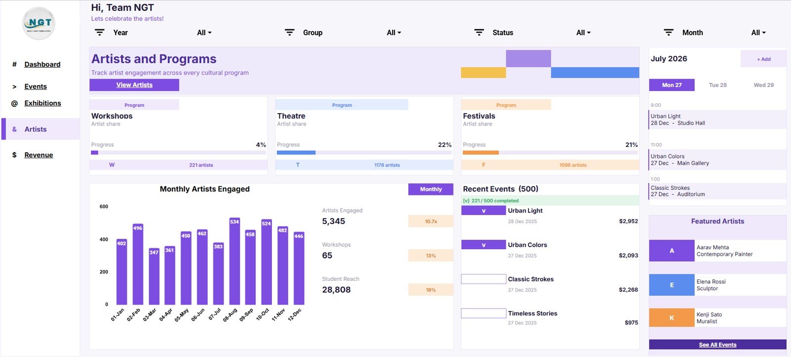
The Artists and Programs page is useful for artistic planning, education, outreach, and grant reporting. It helps teams monitor artist participation, program mix, workshops, student reach, and recent program-related events.
- Artist Share by Program: This chart shows how artist participation is distributed by program. It helps teams review representation, program focus, and artist allocation.
- Artists by Program: This view compares artist counts across programs. It is useful for planning residencies, exhibitions, workshops, and community initiatives.
- Monthly Artists Engaged by Month: This trend shows artist engagement over time. It helps teams see when artist activity rises, dips, or needs more outreach.
- Workshops by Program: This chart compares workshop volume by program. Education and outreach teams can use it to identify which programs are most active.
- Student Reach by Program: This analysis shows learner or student reach by program area. It supports education reporting, impact summaries, and grant updates.
- Recent Events by Event Name: This view links program performance back to specific events. It helps teams confirm which activities drove the latest program results.
5. Revenue and Costs
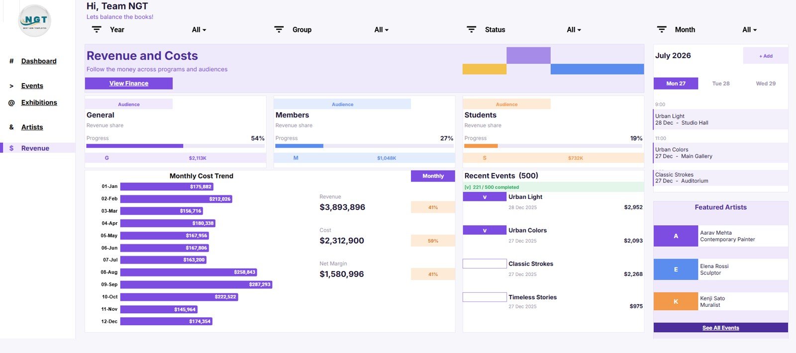
The Revenue and Costs page helps arts leaders review the financial side of programming. Instead of looking only at event count or attendance, this page highlights revenue distribution, monthly cost patterns, and net margin.
- Revenue Share by Audience: This chart shows how revenue is distributed across audience groups. It helps teams understand whether income comes mainly from public visitors, members, schools, partners, donors, or another audience segment.
- Revenue by Audience: This view compares revenue amounts by audience. It supports campaign review, pricing decisions, fundraising planning, and sponsorship discussions.
- Monthly Cost Trend by Month: This trend shows how costs move across the year. Finance teams can use it to spot expensive months and connect spending to program activity.
- Cost by Month: This chart compares cost totals by month. It makes budget review easier because spending can be checked against event timing and revenue patterns.
- Net Margin by Month: This analysis shows whether revenue is translating into margin. Leadership can use it to review sustainability across the reporting period.
- Recent Events by Event Name: This view links financial performance back to specific events. It helps teams investigate which events deserve deeper financial review.
6. Data Sheet Tab
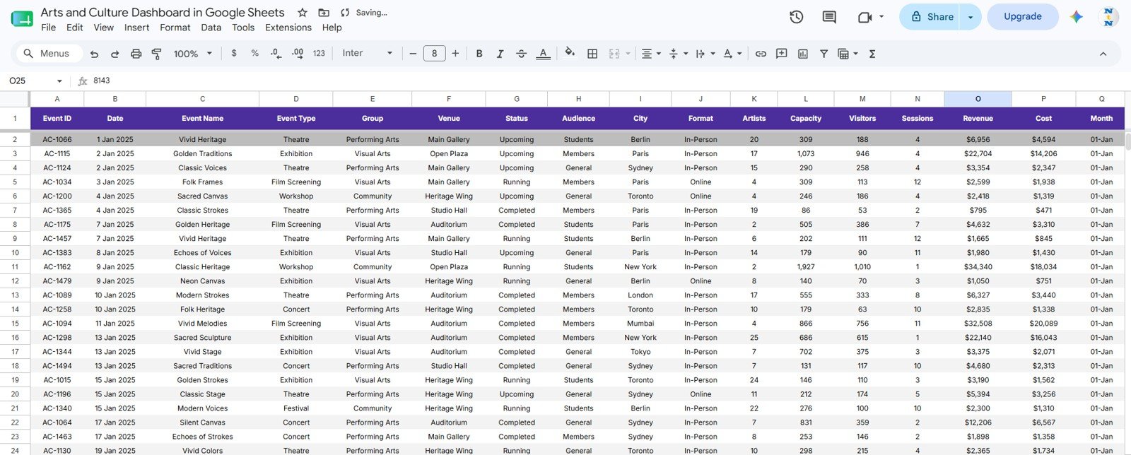
The Data Sheet tab is the source layer for the dashboard. This is where you add your arts and culture records in the same format used by the template. A good data sheet should include consistent event names, dates, categories, venues, audience segments, visitor counts, revenue, costs, artist details, program fields, and pipeline status.
How Teams Can Use This Template
- Weekly operations: Review pipeline stage, upcoming event load, recent events, and venue activity.
- Monthly reporting: Track visitors, event volume, revenue, costs, and program reach by month.
- Board updates: Turn event and financial data into clear charts before leadership meetings.
- Grant reporting: Summarize workshops, student reach, artist participation, and community impact.
- Finance review: Compare revenue by audience with monthly cost trends and net margin.
- Programming review: Understand which event categories, programs, artists, and venues are driving activity.
Google Sheets Dashboard vs Excel Dashboard vs Paid SaaS
| Option | Best Fit | Strength | Limitation |
|---|---|---|---|
| Google Sheets dashboard | Small and mid-sized cultural teams that need shareable reporting. | Easy collaboration, browser access, one-time template cost. | Requires clean manual or imported data updates. |
| Excel dashboard | Teams that prefer desktop spreadsheets or advanced Excel workflows. | Strong local spreadsheet control and familiar analysis features. | Sharing and version control can become harder. |
| Paid cultural SaaS | Larger organizations needing ticketing, CRM, donor management, memberships, and automation. | Can centralize many operational systems. | Higher cost, more setup, and less spreadsheet flexibility. |
Best Practices Before You Customize
- Keep event names consistent so charts and slicers group data correctly.
- Use standard categories for exhibitions, concerts, festivals, workshops, and programs.
- Decide whether visitors, sessions, and attendees mean different things for your organization.
- Review revenue and cost definitions before presenting margin to leadership.
- Add new fields carefully so formulas, pivot tables, charts, and slicers stay aligned.
- Keep a clean backup copy before making major design or formula changes.
Who Should Use This Dashboard?
This dashboard is a good fit for museums, galleries, cultural centers, performing arts groups, concert organizers, festivals, arts nonprofits, education teams, and creative program managers. It is also useful for consultants who prepare dashboards for cultural organizations and need a starting structure that already matches the arts and culture domain.
Who May Need Something Else?
If your organization needs automated ticketing, donor management, CRM workflows, membership processing, or advanced integrations, a dedicated arts management platform may be more appropriate. This dashboard is best when the reporting need is clear and the team wants an editable spreadsheet dashboard first.
Related Templates to Explore
- Arts & Culture Dashboard in Excel
- Music Industry KPI Scorecard in Google Sheets
- Advertising Dashboard in Google Sheets
Frequently Asked Questions
Is the Arts and Culture Dashboard built in Google Sheets?
Yes. It is a Google Sheets dashboard template that can be copied into Google Drive and customized for your own organization.
Can I use it for museums, galleries, concerts, and festivals?
Yes. The structure supports exhibitions, concerts, festivals, programs, venues, audiences, artists, visitors, revenue, costs, and event pipeline reporting.
Does the dashboard include multiple pages?
Yes. It includes the Overview Page, Event Command Center, Exhibition and Venue Hub, Artists and Programs, Revenue and Costs, and Data Sheet tab.
Can I replace the sample data?
Yes. The Data Sheet tab is designed so you can replace sample records with your own event, artist, venue, visitor, revenue, and cost data.
Does it require a paid SaaS subscription?
No. The template is a one-time purchase from NextGenTemplates. You can customize the Google Sheets copy for your own reporting process.
Can my team collaborate on it?
Yes. Since it is built in Google Sheets, you can share the workbook with team members according to your own Google Drive permissions.
Conclusion
The Arts and Culture Dashboard in Google Sheets gives arts teams a structured way to review events, venues, artists, visitors, audiences, programs, revenue, costs, and margins from one spreadsheet-based reporting system. It is practical for recurring reviews, board updates, grant reporting, program planning, and finance conversations.
Get the Arts and Culture Dashboard in Google Sheets and start organizing your cultural event reporting in a cleaner, more visual format.
Last updated: July 27, 2026.