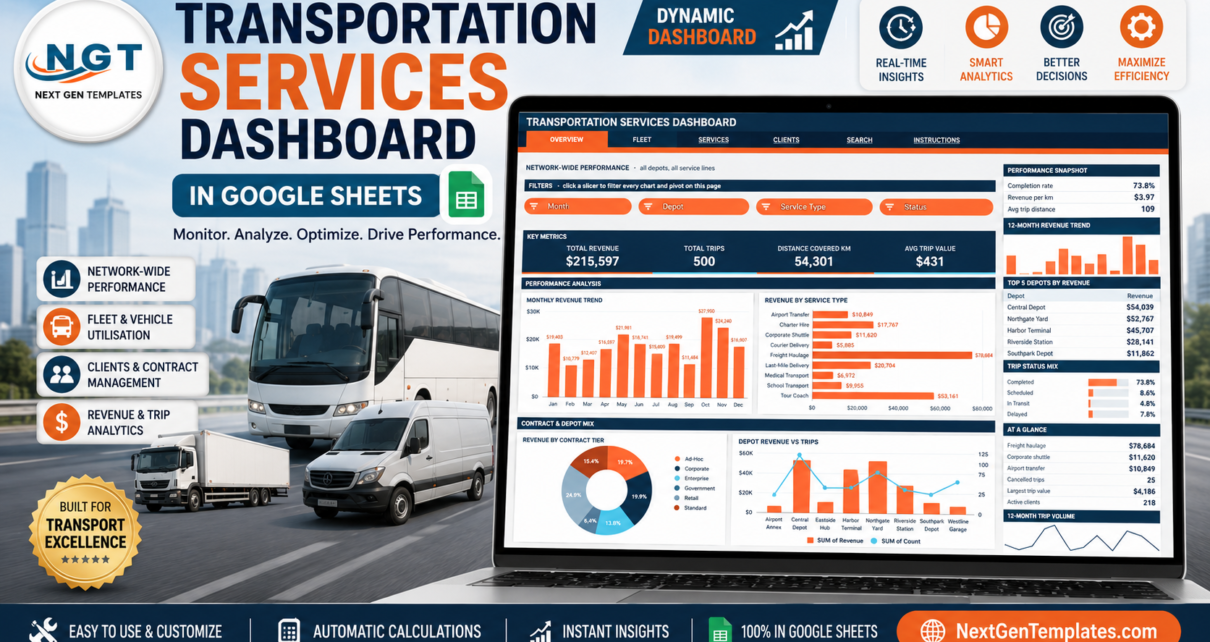
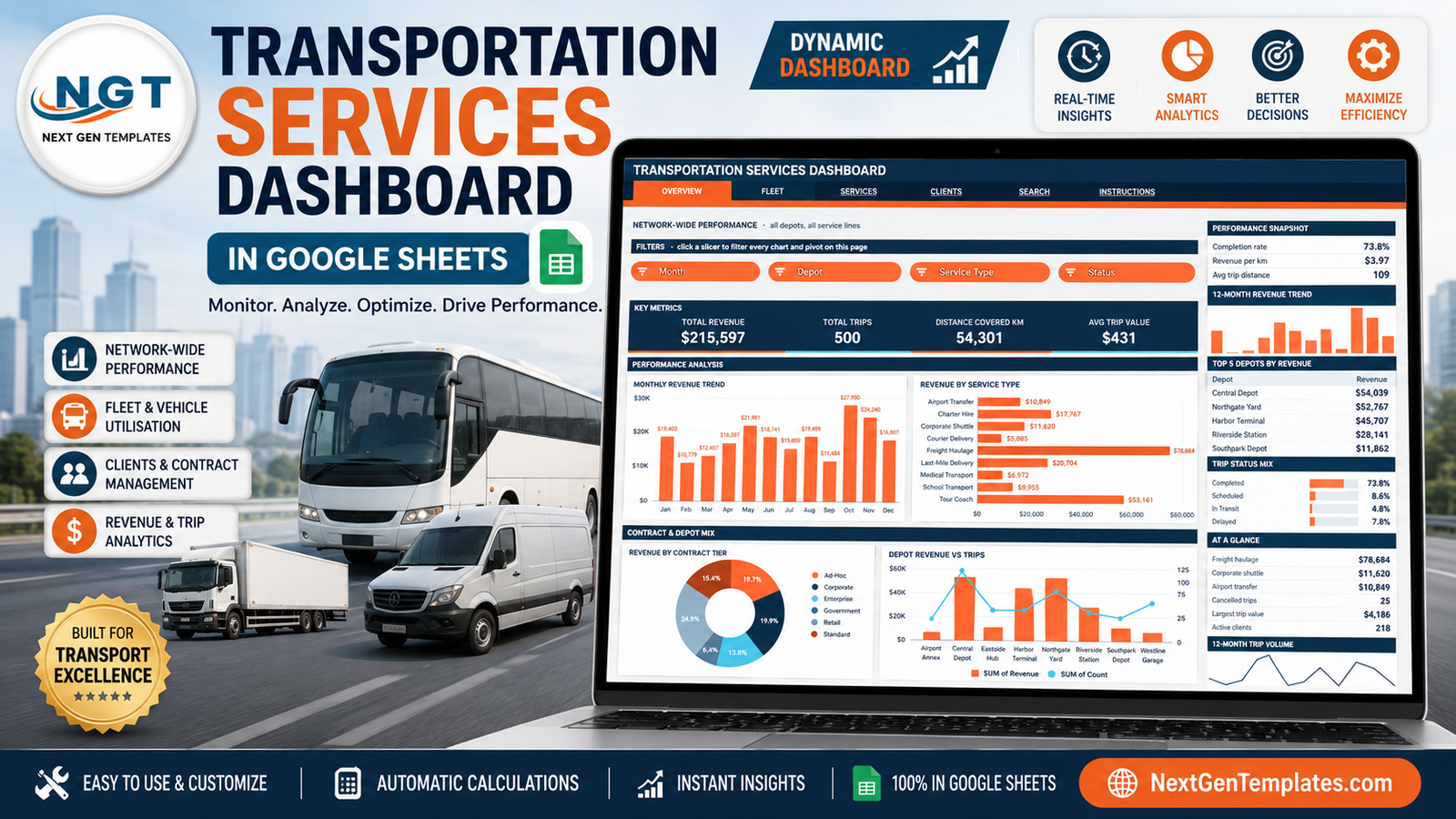
Most transport operators already have the data. It sits in a booking export or a shared sheet: one row per trip, a date, a depot, a driver, a fare. What they usually do not have is a way to look at it. The Transportation Services Dashboard in Google Sheets is built for exactly that gap. The sample file carries 500 trips worth $215,597 across 8 depots, 9 service lines, 8 vehicle types and 10 drivers, and turns them into six linked pages with 16 slicers, 16 KPI cards and 16 charts – all driven by native Google Sheets pivot tables rather than a hidden layer of helper formulas.
This walkthrough covers what is on each page, how the pivot-and-slicer architecture behaves, where the design is opinionated, and what it will not do. If you run a coach fleet, a courier network, a freight operation or a corporate shuttle contract, that should be enough to tell whether it fits.
Get the Transportation Services Dashboard in Google Sheets
Key Features of the Transportation Services Dashboard in Google Sheets
Real pivot tables behind every chart
Each page parks its pivot tables far to the right, past a wide spacer column. Every chart reads one of them. That matters more than it sounds: when a depot manager disputes a number, you scroll right and show the pivot that produced it, instead of unpicking a nested formula. Google’s own pivot table documentation covers the underlying mechanics if you want to extend them.
Four slicers per analysis page
Overview, Fleet, Services and Clients each open with a FILTERS strip holding four slicers. Click one and every chart, pivot and sidebar Top 5 table on that page redraws together. Slicers are page-scoped, so a filter on Fleet does not silently change what Clients is showing – a deliberate choice that keeps two people working in the same file from confusing each other.
KPI cards that stay unfiltered on purpose
The KPI strip and the AT A GLANCE sidebar list run on SUMIFS and COUNTIFS against the Data sheet, not on the pivots. They always report the network total. Some people find that surprising the first time; the reason is that it gives you a fixed anchor. When you filter the Overview page down to one depot, the charts move but Total Revenue $215,597 stays put, so you can immediately judge that depot as a share of the whole.
Auto-expanding ranges to 1,000 rows
Pivots, slicers and formulas are pre-wired to row 1001. Paste new trips anywhere in that span and nothing needs rebuilding. Past 1,000 rows, the bundled Apps Script exposes a DATA_ROWS constant you can raise and re-run.
A one-block colour theme
The palette lives in a single constant at the top of the script – ink #0B3954, accent #FF7043 and cyan #4DD0E1 for second chart series. Change those three values, re-run, and the banner, tab strip, KPI cards and every chart series follow.
Dashboard Pages Explanation
Page 1 – Overview: network-wide performance
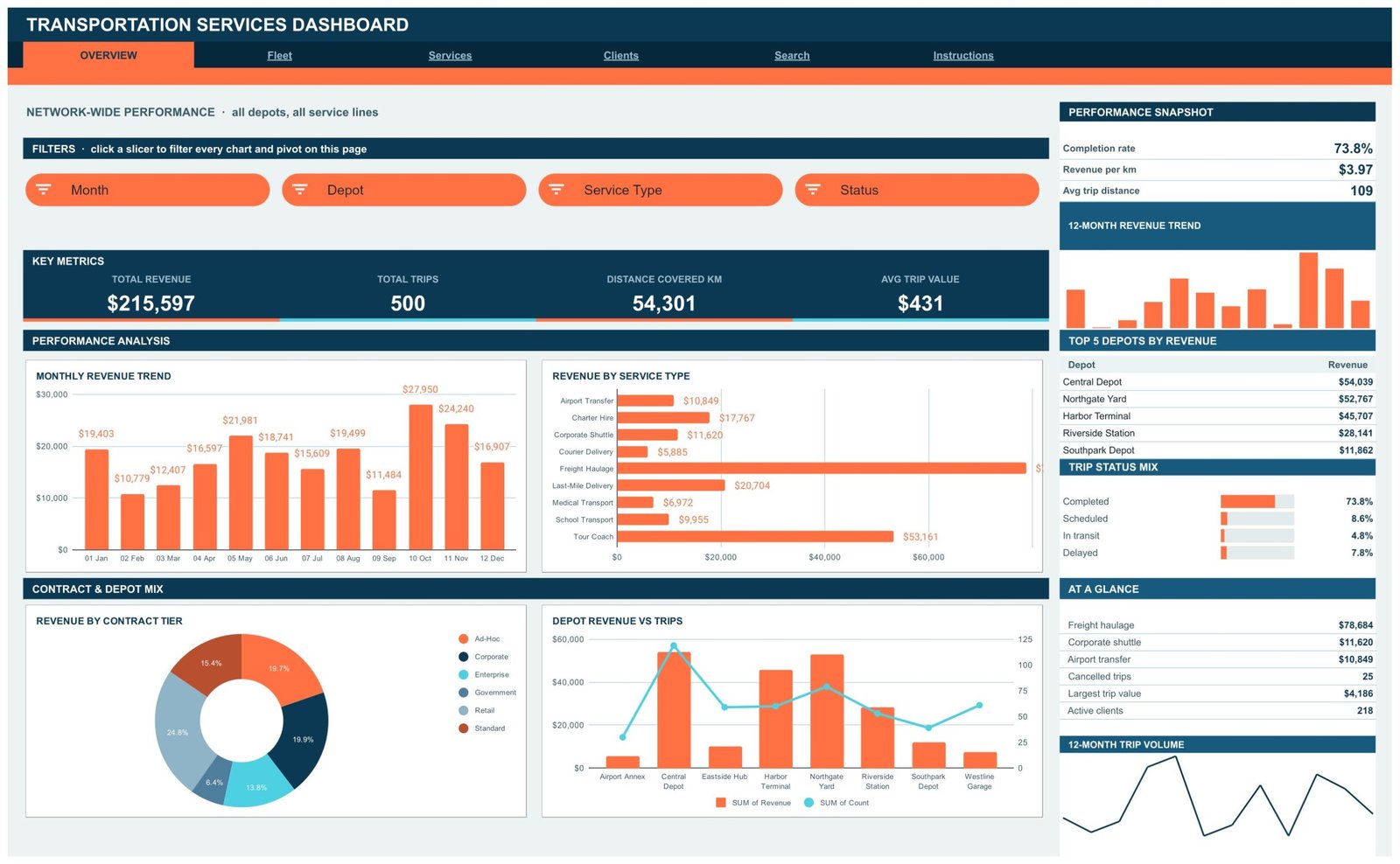
The landing page answers “how is the whole operation doing”. Four KPI cards read Total Revenue $215,597, Total Trips 500, Distance Covered 54,301 km and Avg Trip Value $431. Below them, Monthly Revenue Trend and Revenue by Service Type sit side by side, with Revenue by Contract Tier and Depot Revenue vs Trips underneath.
The right rail is where the quick answers live: a Performance Snapshot (completion rate 73.8%, revenue per km $3.97, average trip distance 109 km), a Top 5 Depots by Revenue table led by Central Depot at $54,039 and Northgate Yard at $52,767, a Trip Status Mix bar set, and an AT A GLANCE list that puts freight haulage at $78,684 against 25 cancelled trips and 218 active clients. Slicers: Month, Depot, Service Type, Status.
Page 2 – Fleet: depot and vehicle utilisation
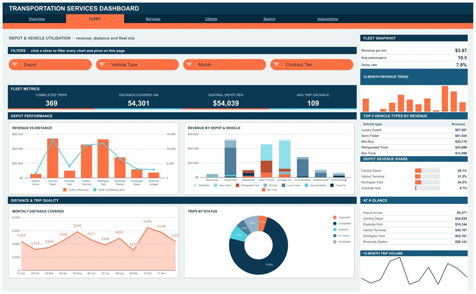
Fleet asks where the assets are earning. KPI cards switch to Completed Trips 369, Distance Covered 54,301 km, Central Depot Rev $54,039 and Avg Trip Distance 109 km. Revenue vs Distance plots money and kilometres per depot on twin axes, which is the fastest way to spot a depot covering a lot of ground for little return. Revenue by Depot & Vehicle stacks all eight vehicle types inside each depot column. Monthly Distance Covered draws the kilometre curve as an area chart, and Trips by Status separates the 73.8% completed share from delayed, in-transit, scheduled and cancelled work.
The rail ranks vehicle types by revenue – Luxury Coach $67,987 ahead of Semi-Trailer $61,025 and Mini Bus $25,176 – and shows depot revenue share as bars. Slicers: Depot, Vehicle Type, Month, Contract Tier.
Page 3 – Services: service line, driver and route coverage
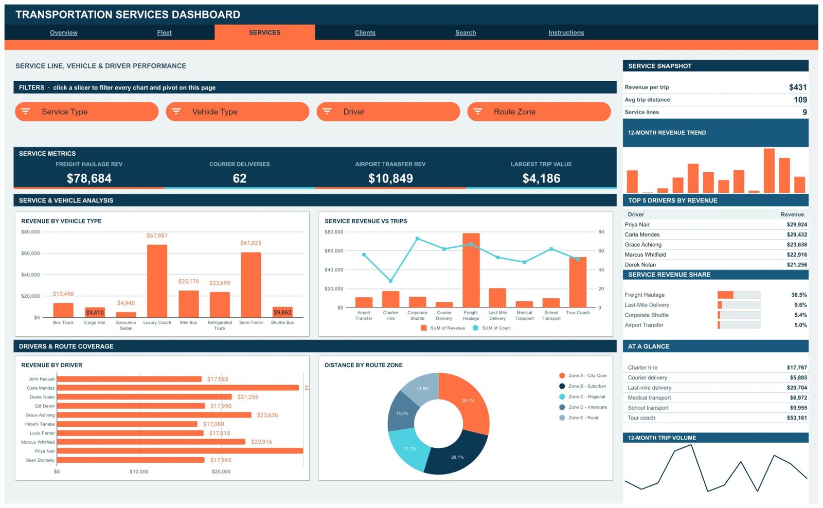
This is the page for anyone managing a mixed service book. Freight Haulage Rev $78,684, Courier Deliveries 62, Airport Transfer Rev $10,849 and Largest Trip Value $4,186 head the strip. Revenue by Vehicle Type and Service Revenue vs Trips sit above Revenue by Driver and Distance by Route Zone.
The zone donut is quietly useful: Zone A – City Core takes 28.7% of distance, Zone B – Suburban 26.1%, then Regional 17.7%, Interstate 14.0% and Rural 13.5%. Read alongside the driver bar chart – Priya Nair at $29,924, Carla Mendes at $29,432 – it tells you whether your best earners are also your longest runners. Service Revenue Share puts Freight Haulage at 36.5% of the book. Slicers: Service Type, Vehicle Type, Driver, Route Zone.
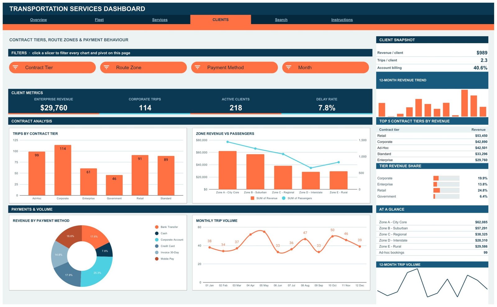
Page 4 – Clients: contract tiers, zones and payment behaviour
Clients covers who buys and how they pay. Enterprise Revenue $29,760, Corporate Trips 114, Active Clients 218 and Delay Rate 7.8% sit on the cards. Trips by Contract Tier counts all six tiers – Corporate 114, Ad-Hoc 99, Retail 91, Standard 89, Enterprise 61 and Government 46. Zone Revenue vs Passengers pairs money against headcount, so you can see revenue falling as you move outward from the city core while passenger counts do not fall at the same rate.
Revenue by Payment Method is the page’s most practical chart for a finance team: Corporate Account 25.3%, Credit Card 17.9%, Bank Transfer 17.6%, Mobile Pay 16.6%, Invoice 30-Day 14.8% and Cash 7.8%. The Client Snapshot converts that to an account-billing share of 40.6%. Slicers: Contract Tier, Route Zone, Payment Method, Month.
Page 5 – Search: one trip, all its fields
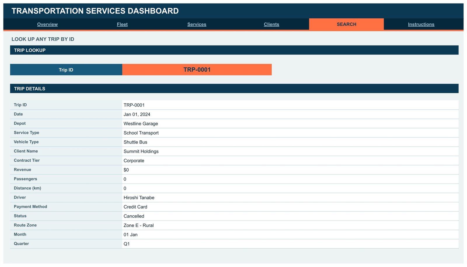
Pick a Trip ID from the dropdown and the Trip Details panel returns the full record: date, depot, service type, vehicle type, client name, contract tier, revenue, passengers, distance, driver, payment method, status, route zone, month and quarter. It is the page you open when a customer calls about a specific job rather than a trend.
Page 6 – Instructions: the 10-point guide
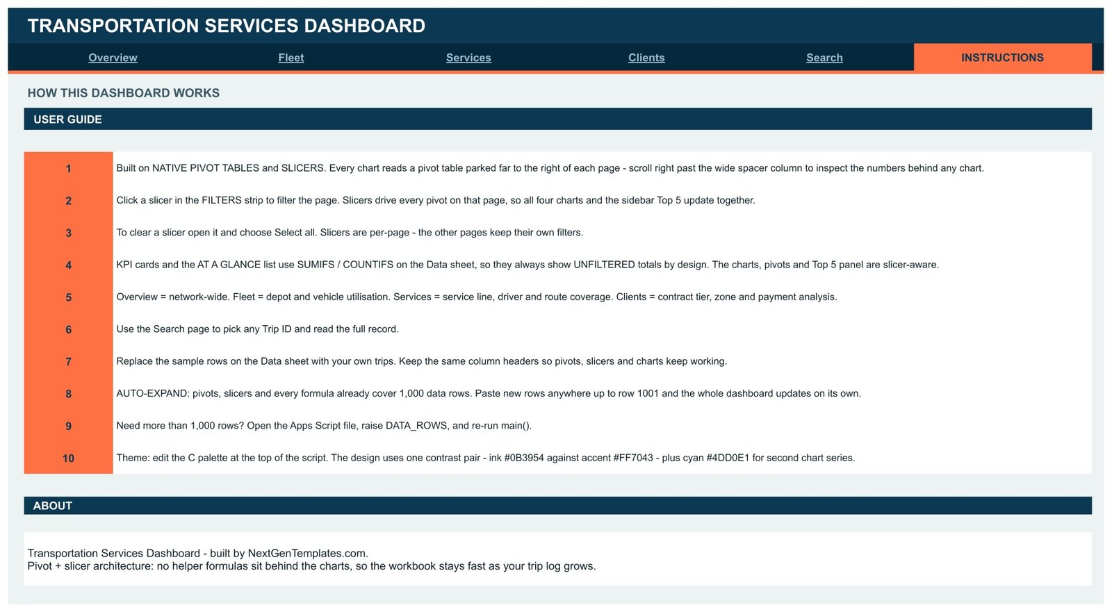
The final tab documents the build in plain language – where the pivots sit, how to clear a slicer with Select all, why the KPI cards stay unfiltered, how the 1,000-row auto-expand works, and how to recolour the file. Whoever inherits this sheet after you should be pointed here first.Transportation Services Dashboard in Google Sheets
Google Sheets vs. Excel vs. Paid Fleet Telematics Software – Feature Comparison
| This template (Google Sheets) | Excel dashboard | Fleet telematics SaaS | |
|---|---|---|---|
| Cost | One-time, under $20 | One-time, plus a Microsoft 365 seat | Per-vehicle monthly fee |
| Platform | Any browser, Android, iOS | Desktop Excel; mobile is limited | Web plus vendor app |
| Setup time | About a minute | Download, open, replace data | Hardware fitting and onboarding |
| Real-time team collaboration | Yes, native multi-user editing | Only via OneDrive co-authoring | Yes |
| Mobile access | Full read and edit | Read-mostly | Yes |
| Customisable fields | Yes – edit the Data sheet and script | Yes | Usually fixed to the vendor schema |
| Share with a link | Yes | File attachment or cloud link | Seat-based logins |
| Year-1 cost at 5 users | The purchase price, once | Purchase price plus five subscriptions | Typically four figures and up |
| GPS and telematics hardware | Not included | Not included | Included, and required |
| Who owns the data | You, in your own Drive | You, in your own file | The vendor’s platform |
Telematics platforms answer “where is vehicle 12 right now”. This dashboard answers “what did our trips earn, which depots and service lines carry the business, and where do delays cluster”. Different questions – and a lot of operators only need the second.
Who Should Use This Template
It suits a multi-depot transport, coach, courier or freight business doing anywhere from a handful to a few hundred trips a month, where the trip records already exist in a sheet or can be exported from a booking system. Operations managers get the depot and vehicle view; dispatchers get the service and driver view; finance gets contract tiers and payment behaviour. Because it is Google Sheets, a depot supervisor can open it on a phone without a licence being provisioned.
It is the wrong choice if you need live GPS, geofencing or ELD compliance, if you are logging thousands of trips a month (move to a database), or if you need automated invoicing rather than revenue reporting.
Real-World Use Cases
Regional coach and shuttle operator. Every Monday the operations manager pastes last week’s completed jobs into the Data sheet. The Fleet page shows Luxury Coach revenue running well ahead of Semi-Trailer work, so two drivers move onto charter hire for the following month.Transportation Services Dashboard in Google Sheets
Last-mile courier network. A dispatch coordinator filters the Services page by Route Zone and Driver, looking for distance being burned without matching revenue. Rural zone runs turn out to carry 13.5% of distance for a smaller share of revenue, which starts a conversation about a rural surcharge.
Corporate shuttle contractor. Month-end billing lives on the Clients page: trips by contract tier, revenue by payment method, and the 40.6% account-billing share that tells the finance lead how much of the month is sitting on 30-day invoices rather than settled card payments.
Advantages of the Transportation Services Dashboard in Google Sheets
- Auditable. Every chart traces back to a visible pivot table, so no number is unexplainable.
- Fast to adopt. Copy the file, paste your trips, done. No install, no add-on, no macro.
- Genuinely multi-user. Dispatch, operations and finance can be in the same file at once without version conflicts.
- Cheap to run. One purchase covers the whole team, with no per-vehicle charge.
- Self-documenting. The Instructions page means handover does not depend on the person who set it up.
- Restyleable. Three hex codes rebrand the entire dashboard.
Opportunities for Improvement
Being honest about the edges matters more than a feature list.
- The KPI cards do not respond to slicers. That is by design, but it will confuse a first-time user who filters to one depot and expects Total Revenue to change. Say so when you hand the file over.
- The 1,000-row ceiling is a real ceiling. Going beyond it means editing the Apps Script, which is a five-minute job but still a script edit.
- No cost or margin side. The dashboard tracks revenue, distance and status. Fuel, maintenance and driver cost are not in the data model, so profitability is out of scope unless you extend it.
- No date-range slicer. Filtering is by Month, so a mid-month to mid-month window needs a helper column.
- Google Sheets slowdown at scale. With many pivots recalculating, very large files feel sluggish – which is the practical reason for the 1,000-row default.
Best Practices
- Keep the column headers exactly as shipped. The pivots, slicers and every SUMIFS reference them by name.
- Standardise your list values before importing. “Central Depot” and “Central depot” become two slicer entries and split your totals.Transportation Services Dashboard in Google Sheets
- Import on a fixed rhythm. Weekly beats ad-hoc; the monthly trend charts only mean something on complete periods.Transportation Services Dashboard in Google Sheets
- Give viewers view-only access. Editors can move a pivot by accident, and pivot ranges do not always recover gracefully.Transportation Services Dashboard in Google Sheets
- Duplicate the file before restyling. Re-running the script on your live copy is safe, but a backup costs nothing.
- Clear slicers before sharing a screenshot. Filters persist per page, and a filtered chart mislabelled as a total is how bad decisions start. Google’s slicer documentation covers the reset behaviour.
Explore Relevant Templates
- Logistics Dashboard in Google Sheets – the warehouse and freight-flow companion to this trip-level view.
- Shipping Dashboard in Google Sheets – carrier, lane and consignment analysis in the same pivot-and-slicer style.
- EV Fleet Dashboard in Google Sheets – charging, range and energy cost for an electric fleet.
- School Transportation Services Dashboard in Excel – route-based school transport, on the Excel side.
- Earlier walkthroughs: Fleet Management Dashboard in Google Sheets and the Transportation KPI Dashboard in Google Sheets.
Get the Transportation Services Dashboard in Google Sheets
Pivot tables and slicers do the heavy lifting in a dashboard like this. The Excel Pivot Tables & Dashboards course on NextGenTemplates Academy teaches the same ideas step by step, with practice files.
Frequently Asked Questions
How is the template delivered?
As a PDF containing a Google Sheets copy link. Click it, choose Make a copy, and the dashboard lands in your own Drive with every pivot, slicer and chart intact.
Do I need a paid Google Workspace account?
No. A free personal Google account opens and edits it.
Can it handle more than 1,000 trips?
Yes. Raise the DATA_ROWS constant in the bundled Apps Script and re-run main() to extend every range.
Why do the KPI cards ignore my slicer selection?
They are built on SUMIFS and COUNTIFS over the Data sheet so they always show the network total. Charts, pivots and Top 5 panels are the slicer-aware parts.
Can I rename the depots, service types and vehicle types?
Yes – they are ordinary values in the Data sheet. Edit them, refresh the pivots, and the slicer lists follow.
Does it track vehicles by GPS?
No. It analyses trip records you enter or import. Live location needs telematics hardware.
Does it calculate profit?
Not out of the box. Revenue, distance and status are modelled; fuel, maintenance and driver cost are not. You can add cost columns and extend the pivots yourself.
About the Author
Built by PK – Microsoft Certified Professional with 15+ years of Excel, Google Sheets, and Power BI experience. Founder of NextGenTemplates, reaching 300K+ subscribers across YouTube channels. Every template is hand-built and tested before release.
Conclusion
The Transportation Services Dashboard in Google Sheets is a reporting layer, not a tracking platform. Within that scope it is well drawn: six pages that separate network, fleet, service and client questions instead of piling them onto one screen; slicers that filter a page cleanly; pivots you can actually inspect; and an instructions tab so the file survives a handover. The trade-offs – unfiltered KPI cards, a 1,000-row default and no cost model – are stated plainly rather than hidden.Transportation Services Dashboard in Google Sheets
If your trips are already in a spreadsheet and you have been meaning to make sense of them, this is a short path from raw log to a view your operations and finance teams can share. Get it here: Transportation Services Dashboard in Google Sheets.Transportation Services Dashboard in Google Sheets