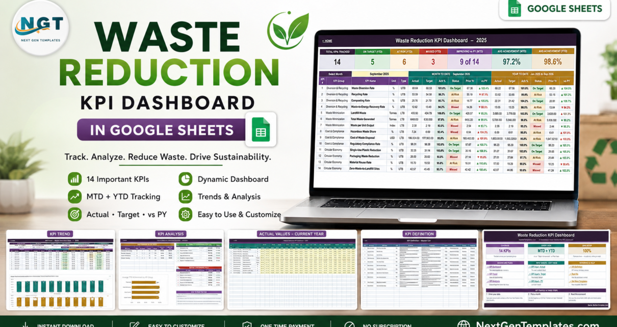
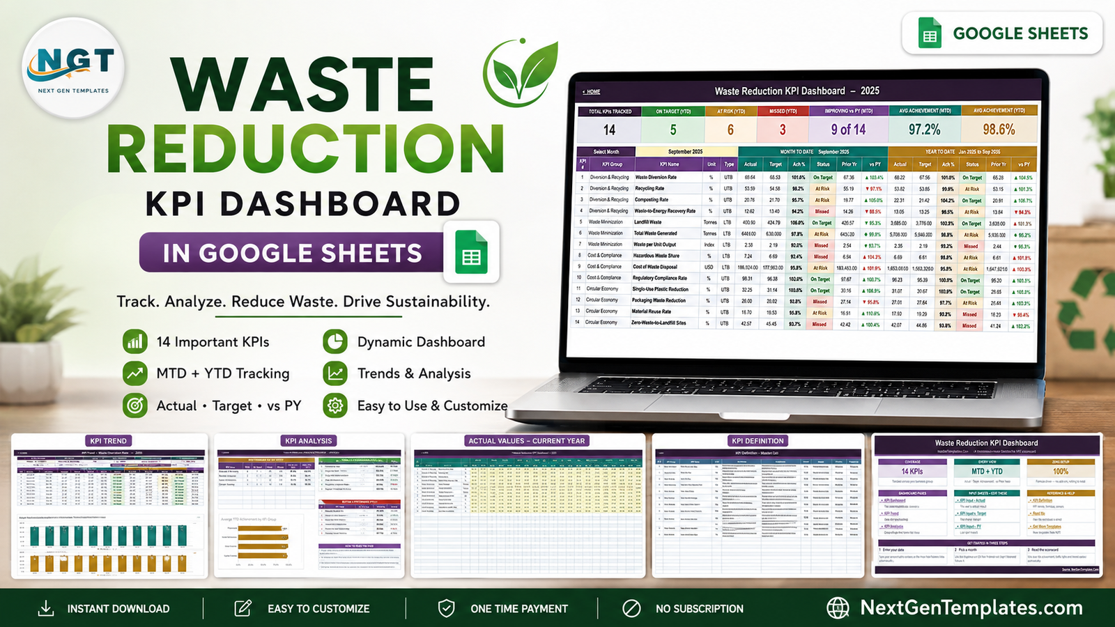
Most waste reporting dies the same death: the haulier’s tonnage report lands, someone pastes it into a fresh tab, rebuilds a chart, and by the time the meeting happens nobody can say whether the recycling rate actually moved. The Waste Reduction KPI Dashboard in Google Sheets replaces that with a fixed scorecard – 14 KPIs in 4 groups, each reported month to date and year to date against target and against last year.
The sample file carries a complete twelve-month year. Select September 2025 and it reports 97.2% average MTD achievement, 98.6% YTD, 5 KPIs On Target, 6 At Risk and 3 Missed, and 9 of 14 improving against the prior year. Every one of those figures is a formula over numbers you typed on three input sheets – no add-on, no Apps Script, no refresh step.
Get the Waste Reduction KPI Dashboard in Google Sheets
One clarification before anything else, because the catalogue holds near-identical names: this is the KPI scorecard, with a month picker, traffic lights, a KPI Trend page and a KPI Analysis page. It is not the chart-led analytical waste dashboard with slicers. And it is a manual tracking template – it records and visualises numbers you enter, it does not produce regulatory, audited or certified figures of any kind.
Key Features of the Waste Reduction KPI Dashboard in Google Sheets
- 14 KPIs across four groups. Diversion & Recycling (4), Waste Minimization (3), Cost & Compliance (3) and Circular Economy (4).
- MTD and YTD in the same row. Actual, Target, Achievement %, Status, Prior Yr and vs PY – twice, once for the month and once cumulatively.
- Seven summary cards. Total KPIs Tracked, On Target, At Risk, Missed, Improving vs PY, Average Achievement MTD and Average Achievement YTD.
- Upper-the-better and lower-the-better logic. Achievement is Actual / Target for UTB KPIs and Target / Actual for LTB ones, so cutting landfill tonnage or disposal cost below target scores above 100%.
- Traffic-light thresholds you control. On Target from 100%, At Risk 95-99%, Missed below 95% – editable in the Status formulas.
- A trend page for any single KPI and a group roll-up page with top and bottom five.
- A KPI Definition master list holding the formula, definition, owner, priority and frequency for every metric.
Dashboard Pages Explanation
Home
A launch page rather than decoration. Three cards summarise the build – 14 KPIs, MTD + YTD, 100% formula-driven – and three link blocks separate the dashboard pages from the input sheets you edit and the reference sheets. A three-step start guide sits underneath: enter your data, pick a month, read the scorecard.
KPI Dashboard
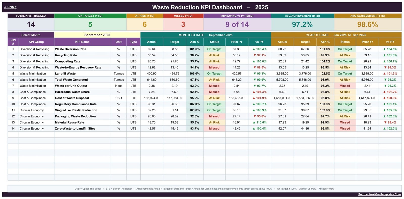
The scorecard. A Select Month dropdown at the top left drives the entire workbook; the month-to-date block is teal, the year-to-date block gold. Each row carries the KPI number, group, name, unit and type, then the two six-column blocks. In the sample, Waste Diversion Rate runs 69.64% against a 68.53% target – 101.6%, On Target – while Waste per Unit Output sits at 92.0% of target and shows as Missed. A footnote spells out the UTB/LTB rule and the three thresholds so nobody has to reverse-engineer a formula.
KPI Trend
Pick one KPI and see its whole year. The sample opens on Waste Diversion Rate – group Diversion & Recycling, unit %, type UTB, owner Sustainability Manager, priority Critical, frequency Monthly – with its formula and definition printed above the table. Twelve rows follow, each with MTD Actual, Target, Prior Yr, Achievement and Status, then the same for YTD, then MTD and YTD movement against the prior year. Two charts sit below: MTD Trend for Waste Diversion Rate and YTD Trend for Waste Diversion Rate, both plotting Actual bars against Target and prior-year lines.
KPI Analysis
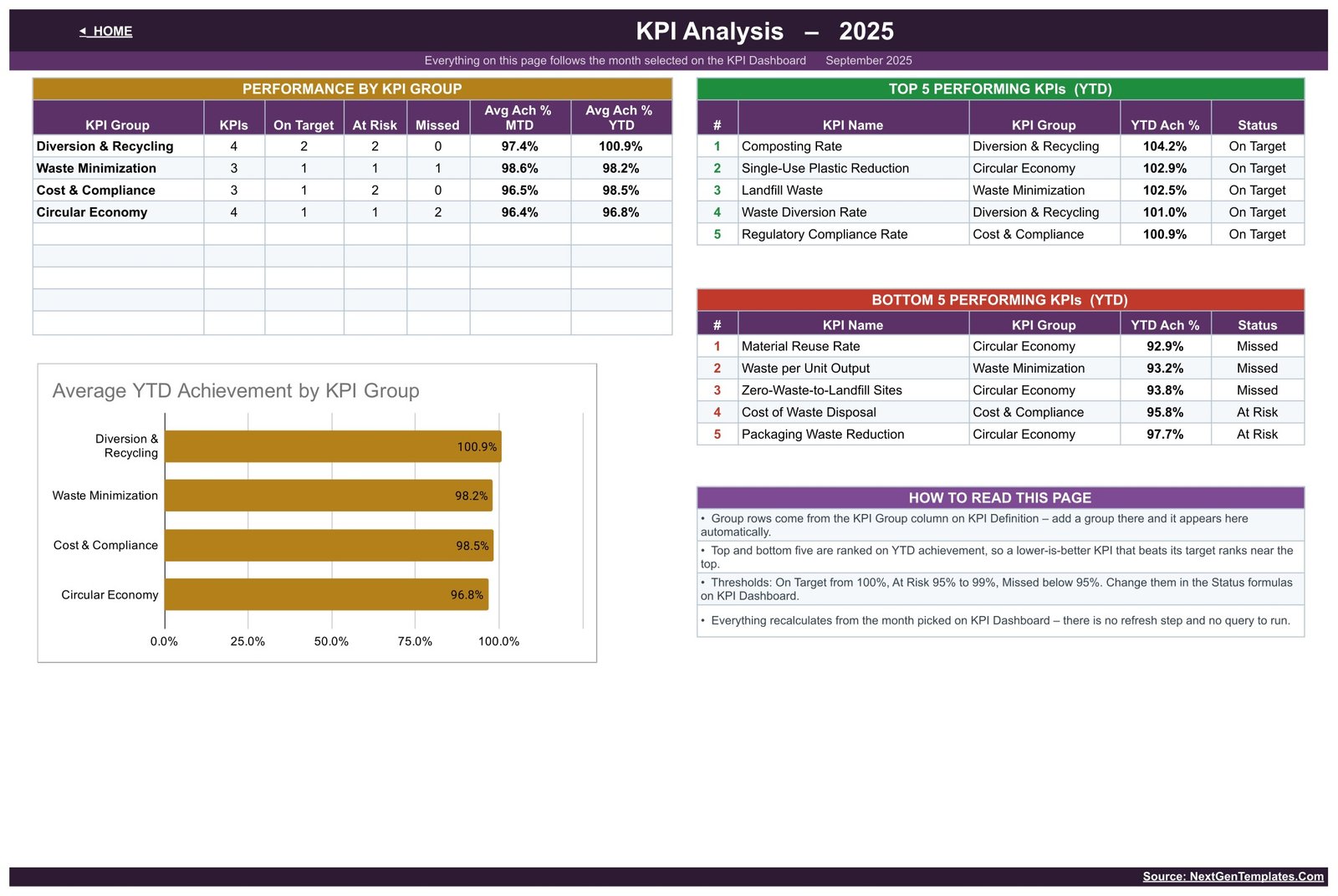
Three blocks and a chart. Performance by KPI Group counts On Target / At Risk / Missed per group and averages MTD and YTD achievement – in the sample, Diversion & Recycling leads on 100.9% YTD and Circular Economy trails on 96.8%. Top 5 and Bottom 5 Performing KPIs rank on YTD achievement, so Composting Rate (104.2%) heads the list and Material Reuse Rate (92.9%) anchors the other. The Average YTD Achievement by KPI Group bar chart repeats the group picture visually, and a short “how to read this page” panel explains that the groups come from the KPI Definition sheet.
KPI Input – Actual, Target and PY
Three identical grids: this year’s result, this year’s target and last year’s result. Each has MTD and YTD columns for all twelve months, with the yellow cells as the only ones you touch. Cell E3 sets the first month of the reporting year, so a April-March or July-June year re-bases the whole workbook with one edit.
KPI Definition
The master list, and the sheet that makes this template yours. Fourteen rows hold KPI number, group, name, unit, formula, definition, type, owner, priority and frequency – Recycling Coordinator owns Recycling Rate, the EHS Officer owns Hazardous Waste Share and Regulatory Compliance Rate, the Finance Business Partner owns Cost of Waste Disposal. Add, rename or delete a row and every other sheet follows automatically.
Waste Reduction KPI Dashboard vs. Excel vs. Paid Sustainability Software – Feature Comparison
| This Google Sheets scorecard | An Excel KPI workbook | Paid EHS / sustainability platform | |
|---|---|---|---|
| Cost | One-time, under 10 USD | Similar one-off, plus Microsoft 365 | Typically 200-1,500+ per month |
| Platform | Browser, free Google account | Desktop Excel | Vendor web app |
| Setup time | Minutes | Minutes once shared | Weeks of onboarding |
| Real-time collaboration | Native multi-user editing | Only via OneDrive co-authoring | Yes, per seat |
| Mobile access | Google Sheets app | Excel mobile | Vendor app |
| Customizable KPIs | Edit one definition sheet | Yes, if you know the formulas | Vendor metric library |
| Share with a link | Yes | No | Yes |
| Year-1 cost at 5 users | Under 10 USD | Under 10 USD plus licences | 2,400-18,000+ |
| Automated data capture | No – manual entry | No | Usually yes |
| Regulatory reporting | No | No | Often included |
Who Should Use This Template
Sustainability and EHS leads at one site or a handful of sites. Facilities and operations managers who already receive monthly tonnages from a waste contractor. Procurement teams working a packaging or single-use plastic reduction target. Finance business partners who want disposal cost sitting next to the tonnage that drives it. In short: teams whose waste review is monthly and whose data arrives as a report, not a feed.
It is the wrong tool if you need weighbridge or bin-sensor integration, emissions calculations, or a disclosure produced under a named reporting framework. It performs no unit conversion, ships no emission factors and encodes no regulatory logic – Regulatory Compliance Rate is a percentage you calculate elsewhere and type in.
Real-World Use Cases
Multi-site manufacturer. A sustainability manager receives tonnages on the 5th of each month, types them into KPI Input – Actual, selects the month, and walks into the operations review with the diversion rate, the landfill trend and the three KPIs that missed – no deck rebuild.
Retail head office. A facilities lead tracks Composting Rate and Single-Use Plastic Reduction against a baseline year. When someone claims the reusable-cup scheme changed nothing, the vs PY column settles it.
Finance partner on a cost programme. Cost of Waste Disposal is lower-the-better, so coming in under budget shows as achievement above 100% instead of looking like a shortfall – and the cost line and tonnage line go to the same committee on one page.
Advantages of the Waste Reduction KPI Dashboard in Google Sheets
- Nothing to install or refresh. Plain formulas and native Google Sheets charts; the file works on a free account.
- One control point. A single month dropdown drives the scorecard, the trend page and the analysis page.
- Honest scoring. Lower-is-better KPIs are handled properly, which is where most home-made waste trackers quietly go wrong.
- Ownership on the page. Every KPI has a named owner, a priority and a stated formula, so review meetings argue about the number rather than about its definition.
- Structure survives customisation. Swap all fourteen KPIs for your own and the pages, charts and roll-ups still work.
Opportunities for Improvement
Being straight about the limits: entry is manual, so if your waste data already sits in a contractor portal you will still be re-keying it. There is one KPI on the trend page at a time – useful for a deep dive, not for scanning. The workbook is single-entity; multiple sites need either separate copies or extra KPI rows per site. Long values in the KPI Group and KPI Name columns can clip at the default column widths, which is a two-second drag to fix. And there is no forecast or target-setting engine – targets are numbers you decide and type.
Best Practices
- Finish the KPI Definition sheet before entering a single figure. Naming and ownership decisions get expensive later.
- Set the reporting-year start in E3 first if you do not run January to December.
- Fill the prior-year sheet even if it is approximate – the vs PY column is where most of the insight lives.
- Keep 10-16 KPIs. Beyond that the scorecard stops being readable in a meeting.
- Protect the calculated sheets and share edit access only to the three input sheets. Google’s data validation and dropdown documentation is worth ten minutes if you plan to add your own picklists.
- Revisit thresholds annually. A 95% At Risk floor that everything clears is not telling you anything.
Explore Relevant Templates
- Carbon Footprint KPI Dashboard in Google Sheets – same scorecard layout, energy and emissions subject.
- Renewable Resource KPI Dashboard in Google Sheets – the closest sibling, for material and energy sourcing.
- Waste Management KPI Scorecard in Google Sheets – the collection and haulage side.
- Circular Economy KPI Dashboard in Google Sheets – reuse and material recovery in more depth.
- Environmental Services Dashboard in Google Sheets – the analytical, chart-led alternative.
- Waste Reduction KPI Dashboard in Power BI – the same subject for a Power BI team.
If you want to go further with scorecards like this one, the Excel Pivot Tables & Dashboards course on NextGenTemplates Academy teaches the reporting techniques behind them, with practice files.
Get the Waste Reduction KPI Dashboard in Google Sheets
Frequently Asked Questions
Does this template make my organisation compliant with environmental or waste regulations?
No. It is a manual tracking and visualisation spreadsheet for figures you enter yourself. It does not perform regulatory reporting, implement any named reporting or certification standard, produce audited numbers or calculate emissions.
Is this the KPI scorecard or the analytical dashboard?
The scorecard – month picker, traffic lights, KPI Trend and KPI Analysis pages. Similarly named analytical dashboards are different products, so compare the screenshots.
Can I replace the 14 KPIs with my own?
Yes. Edit the KPI Definition sheet and every other page follows. No formula edits needed.
Do I need any add-on, script or paid Google plan?
No. It is native Google Sheets formulas and charts on a free account.
How are lower-is-better KPIs scored?
They are flagged LTB and scored as Target divided by Actual, so beating a landfill or cost target produces achievement above 100%.
Can several people use it at once?
Yes – once you have made your own copy it behaves like any other Google Sheet, including simultaneous editing.
What arrives when I buy it?
A PDF containing the Google Sheets link. Open it, click through and use File > Make a copy to put an editable copy in your own Drive.
About the Author
Built by PK – Microsoft Certified Professional with 15+ years of Excel, Google Sheets, and Power BI experience. Founder of NextGenTemplates, reaching 300K+ subscribers across YouTube channels. Every template is hand-built and tested before release.
Conclusion
Waste programmes fail on reporting long before they fail on operations. A fixed scorecard – the same fourteen KPIs, the same thresholds, the same owners, every month – turns the monthly review from a data-gathering exercise into a decision. The Waste Reduction KPI Dashboard in Google Sheets gives you that structure for the price of a lunch, with nothing to install and nothing to renew.
Get the Waste Reduction KPI Dashboard in Google Sheets on NextGenTemplates – one-time payment, instant download, your own editable copy in minutes.