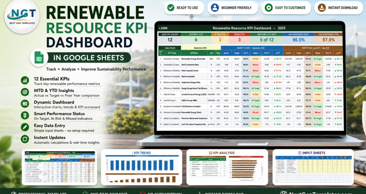
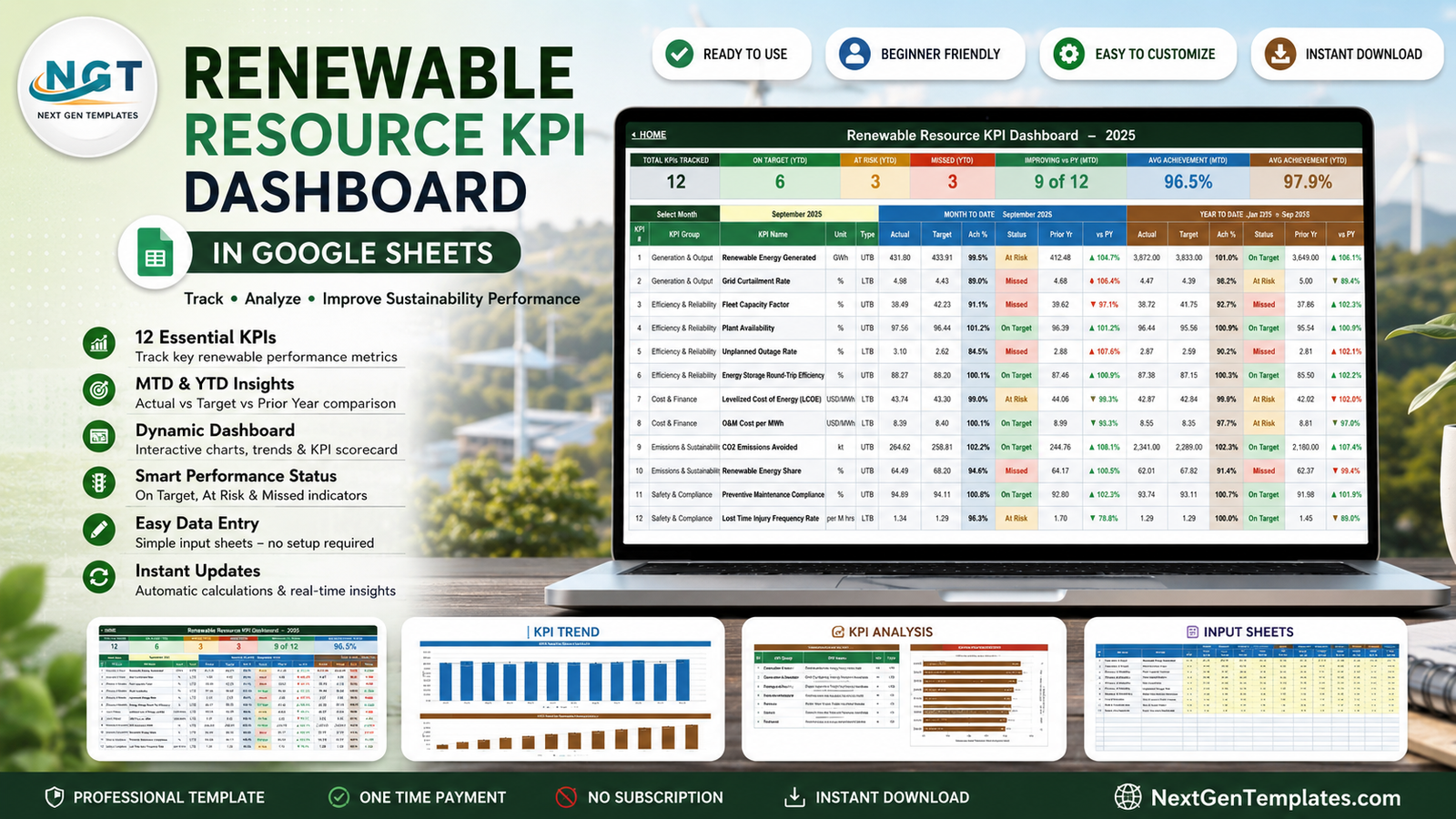
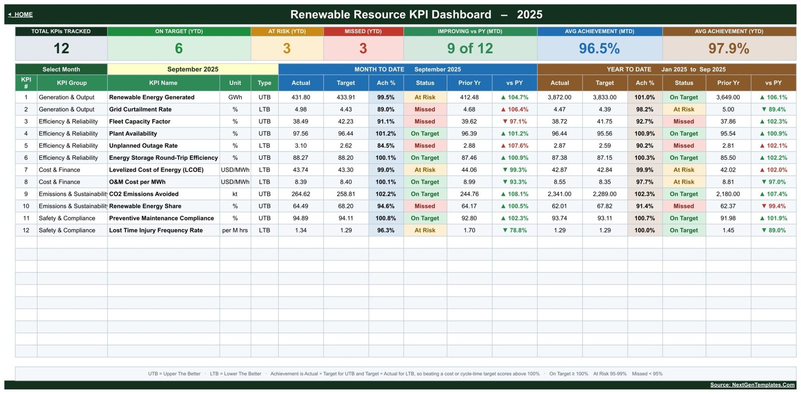
The Renewable Resource KPI Dashboard in Google Sheets tracks 12 KPIs across 5 KPI groups on 6 linked sheets, each reported month-to-date and year-to-date against target and against prior year. In the sample September 2025 month it reads 96.5% average MTD achievement and 97.9% YTD, with 6 KPIs On Target, 3 At Risk, 3 Missed, and 9 of 12 improving against last year. Every figure is formula-driven, so there is no add-on to install, no script to authorise and no refresh button to press.Renewable Resource KPI Dashboard in Google Sheets
Most renewable teams already have the numbers. What they do not have is one page that turns net export, curtailment, availability, LCOE, emissions avoided and injury rate into a single monthly verdict everyone can read in thirty seconds. That is the job this template does. You type your monthly figures into three input sheets, pick a month from one dropdown, and the scorecard, the trend charts and the group roll-up all follow.
Get the Renewable Resource KPI Dashboard in Google Sheets
Which template is this? This is the KPI scorecard – a month-picker layout with Actual vs Target vs Prior Year, On Target / At Risk / Missed traffic lights, a single-KPI trend page and a group analysis page. It is a different product from the chart-led analytical Renewable Energy Dashboard in Google Sheets. Names in the two families overlap, so it is worth being clear which one you are looking at.
And what it is not. The Renewable Resource KPI Dashboard is a manual tracking and visualisation template. It reports the figures you enter. It does not meter generation, read SCADA or inverter data, calculate emissions from raw activity data, ship emission factors, connect to certificate or REC registries, or produce audited, verified or certified figures for any sustainability or regulatory reporting framework.Renewable Resource KPI Dashboard in Google Sheets
Key Features of the Renewable Resource KPI Dashboard
The template covers twelve KPIs organised into five groups that mirror how a renewable asset team actually reviews a month:
- Generation & Output – Renewable Energy Generated (GWh) and Grid Curtailment Rate (%)
- Efficiency & Reliability – Fleet Capacity Factor, Plant Availability, Unplanned Outage Rate and Energy Storage Round-Trip Efficiency
- Cost & Finance – Levelized Cost of Energy (LCOE) and O&M Cost per MWh, both in USD/MWh
- Emissions & Sustainability – CO2 Emissions Avoided (kt) and Renewable Energy Share (%)
- Safety & Compliance – Preventive Maintenance Compliance and Lost Time Injury Frequency Rate (per million hours)
One dropdown drives the whole workbook. The Select Month cell on the KPI Dashboard sheet is the only control in the template. Pick a month and the month-to-date block, the year-to-date block, every status light, both charts on KPI Trend and the entire KPI Analysis page recalculate from it.
Traffic lights with published thresholds. Status is On Target from 100%, At Risk between 95% and 99%, and Missed below 95%. Those bands live in the Status formulas on the KPI Dashboard sheet, so changing them to match your own governance is a formula edit, not a rebuild.
Upper-the-better and lower-the-better are handled properly. Every KPI carries a UTB or LTB type. Achievement is Actual divided by Target for UTB metrics and Target divided by Actual for LTB metrics, so beating an LCOE, outage or injury target scores above 100% rather than reading as a failure. Five of the twelve KPIs use the LTB path.
Year-to-date is computed, not typed. Volume KPIs such as Renewable Energy Generated and CO2 Emissions Avoided accumulate as a running sum across the elapsed months; rate KPIs such as Fleet Capacity Factor and Plant Availability average instead. Both YTD tracks carry their own Target, Prior Year, Achievement % and Status.
Dashboard Pages Explanation
Home
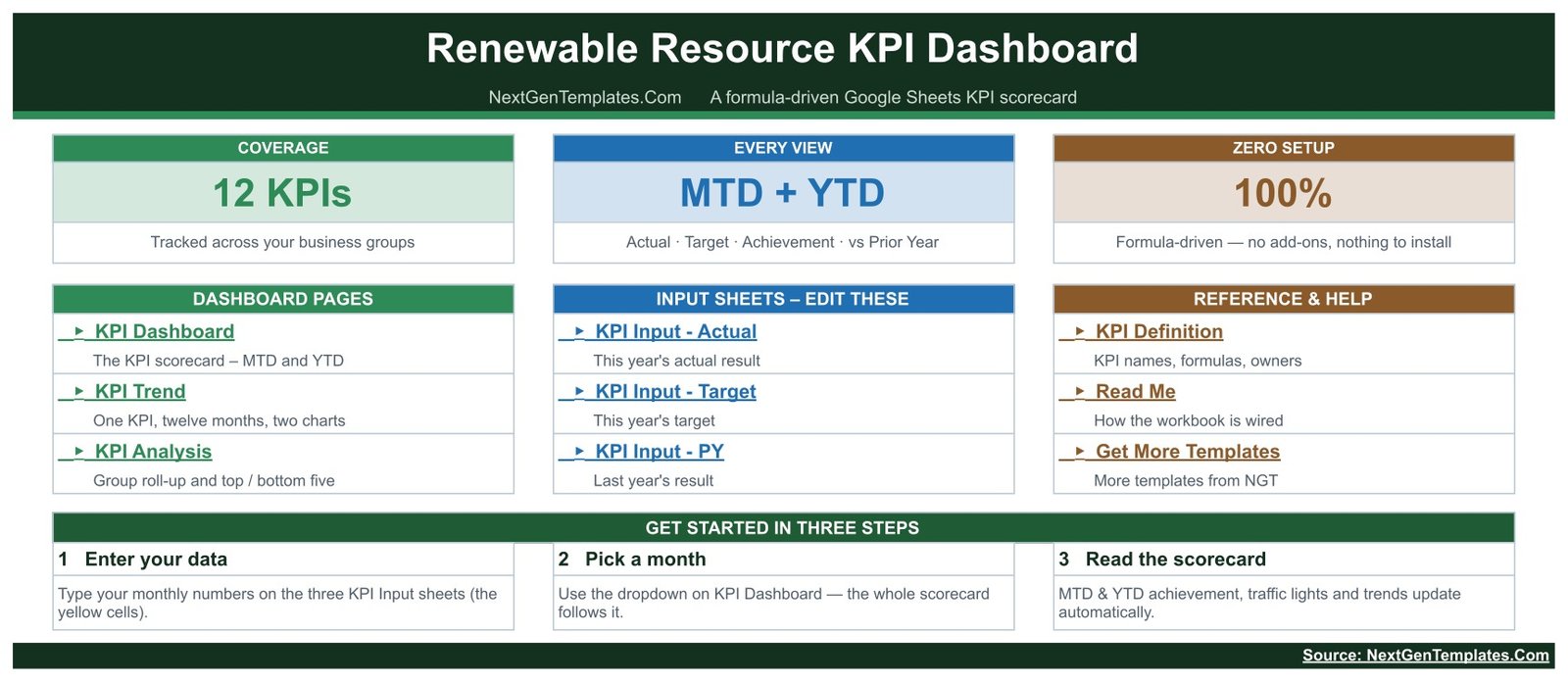
The launch page. Three cards state the coverage (12 KPIs), the reporting windows (MTD + YTD with Actual, Target, Achievement and vs Prior Year) and the setup effort (100% formula-driven, nothing to install). Three link panels below them jump to the dashboard pages, the three input sheets and the reference sheets, and a Get Started strip lays out the three steps.
KPI Dashboard
The scorecard. Seven header cards report Total KPIs Tracked, On Target (YTD), At Risk (YTD), Missed (YTD), Improving vs PY (MTD), Avg Achievement (MTD) and Avg Achievement (YTD). Each KPI row then shows its group, name, unit and type followed by a Month To Date block and a Year To Date block, each carrying Actual, Target, Achievement %, Status, Prior Yr and vs PY.Renewable Resource KPI Dashboard in Google Sheets
KPI Trend
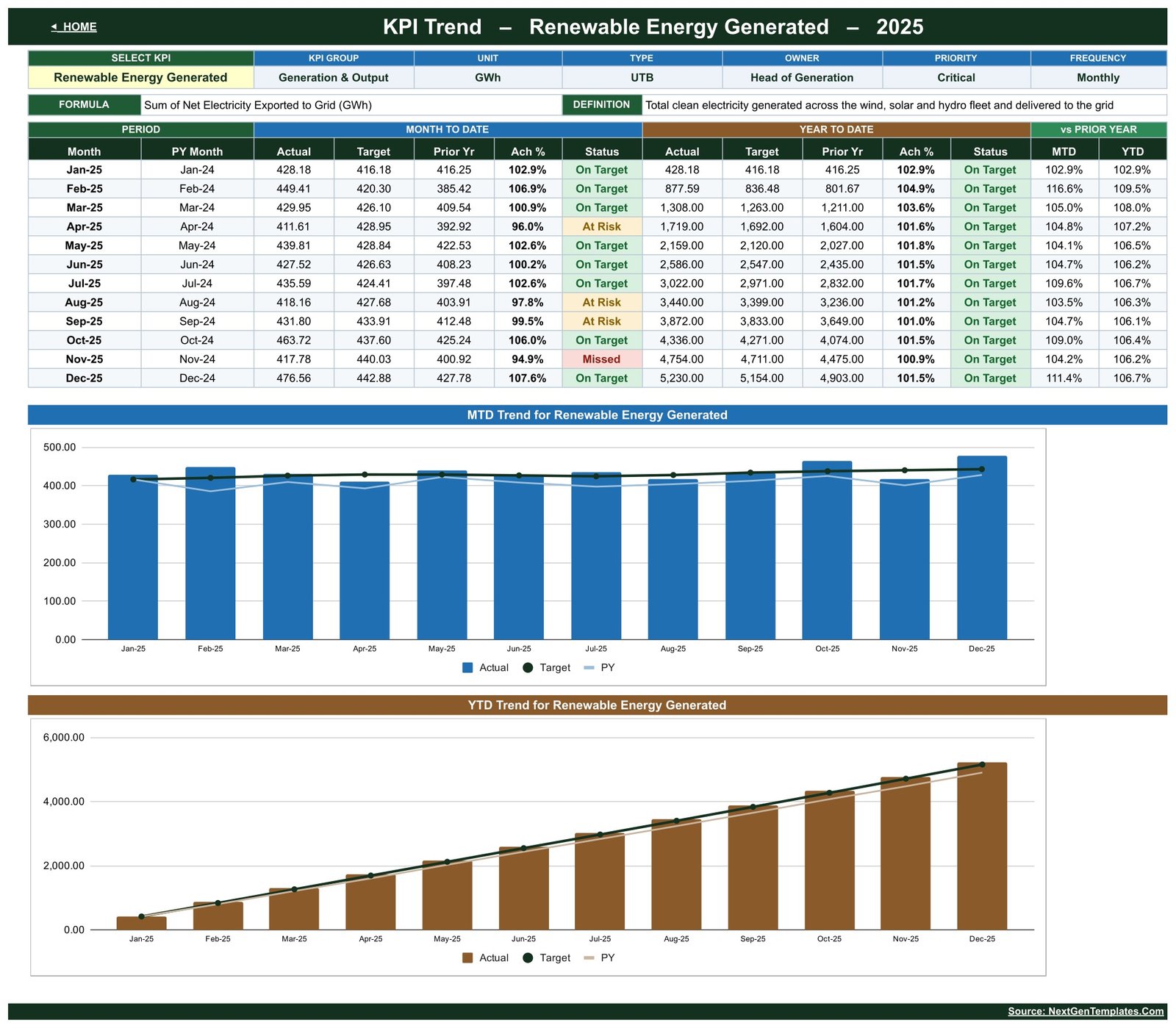
One KPI at a time, across twelve months. Choose a KPI from the Select KPI dropdown and the header restates its group, unit, type, owner, priority, frequency, formula and definition. A twelve-row table lists MTD and YTD Actual, Target, Prior Yr, Achievement % and Status per month, feeding two charts: MTD Trend for the selected KPI and YTD Trend for the selected KPI, each overlaying Target and Prior Year on the Actual bars.Renewable Resource KPI Dashboard in Google Sheets
KPI Analysis
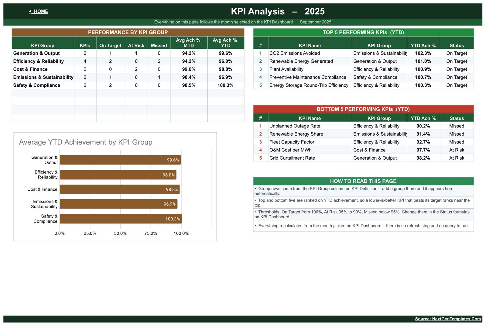
The roll-up view. Performance by KPI Group counts KPIs, On Target, At Risk and Missed for each group and averages MTD and YTD achievement, with a matching Average YTD Achievement by KPI Group chart. Alongside it, Top 5 Performing KPIs and Bottom 5 Performing KPIs rank every metric on YTD achievement, and a How to Read This Page panel explains both the ranking and the thresholds.Renewable Resource KPI Dashboard in Google Sheets
KPI Input – Actual, Target and PY
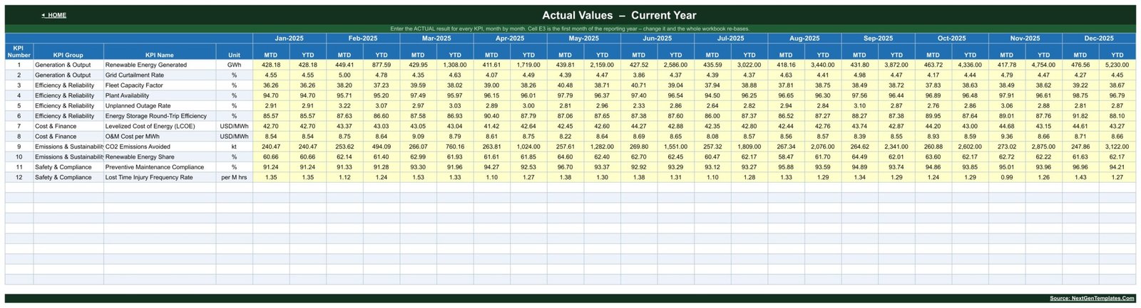
Three identical entry sheets, one for this year’s actuals, one for this year’s targets and one for last year’s results. Every KPI gets a row and every month gets an MTD and a YTD column across January to December, with editable cells shaded yellow. Cell E3 sets the first month of the reporting year, so a non-calendar financial year re-bases the whole workbook.
KPI Definition
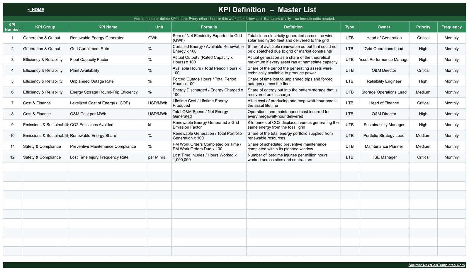
The master list every other sheet reads. Each row holds KPI Number, KPI Group, KPI Name, Unit, Formula, Definition, Type, Owner, Priority and Frequency – Fleet Capacity Factor, for instance, is Actual Output divided by Rated Capacity times Hours, times 100, owned by the Asset Performance Manager at High priority. Add, rename, regroup or delete a row here and the rest of the workbook follows automatically.
Renewable Resource KPI Dashboard vs. a Microsoft Excel Scorecard vs. Paid Energy-Monitoring SaaS – Feature Comparison
| Feature | Renewable Resource KPI Dashboard (Google Sheets) | Microsoft Excel KPI scorecard | Paid energy-monitoring SaaS (Power Factors, AlsoEnergy) |
|---|---|---|---|
| Cost | $8.99 one-time | $12-20 one-time, plus an Excel licence | Quote-based annual licence, usually per site or per MW |
| Platform | Any browser, no install | Desktop Excel | Vendor web portal |
| Setup time | Under 10 minutes | Under 15 minutes | Weeks – metering, data mapping and onboarding |
| Real-time team collaboration | Native, multiple editors at once | Only via OneDrive co-authoring | Yes |
| Mobile access | Google Sheets mobile app | Excel mobile, limited | Vendor app |
| Customisable KPI list | Type a row on KPI Definition | Editable, formulas usually need touching | Fixed to the vendor’s metric library |
| Share with a link | Yes, one link | File attachment or cloud link | Seat-based logins |
| Automatic meter or SCADA feed | No – you type the monthly numbers | No | Yes |
| Year-1 cost at 5 users | $8.99 total | $12-20 plus licences | Thousands, quote-based |
For teams that want a monthly renewable scorecard everyone can open without waiting on a metering integration project, the Renewable Resource KPI Dashboard sits in the sweet spot.
Who Should Use This Template
Perfect for:
- Asset performance and O&M managers running a monthly review across a wind, solar, hydro or mixed fleet
- Independent power producers and small developers with 1-50 sites reporting to an owner or board
- Sustainability and energy managers who need one internal scorecard rather than a reporting platformRenewable Resource KPI Dashboard in Google Sheets
- Consultants and asset managers serving several clients who want one shareable link per clientRenewable Resource KPI Dashboard in Google Sheets
- Finance partners who want LCOE and O&M cost per MWh sitting beside output and availabilityRenewable Resource KPI Dashboard in Google Sheets
Not a fit if:
- You need an automatic feed from SCADA, inverters, meters or a market operator – every number here is entered by hand
- You need audited, verified or assured figures for a regulatory or sustainability reporting framework
- You expect emissions to be calculated from raw activity data – no emission factors ship with this template
- You need real-time monitoring, alarm handling or dispatch – this is a monthly scorecard
- You need sub-hourly forecasting, degradation modelling or engineering-grade performance-ratio analysis
Real-World Use Cases
Maria manages a 140 MW wind and solar portfolio for an independent power producer. Each month she types net export, curtailment, availability and forced-outage hours into KPI Input – Actual, then picks the month on the KPI Dashboard. The red Missed lights tell her where to spend the review meeting instead of walking the board through twelve rows one at a time.
Daniel is the O&M director at a hydro operator with eight plants. He watches Plant Availability, Unplanned Outage Rate and Preventive Maintenance Compliance on the KPI Trend page, one KPI at a time, because the MTD chart with the Prior Year overlay shows whether this year’s maintenance plan is holding up against last year’s.
Priya consults for four small renewable developers. She keeps one copy of the Renewable Resource KPI Dashboard per client, shares each as a view-only link, and uses the KPI Analysis group roll-up to open every client call the same way: which groups improved, and which five KPIs sit at the bottom.
Advantages of the Renewable Resource KPI Dashboard
It costs once. At $8.99 there is no per-user fee and no renewal. A five-person team pays $8.99 in year one and $0 in year two, against a quote-based annual licence for a monitoring platform.
It works on day one. There is no metering project, no IT approval and no data mapping. Make a copy, type your numbers, pick a month. Most users have their own data on screen in under ten minutes.
Nothing is hard-coded. Because KPI Definition drives the whole workbook, a fleet that adds battery storage or drops a metric changes one row instead of rewriting formulas across six sheets.
It is shareable by link. Google Sheets handles the collaboration – see Google’s own guide to sharing files for view-only, comment and edit permissions – so the board gets a read-only link while the analyst keeps edit rights.
Opportunities for Improvement
Two honest limitations are worth stating. First, the KPI Group column is narrow, so the longer group names – “Emissions & Sustainability” in particular – are visually clipped on the KPI Dashboard, KPI Analysis, input and KPI Definition sheets. The underlying cell values are complete; widening the column in your own copy fixes the display in seconds. The Owner column on KPI Definition clips “Asset Performance Manager” the same way.
Second, everything is manual by design. There is no live connection to plant data, so the accuracy of the scorecard is exactly the accuracy of what you type. Teams with a real-time monitoring platform should treat this as the management summary layer on top of it, not a replacement for it.
The sample figures shipped with the template are illustrative demonstration data for a mixed renewable fleet. They are there to show the formulas working, not to serve as benchmarks – replace them before drawing any conclusion.
Best Practices
- Fix the KPI list on KPI Definition before entering a year of data – reordering rows later means re-keying inputs.
- Set targets for all twelve months at the start of the year so YTD achievement is meaningful from month one.
- Enter prior-year figures too. Half the value of the scorecard is the vs PY column, and it is blank without them.
- Check the UTB / LTB type on every KPI you add. A cost or rate metric typed as UTB will score backwards.
- Review Bottom 5 Performing KPIs first in the monthly meeting – it is the fastest route to the two or three items that need a decision.
- Keep one master copy and duplicate it per year or per client rather than stretching a single file across multiple reporting years.
Explore Relevant Templates
If you want the same month-picker layout narrowed to one technology, look at the Wind Energy KPI Scorecard in Google Sheets, the Solar Energy KPI Scorecard in Google Sheets or the Hydropower KPI Scorecard in Google Sheets. On the sustainability side, the Carbon Footprint KPI Dashboard in Google Sheets and the Waste Reduction KPI Dashboard in Google Sheets pair naturally with this one, and the ESG Dashboard in Google Sheets covers the wider environmental, social and governance picture. For the analytical treatment of the same subject, see the Renewable Energy Dashboard in Google Sheets.
Also available as: Renewable Resource KPI Dashboard in Excel and Renewable Resource KPI Dashboard in Power BI.
Want to build scorecards like this yourself? The Excel Pivot Tables & Dashboards course on NextGenTemplates Academy walks you through the reporting techniques step by step, with practice files.
Get the Renewable Resource KPI Dashboard in Google Sheets
Frequently Asked Questions
Does the Renewable Resource KPI Dashboard make my organisation compliant or produce reportable emissions figures?
No. The Renewable Resource KPI Dashboard is a manual tracking and visualisation template. It reports the numbers you type in, ships no emission factors, performs no verification, and produces no audited, assured or certified figure for any sustainability or regulatory reporting framework.
Does it connect to SCADA, inverters or meters?
No. The Renewable Resource KPI Dashboard has no data connection of any kind. Monthly figures are entered by hand on the three input sheets. That is deliberate – the template works on day one with no integration project, no vendor API and no IT approval.
What KPIs does the Renewable Resource KPI Dashboard track?
Twelve, in five groups: Renewable Energy Generated, Grid Curtailment Rate, Fleet Capacity Factor, Plant Availability, Unplanned Outage Rate, Energy Storage Round-Trip Efficiency, LCOE, O&M Cost per MWh, CO2 Emissions Avoided, Renewable Energy Share, Preventive Maintenance Compliance and Lost Time Injury Frequency Rate.
Can I add my own KPIs or delete the ones I don’t use?
Yes. KPI Definition is the master list for the whole workbook. Add, rename, regroup or delete a row there and the KPI Dashboard, KPI Trend, KPI Analysis and all three input sheets follow automatically. No formula editing is needed anywhere in the Renewable Resource KPI Dashboard.
How long does setup take?
Under 10 minutes. Make a copy of the sheet, adjust the KPI list on KPI Definition, then type your monthly actuals, targets and prior-year figures into the yellow cells. Everything else in the Renewable Resource KPI Dashboard is formula-driven, so there is nothing to install, refresh or configure.
How does this compare to paid energy-monitoring software?
Platforms such as Power Factors or AlsoEnergy ingest live plant data on a quote-based annual licence. The Renewable Resource KPI Dashboard costs $8.99 once, needs no integration, and covers the monthly management scorecard – output, efficiency, cost, emissions avoided and safety – that most small fleets actually review.
Is this the same as the Renewable Energy Dashboard in Google Sheets?
No, they are different templates. The Renewable Resource KPI Dashboard is a scorecard: one month picked, actual versus target versus prior year, traffic lights and a KPI trend page. The Renewable Energy Dashboard is the chart-led analytical view. Many teams use both, for different meetings.
About the Author
Built by PK – Microsoft Certified Professional with 15+ years of Excel, Google Sheets and Power BI experience. Founder of NextGenTemplates, reaching 300K+ subscribers across YouTube channels. Every template is hand-built and tested before release.
Conclusion
If your renewable monthly review currently means rebuilding the same table by hand, the Renewable Resource KPI Dashboard in Google Sheets removes that work. Twelve KPIs, five groups, MTD and YTD against target and prior year, traffic lights, a trend page and a group roll-up – all from one month dropdown and three input sheets you fill in yourself.
Instant download · One-time payment · No subscription · Lifetime access
Last updated: August 2026