Most institutions already hold everything they need to answer “how is intake going?” – it just lives in a 20-column export nobody wants to read. The Colleges & Universities Dashboard in Google Sheets is a ready-built reporting layer for exactly that export. It ships with 500 sample application records covering 5 campuses, 6 faculties, 11 programs, 5 degree levels, 6 student regions and 5 funding sources, spread across six sheets, 15 slicers and 16 charts. Everything runs on native Google Sheets pivot tables and slicers, and the pivots, slicers and formulas already reach 1,000 rows, so a full year of applications drops straight in.Colleges & Universities Dashboard in Google Sheets
This post walks through what is actually on each page, what the underlying data sheet contains, where the template fits against Excel and a paid BI suite, and – just as important – the things it deliberately does not do.Colleges & Universities Dashboard in Google Sheets
Key Features of the Colleges & Universities Dashboard in Google Sheets
- Six sheets plus a Data sheet – Overview, Academics, Admissions, Finance, Search and Instructions, all reachable from a top navigation strip.
- Fifteen slicers spread across the four report pages, each one filtering every chart and pivot on its own page.Colleges & Universities Dashboard in Google Sheets
- Sixteen charts – a degree-level donut, a faculty treemap, six graduation-rate gauges, stacked columns, an area chart, a dual-axis tuition-versus-scholarship combo, a bar chart, a scatter and a tuition fee histogram.
- Four KPI tiles per report page, each page carrying a different four.
- A right-hand rail on all four report pages: a snapshot block, a 12-month tuition revenue bar strip, a Top 5 table, a percentage mix panel, an At a Glance list and a 12-month application volume line.Colleges & Universities Dashboard in Google Sheets
- A Search sheet that pulls any single application record by its ID.
- 1,000-row auto-expand and a documented route to go beyond it.
- A consistent Indigo / Sky theme – ink #2A2A5E, accent #38BDF8, amber #FBBF24.Colleges & Universities Dashboard in Google Sheets
Dashboard Pages Explanation
Overview – institution-wide performance
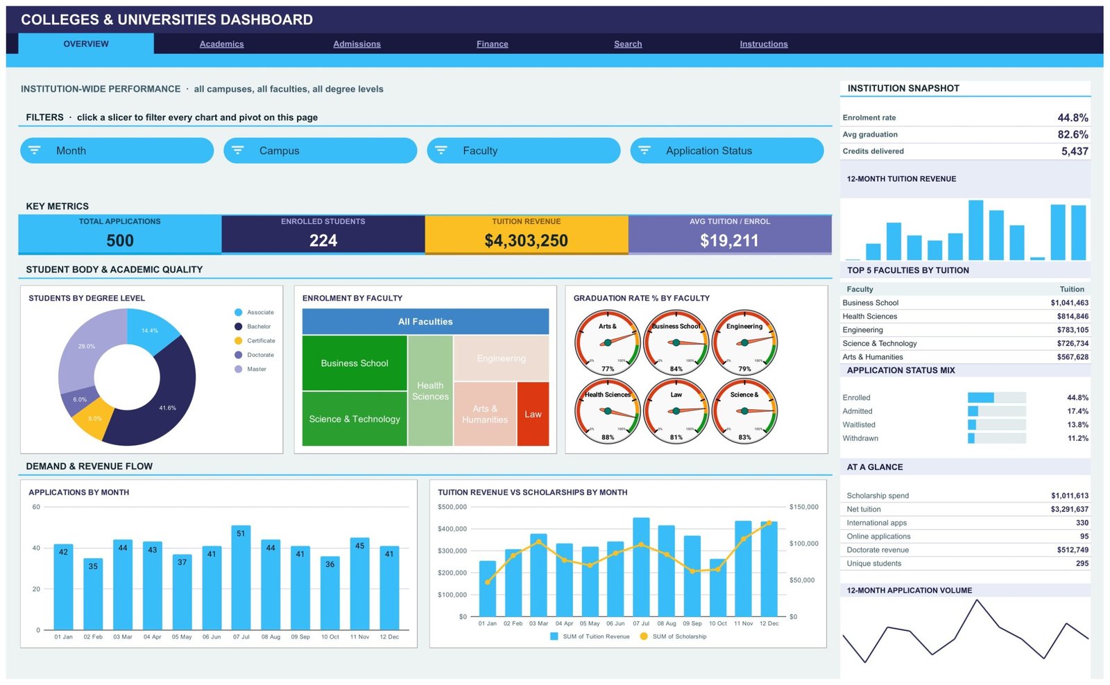
Four slicers (Month, Campus, Faculty, Application Status) sit above four KPI tiles: Total Applications 500, Enrolled Students 224, Tuition Revenue $4,303,250 and Avg Tuition / Enrol $19,211. Below them, Students by Degree Level splits the cohort (Bachelor 41.6%, Master 29.0%, Associate 14.4%, Doctorate 6.0%, Certificate 9.0%), Enrolment by Faculty renders as a treemap, and Graduation Rate % by Faculty shows six gauges – Arts & Humanities 77%, Business School 84%, Engineering 79%, Health Sciences 88%, Law 81% and Science & Technology 83%. Underneath, Applications by Month and Tuition Revenue vs Scholarships by Month cover the demand and revenue flow. The right rail reports an enrolment rate of 44.8%, average graduation of 82.6%, 5,437 credits delivered, the top five faculties by tuition and an application status mix.Colleges & Universities Dashboard in Google Sheets

Academics – faculty, program and degree performance
Slicers here are Faculty, Degree Level, Program and Study Mode. The KPI tiles read Credits Delivered 5,437, Avg Graduation 82.6%, Programs Offered 11 and Avg Satisfaction 4.01. Enrolment by Faculty & Degree Level stacks five degree levels across six faculties; Credits Delivered by Month runs from 400 in January to a July peak of 611; Applications by Program ranks all eleven programs; and Avg Tuition vs Graduation Rate by Program plots price against outcome. The rail carries credits per student 24.3, doctorate students 30, faculties active 6, the top five programs by applications (Accounting & Finance 55, Business Administration 54, Data Science 53, Computer Science 53, Nursing 49) and a degree level mix.Colleges & Universities Dashboard in Google Sheets

Admissions – the application funnel
Application Status, Student Region, Study Mode and Campus slicers feed KPI tiles of Applications 500, Offer Rate 62.2%, Waitlisted 69 and International Share 66.0%. Applications by Status gives the funnel in counts – Admitted 87, Deferred 64, Enrolled 224, Waitlisted 69, Withdrawn 56. Applications by Study Mode splits On Campus 56.0%, Hybrid 25.0% and Online 19.0%. Applications by Student Region ranks North America 170, Asia-Pacific 108, Europe 69, Latin America 65, Middle East 46 and Africa 42. The lower band adds Applications vs Credits by Campus, Average Scholarship by Degree Level and a Tuition Fee Distribution histogram. The rail lists the top five campuses by applications, led by Downtown Campus on 146.Colleges & Universities Dashboard in Google Sheets

Finance – tuition, scholarships and net revenue
Three slicers (Month, Funding Source, Degree Level) and four tiles: Tuition Revenue $4,303,250, Scholarship Spend $1,011,613, Net Revenue $3,291,637 and Scholarship Rate 23.5%. Tuition Revenue by Month & Funding Source stacks all five sources month by month; Scholarship Spend by Faculty and Average Tuition per Application by Month sit below it. The rail shows net per enrolment $14,695, average scholarship $2,967, 341 funded students, the top five funding sources by tuition (Scholarship $1,136,805 leading) and a funding source mixColleges & Universities Dashboard in Google Sheets

Search and Instructions
Search takes one Application ID – APP-0001, say – and renders the full 16-field record beneath it: date, campus, faculty, degree level, student name, program, tuition revenue, scholarship, credits, student region, study mode, application status, funding source, month and quarter. Instructions is a ten-point user guide explaining the pivot architecture, how slicers behave per page, why the KPI cards are deliberately unfiltered, the 1,000-row auto-expand and the theme colours.Colleges & Universities Dashboard in Google Sheets
What the Data sheet holds – and what to strip out first
The Data sheet has 20 columns: Application ID, Date, Campus, Faculty, Degree Level, Student Name, Program, Tuition Revenue, Scholarship, Credits, Student Region, Study Mode, Application Status, Funding Source, Month, Year, Quarter, Count, Graduation Rate and Satisfaction. The sample rows are applicant-level, and the Student Name column is filled in with invented names.Colleges & Universities Dashboard in Google Sheets
Be deliberate about that column. If you paste in a real applicant export, this file will hold named individuals next to their funding source and scholarship amount. The safer default is to leave Student Name blank and identify records by an internal code – the Application ID already does that, and no chart, pivot or slicer in the workbook depends on names. The template holds no date of birth, no contact details, and no disability or disciplinary field. Decide where the copy lives and who can open it before real data goes anywhere near it, following your own institution’s data protection policy.Colleges & Universities Dashboard in Google Sheets
Colleges & Universities Dashboard in Google Sheets vs. Excel vs. a Paid BI Suite – Feature Comparison
| This template (Google Sheets) | Excel dashboard build | Paid BI suite (e.g. Tableau Creator) | |
|---|---|---|---|
| Cost | $9.99 one time | $0 plus your build hours | Roughly $70-$75 per creator per month |
| Platform | Google Sheets in a browser | Desktop Excel | Desktop authoring plus a hosted server |
| Setup time | About a minute to copy, then paste | Days to build pivots and charts | Days, plus licence procurement |
| Real-time team collaboration | Yes, native | Only via OneDrive co-authoring | Yes, on the paid server |
| Mobile access | Yes, Google Sheets app | Limited | Yes, with a licence |
| Customisable fields | Yes – it is a spreadsheet | Yes | Yes, with modelling work |
| Share with a link | Yes | No | Only to licensed viewers |
| Year-1 cost at 5 users | $9.99 | $0 plus build time | Roughly $4,200 |
| Record lookup by Application ID | Built in | Build it yourself | Build it yourself |
| Live link to a student record system | No – paste or import an export | No | Possible with a connector and an engineer |
A student information system belongs to a different category entirely. An SIS is the system of record for enrolment, timetabling and transcripts. This file is a reporting layer that reads an export from one, so comparing their prices would be meaningless.
Who Should Use This Template
Planning and admissions officers who need a shareable weekly read on intake. Faculty administrators comparing programs on credits, demand and satisfaction. Finance and bursary teams tracking tuition against scholarship spend by funding source. Small private colleges and single faculties within a larger university get the most out of it, because their data volumes fit comfortably inside a spreadsheet.Colleges & Universities Dashboard in Google Sheets
It is a poor fit if you need a live feed from your SIS or CRM, if your export runs to hundreds of thousands of rows, or if you were hoping for something that scores applicants or forecasts outcomes. It does none of those things – see the next section.Colleges & Universities Dashboard in Google Sheets
Real-World Use Cases
Weekly admissions stand-up. Export the application log on Monday, paste it over the sample rows, and filter the Admissions page to Waitlisted. The funnel counts and the region bar chart answer “where are we sitting on offers?” before anyone opens a second file.
Faculty review. Filter Academics to one faculty and read credits delivered by month against average satisfaction, then use Applications by Program to see which of the eleven programs are pulling demand.
Bursary and funding review. Use Finance to split tuition revenue by funding source across the year and put scholarship spend by faculty next to the 23.5% scholarship rate, so the conversation starts from a chart rather than a debate.Colleges & Universities Dashboard in Google Sheets
Campus comparison. On Admissions, Applications vs Credits by Campus puts application volume and credits on the same frame across all five campuses.Colleges & Universities Dashboard in Google Sheets
Advantages of the Colleges & Universities Dashboard in Google Sheets
- Nothing to install. Native pivots, slicers and charts only – no add-ons and no macros.
- Fast to stand up. Copy the file, paste your export, keep the headers, and it works.
- Genuinely shareable. Send a link; colleagues open it on a phone if they want to.
- Fully unlocked. Every chart, pivot and colour is editable, and the theme colours are documented.Colleges & Universities Dashboard in Google Sheets
- Fast as it grows. The charts read pivot tables rather than long helper-formula chains, so the file does not bog down as rows accumulate.
- One-time cost. No per-seat licence and no renewal.Colleges & Universities Dashboard in Google Sheets
Opportunities for Improvement
Being straight about the limits saves everyone time:
- It is static. There is no connection to a student information system, no API and no scheduled sync. You refresh it by pasting.
- The KPI cards ignore slicers by design. They use SUMIFS and COUNTIFS over the whole Data sheet, so they always show institution-wide totals while the charts and Top 5 panels respond to filters. Useful once you know it; confusing if you do not.
- Slicers are per page. Filtering Admissions does not filter Finance.
- 1,000 rows out of the box. Going further means editing DATA_ROWS in the source script and re-running it.
- Single year of sample data. The sample covers 2024 only, so year-on-year comparison is something you would add yourself.
- No forecasting. There is no model here – it reports what you recorded, and nothing more.
It is also worth saying plainly what this template is not: it is not a student information system, not admissions software, and not a student record system. It makes no admissions decisions, scores no applicants, predicts no attainment, forecasts no retention, and produces nothing you should submit to an accreditation review, a ranking body or a statutory return. It also makes no compliance claim of any kind – how you handle personal data in your copy is governed by your own institution’s policies, not by this file.
Best Practices
- Strip names before you paste. Leave Student Name blank and rely on Application ID.
- Never change the column headers. Pivots, slicers and charts resolve them by name; rename one and the page breaks.
- Keep one file per reporting cycle rather than appending years into one sheet, so the 1,000-row ceiling stays comfortable.
- Set sharing to view-only for anyone who is not maintaining the data.
- Clear slicers with Select all before you screenshot a page for a report – a stray filter is the classic way to circulate a wrong number.
- Read the Instructions sheet once. The unfiltered-KPI rule in point 4 explains most of the questions people ask on day one.
- Keep the source export. If a paste goes wrong, re-pasting is faster than repairing.
If you are new to slicers and pivot tables in Sheets, Google’s own guide to filtering data with slicers covers the basics in a couple of minutes.
Explore Relevant Templates
- Student Academic Performance Dashboard in Google Sheets – cohort and course level rather than institution level.
- Student Enrollment KPI Dashboard in Google Sheets – a month-picker KPI dashboard, a different family of template.
- Education KPI Scorecard in Google Sheets – a traffic-light scorecard for education KPIs.
- Colleges & Universities Dashboard in Excel and in Power BI – the same analysis on other platforms.
Building a dashboard like this yourself is a good way to learn pivots. The Excel Pivot Tables & Dashboards course on NextGenTemplates Academy takes you through the technique with practice files.
Frequently Asked Questions
Do I need any add-on or script to use it?
No. It uses native Google Sheets pivot tables, slicers and charts. There is nothing to install and no authorisation prompt.
How many application records can it hold?
Pivots, slicers and formulas already cover 1,000 rows. Paste anywhere up to row 1001 and the whole dashboard updates. The Instructions sheet explains how to raise the limit.
Will it connect to our student information system?
No. It is a static file with no live connection, no API and no sync. You paste or import an export from your own system.
Does it hold student names?
The sample data has a Student Name column with invented names. Leave it blank in your own copy and use the Application ID instead – nothing in the dashboard depends on names.
Can it predict enrolment or tell us who to admit?
No. It reports figures you have already recorded. Decisions, attainment and retention modelling stay with your own processes and systems.
Why do the KPI tiles not change when I click a slicer?
That is deliberate. The KPI cards and the At a Glance list use SUMIFS and COUNTIFS across the entire Data sheet so they always show unfiltered totals, while the charts, pivots and Top 5 panel are slicer-aware.
Can several people use it at the same time?
Yes. It is an ordinary Google Sheets file, so you share it by link with whatever view or edit permissions you choose.
About the Author
Built by PK – Microsoft Certified Professional with 15+ years of Excel, Google Sheets, and Power BI experience. Founder of NextGenTemplates, reaching 300K+ subscribers across YouTube channels. Every template is hand-built and tested before release.
Conclusion
The Colleges & Universities Dashboard in Google Sheets does one job properly: it takes an application export and turns it into six pages a committee can actually read – institution-wide, academic, admissions funnel and finance, plus a record lookup and a user guide. It will not decide who to admit or forecast next year’s intake, and it does not pretend to. What it will do is get a shareable, filterable, honestly-labelled view of this cycle in front of people in about a minute, for a one-time $9.99.
Get the Colleges & Universities Dashboard in Google Sheets on NextGenTemplates.com – instant download, one-time payment, with a PDF guide that carries the “Make a copy” link.
For more Google Sheets dashboard walkthroughs, subscribe to NeoTechNavigators on YouTube.