The Farm Production and Profitability Dashboard in Google Sheets shows a farm’s revenue, cost, profit, yield and production in one shared file. It is built for farm owners, agribusiness managers and agronomy consultants who record crop data in spreadsheets but struggle to see which crops, soils, seasons and regions actually make money.
The template has five dashboard pages: Overview, Region Analysis, Crop vs Soil Analysis, Cost vs Revenue Analysis and Monthly Trends. Each page has the same eight slicers for Month, Region, State, Crop Type, Season, Soil Type, Irrigation Type and Fertilizer Type, so you can narrow every chart to the exact slice of the farm you care about.
🎥 Watch the Video Tutorial
Get the Farm Production and Profitability Dashboard
What Problem Does This Farm Dashboard Solve?
A farm produces plenty of numbers: area sown, harvest weight, input costs and sale value, often split across several plots, crops and seasons. When those numbers live in separate sheets, it is hard to answer basic questions. Is rice more profitable than wheat on our land? Does organic fertilizer pay for itself? Which region earned the most this season?
This dashboard keeps the records in one table and summarises them automatically. You see the farm’s overall position on the first page, then drill into regions, crops, soils, seasons, fertilizers and months without building any new charts yourself.
Key Metrics in the Farm Production and Profitability Dashboard in Google Sheets
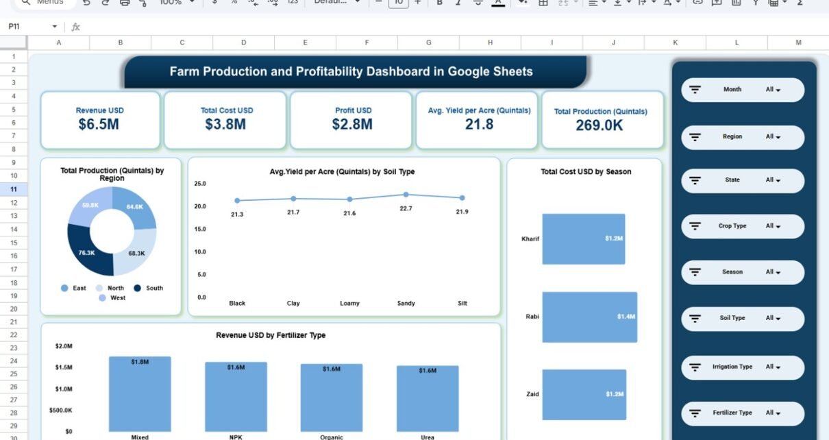
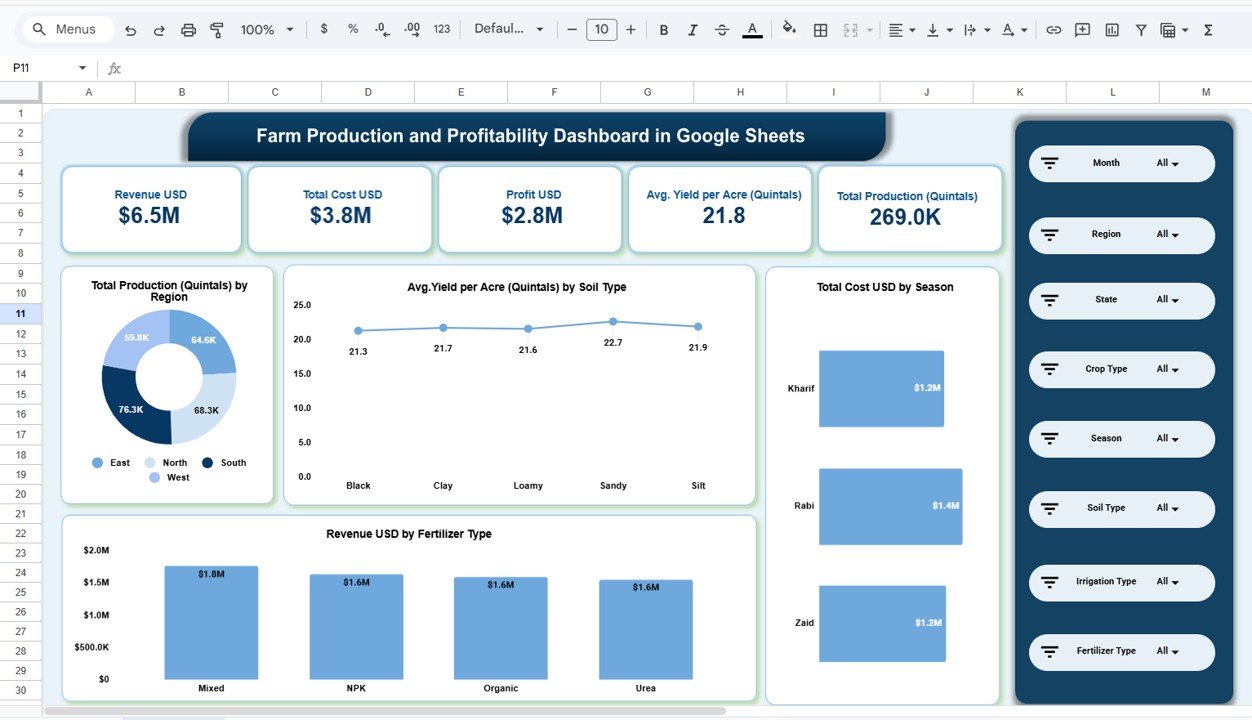
Five KPI cards sit at the top of the Overview page. The table below explains each one. Values are from the sample data with no filters applied.
| KPI card | What it measures | How it is calculated | Sample value | Better when |
|---|---|---|---|---|
| Revenue USD | Total sales value of the harvest | Sum of revenue across the filtered records | $6.5M | Higher |
| Total Cost USD | All recorded production costs | Sum of cost across the filtered records | $3.8M | Lower |
| Profit USD | What is left after costs | Revenue USD − Total Cost USD | $2.8M | Higher |
| Avg. Yield per Acre (Quintals) | Average harvest per acre | Average of the yield per acre in the filtered records | 21.8 | Higher |
| Total Production (Quintals) | Total harvest weight | Sum of production across the filtered records | 269.0K | Higher |
Because the cards round to one decimal, $6.5M minus $3.8M can show as $2.8M rather than $2.7M. The region-wise profit figures on the Region Analysis page add up to about $2.75M, which matches.
Dashboard Pages Explained
Overview page
Below the KPI cards, the Overview page shows four charts. A donut chart splits Total Production (Quintals) by Region across East, North, South and West. A line chart tracks Avg. Yield per Acre (Quintals) by Soil Type for Black, Clay, Loamy, Sandy and Silt soil, with Sandy highest at 22.7. A bar chart shows Total Cost USD by Season for Kharif, Rabi and Zaid, and a column chart shows Revenue USD by Fertilizer Type for Mixed, NPK, Organic and Urea.
Region Analysis page
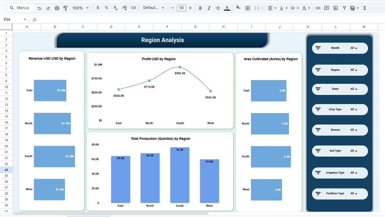
This page compares the four regions on Revenue, Profit, Area Cultivated (Acres) and Total Production (Quintals). In the sample, South leads on every measure: $1.9M revenue, $956.3K profit, 3.4K acres and 76.3K quintals. West is lowest on all four. Seeing area next to profit helps you tell whether a region earns more because it farms more land or because it farms it better.
Crop vs Soil Analysis page
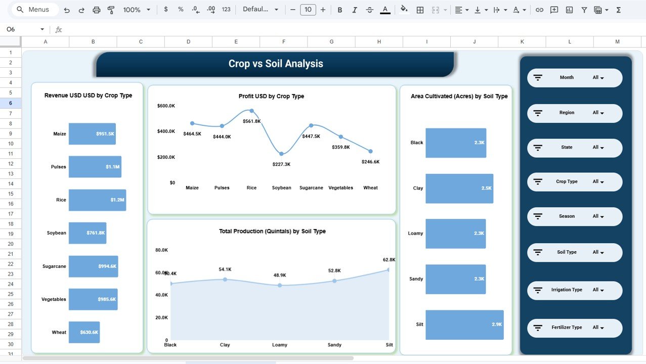
Here you compare the seven crops in the sample (Maize, Pulses, Rice, Soybean, Sugarcane, Vegetables and Wheat) on revenue and profit, alongside area and production by soil type. Rice brings in the most revenue ($1.2M) and the most profit ($561.8K), while Soybean has the lowest profit at $227.3K. On the soil side, Silt has the largest area (2.9K acres) and the highest production (62.8K quintals).
Cost vs Revenue Analysis page
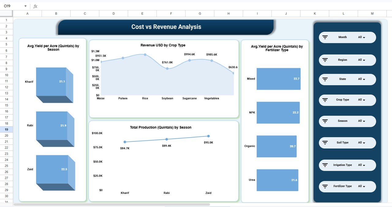
Despite its name, this page focuses on the drivers behind revenue. It shows Avg. Yield per Acre by Season (Zaid 22.5, Rabi 21.9, Kharif 21.1), Revenue USD by Crop Type, Total Production by Season and Avg. Yield per Acre by Fertilizer Type. In the sample, Mixed fertilizer gives the best average yield at 22.7 quintals per acre and Organic the lowest at 20.7.
Monthly Trends page
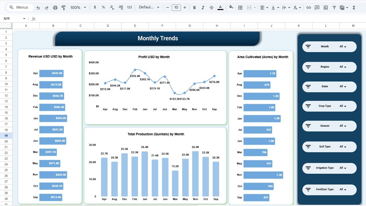
The last page lays out Revenue, Profit, Area Cultivated and Total Production by month. It makes seasonal swings easy to see. In the sample, March and May are the weakest profit months at about $123K each, while February peaks at $332.4K. Use this page to plan cash flow around lean months.
How to Use It with Your Own Farm Data
- Make your own copy with File > Make a copy and keep the original untouched.
- Open the data table and note the column headings. Keep them exactly as they are, because the cards, charts and slicers read from them.
- Replace the sample rows with your own records: one row per plot or harvest entry, covering details such as region, state, crop type, season, soil type, irrigation type, fertilizer type, area, production, revenue and cost.
- Use the same spelling every time for repeated values (for example “Kharif”, not “kharif season”), so each crop, soil and season shows up as one group.
- Return to the Overview page. Everything recalculates automatically.
- Use the slicer panel on the right to focus on one region, crop, season or fertilizer, and switch pages to compare the same slice from different angles.
To learn how slicers and summary charts work so you can add your own views, the Excel Pivot Tables and Dashboards course on NextGenTemplates Academy walks through the same ideas with practice files.
Real-World Use Cases
- Family farm planning next season’s crops: compare profit by crop type and yield by soil to decide which crops to expand on which fields.
- Agribusiness with farms in several regions: use the Region Analysis page each quarter to see which region earns the most per acre and where costs need attention.
- Agronomy consultant advising clients: load a client’s records, filter by fertilizer type and season, and show the yield difference in a meeting instead of in a long report.
Best Practices
- Record costs when they happen. Seed, fertilizer, labour and irrigation bills entered weeks later are often forgotten, which makes profit look better than it is.
- Use consistent units. Keep production in quintals and area in acres throughout, as the template does.
- Compare seasons fairly. Filter to one season before comparing crops, because Kharif, Rabi and Zaid crops are not grown under the same conditions.
- Look at profit, not just revenue. A high-revenue crop can still be a weak earner once costs are included.
- Review after every harvest. A short review after each season builds a useful history for the next planting decision.
Limitations: Who Should Not Use This Template
This is a reporting dashboard. It does not record weather, rainfall or soil test results, and it does not forecast yields. Data is typed or pasted in by hand, so it will not connect to farm sensors or machinery. If you only grow one crop on a single plot, a simple income and expense log may be enough. Very large operations with tens of thousands of entries a year will find a database or Power BI easier to scale.
Related Agriculture Dashboards
If you want target-vs-actual tracking instead of record-level analysis, see the Agriculture KPI Dashboard in Google Sheets or the Smart Agriculture KPI Dashboard. For broader farm reporting, compare the Agriculture Dashboard in Google Sheets and the Agriculture Farm Dashboard in Google Sheets. If you prefer a browser-based file, there is also an Agriculture and Farm Dashboard in HTML.
Frequently Asked Questions
What does the Farm Production and Profitability Dashboard track?
It tracks revenue, total cost, profit, average yield per acre and total production, and breaks them down by region, crop type, soil type, season, fertilizer type and month.
Which filters can I use?
Every page has eight slicers: Month, Region, State, Crop Type, Season, Soil Type, Irrigation Type and Fertilizer Type.
How is profit calculated?
Profit is revenue minus total cost for the records currently in view. If you filter to one crop or region, profit is recalculated for that selection only.
Can I add my own crops or regions?
Yes. Type the new crop, soil, region or fertilizer names into the data table and they appear in the charts and slicers automatically.
Does it work in currencies other than USD?
The sample uses USD labels. You can enter amounts in your own currency and change the number format and card labels to match.
Can several people update it at once?
Yes. It is a standard Google Sheets file, so you can share it with your farm manager, accountant or adviser and everyone works on the same live data.
Wrapping Up
The Farm Production and Profitability Dashboard in Google Sheets gives you a clear picture of what each crop, soil, season and region earns. Load your own records, check the Overview after each harvest, and use the crop, region and monthly pages to plan a more profitable next season.
Get the Farm Production and Profitability Dashboard
📅 Last updated: October 2026