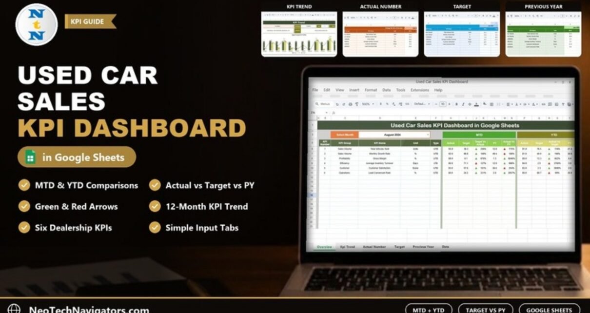
The Used Car Sales KPI Dashboard in Google Sheets gives a used car dealership one page to compare this month’s and this year’s results against target and against the previous year. You pick a month, and every KPI shows its Actual, Target and PY figures with green or red arrows, so a sales manager can see at a glance where the lot is ahead and where it is slipping.
It suits independent dealers, sales managers and small dealership groups who already collect monthly numbers but spend too long turning them into a report. Below I walk through all six tabs, the KPIs defined in the file, the comparison logic behind the arrows, and how to load your own figures.
🎥 Watch the Video Tutorial
Get the Used Car Sales KPI Dashboard
What Problem Does It Solve?
Dealership numbers change every month: units sold, margin, how long stock sits on the lot, how many leads become buyers. When those figures live in separate reports, it is hard to answer simple questions such as “Are we ahead of target this year?” or “Is gross margin better than last August?” This template keeps actuals, targets and last year’s figures in three input tabs and does the comparison for you on one dashboard.
The Six Tabs in the Template
| Tab | What it does |
|---|---|
| Dashboard | Month selector plus MTD and YTD Actual, Target, PY and comparison columns for every KPI |
| KPI Trend | Pick one KPI to see its group, unit, type, formula, definition and a 12-month chart |
| Actual Number | Monthly MTD and YTD actuals for the current year |
| Target | Monthly MTD and YTD targets |
| Previous Year Number | Last year’s MTD and YTD figures in the same layout |
| KPI Definition | Master list of KPI Group, KPI Name, Unit, Formula, Definition and Type |
KPIs Defined in the Template
The KPI Definition tab in the sample file lists six KPIs. The formulas and definitions below are copied from that tab. UTB means “Upper the Better” and LTB means “Lower the Better”.
| KPI | Group | Unit | What it measures | Formula | Better when |
|---|---|---|---|---|---|
| Total Vehicles Sold | Sales Volume | Units | Total number of vehicles sold | COUNT(Sales) | Higher (UTB) |
| Monthly Growth Rate | Sales Volume | % | Month-over-month growth rate in vehicle sales | (This Month – Last Month) / Last Month * 100 | Higher (UTB) |
| Gross Margin | Profitability | % | Profit per vehicle sold after costs | (Sales Revenue – Cost of Goods Sold) / Sales Revenue * 100 | Higher (UTB) |
| Average Inventory Turnover | Efficiency | Days | How quickly inventory is sold and replaced | Average Stock / Daily Sales | Lower (LTB) |
| Customer Satisfaction | Customer | Score | Customer satisfaction rating from surveys | Survey Results | Higher (UTB) |
| Lead Conversion Rate | Operations | % | Percentage of leads converting into sales | (Number of Sales / Number of Leads) * 100 | Higher (UTB) |
You calculate these values in your own records (DMS, CRM or sales log) and type the results into the input tabs; the dashboard then compares them. You can add more rows to the KPI Definition and input tabs if your dealership tracks other measures.
1. Dashboard Tab
Choose a month from the Select Month dropdown at the top (the screenshot shows August 2024). The table lists each KPI with its number, group, name, unit and type, then two blocks:
- MTD – Actual, Target, Target Vs Actual, PY and Actual Vs PY for the selected month.
- YTD – Actual, Target, Actual Vs Target, PY and Actual Vs PY from the first month of the year to the selected month.
Green and red arrow icons sit next to each comparison percentage so changes are easy to spot.

How the comparison percentages work
The comparison columns divide Actual by the benchmark. Using the Total Vehicles Sold row in the screenshot (MTD Actual 93.0, Target 36.3, PY 12.0):
Target Vs Actual = Actual / Target = 93.0 / 36.3 = 256%
Actual Vs PY     = Actual / PY     = 93.0 / 12.0 = 775%
Always read the percentage together with the Type column. For a UTB KPI, above 100% means you beat the benchmark; for an LTB KPI such as Average Inventory Turnover, above 100% means more days than the benchmark, which is worse. The sample figures are placeholders, which is why some percentages look extreme; with real data the ratios will be much closer to 100%.
2. KPI Trend Tab
Use the Select KPI dropdown to focus on one measure. The tab shows the KPI Group, Unit, Type, Formula and Definition, and a Target Vs Actual Vs PY (MTD) chart for January to December. In the screenshot, Gross Margin is selected (Profitability, %, UTB). This is the tab to project in a monthly sales meeting.

3. Actual Number Tab
Enter the current year’s results here, with an MTD and a YTD column for each month. The first month of the year is set in the header (marked “Change the first of the year”), and the month columns follow from it, so the template can support a financial year that does not start in January.

4. Target Tab
Same layout as the Actual tab. Enter the MTD and YTD target for each KPI and month. Targets drive every Target Vs Actual arrow on the dashboard.

5. Previous Year Number Tab
Holds last year’s figures (2023 in the sample) in the same structure, which powers the PY and Actual Vs PY columns.

6. KPI Definition Tab
The master list behind the dropdowns: KPI Group, KPI Name, Unit, Formula, Definition and Type (UTB or LTB, chosen from a dropdown). Keep this tab accurate, because the Type tells readers whether a higher number is good or bad.

How to Use It With Your Own Data
- Make your own copy with File > Make a copy.
- On KPI Definition, review the six KPIs. Edit names, formulas or definitions to match how your dealership measures them, and set each Type to UTB or LTB.
- On Actual Number, set the first month of your year in the header, then enter MTD and YTD actuals for each month you have.
- Fill in Target and Previous Year Number in the same rows and columns.
- Open Dashboard, choose a month in Select Month and check one KPI by hand (Actual ÷ Target) to confirm the setup.
- Use KPI Trend in review meetings to discuss one KPI at a time.
Real-World Use Cases
- Independent used car lot: the owner reviews Total Vehicles Sold and Gross Margin against target on the first working day of each month.
- Sales manager: tracks Lead Conversion Rate MTD to coach the team before month-end, not after.
- Multi-branch group: keeps one copy per branch with identical KPI definitions, so branch results are compared on the same basis.
Best Practices
- Close the month first, then enter actuals once, from one source.
- Set targets you can explain; a target that is always beaten by 500% tells you nothing.
- Keep units consistent: Average Inventory Turnover is in days, so do not mix it with a turns-per-year figure.
- Do not change KPI names in the input tabs without changing them in KPI Definition too.
Limitations: Who Should Not Use It
This is a KPI scorecard, not a dealer management system. It does not store individual vehicle, customer or deal records, it does not calculate the KPIs from raw transactions, and it does not connect to your DMS. If you want charts built from a list of individual sales, look at a transaction-level dashboard such as the Car Dealership Dashboard in Google Sheets instead.
Related Templates and Guides
Prefer Power BI? There is a Used Car Sales KPI Dashboard in Power BI version. For wider automotive tracking, see the Automotive KPI Dashboard in Google Sheets, the Dealer Network KPI Dashboard and the general Sales KPI Dashboard in Google Sheets.
If you want to build dashboards like this yourself, the Pivot Tables and Dashboards course on NextGenTemplates Academy teaches the reporting skills step by step.
Frequently Asked Questions
Which KPIs are included in the Used Car Sales KPI Dashboard?
The sample file defines Total Vehicles Sold, Monthly Growth Rate, Gross Margin, Average Inventory Turnover, Customer Satisfaction and Lead Conversion Rate, each with a group, unit, formula, definition and UTB/LTB type.
What is the difference between MTD and YTD here?
MTD shows the selected month only. YTD shows the cumulative figure from the first month of your year up to the selected month.
What do UTB and LTB mean?
UTB (Upper the Better) means a higher value is good, such as Gross Margin. LTB (Lower the Better) means a lower value is good, such as Average Inventory Turnover in days.
Can I start the year in April instead of January?
Yes. Change the first month of the year in the Actual Number tab header and the month columns follow from it.
Can I add my own KPIs?
Yes. Add the KPI to the KPI Definition tab and add matching rows to the Actual, Target and Previous Year tabs.
Does it calculate KPIs from my sales list automatically?
No. You enter the monthly KPI values; the template handles the comparisons, arrows and trend chart.
Wrapping Up
The Used Car Sales KPI Dashboard in Google Sheets is a simple, disciplined way to hold a dealership to its targets every month. Enter last year’s figures and this year’s targets first, add actuals at each month-end, and the dashboard will show you where to focus before the next month starts.
Get the Used Car Sales KPI Dashboard in Google Sheets
📅 Last updated: October 2026