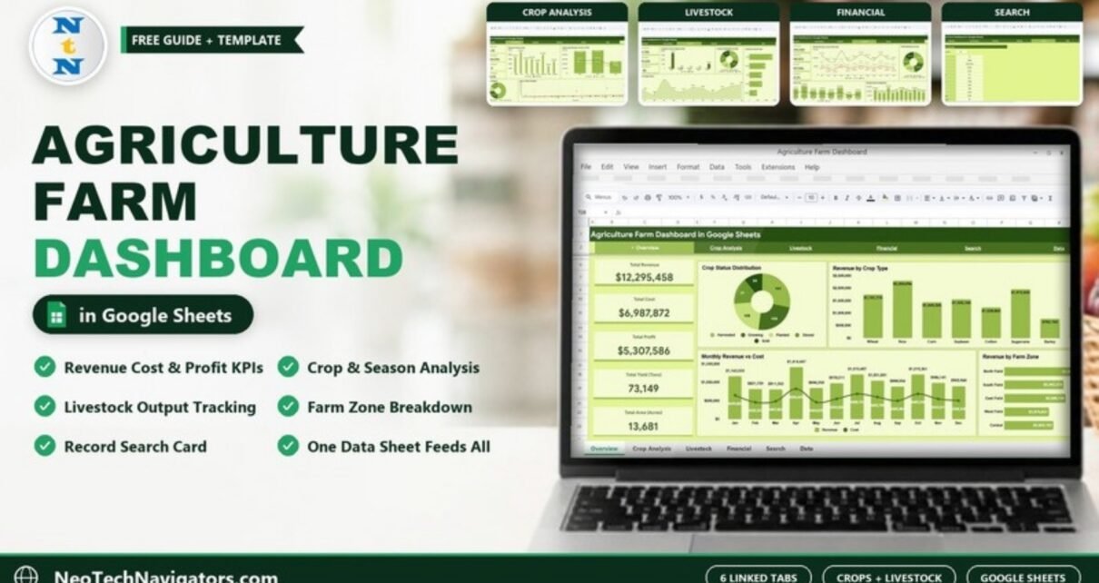
The Agriculture Farm Dashboard in Google Sheets puts crop, livestock and money data for a whole farm on six linked tabs, so you can see revenue, cost, profit, yield and cultivated area without building a single chart yourself. It is designed for farm owners, farm managers, agronomists and agribusiness consultants who already keep records in a spreadsheet and want a clear picture of what each crop, season and field zone is really earning.
In this guide I walk through every tab exactly as it appears in the template: the five headline KPI cards, the Crop Analysis and Livestock pages, the Financial page, the Search page and the Data sheet that feeds everything. You will also see how the numbers are calculated, how to load your own records, and where the template is not the right fit.
🎥 Watch the Video Tutorial
Get the Agriculture Farm Dashboard
What Problem Does This Farm Dashboard Solve?
Most farms track planting, harvest, sales and animal numbers in separate notebooks or sheets. The information exists, but answering simple questions takes hours: Which crop made the most money this year? Is the Rabi season more profitable than Kharif? Which field zone carries the most livestock? This dashboard answers those questions on one screen because every chart reads from a single Data sheet.
Because it runs in Google Sheets, the file lives in your Google Drive, opens on a phone in the field, and can be shared with a partner, an accountant or a lender with view-only access.
Dashboard Tabs at a Glance
A green navigation bar at the top of every page links the six tabs: Overview, Crop Analysis, Livestock, Financial, Search and Data.
| Tab | Summary cards | Charts |
|---|---|---|
| Overview | Total Revenue, Total Cost, Total Profit, Total Yield (Tons), Total Area (Acres) | Crop Status Distribution, Revenue by Crop Type, Monthly Revenue vs Cost, Revenue by Farm Zone |
| Crop Analysis | Avg Yield / Acre, Top Crop Revenue, Total Crop Types, Avg Profit Margin | Revenue & Area by Crop, Season-wise Revenue vs Cost vs Profit, Revenue by Crop Category, Area vs Yield Correlation |
| Livestock | Total Livestock, Total Output, Avg Count/Record | Livestock Count & Output by Type, Livestock Distribution by Zone, Livestock Count by Type, Monthly Livestock Output Trend |
| Financial | Gross Revenue, Total Expenses, Net Profit, Profit Margin % | Monthly Revenue, Cost & Profit Trend, Profit Distribution by Zone, Revenue vs Cost by Crop, Monthly Revenue Breakdown |
| Search | Select Record ID dropdown | Full detail card for one record |
| Data | Raw records | Source for every page |
1. Overview Page
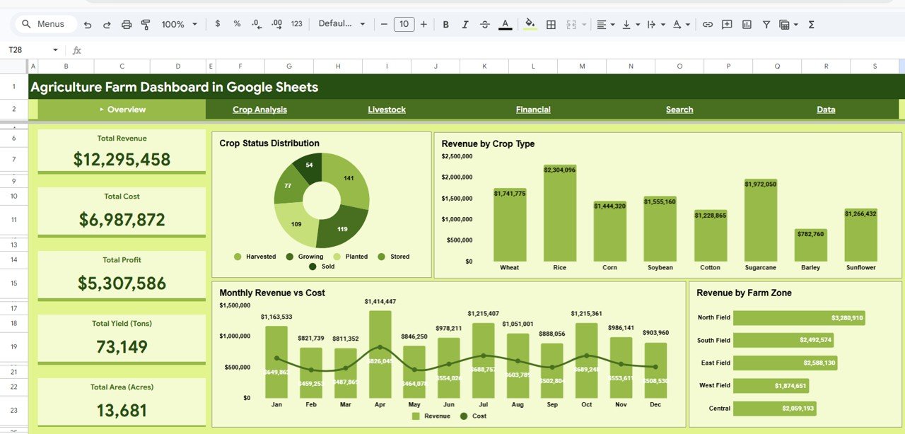
The Overview is the page you open first. The left column holds the five headline KPI cards. In the sample data they read Total Revenue $12,295,458, Total Cost $6,987,872, Total Profit $5,307,586, Total Yield 73,149 tons and Total Area 13,681 acres.
- Crop Status Distribution – a doughnut that counts records by status: Harvested, Growing, Planted, Stored and Sold.
- Revenue by Crop Type – columns for the eight crops in the sample: Wheat, Rice, Corn, Soybean, Cotton, Sugarcane, Barley and Sunflower. Rice leads at $2,304,096.
- Monthly Revenue vs Cost – revenue columns with a cost line from January to December, so seasonal peaks (April is the highest revenue month in the sample) stand out.
- Revenue by Farm Zone – horizontal bars for North Field, South Field, East Field, West Field and Central.
2. Crop Analysis Page
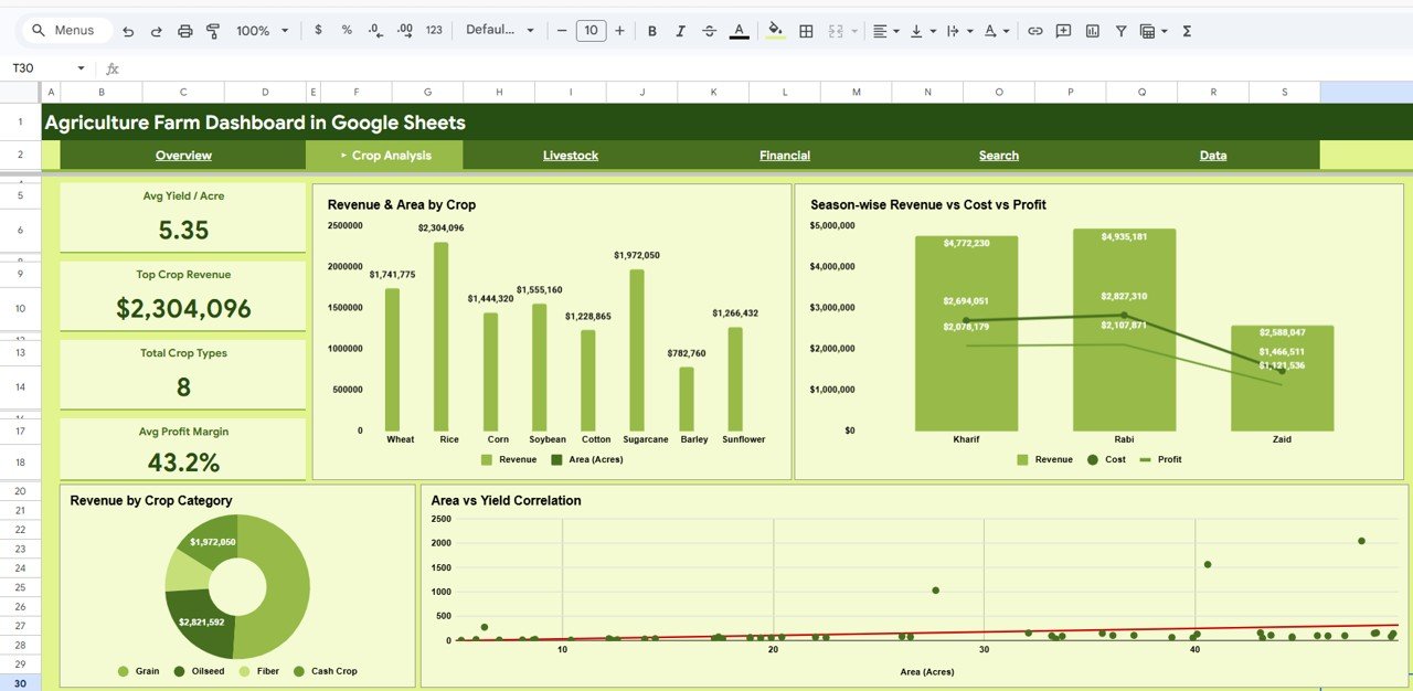
This page shifts from totals to efficiency. Four cards sit on the left: Avg Yield / Acre (5.35 in the sample), Top Crop Revenue ($2,304,096), Total Crop Types (8) and Avg Profit Margin (43.2%).
- Revenue & Area by Crop – revenue and cultivated acres per crop side by side, which shows whether a high-earning crop is simply using more land.
- Season-wise Revenue vs Cost vs Profit – compares the three seasons in the data: Kharif, Rabi and Zaid. Rabi has the highest revenue in the sample ($4,935,181).
- Revenue by Crop Category – a doughnut grouping crops into Grain, Oilseed, Fiber and Cash Crop.
- Area vs Yield Correlation – a scatter plot of each record’s acres against tons, with a trend line. Points far above the line are worth a closer look.
3. Livestock Page
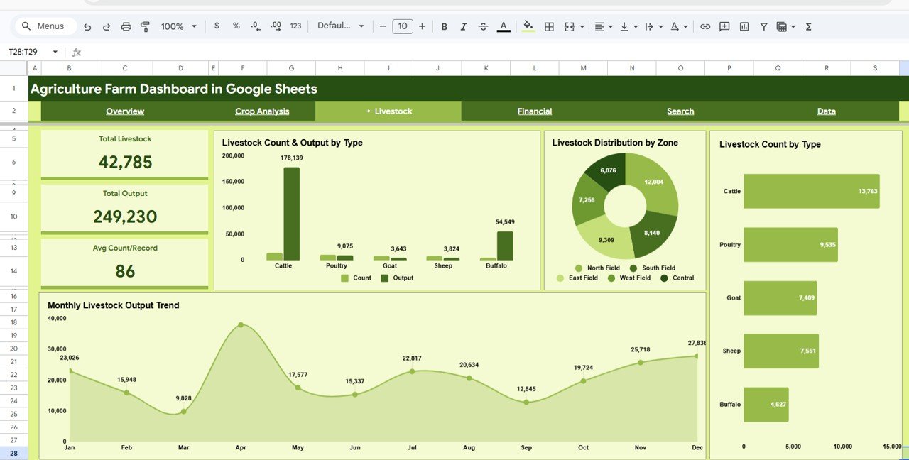
Many farm templates ignore animals. Here livestock has its own tab with three cards: Total Livestock (42,785), Total Output (249,230) and Avg Count/Record (86). The output figure comes from the Milk/Egg Output column in the Data sheet.
- Livestock Count & Output by Type – Cattle, Poultry, Goat, Sheep and Buffalo, with headcount and output as paired columns.
- Livestock Distribution by Zone – how animals are spread across the five farm zones.
- Livestock Count by Type – horizontal bars; Cattle is the largest group in the sample (13,763).
- Monthly Livestock Output Trend – an area chart from January to December.
4. Financial Page
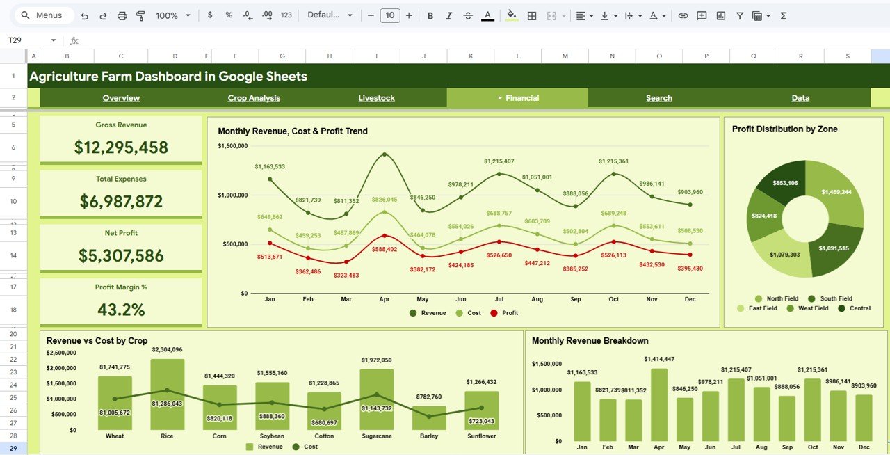
The Financial tab repeats the money totals with accounting labels – Gross Revenue, Total Expenses, Net Profit and Profit Margin % – and adds four charts:
- Monthly Revenue, Cost & Profit Trend – three lines across the year.
- Profit Distribution by Zone – a doughnut of profit per farm zone.
- Revenue vs Cost by Crop – revenue columns with a cost line for each crop.
- Monthly Revenue Breakdown – revenue by month as columns.
5. Search Page
Under the heading Search Farm Records, pick a number from the Select Record ID dropdown and the page fills a detail card: Record ID, Date, Farm Zone, Crop Type, Category, Area (Acres), Yield (Tons), Revenue ($), Cost ($), Profit ($), Season, Livestock Type and Livestock Count. It is handy when someone asks about a single field entry during a meeting.
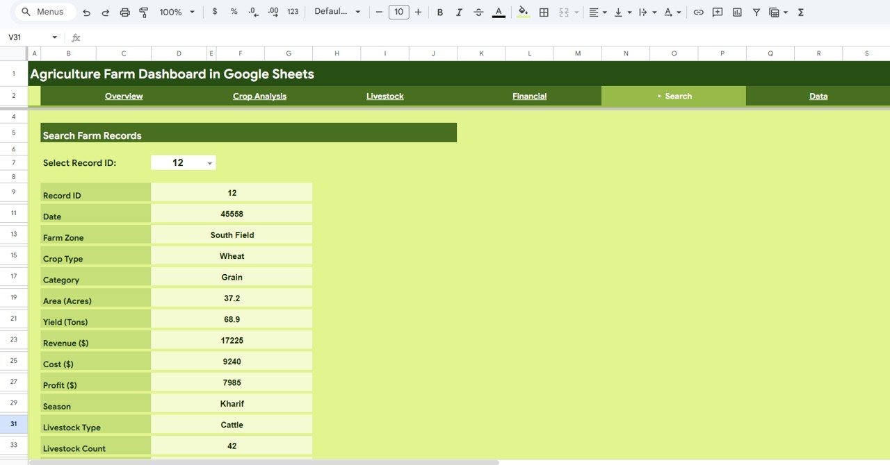
Tip: the Date row on the Search card shows a serial number (for example 45558). To display it as a date, select that cell and choose Format > Number > Date.
6. Data Sheet
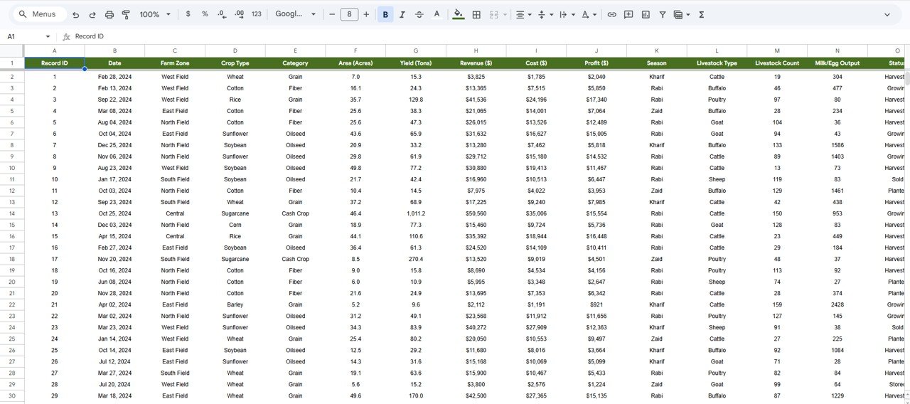
All pages read from this one table. The columns are: Record ID, Date, Farm Zone, Crop Type, Category, Area (Acres), Yield (Tons), Revenue ($), Cost ($), Profit ($), Season, Livestock Type, Livestock Count, Milk/Egg Output and Status.
How the Key Numbers Are Calculated
You do not need to write these formulas, but knowing the logic helps you trust (and check) the cards. Assuming the Data sheet columns shown above:
Total Profit      = Total Revenue - Total Cost
                  = 12,295,458 - 6,987,872 = 5,307,586
Profit Margin %   = Total Profit / Total Revenue
                  = 5,307,586 / 12,295,458 = 43.2%
Avg Yield / Acre  = Total Yield (Tons) / Total Area (Acres)
                  = 73,149 / 13,681 = 5.35
If you want to verify a total yourself on the Data tab, a formula such as =SUMIFS(H:H, D:D, "Rice") returns revenue for one crop when column H holds Revenue and column D holds Crop Type.
How to Use It With Your Own Data
- Open the template and choose File > Make a copy so you have your own editable version in Google Drive.
- Go to the Data tab and clear the sample rows, keeping the header row and column order.
- Enter or paste your records, one row per field/crop entry. Use the same spelling every time for Farm Zone, Crop Type, Category, Season, Livestock Type and Status.
- Make sure Revenue, Cost and Profit are numbers (no currency text typed in) and Date is a real date.
- Return to Overview and check that the five KPI cards match a quick manual total of your data.
- Use the Search tab to spot-check a few records, then share the file with Share > Viewer access for stakeholders.
Real-World Use Cases
- Mixed crop and dairy farm: compare crop profit by season with Milk/Egg output from cattle and buffalo on one file instead of two.
- Farm manager reporting to owners: share the Financial tab view-only each month to show gross revenue, expenses and margin by zone.
- Agronomy consultant: use Area vs Yield Correlation and Avg Yield / Acre to identify fields or crops that underperform for their acreage.
Best Practices
- Update the Data tab on a fixed schedule (weekly during harvest, monthly otherwise).
- Keep one row per crop entry; do not merge cells or add subtotal rows inside the data.
- Record costs in the same period as the revenue they relate to, or monthly profit will swing artificially.
- Make a dated copy at the end of each season so you can compare years.
Who Should Not Use This Template
Be honest about fit before you buy. This dashboard summarises records you enter; it does not connect to weather services, sensors or farm-management software. It has no alerts or approval workflows, and very large datasets (tens of thousands of rows) will slow Google Sheets down. If you need multi-year analytics at scale, a Power BI version is a better match.
Related Templates and Guides
If you prefer another platform, the same topic is available as the Agriculture and Farm Dashboard in Power BI. On this site you can also compare the Agriculture Dashboard in Google Sheets, the Farm Production and Profitability Dashboard, the KPI-focused Agriculture KPI Dashboard in Google Sheets and the browser-based Agriculture and Farm Dashboard in HTML. To build your own version from scratch, read how to create dynamic dashboards in Google Sheets.
If you want to go further with structured lessons on summarising data and designing dashboards, the Pivot Tables and Dashboards course on NextGenTemplates Academy covers the same thinking step by step.
Frequently Asked Questions
What KPIs does the Agriculture Farm Dashboard in Google Sheets show?
The Overview shows Total Revenue, Total Cost, Total Profit, Total Yield (Tons) and Total Area (Acres). Other tabs add Avg Yield / Acre, Top Crop Revenue, Total Crop Types, Avg Profit Margin, Total Livestock, Total Output, Avg Count/Record and Profit Margin %.
Can I track livestock and crops in the same sheet?
Yes. Each Data row carries crop fields and livestock fields (Livestock Type, Livestock Count, Milk/Egg Output), and the Livestock tab summarises them by type, zone and month.
Can I use my own crop names, seasons and zones?
Yes. The charts group whatever values you enter. Keep spellings consistent so the same crop or zone is not split into two categories.
Do I need formula knowledge to use it?
No. You only edit the Data tab. The cards and charts are already built and recalculate when your data changes.
Why does the date on the Search page look like a number?
Google Sheets stores dates as serial numbers. Apply Format > Number > Date to that cell to show it as a calendar date.
Does it work on a phone?
It opens in the Google Sheets mobile app, so you can view the pages and add records in the field, although the dashboard is easiest to read on a laptop or tablet.
Wrapping Up
The Agriculture Farm Dashboard in Google Sheets turns a plain list of farm records into six readable pages covering crops, livestock, seasons, zones and profit. Start by loading one season of your own data and checking the Overview cards; within an hour you will know which crops and fields are carrying the farm.
Get the Agriculture Farm Dashboard in Google Sheets
📅 Last updated: October 2026