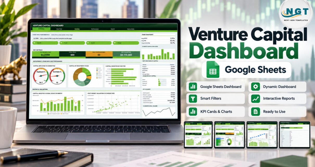
The Venture Capital Dashboard in Google Sheets reads a log of 500 sample deals across 5 funds, 8 sectors and 6 stages and turns it into six linked pages. It carries 16 KPI cards, 18 chart panels and 15 slicers, all built on native pivot tables, and every pivot, slicer and formula already covers 1,000 deal records.
Most emerging managers keep their deal log in a spreadsheet, then spend hours before each partner meeting rebuilding charts for deployment, deal flow and returns. This Google Sheets VC dashboard does that reporting from the same rows: paste your deals, set your committed capital, and filter by fund, sector, stage, region or status in the browser.
It is an analytical Dashboard, not a month-picker KPI Dashboard with targets and traffic lights, and not investment software. It gives no investment advice, has no live market feed, calculates no cash-flow IRR and makes no regulatory or compliance claim. The funds, partners and portfolio companies in the sample data are fictional.
Key Features of the Venture Capital Dashboard in Google Sheets
- Four analysis pages, one reading pattern. Overview, Deal Flow, Portfolio and Performance each show four KPI cards, a snapshot panel, a Top 5 list, a mix panel, an At a Glance list and two 12-month sparkline charts.
- 15 slicers. Each page has its own filters — Month, Fund, Sector, Stage, Deal Source, Region and Status — and each slicer drives every pivot and chart on that page only.
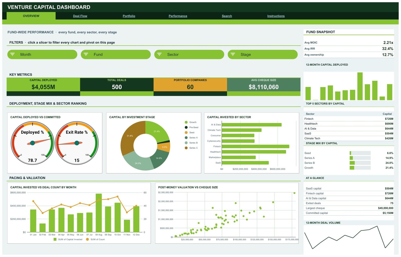
- Deployment gauges. The Overview compares capital deployed with committed capital (78.7% in the sample) and shows the Exit Rate % (15).
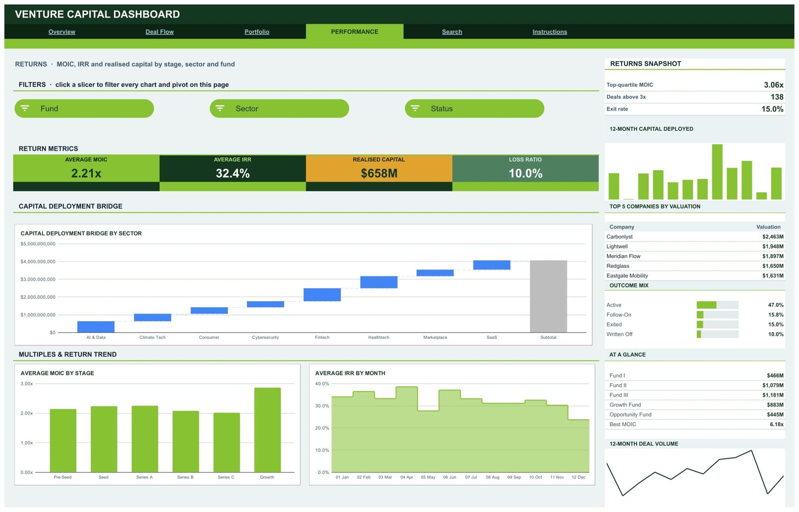
- Returns reporting. The Performance page reports Average MOIC (2.21x), Average IRR (32.4%), Realised Capital ($658M) and Loss Ratio (10.0%).
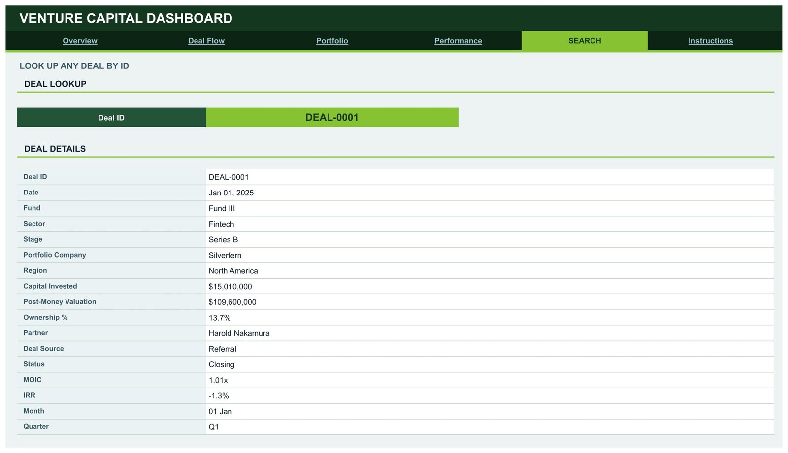
- Deal-level Search. Pick a Deal ID and read all 17 fields of that investment record.
- Fast by design. No helper formulas sit behind the charts; pivot tables do the aggregation (see Google’s guide to pivot tables).
Dashboard Pages Explanation
Page 1: Overview
Fund-wide performance across every fund, sector and stage. The key metrics are Capital Deployed ($4,055M), Total Deals (500), Portfolio Companies (60) and Avg Cheque Size ($8,110,060). The Fund Snapshot shows Avg MOIC 2.21x, Avg IRR 32.4% and Avg ownership 12.7%.
Charts: Capital Deployed vs Committed (two gauges), Capital by Investment Stage (donut), Capital Invested by Sector, Capital Invested vs Deal Count by Month and Post-Money Valuation vs Cheque Size (scatter). The sidebar lists the Top 5 Sectors by Capital, led by Fintech at $726M.
Page 2: Deal Flow
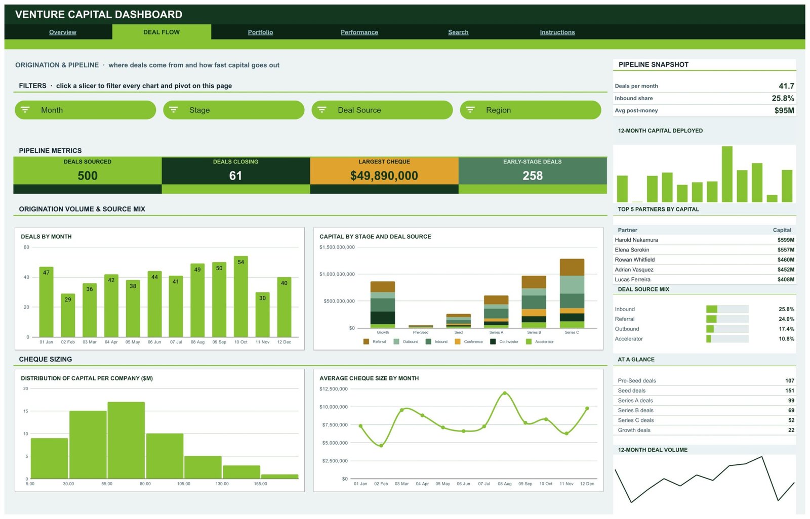
Origination and pipeline: where deals come from and how fast capital goes out. Cards show Deals Sourced (500), Deals Closing (61), Largest Cheque ($49,890,000) and Early-Stage Deals (258); the snapshot reports 41.7 deals per month, a 25.8% inbound share and $95M average post-money.
Charts: Deals by Month, Capital by Stage and Deal Source (stacked columns across Referral, Outbound, Inbound, Conference, Co-Investor and Accelerator), Distribution of Capital per Company ($M) and Average Cheque Size by Month. The sidebar ranks the Top 5 Partners by Capital.
Page 3: Portfolio
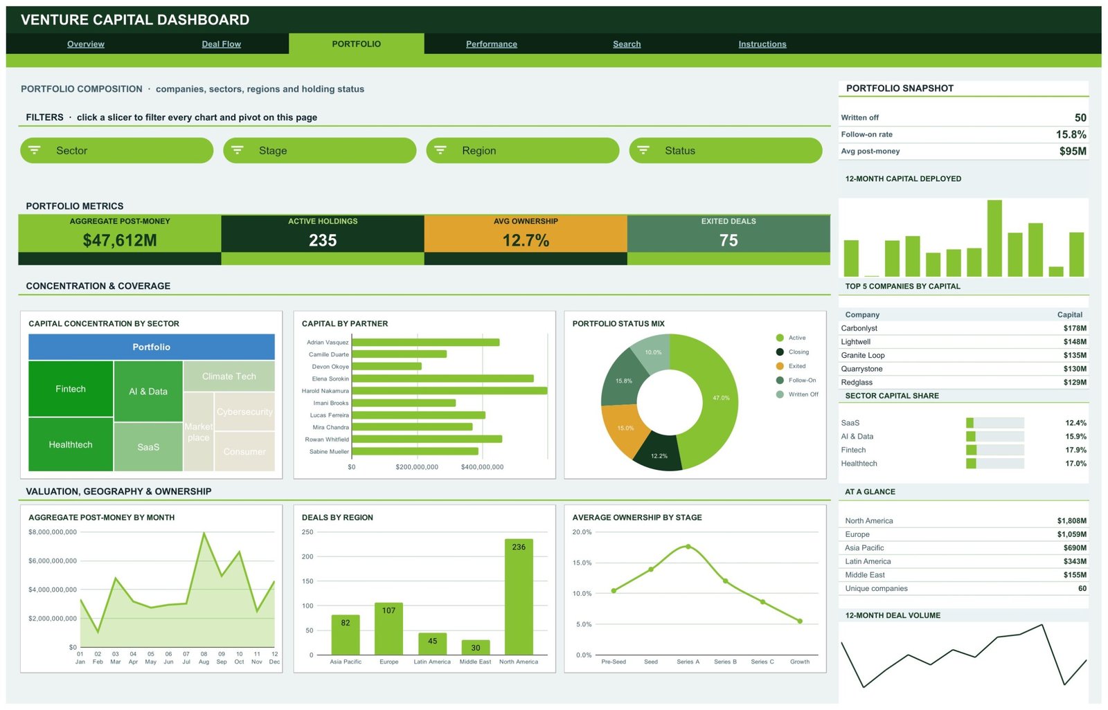
Portfolio composition by company, sector, region and holding status. Cards: Aggregate Post-Money ($47,612M), Active Holdings (235), Avg Ownership (12.7%) and Exited Deals (75). The snapshot shows 50 written-off deals and a 15.8% follow-on rate.
Charts: Capital Concentration by Sector (treemap), Capital by Partner, Portfolio Status Mix, Aggregate Post-Money by Month, Deals by Region and Average Ownership by Stage. North America carries 236 of the 500 sample deals.
Page 4: Performance
Returns by stage, sector and fund. A Capital Deployment Bridge by Sector waterfall builds the $4,055M total sector by sector; Average MOIC by Stage and Average IRR by Month sit below. The snapshot reports a top-quartile MOIC of 3.06x and 138 deals above 3x, and the sidebar lists Top 5 Companies by Valuation and capital by fund.
Page 5: Search
Enter or pick a Deal ID and the Deal Details block returns the date, fund, sector, stage, portfolio company, region, capital invested, post-money valuation, ownership %, partner, deal source, status, MOIC, IRR, month and quarter.
Page 6: Instructions
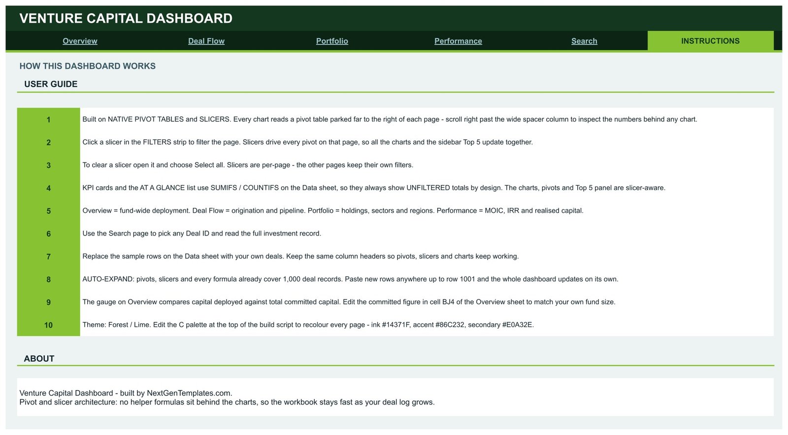
A ten-step user guide explains the pivot and slicer architecture, how to clear a slicer, why cards show unfiltered totals, how auto-expand works and where to set committed capital.
This VC Dashboard vs. Microsoft Excel Dashboard vs. Paid VC Portfolio Platform — Feature Comparison
| Feature | This Google Sheets template | Microsoft Excel Dashboard | Paid VC portfolio platform |
|---|---|---|---|
| Cost | ✅ $9.99 one-time | One-time template price | Recurring subscription, often quote-based |
| Platform | ✅ Any browser with a Google account | Excel desktop | Vendor web app |
| Setup time | ✅ Under 10 minutes | Under 30 minutes | Days to weeks of onboarding |
| Real-time team collaboration | ✅ Native sharing | Needs OneDrive/SharePoint | ✅ Per seat |
| Mobile access | ✅ Google Sheets app | Limited | ✅ Usually |
| Customizable fields | ✅ Full sheet access | ✅ Full workbook access | Vendor schema |
| Share with link | ✅ Yes | Partial | Invite-only accounts |
| Year-1 cost at 5 users | ✅ $9.99 total | One-time template price | Several thousand dollars |
| Cash-flow IRR and LP reporting | ❌ Not included | Varies | ✅ Usually included |
For small funds and syndicates that want clear deployment, deal-flow and returns reporting without a platform subscription, this template sits in the sweet spot.
Who Should Use This Template
Perfect for:
- Associates and analysts at emerging or micro VC funds
- Angel syndicates and family-office direct-investment teams
- Corporate venture units and accelerator programmes reporting to a committee
Not a fit if:
- You need capital calls, distribution waterfalls, cash-flow IRR or LP statements
- You want live valuations, investment recommendations or a compliance system
Real-World Use Cases
Maya is an associate at a seed fund. Every Monday she pastes the week’s closed deals into the Data sheet. On Deal Flow she filters by Deal Source to show partners how much capital came through referrals versus inbound, and the Average Cheque Size by Month chart shows whether round sizes are creeping up.
Daniel runs a corporate venture arm. Before the quarterly board pack he filters the Portfolio page by Region and Status. Deals by Region and Portfolio Status Mix give him a slide on geographic spread and on how many holdings are active, exited or written off.
Priya manages an angel syndicate. She uses Average MOIC by Stage and the Outcome Mix on the Performance page to discuss which stages have produced higher recorded multiples, then opens Search to review individual deals.
Advantages of This VC Dashboard
- One-time cost: $9.99 instead of a per-seat platform subscription.
- Browser-based sharing: partners view the same file with a link (see how slicers filter charts and tables).
- Consistent page layout: every analysis page reads top-down from cards to charts to sidebar lists.
- Room to grow: 1,000-row capacity before you need to extend any range.
Opportunities for Improvement
- KPI cards ignore slicers. Cards and At a Glance lists use SUMIFS/COUNTIFS and always show unfiltered totals; only charts, pivots and Top 5 lists filter.
- MOIC and IRR are inputs. They are read from each deal row, not calculated from cash flows.
- Stage Mix by Capital on the Overview lists Seed, Series A, Series B and Growth but omits Pre-Seed and Series C.
- Colours: the sector treemap header and the bridge chart bars use Google’s default blue and grey, and the Instructions page mentions a build-script palette that is not included in your copy.
- Month labels such as “01 Jan” carry no year, so multi-year data combines months across years.
Best Practices
- Keep the Data sheet column headers exactly as supplied.
- Update committed capital in cell BJ4 on the Overview whenever a fund closes.
- Use one row per investment, including follow-ons, with a unique Deal ID.
- Clear slicers (Select all) before exporting a page for a report.
Explore Relevant Templates
- Venture Capital Dashboard in Excel and Venture Capital Dashboard in Power BI — separate builds for desktop users.
- Venture Capital KPI Dashboard in Power BI — a different family with monthly KPI targets.
- Read our walkthroughs of the Wealth Management Dashboard in Google Sheets, the Credit Unions Dashboard in Google Sheets and the Accounting Firms Dashboard in Google Sheets.
Frequently Asked Questions
What does the Venture Capital Dashboard in Google Sheets track?
It tracks capital deployed, deal count, portfolio companies, cheque size, deal sources, post-money valuation, ownership, holding status, MOIC, IRR, realised capital and loss ratio, using 16 KPI cards and 18 chart panels across Overview, Deal Flow, Portfolio and Performance pages.
Does it calculate IRR or give investment advice?
No. It averages and charts MOIC and IRR values stored on each deal row. It does not model cash flows, has no live market data and gives no investment advice or regulatory assurance.
How long does setup take?
Usually under 10 minutes. Make a copy from the PDF link, paste your deals into the Data sheet with the same headers and set committed capital in cell BJ4. Pivots, slicers and formulas already cover 1,000 rows.
How does it compare with a paid VC portfolio platform?
Paid platforms add LP reporting, cash-flow returns and integrations for a recurring fee. This template costs $9.99 once and covers deployment, deal flow, portfolio and returns reporting from a spreadsheet deal log.
Why don’t the KPI cards change when I click a slicer?
The cards and At a Glance lists use SUMIFS and COUNTIFS on the Data sheet, so they show unfiltered totals by design. Charts, pivot tables and Top 5 lists on the same page respond to its slicers.
About the Author
Built by PK — Microsoft Certified Professional with 15+ years of Excel, Google Sheets and Power BI experience. Founder of NextGenTemplates, reaching 300K+ subscribers across YouTube channels. Every template is hand-built and tested before release.
Conclusion
This Google Sheets VC dashboard gives a small investment team a clear, filterable view of deployment, deal flow, portfolio composition and recorded returns from the deal log it already keeps. For tax and advisory practices, see also the Tax Advisory Dashboard in Google Sheets.
👉 Click here to Purchase the Venture Capital Dashboard in Google Sheets
✅ Instant download · One-time payment · No subscription
🎥 Watch more tutorials at Youtube.com/@NeoTechNavigators
Last updated: September 2026