The Automotive Dashboard in Google Sheets pulls fuel cost, maintenance cost, mileage and vehicle status for a whole fleet into one shared file. It is built for fleet managers, transport teams and operations staff who currently keep vehicle records in several separate sheets and spend too long working out where the money goes.
Inside you get five dashboard pages (Overview, Department Analysis, Region Analysis, Vehicle Analysis and Monthly Trends), five KPI cards, a slicer panel on every page and a keyword search sheet for pulling up individual records. Everything runs on native Google Sheets charts and formulas, so there are no add-ons or scripts to install.
🎥 Watch the Video Tutorial
Get the Automotive Dashboard in Google Sheets
What Problem Does This Automotive Dashboard Solve?
Most fleets already collect the right data: fuel bills, workshop invoices, odometer readings and a note on which vehicles are off the road. The trouble is that the data sits in different places, so simple questions take an afternoon to answer. Which department spends the most on maintenance? Are trucks or SUVs costing more to run? Which region has the most vehicles in the workshop this month?
This dashboard answers those questions from a single data table. You keep one row per vehicle record, and the cards and charts summarise it by department, region, vehicle type, fuel type and month. Because it lives in Google Sheets, the whole team can look at the same numbers without emailing files around.
What Is Inside the Automotive Dashboard in Google Sheets
The table below summarises each page. Every analysis page shares the same left-hand slicer panel, so a filter you choose (for example one region) applies to all the charts on that page.
| Page | What it shows | Question it answers |
|---|---|---|
| Overview | 5 KPI cards, Fuel Cost vs Maintenance Cost by Vehicle Type, Mileage by Fuel Type, Active Vehicle by Region, Total Cost by Department, Maintenance Cost by Month | How is the fleet doing overall? |
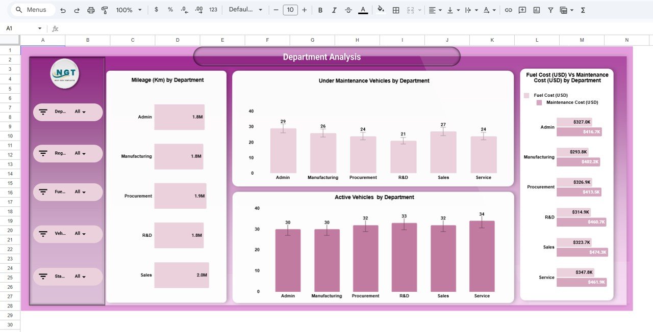
| Department Analysis | Mileage, Under Maintenance Vehicles, Active Vehicles and Fuel vs Maintenance Cost by Department | Which teams drive the most and spend the most? |
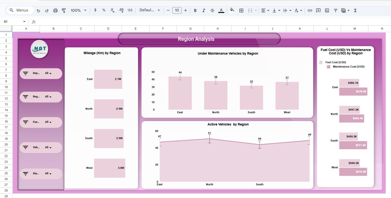
| Region Analysis | Mileage, Under Maintenance Vehicles, Active Vehicles and Fuel vs Maintenance Cost by Region | How do East, North, South and West compare? |
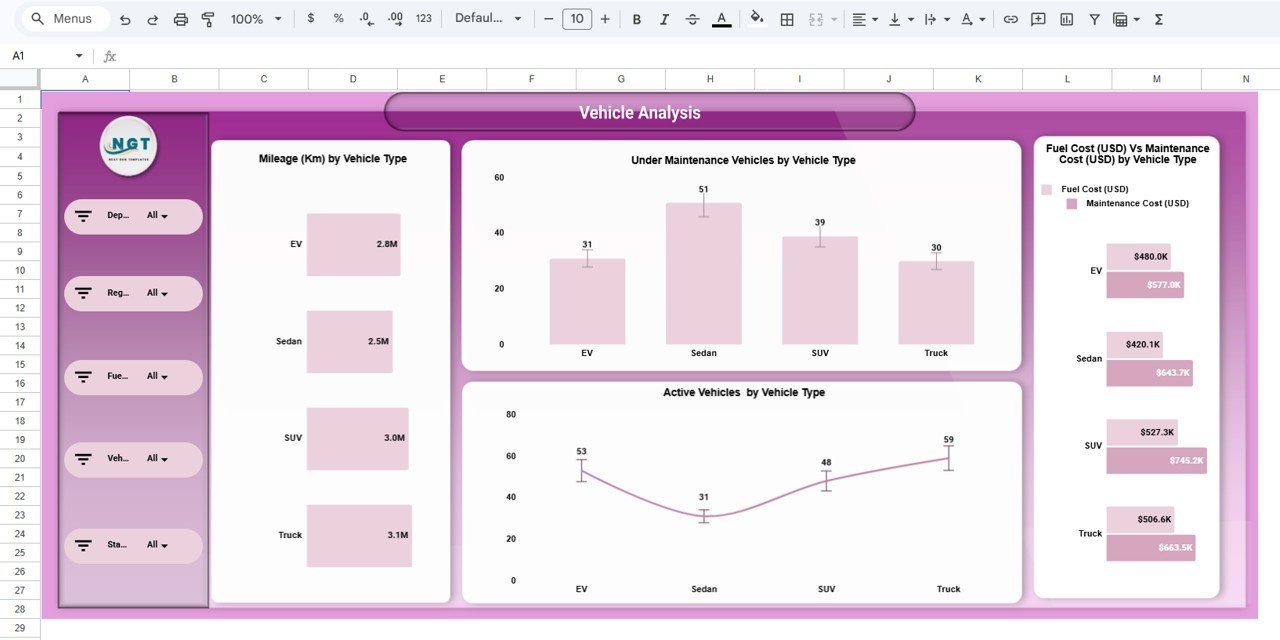
| Vehicle Analysis | Mileage, Under Maintenance Vehicles, Active Vehicles and Fuel vs Maintenance Cost by Vehicle Type | Are EVs, Sedans, SUVs or Trucks the most expensive to run? |
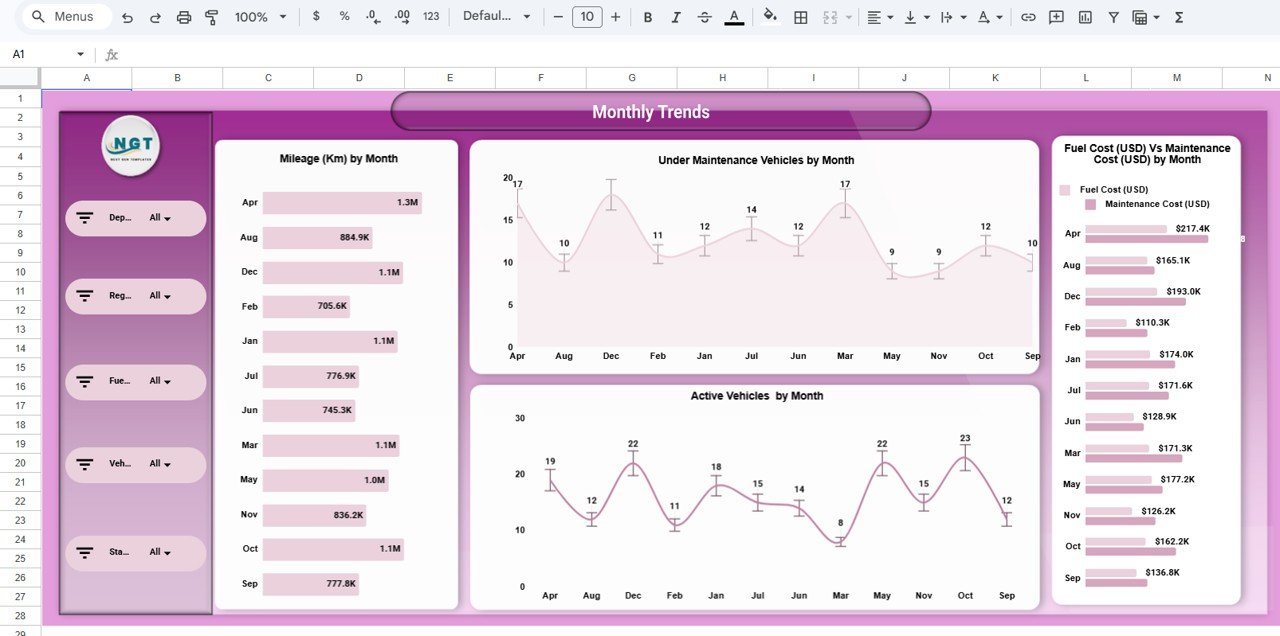
| Monthly Trends | Mileage, Under Maintenance Vehicles, Active Vehicles and Fuel vs Maintenance Cost by Month | Which months bring cost or downtime spikes? |
| Search sheet | Select Column, Search Keyword, Total Record count and the matching rows | Show me every record for one department, vehicle or status. |
Overview page
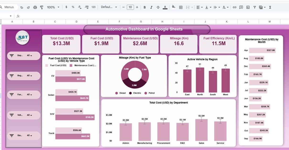
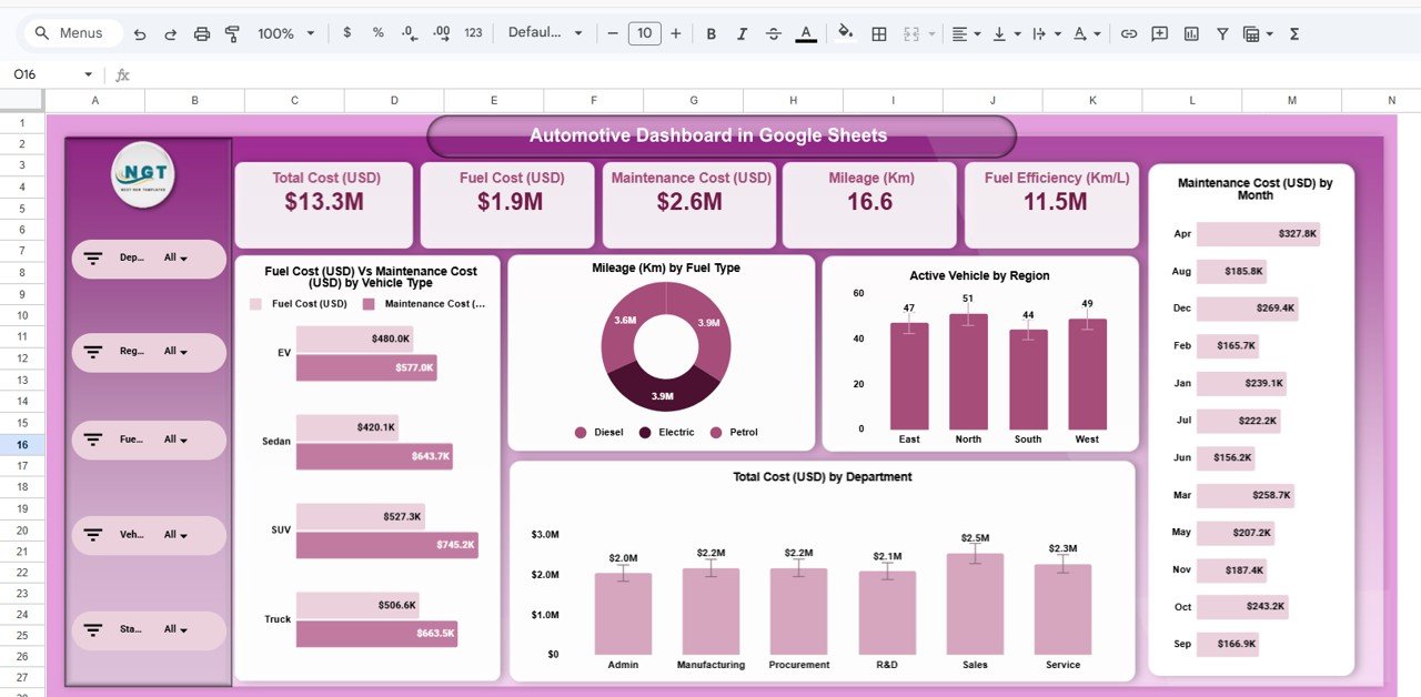
The Overview page opens with five KPI cards: Total Cost (USD), Fuel Cost (USD), Maintenance Cost (USD), Mileage (Km) and Fuel Efficiency (Km/L). With the sample data and no filters applied, the cost cards read $13.3M total cost, $1.9M fuel cost and $2.6M maintenance cost. Total Cost (USD) comes from its own column in the data table, so it is not simply fuel plus maintenance.
Below the cards, a grouped bar chart compares fuel and maintenance cost for each vehicle type (EV, Sedan, SUV and Truck). A donut chart splits mileage by fuel type (Diesel, Electric and Petrol). A column chart counts active vehicles in each region, another shows total cost by department (Admin, Manufacturing, Procurement, R&D, Sales and Service), and a bar list on the right ranks maintenance cost by month.
Department Analysis page
This page puts the six departments side by side. You see mileage by department, how many vehicles each department has under maintenance, how many are active, and a paired bar of fuel cost against maintenance cost. In the sample data Sales logs about 2.0M km against 1.8M km for Admin, and Admin has the most vehicles under maintenance (29). That kind of contrast is exactly what a department head needs before a budget review.
Region Analysis page
The Region Analysis page repeats the same four views for East, North, South and West. It is the quickest way to see whether one region is carrying more downtime than the others. In the sample, East has 44 vehicles under maintenance compared with 32 in South, while West records the highest mileage at 3.0M km.
Vehicle Analysis page
Here the split is by vehicle type. It shows which category covers the most distance, which spends the most time in the workshop and how fuel and maintenance cost compare for each. In the sample data Sedans have the most vehicles under maintenance (51), while SUVs carry the highest maintenance cost at $745.2K.
Monthly Trends page
The Monthly Trends page plots the same measures by month. Line charts show the number of vehicles under maintenance and active vehicles across the year, and bar lists rank mileage and fuel vs maintenance cost per month. Use it to spot seasonal patterns, such as a rise in workshop visits before a busy period.
Search by keyword and field name
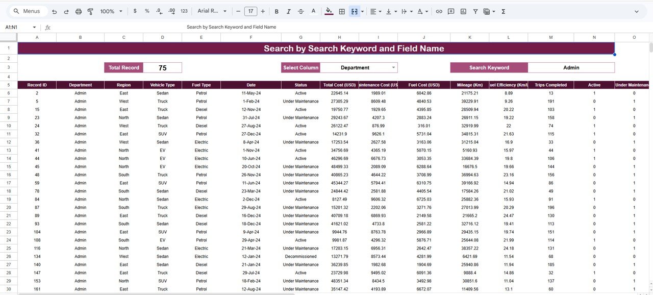
The search sheet, titled Search by Search Keyword and Field Name, lets you choose a column in Select Column, type a value in Search Keyword and see every matching row. A Total Record box counts the matches. In the screenshot, choosing Department and typing Admin returns 75 records.
The results show the full record layout: Record ID, Department, Region, Vehicle Type, Fuel Type, Date, Status, Total Cost (USD), Maintenance Cost (USD), Fuel Cost (USD), Mileage (Km), Fuel Efficiency (Km/L), Trips Completed, Active and Under Maintenance. Status values in the sample include Active, Under Maintenance and Decommissioned.
How to Use the Dashboard with Your Own Fleet Data
- Make a copy of the template in your Google Drive (File > Make a copy) so you keep the original as a backup.
- Open the data table and look at the column headings shown above. Keep the headings exactly as they are, because the charts and cards read from them.
- Paste your own records below the headings, one row per vehicle record. Use the same text for repeated values (for example always “R&D”, never “R and D”) so the groups stay clean.
- Enter dates as real dates, not text, so the Monthly Trends page can group them by month.
- Fill the Active and Under Maintenance columns as 1 or 0, as in the sample rows, so the vehicle counts add up correctly.
- Go back to the Overview page. The KPI cards and charts recalculate on their own. Use the slicers on the left to filter by department, region, fuel type, vehicle type or status.
- Use the search sheet whenever you need the underlying rows behind a number, for example every SUV under maintenance in the West region.
If you want to understand how slicers, summary tables and charts fit together so you can extend a dashboard like this yourself, the Excel Pivot Tables and Dashboards course on NextGenTemplates Academy covers the same building blocks step by step.
Real-World Use Cases
- Corporate fleet department: a company running pool cars and service vans across several departments can show each department head its own mileage, downtime and spend, then agree a fair cost allocation.
- Logistics or delivery operator: regional managers can compare East, North, South and West on vehicles in the workshop and maintenance spend, and move spare vehicles to the region that needs them.
- Fleet replacement planning: the Vehicle Analysis page shows which vehicle type carries the heaviest maintenance bill, which is useful evidence when deciding whether to replace petrol vehicles with EVs.
Best Practices
- Update on a fixed schedule. Add new fuel and workshop records weekly. A dashboard that is a month behind is easy to ignore.
- Keep category names consistent. One spelling per department, region and vehicle type. A stray space creates a new bar in every chart.
- Compare like with like. Use the slicers to look at one vehicle type or one region at a time before drawing conclusions.
- Read trends, not single months. One expensive month can be a one-off repair. Look for patterns across several months on the Monthly Trends page.
- Follow up with the search sheet. When a chart looks odd, pull the matching rows and check them before acting.
Who Should Not Use This Template
Be honest about fit before you buy. This is a reporting dashboard, not a full fleet management system. It does not schedule services, send reminders, read GPS or telematics data or manage drivers. The data is entered or pasted manually, so it will not update itself from a fuel card provider. If you run hundreds of thousands of rows a year, a database or Power BI will handle the volume better than Google Sheets. And if you only manage two or three vehicles, a simple log such as our vehicle maintenance checklist in Google Sheets may be all you need.
Related Guides and Templates
If you prefer target-vs-actual KPI tracking rather than record-level analysis, see the Automotive KPI Dashboard in Google Sheets and the Fleet Management KPI Dashboard in Google Sheets. For smaller company car pools, the Office Vehicle Fleet Dashboard in Google Sheets is a lighter option, and the Transportation and Logistics Dashboard in Google Sheets covers shipments and delivery performance.
Related templates: if your team works outside Google Sheets, there is also an Automotive Dashboard in Excel and an Automotive Dashboard in Power BI.
Frequently Asked Questions
What does the Automotive Dashboard in Google Sheets track?
It tracks total cost, fuel cost, maintenance cost, mileage, fuel efficiency and the number of active and under-maintenance vehicles. You can view them by department, region, vehicle type, fuel type and month.
Which filters are available?
Each dashboard page has a slicer panel for Department, Region, Fuel Type, Vehicle Type and Status. The search sheet adds a column picker and keyword box for record-level lookups.
Can I add my own vehicle types or departments?
Yes. Type the new names into the data table and they appear in the charts and slicers. Keep the column headings unchanged so the formulas keep working.
Does it connect to GPS or fuel card systems?
No. The dashboard works from data you paste or type into the sheet. You can export a CSV from your fuel card or telematics provider and paste the relevant columns in.
Can my whole team use it at the same time?
Yes. It is a normal Google Sheets file, so you can share it with view or edit access and everyone sees the same live numbers.
Do I need advanced Google Sheets skills?
No. If you can paste data into a sheet and click a slicer, you can run it. Formula knowledge only matters if you want to add new charts.
Wrapping Up
The Automotive Dashboard in Google Sheets turns scattered fuel, workshop and mileage records into five clear pages and a searchable record list. Load your own data, check the Overview each week, and use the department, region and vehicle views to decide where to cut cost or reduce downtime.
Get the Automotive Dashboard in Google Sheets
📅 Last updated: October 2026