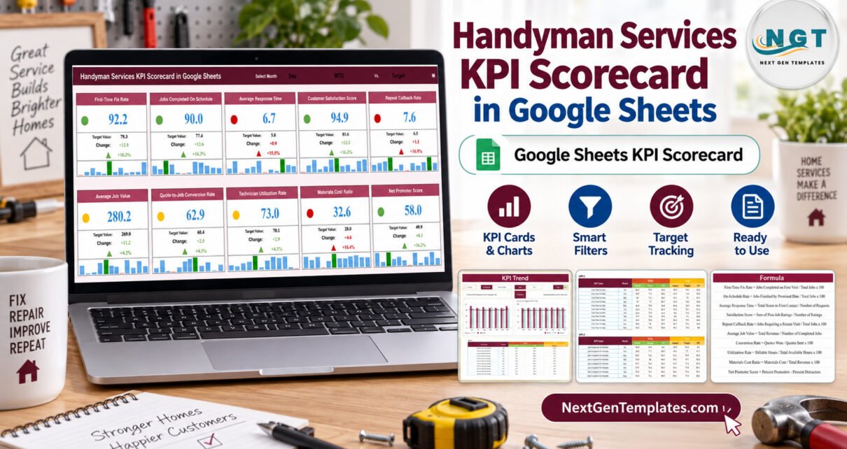
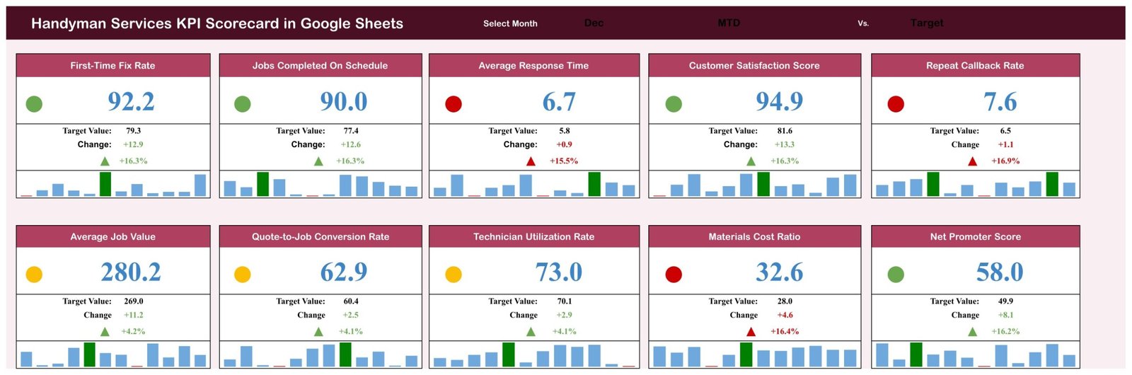
The Handyman Services KPI Scorecard in Google Sheets puts 10 KPIs from five groups on a single page: Job Execution, Scheduling, Customer, Financial and Workforce. You choose a month, pick MTD or YTD, and compare against Target or Prior Year (PY). Each card shows the value, the change and change %, a red/amber/green light, and a 12-month mini trend. A second page charts Actual vs Target vs PY for any KPI from January to December. The sample file opens on December, MTD vs Target, with 4 green, 3 amber and 3 red lights.Handyman Services KPI Scorecard in Google Sheets
Handyman businesses collect plenty of numbers: jobs booked and finished, return visits, response times, quotes sent and won, technician hours and parts spend. What is often missing is one monthly view that shows which of those numbers are on target and which are slipping. This scorecard is that view. It is the KPI scorecard format (ten cards, one review page), a separate product from our analytical Google Sheets dashboards and from the larger GS KPI Dashboard family. All figures in the file are fictional sample data.Handyman Services KPI Scorecard in Google Sheets
Get the Handyman Services KPI Scorecard in Google Sheets
Key Features of the Handyman Services KPI Scorecard in Google Sheets
- Three header selectors. Select Month runs Jan to Dec, the second drop-down switches MTD and YTD, and the third switches the comparison between Target and PY. All ten cards recalculate from those three cells.Handyman Services KPI Scorecard in Google Sheets
- Direction-aware traffic lights. Seven KPIs are upper-the-better (UTB) and three are lower-the-better (LTB). A rising Average Response Time or Materials Cost Ratio turns red; a rising First-Time Fix Rate turns green.Handyman Services KPI Scorecard in Google Sheets
- Mini trend on every card. Each card has a Jan to Dec column trend with the highest month in green and the lowest in red.
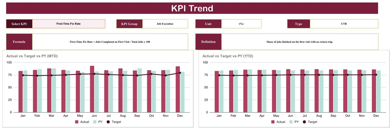
- KPI Trend page. A KPI drop-down pulls the group, unit, type, formula and definition, and two charts show Actual vs Target vs PY by month for MTD and YTD.
- Documented KPIs. Every KPI has a written formula, such as Quote-to-Job Conversion Rate = Quotes Won / Quotes Sent x 100.Handyman Services KPI Scorecard in Google Sheets
Template Structure: Page by Page
Scorecard
The review page. Row one holds First-Time Fix Rate, Jobs Completed On Schedule, Average Response Time, Customer Satisfaction Score and Repeat Callback Rate. Row two holds Average Job Value, Quote-to-Job Conversion Rate, Technician Utilization Rate, Materials Cost Ratio and Net Promoter Score. In the December sample, Jobs Completed On Schedule reads 90.0 against a target of 77.4 (green), Technician Utilization Rate reads 73.0 against 70.1 (amber, only 4.1% ahead), and Average Response Time reads 6.7 hours against 5.8 (red).Handyman Services KPI Scorecard in Google Sheets
KPI Trend
Select a KPI to see its KPI Group, Unit, Type, Formula and Definition, followed by Actual vs Target vs PY (MTD) and Actual vs Target vs PY (YTD) by month. The sample opens on First-Time Fix Rate, whose MTD actual sits above target in every month of the year.Handyman Services KPI Scorecard in Google Sheets
KPI Definition
The master list: number, KPI Group, KPI Name, Unit, Formula, Definition and Type. Units are (%), (hrs), (score) and (USD). The Scorecard and the KPI Trend page read names and types from this sheet.Handyman Services KPI Scorecard in Google Sheets

Input Data
Ten blocks (KPI-1 to KPI-10), each with twelve month rows and six typed numbers: MTD Actual, Target and PY, plus YTD Actual, Target and PY.
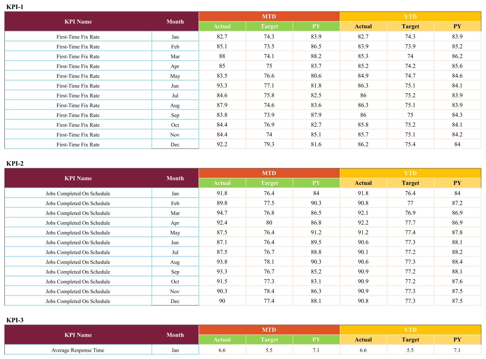
The workbook also includes Read Me and Color Settings tabs and two helper sheets, Support and Trend_Support, which run the lookups behind the cards and charts.
Handyman Scorecard vs. Excel Dashboard vs. Field Service Software: Feature Comparison
| Feature | This Google Sheets scorecard | Microsoft Excel KPI dashboard | Field service software (e.g. Jobber, Housecall Pro) |
|---|---|---|---|
| Cost | ✅ One-time purchase | One-time template plus an Excel licence | Recurring subscription |
| Platform | ✅ Browser, free Google account | Excel desktop | Vendor web and mobile apps |
| Team collaboration | ✅ Live Google sharing | Limited outside Microsoft 365 | ✅ Yes |
| Share with a link | ✅ Yes | File or OneDrive link | User accounts |
| Change KPIs and targets | ✅ Edit two sheets | ✅ Yes | Fixed reports |
| One-page monthly KPI review | ✅ Ten cards with lights | ✅ Yes | Varies by plan |
| Job booking, dispatch, invoicing | No | No | ✅ Yes |
| Automatic data capture | No, typed monthly | No | ✅ Yes |
| Year-1 cost at 5 users | ✅ One purchase | Template plus 5 Excel seats | Subscription per user or tier |
For handyman businesses that want a monthly KPI review without paying for a full job-management platform, this scorecard sits in the sweet spot.
Who Should Use This Template
Perfect for:
- Owners of small and mid-sized handyman and home repair businesses who already track monthly totals Handyman Services KPI Scorecard in Google Sheets
- Operations leads comparing first-time fixes, on-schedule jobs and technician utilization with target or last year
- Office staff who watch response time, quote conversion, average job value and materials cost
Not a fit if:
- You need job booking, dispatch, estimates or invoicing; the sheet reports only numbers you enter
- You need licensing, insurance, warranty or building-code records; the template holds none of them
- You need per-technician or multi-branch roll-ups; the grain is one row per KPI per month
Real-World Use Cases
Dave runs a four-technician handyman company. At month end he types the totals, leaves the scorecard on MTD vs Target and looks at the red cards first. In the sample December those are Average Response Time, Repeat Callback Rate and Materials Cost Ratio, which tells him to look at how requests are assigned, review which jobs needed a return trip, and check what parts are costing.
Priya manages bookings and quotes. She switches to YTD vs PY to see whether Quote-to-Job Conversion Rate and Average Job Value beat last year, then opens KPI Trend to show the owner the months where quotes stopped converting.
Luis is planning next year’s hiring. He reads Technician Utilization Rate beside Jobs Completed On Schedule across twelve months to decide whether the team is stretched thin or has room for more bookings.
Advantages of the Handyman Scorecard
- One purchase, no seats. Share it with the whole office through Google Drive at no extra cost.
- Fast monthly review. Ten cards and three selectors replace flicking through several spreadsheets.
- Honest colours for lower-the-better KPIs. Slower response, more callbacks and higher materials cost are scored the right way round in the traffic lights.
- Two comparisons in one file. Target keeps this year honest; PY shows whether the business is improving year on year.
Opportunities for Improvement
We exported the live Google Sheet and checked its formulas before listing. These are the points a buyer should know, with the fix where one exists:
- June and July break the cards. The Select Month drop-down offers “June” and “July”, but Input Data stores “Jun” and “Jul”, and the card lookups match the exact text. Picking either month drops all ten cards to zero with broken lights and change %. The one-minute fix: click Scorecard cell N1, open Data > Data validation, and edit the list so it reads Jun and Jul. The KPI Trend page and the mini trends are not affected.
- Average Response Time change colour is always red. On that card both conditional-format rules use red text, so the change figure and arrow stay red even in a month when response time improves. Open Format > Conditional formatting for N6:N7 and M7 and set the “Green” rule’s text colour to green.
- The Color Settings tab is not wired in. The traffic-light bands are hardcoded on the Support sheet in Z4:AA6 (upper-the-better) and AC4:AD6 (lower-the-better). By default an upper-the-better KPI is red at or below its comparison value, amber up to 10% above it, and green only beyond 10%, which is strict: hitting target exactly shows red. A lower-the-better KPI is green at or below its comparison, amber up to 10% above and red beyond. Change the bands on Support, not on Color Settings.
- The Read Me tab is empty. Use this guide and the steps in the product listing instead.
- YTD is typed, not calculated. You enter YTD Actual, Target and PY yourself; the sheet does not sum or average the MTD rows.
- Header selector text is hard to read. The selected month, MTD/YTD and Target/PY print in dark text on a maroon band. Select N1, Q1 and V1 and set the font colour to white.
- One calendar year per file, no year field. Keep one copy per year and replace the fictional sample figures with your own.
Best Practices
- Apply the June/July and Average Response Time fixes before entering real data.
- Agree each KPI’s formula with your team using the KPI Definition sheet, so everyone counts a first-time fix, a callback and a response hour the same way.
- Keep KPI names identical on KPI Definition and Input Data; the cards match them by exact text.
- Set targets per month rather than one flat number, because busy spring and holiday months look very different for a handyman business.
- Review on MTD vs Target monthly and on YTD vs PY at year end.
- Treat every figure here as a summary number you enter; keep your own job records and follow the licensing and insurance rules that apply where you work.
Explore Relevant Templates
Other ten-KPI scorecards for home-service trades on this blog use the same format: read the Home Renovation Contractor KPI Scorecard in Google Sheets guide, the Painting Contractor KPI Scorecard in Google Sheets guide, the Garage Door Service KPI Scorecard in Google Sheets guide and the Locksmith Business KPI Scorecard in Google Sheets guide. For the larger KPI dashboard format, see the Plumbing Business KPI Dashboard in Google Sheets walkthrough, and to follow quotes one by one, the Proposal and Quote Tracker in Google Sheets.
On the store: HVAC Contractor KPI Scorecard in Google Sheets and all Google Sheets KPI templates.
New to the Google Sheets features behind this template? Google explains in-cell drop-down lists and conditional formatting rules.
To get more from KPI reporting like this, the Excel Pivot Tables & Dashboards course on NextGenTemplates Academy takes you through it with practice files.
Get the Handyman Services KPI Scorecard in Google Sheets
Frequently Asked Questions
What does the handyman scorecard track?
It tracks ten KPIs: First-Time Fix Rate, Jobs Completed On Schedule, Average Response Time, Customer Satisfaction Score, Repeat Callback Rate, Average Job Value, Quote-to-Job Conversion Rate, Technician Utilization Rate, Materials Cost Ratio and Net Promoter Score, grouped into five areas.
How long does setup take?
Making your copy and applying the two fixes takes a few minutes. Entering a year of data means 120 month rows (10 KPIs times 12 months), each with six numbers. After that the cards, lights and trend charts update automatically whenever you change a selector.
Why do the cards show zeros for June or July?
The month drop-down spells those months in full while the data uses Jun and Jul. Edit the validation list on Scorecard cell N1 to Jun and Jul and the cards fill again.
How does this compare to Jobber or Housecall Pro?
Those platforms handle booking, dispatch, quoting and billing on a subscription. This scorecard handles none of that. It is a one-time Google Sheets file for reviewing monthly KPIs you already collect, and it sits happily alongside such software.
Does it make any licensing or certification claim?
No. The template makes no contractor licensing, bonding, insurance, building-code or certification claim. Every KPI is a monthly figure you enter and compare with a target, and the sample data is fictional.
Can I change the KPIs?
Yes. Rename a KPI and set its UTB or LTB type on KPI Definition, then use the identical name in its Input Data block. The layout stays fixed at ten KPI cards.
About the Author
Built by PK, with 15+ years of Excel, Google Sheets and Power BI experience and founder of NextGenTemplates. Every template is built and tested before release, and this guide lists what our own test found.
Conclusion
If you want one page that tells you, month by month, whether your handyman business is hitting its targets, this scorecard does that job for a one-time price. Apply the two quick fixes, enter your numbers, and review the lights each month.
✅ Instant download · One-time payment · No subscription
Last updated: September 2026