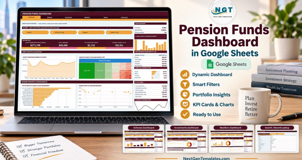
The Pension Funds Dashboard in Google Sheets is a six-page reporting workbook built on 500 fictional scheme records: 14 schemes, 3 scheme types, 8 sponsor industries, 6 regions, 5 asset classes and 8 trustee firms across twelve months of 2024. It carries 16 KPI cards, 18 charts and 15 slicers, all running on native Google Sheets pivot tables, and every pivot already reads 1,000 data rows.
Pension reporting teams usually rebuild the same pivots every month: assets by scheme type, members by region, contributions against benefit payments, fees by asset class. This template does that work once. You paste scheme records into one Data sheet and four analysis pages, a record Search page and an Instructions page update together, so the monthly pack becomes a copy-and-paste job rather than a rebuild.
Get the Pension Funds Dashboard in Google Sheets
Key Features of the Pension Funds Dashboard
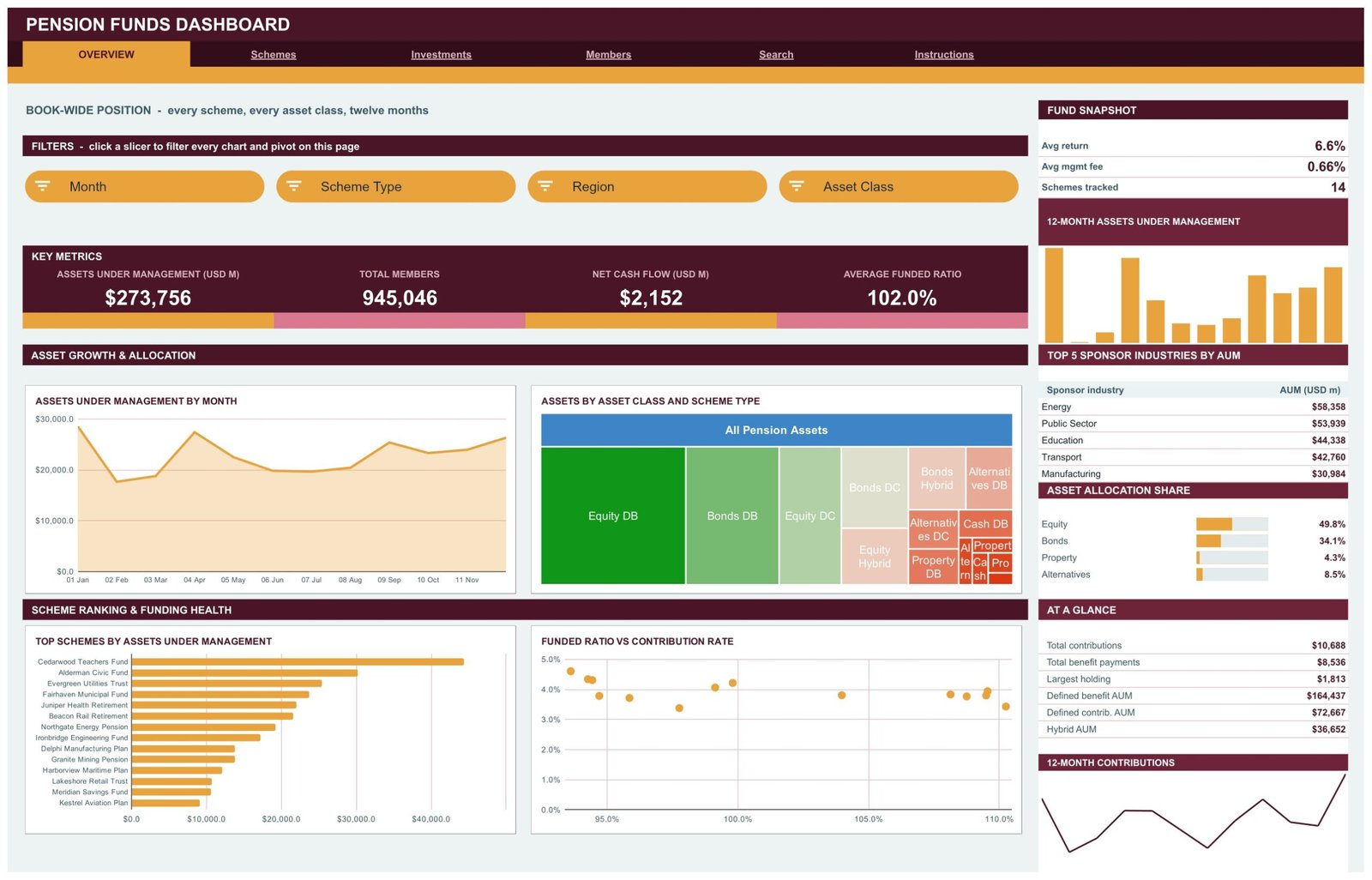
- Sixteen KPI cards. Each analysis page opens with four cards. Overview reads Assets Under Management (USD M) $273,756, Total Members 945,046, Net Cash Flow (USD M) $2,152 and Average Funded Ratio 102.0% in the sample data.
- Eighteen charts on four pages. Overview holds 4, Schemes 3, Investments 6 and Members 5, each named for what it measures, such as Assets by Asset Class and Scheme Type or Contributions vs Benefits by Region.
- Fifteen slicers. Month, Scheme Type, Region, Asset Class, Sponsor Industry and Trustee filters sit in a FILTERS strip at the top of each page, and each page keeps its own filter state.
- A consistent sidebar. Every analysis page has a snapshot box, a 12-Month Assets Under Management column chart, a Top 5 table, a share-bar panel, an AT A GLANCE list and a 12-Month Contributions trend line.
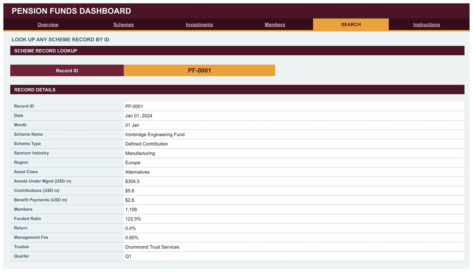
- A scheme record Search page. Choose a Record ID such as PF-0001 and read all 17 fields of that record without scrolling the Data sheet.
- Auto-expanding range. Pivots, slicers and formulas cover rows up to 1001, so new records appear on every page without editing a range.
What This Template Is, and What It Is Not
This is a reporting template for pension scheme figures you already hold. It is not pension administration, member recordkeeping or actuarial valuation software. It calculates no liabilities, gives no investment, actuarial, fiduciary or retirement advice, promises no returns and makes no regulatory or compliance claim under ERISA, The Pensions Regulator, IRDAI, PFRDA or any other regime. Every scheme, trustee and number in the sample is fictional.
Dashboard Pages Explanation
Page 1: Overview
Overview is the book-wide position across every scheme, asset class and month. Below the four cards sit Assets Under Management by Month, Assets by Asset Class and Scheme Type, Top Schemes by Assets Under Management and Funded Ratio vs Contribution Rate. The sidebar shows an average return of 6.6%, an average management fee of 0.66%, 14 schemes tracked, the Top 5 Sponsor Industries by AUM (Energy $58,358M, Public Sector $53,939M) and Asset Allocation Share, where equity holds 49.8%.
Page 2: Schemes
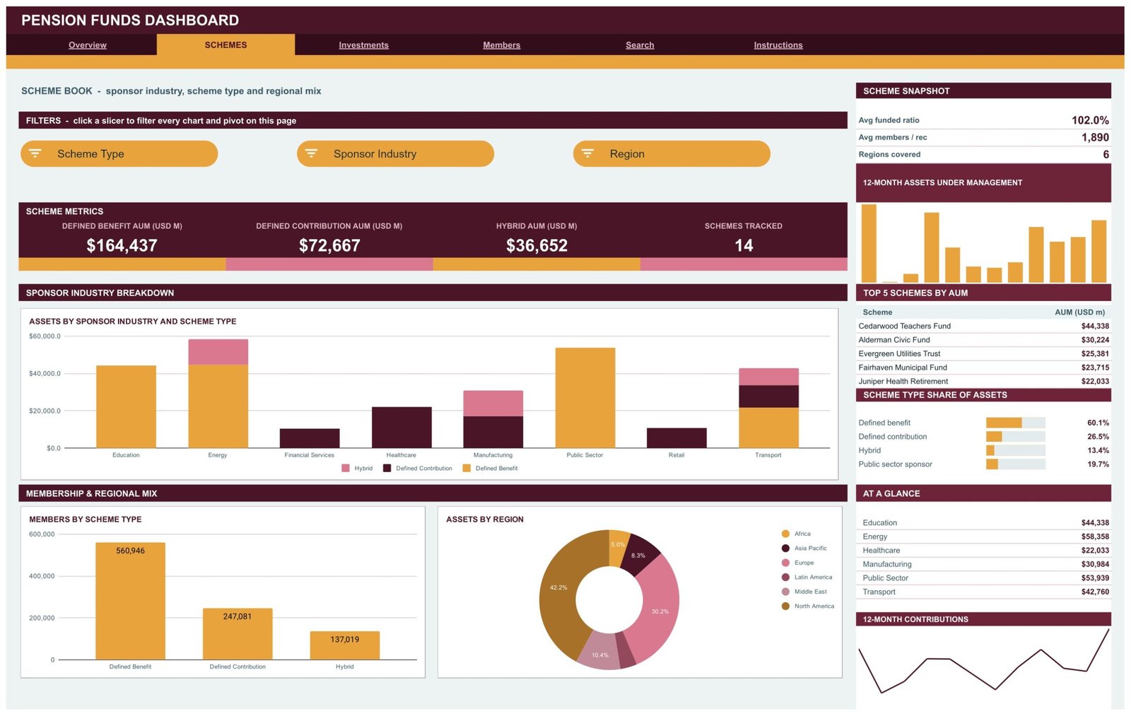
Schemes covers sponsor industry, scheme type and regional mix. The cards read Defined Benefit AUM $164,437M, Defined Contribution AUM $72,667M, Hybrid AUM $36,652M and 14 schemes tracked. Charts include Assets by Sponsor Industry and Scheme Type, Members by Scheme Type (Defined Benefit 560,946) and Assets by Region, where North America holds 42.2%. The Top 5 Schemes by AUM table starts with Cedarwood Teachers Fund at $44,338M.
Page 3: Investments
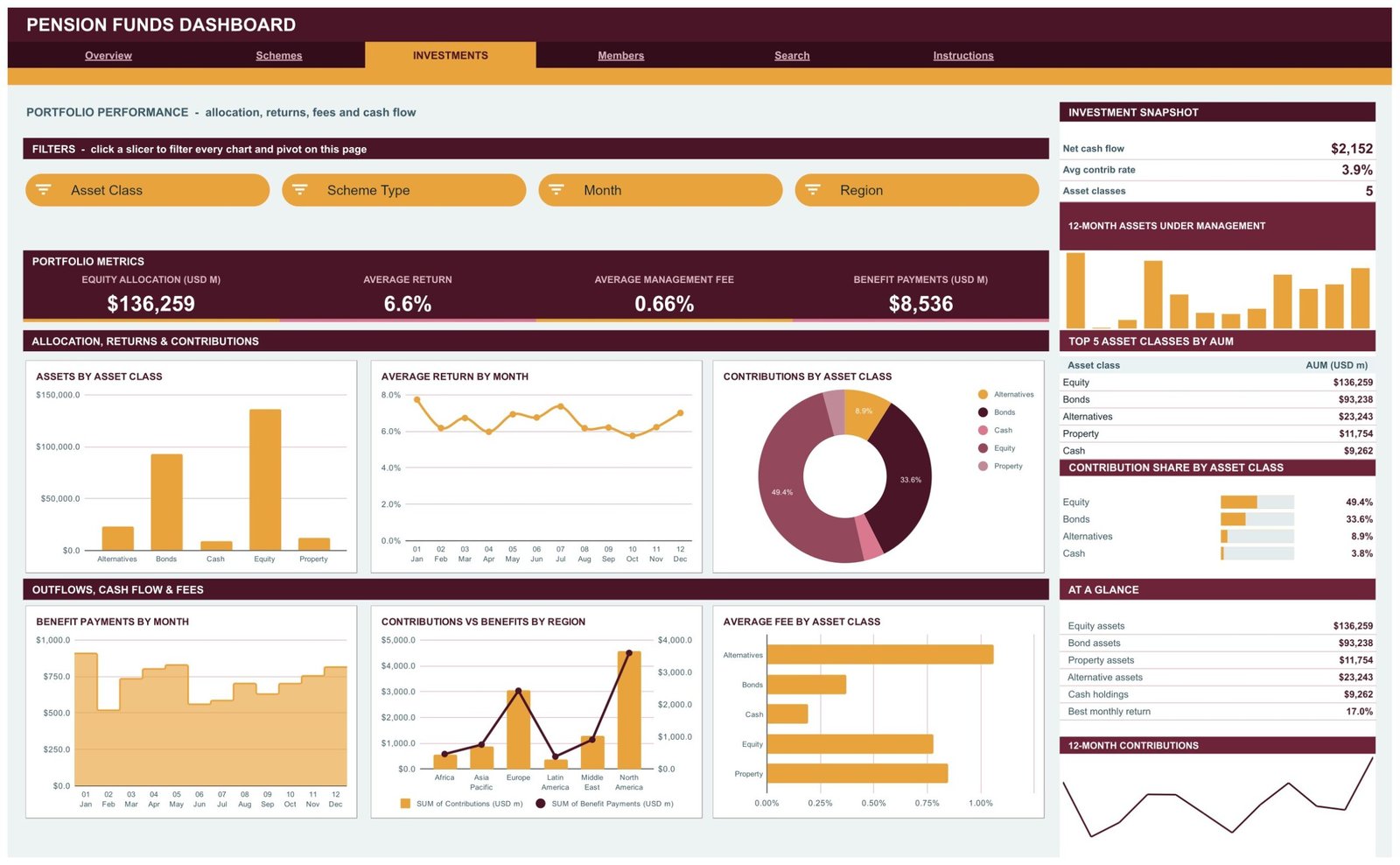
Investments is the portfolio view: Equity Allocation $136,259M, Average Return 6.6%, Average Management Fee 0.66% and Benefit Payments $8,536M. Six charts show Assets by Asset Class, Average Return by Month, Contributions by Asset Class, Benefit Payments by Month, Contributions vs Benefits by Region and Average Fee by Asset Class. The sidebar adds net cash flow of $2,152M, an average contribution rate of 3.9% and a Top 5 Asset Classes by AUM table.
Page 4: Members
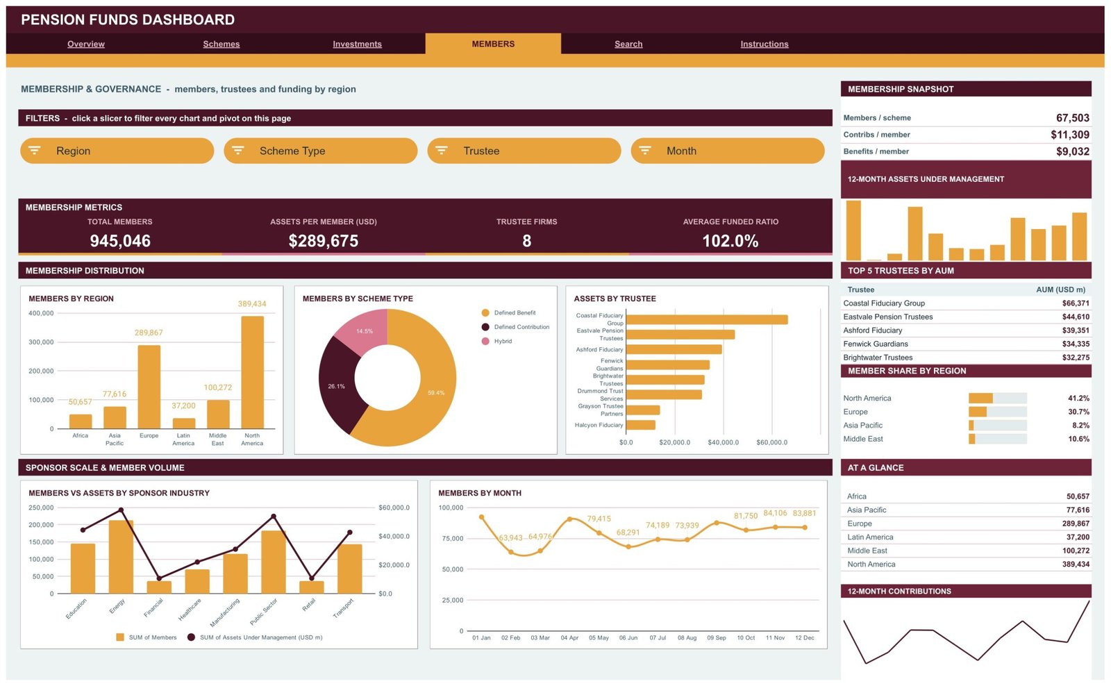
Members covers membership and governance: Total Members 945,046, Assets per Member $289,675, 8 Trustee Firms and Average Funded Ratio 102.0%. Charts include Members by Region, Members by Scheme Type, Assets by Trustee, Members vs Assets by Sponsor Industry and Members by Month. The Top 5 Trustees by AUM table is led by Coastal Fiduciary Group at $66,371M.
Page 5: Search
Search looks up any scheme record by ID and lists date, month, scheme name, scheme type, sponsor industry, region, asset class, assets under management, contributions, benefit payments, members, funded ratio, return, management fee, trustee and quarter.
Page 6: Instructions
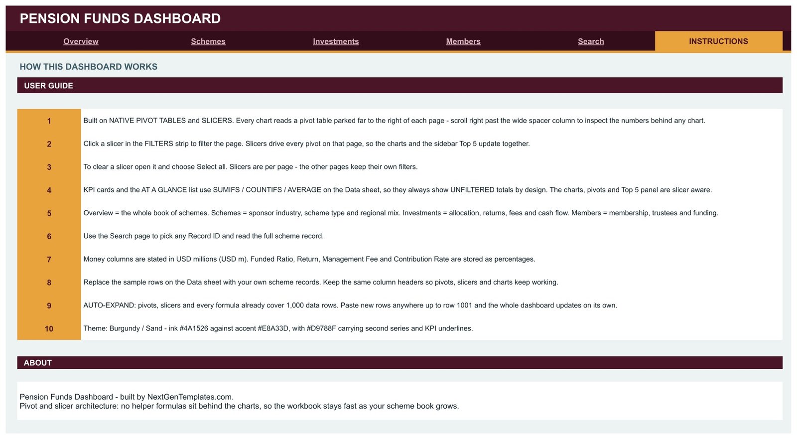
Ten numbered notes explain how the pivots and slicers work, how to clear a filter, why KPI cards stay unfiltered, what each page is for, the USD millions convention, how to replace the sample data and the 1,000-row range.
Pension Funds Dashboard in Google Sheets vs. Excel vs. a Paid BI Suite
| Feature | This Google Sheets dashboard | Microsoft Excel dashboard | Power BI Pro / Tableau Creator |
|---|---|---|---|
| Cost | $9.99 one-time ✅ | $17.99 one-time + Microsoft 365 | $14-75 / user / month |
| Platform | Google Sheets, browser only ✅ | Desktop Excel | Desktop authoring + service |
| Setup time | Under 10 minutes ✅ | Under 15 minutes | Days: model, publish, licence |
| Real-time team collaboration | Built in ✅ | Only via OneDrive co-authoring | Yes, per seat |
| Mobile access | Google Sheets app ✅ | Excel mobile, limited slicers | Vendor app, per seat |
| Share with a link | Any Google account ✅ | File send or OneDrive link | Viewers need a licence |
| Year-1 cost at 5 users | $9.99 ✅ | $17.99 + 5 Microsoft 365 seats | $840-4,500 |
| Scheme record lookup | Search page, no add-ons ✅ | Needs a lookup sheet | Drillthrough page |
| Row capacity out of the box | 1,000 scheme records | Excel row limit | Millions ✅ |
For a pensions reporting team that wants scheme data summarised without per-seat BI licences, this Google Sheets dashboard sits in the sweet spot.
Who Should Use This Template
Perfect for:
- Pension fund analysts and reporting leads who keep scheme-level figures in spreadsheets
- Trustee board secretaries and consultants building a monthly or quarterly board pack
- Lecturers teaching Defined Benefit, Defined Contribution and Hybrid schemes with safe, fictional data
Not a fit if:
- You need investment, retirement or actuarial advice, or a liability and funding valuation
- You need member recordkeeping, benefit calculations, audit trails or regulatory filings
- Your book runs far beyond 1,000 records or needs a live custodian feed
Real-World Use Cases
Helen prepares the quarterly pack for a multi-employer scheme board. She pastes the quarter’s records into the Data sheet, filters the Schemes page by sponsor industry and presents Assets by Sponsor Industry and Scheme Type. The trustees make the decisions; the workbook only organises the figures she already has.
Rahul is a reporting analyst at a pensions consultancy. A client asks how benefit payments compare with contributions in each region. He opens Investments, reads Contributions vs Benefits by Region, then uses Search to pull one record the client queries.
Anna teaches a retirement-finance module. Her students filter by scheme type and region to see how a Defined Benefit book differs from a Defined Contribution one, using fictional schemes rather than anyone’s real pension data.
Advantages of the Pension Funds Dashboard
- One-time cost. $9.99 once instead of per-seat BI licences, and anyone with a Google account can view a shared copy.
- No rebuild each month. Replace rows on one Data sheet and 18 charts, 4 Top 5 tables and the Search page follow.
- Fast workbook. Charts read pivot tables rather than helper formulas, so the file stays responsive as the scheme book grows.
- Transparent numbers. Every pivot is parked to the right of its page, so you can check the figures behind any chart.
Opportunities for Improvement
- Cards do not filter. KPI cards and AT A GLANCE lists always show unfiltered totals; only charts, pivots and Top 5 tables follow the slicers.
- AUM is summed across records. Assets are stored per record for twelve months, so the AUM card adds every record rather than showing one month-end balance. Filter charts to one month for a point-in-time view.
- Share panels show four rows. Asset Allocation Share lists four of the five asset classes and Member Share by Region four of six regions, and the Scheme Type Share panel adds a Public sector sponsor row that is a sponsor industry, not a scheme type.
- No liability or funding model. Funded ratio is a value you enter; the workbook does not calculate it.
Best Practices
- Keep the Data sheet headers exactly as supplied so pivots, slicers and charts keep working.
- Enter money in USD millions and ratios, returns, fees and contribution rates as percentages.
- Give every row a Record ID so Search can find it.
- Clear slicers with Select all before sharing a copy, so readers start from the whole book.
- Read Google’s guides to pivot tables and slicers in Google Sheets if you want to add your own views.
Explore Relevant Templates
On this blog, the Pension Fund KPI Dashboard in Google Sheets covers the month-picker scorecard family for the same subject. For neighbouring finance reporting, read the Investor Relations Dashboard in Google Sheets, the Tax Advisory Dashboard in Google Sheets, the Banking Dashboard in Google Sheets and the Retirement Savings Tracker in Google Sheets.
Also available as separate builds: the Pension Funds Dashboard in Excel and the Pension Funds Dashboard in Power BI, each with its own layout and sample data. Browse more Google Sheets Dashboards on NextGenTemplates.
If you want to see how pivot tables and slicers come together in a dashboard like this, the Excel Pivot Tables & Dashboards course on NextGenTemplates Academy teaches it step by step with practice files.
Get the Pension Funds Dashboard in Google Sheets
Frequently Asked Questions
What does the Pension Funds Dashboard in Google Sheets track?
It tracks assets under management, members, contributions, benefit payments, net cash flow, funded ratio, return, management fee and contribution rate. Those measures are cut by scheme, scheme type, sponsor industry, region, asset class, trustee and month across 18 charts on four analysis pages.
Is the sample data real?
No. All 500 records, 14 schemes and 8 trustee firms are fictional. The template gives no investment, actuarial, fiduciary or retirement advice and implies no returns. Replace the sample rows with your own scheme records before using it for reporting.
Can it replace pension administration or actuarial software?
No. It summarises figures you already hold. It keeps no member records, calculates no benefits or liabilities, runs no valuation and produces no regulatory filings, and it makes no ERISA, TPR, IRDAI or PFRDA compliance claim.
How does this compare with Power BI or Tableau?
Power BI Pro and Tableau Creator handle millions of rows and live data sources but cost $14-75 per user per month. This dashboard costs $9.99 once, runs in a browser and suits books of up to 1,000 records per copy.
How long does setup take?
Most users finish in under 10 minutes. Open the PDF in the download, make a copy in Google Drive, paste your records over the sample rows on the Data sheet and the pages refresh on their own.
Is it the same as the Pension Fund KPI Dashboard?
No. The KPI Dashboard family is a month-picker scorecard with targets and traffic lights. This workbook is an analytical dashboard built on scheme records, with pivot charts, slicers and a Search page.
About the Author
Built by PK, a Microsoft Certified Professional with 15+ years of Excel, Google Sheets and Power BI experience. Founder of NextGenTemplates, reaching 300K+ subscribers across YouTube channels. Every template is hand-built and tested before release.
Conclusion
The Pension Funds Dashboard in Google Sheets gives a pensions reporting team four analysis pages, a record Search page and a built-in guide for a one-time $9.99. It organises scheme figures you already have; it does not advise, value or administer a scheme.
✅ Instant download · One-time payment · No subscription
Last updated: September 2026