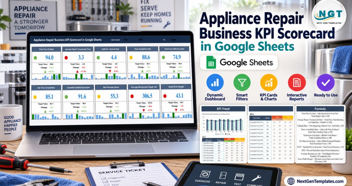
The Appliance Repair Business KPI Scorecard in Google Sheets puts 10 appliance repair KPIs from five groups on one page: three repair execution measures, one parts measure, two scheduling and dispatch measures, two customer measures and two financial measures. Every KPI gets a traffic-light card with a 12-month mini chart, a second page trends one KPI at a time against Target and prior year, and the sample file carries 120 monthly records.
Appliance repair businesses depend on first-visit fixes, low callbacks, parts on the van and punctual technicians. This scorecard gives an owner or service manager one shared Google Sheets file where the figures sit side by side, with a month picker and switches for MTD/YTD and Target/PY. It is a scorecard, not job booking or dispatch software, and this guide explains exactly what it does, including the issues we found while checking the current build.
Key Features of the Appliance Repair Business KPI Scorecard
- Three selectors on the Scorecard: Month (Jan to Dec), MTD or YTD, and a comparison against Target or PY. All 10 cards recalculate from the Input Data sheet with ordinary formulas, without scripts or add-ons.
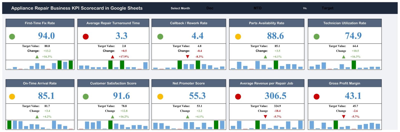
- Direction-aware traffic lights: for an upper-the-better (UTB) KPI, a variance at or below 0% is red, up to 10% is amber and above 10% is green. Lower-the-better (LTB) KPIs use the mirror rule, so a shorter turnaround time or a lower callback rate earns green.
- Complete cards: each card shows the value, the Target or PY value, the absolute change, the change %, an arrow and a 12-month mini column chart with the selected month highlighted.
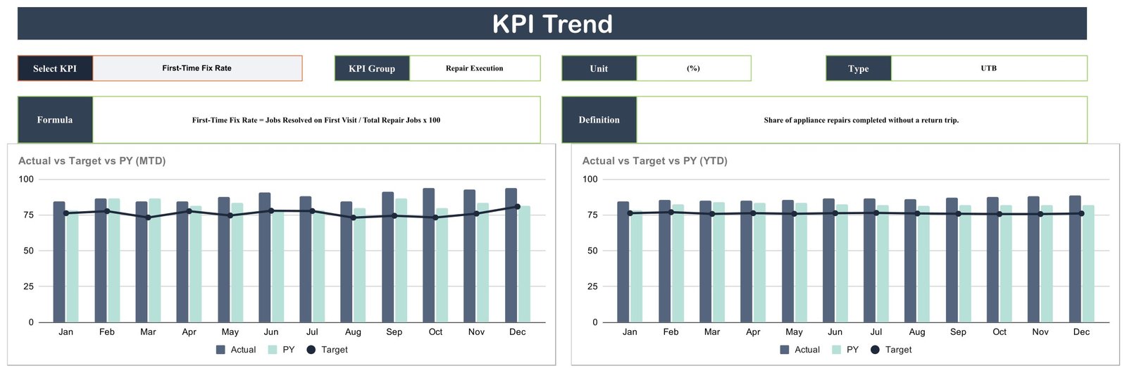
- KPI Trend page: choose one KPI to see its group, unit, type, formula, definition and two charts of Actual vs Target vs PY by month, one for MTD and one for YTD.
- Documented metrics: the KPI Definition sheet lists a unit, formula, definition and UTB/LTB type for each KPI.
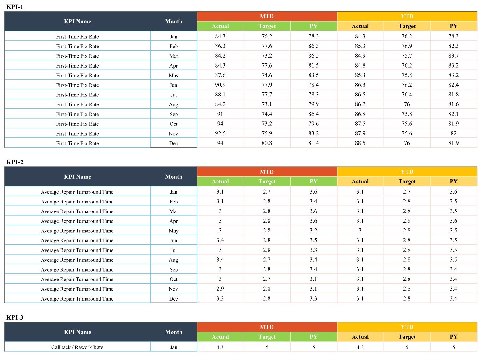
- Plain monthly input: Input Data stores MTD and YTD Actual, Target and PY for 12 months per KPI. YTD is typed, not calculated.
The 10 KPIs
- Repair Execution: First-Time Fix Rate (%), Average Repair Turnaround Time (days, LTB), Callback / Rework Rate (%, LTB)
- Parts & Inventory: Parts Availability Rate (%)
- Scheduling & Dispatch: Technician Utilization Rate (%), On-Time Arrival Rate (%)
- Customer: Customer Satisfaction Score (%), Net Promoter Score (pts)
- Financial: Average Revenue per Repair Job ($), Gross Profit Margin (%)
Scorecard Pages Explanation
Page 1: Scorecard
The main page holds 10 cards in two rows of five under a header with the Month, MTD/YTD and Target/PY selectors. With December, MTD and Target selected, the sample reads 4 green, 3 amber and 3 red. First-Time Fix Rate shows 94.0 against an 80.8 target (green, up 16.3%), Parts Availability Rate shows 88.6 against 85.1 (amber, up 4.1%) and Average Repair Turnaround Time shows 3.3 days against 2.8 (red, because lower is better).
Page 2: KPI Trend
Select a KPI and the page fills in KPI Group, Unit, Type, Formula and Definition, then plots Actual vs Target vs PY (MTD) by Month and Actual vs Target vs PY (YTD) by Month for all 12 months. The sample shows First-Time Fix Rate.
Page 3: KPI Definition
A table of the 10 KPIs with #, KPI Group, KPI Name, Unit, Formula, Definition and Type. For example, Technician Utilization = Billable Field Hours / Total Available Hours x 100, and Parts Availability Rate = Jobs with Parts In Stock / Total Jobs Needing Parts x 100.

Page 4: Input Data
Ten blocks labelled KPI-1 to KPI-10, each with 12 monthly rows and six figures per row: MTD Actual, Target and PY, then YTD Actual, Target and PY. This is the only sheet you update each month.
Behind these pages sit a Read Me tab, a Color Settings tab and two helper tabs, Support and Trend_Support, which do the lookups for the cards and charts.
Google Sheets Scorecard vs. Excel Workbook vs. Field Service Software: Feature Comparison
| Feature | Appliance Repair Business KPI Scorecard (Google Sheets) | Excel KPI scorecard workbook | Field service software (ServiceTitan / Jobber) |
|---|---|---|---|
| Cost | ✅ $8.99 one-time | One-time, plus an Excel licence | Recurring subscription |
| Platform | ✅ Browser, any OS | Desktop Excel | Vendor web and mobile apps |
| Setup time | ✅ Minutes | Minutes | Days to weeks |
| Customisable KPIs | ✅ Names, units, formulas, UTB/LTB | ✅ Yes | Within vendor limits |
| Year-1 cost at 5 users | ✅ $8.99 total | Template plus licences | Per-user fees |
| Traffic-light monthly scorecard | ✅ Built in | ✅ Built in | Usually a custom report |
| Job booking, dispatch and invoicing | No, monthly totals | No | ✅ Yes |
For an appliance repair shop that wants a clear monthly KPI review without paying for a field service platform, this Google Sheets scorecard sits in the sweet spot.
Who Should Use This Template
Perfect for:
- Owners and service managers of appliance repair businesses who hold a monthly performance review
- Dispatch leads who watch technician utilization, on-time arrival and parts availability together
- Finance or admin staff who track revenue per job and gross profit margin against target
Not a fit if:
- You need job booking, technician dispatch, parts ordering or invoicing, because the file only reports monthly totals
- You want several years in one file, because each copy covers one Jan to Dec year
Real-World Use Cases
Dave owns a six-van appliance repair company. At month end he flips the comparison switch from Target to PY to check whether First-Time Fix Rate and Callback / Rework Rate beat last year, then shares the sheet link with his lead technicians so everyone sees the same lights.
Anita runs dispatch for a regional repair service. She keeps Technician Utilization Rate, On-Time Arrival Rate and Parts Availability Rate side by side. When parts availability turns amber, she opens KPI Trend to see which months dragged it down.
Advantages of the Appliance Repair Scorecard
- One page for five areas of the business: repairs, parts, dispatch, customers and money are reviewed together instead of in separate files.
- Correct lights for lower-the-better metrics: turnaround time and callback rate turn green when they fall, not when they rise.
- Two comparison bases: switching between Target and PY answers both “are we on plan?” and “are we better than last year?”.
- No recurring cost: a one-time purchase that lives in your own Google Drive and can be shared with any number of viewers.
Opportunities for Improvement
We checked the live sheet and the scorecard build behind this template before writing this post. These are the issues a buyer should know about:
- June and July show zeros on the Scorecard. The Month drop-down in cell N1 offers “June” and “July”, but Input Data and the lookup formulas use “Jun” and “Jul”. Choosing either month makes all 10 cards read 0.0. The fix takes a minute: open Data > Data validation on N1 and change those two entries to Jun and Jul. The KPI Trend charts are not affected.
- The Read Me tab is empty. There are no in-file instructions yet, so use this post and the steps below.
- Color Settings is not connected. The Color Settings tab shows the RAG table, but the lights read a copy of it in the Support tab (cells Z4:AE6). Edit those cells if you want different thresholds.
- One card colours its change figures wrongly. On the Callback / Rework Rate card, the change (-0.4), change % (-8.3%) and down arrow appear in red even though a falling callback rate is good news and the light itself is green.
- Design limits: YTD values are typed rather than calculated, the file holds monthly totals for a single year, KPI names must match exactly between KPI Definition and Input Data, and the supplied figures are fictional sample data.
Best Practices
- Apply the June/July drop-down fix as soon as you make your copy.
- Agree each KPI formula with your team using the KPI Definition sheet before entering real figures.
- Set Targets for the whole year at the start, and load last year’s actuals as PY so the comparison switch is useful from month one.
- Enter figures on the same working day each month and review the Scorecard in both MTD and YTD mode.
- Share view-only links with technicians and keep edit rights for the person who maintains Input Data. Google explains the options in its guide to sharing files from Google Drive.
For more on how drop-down cells work, see Google’s help page on creating a drop-down list in Google Sheets.
Explore Relevant Templates
- Our walkthrough of the HVAC Contractor KPI Scorecard in Google Sheets covers the same scorecard layout for heating and cooling contractors.
- The Plumbing Business KPI Scorecard in Google Sheets post shows it applied to another home-service trade.
- Read the Garage Door Service KPI Scorecard in Google Sheets guide for a service-call business with similar KPIs.
- For daily job records rather than monthly KPIs, see the Appliance Repair Service Management System Web App.
Excel editions of this appliance repair scorecard and dashboard are in preparation.
Frequently Asked Questions
What does the appliance repair business scorecard measure?
It measures 10 KPIs: First-Time Fix Rate, Average Repair Turnaround Time, Callback / Rework Rate, Parts Availability Rate, Technician Utilization Rate, On-Time Arrival Rate, Customer Satisfaction Score, Net Promoter Score, Average Revenue per Repair Job and Gross Profit Margin, each with a unit, formula and direction.
Is this the same as an Appliance Repair Business KPI Dashboard?
No. This is the Google Sheets KPI Scorecard, built around 10 traffic-light cards, a month picker and a KPI Trend page. KPI Dashboards are separate products with different layouts, so choose the scorecard when you want a one-page monthly review.
How long does setup take?
Making a copy takes under a minute and the June/July drop-down fix takes about a minute more. The rest of setup is entering 12 months of MTD and YTD Actual, Target and PY figures for your 10 KPIs in the Input Data sheet.
Can I change the traffic-light thresholds?
Yes. Edit the RAG table in the Support tab, cells Z4:AE6. The Color Settings tab is not linked in this build.
About the Author
Built by PK, Microsoft Certified Professional with 15+ years of Excel, Google Sheets and Power BI experience. Founder of NextGenTemplates, reaching 300K+ subscribers across YouTube channels. Every template is hand-built and tested before release.
Conclusion
If your appliance repair business reviews fix rates, callbacks, dispatch, customer scores and margin once a month, this scorecard brings all 10 figures onto one colour-coded page in Google Sheets for a one-time price. Apply the one-minute June/July fix, load your own targets and actuals, and the cards and trend charts are ready for your next review.
👉 Click here to Purchase the Appliance Repair Business KPI Scorecard in Google Sheets
✅ Instant download · One-time payment · No subscription
🎥 More tutorials: Youtube.com/@NeoTechNavigators
Last updated: September 2026