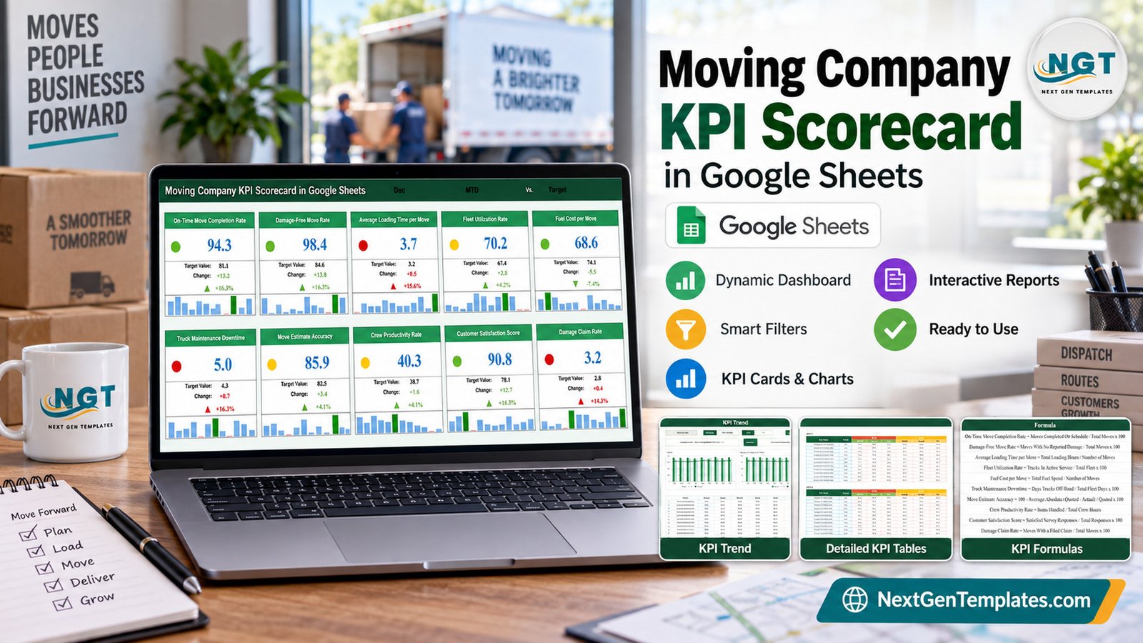
The Moving Company KPI Scorecard in Google Sheets puts 10 KPIs from 4 groups on one page and scores each against a target or last year’s figure. It ships with twelve months of MTD and YTD sample data (120 input rows), three drop-down selectors, a red/amber/green light and a 12-month mini bar chart on every card, and a KPI Trend page with two charts for any metric you pick.
Most moving company owners know how many jobs the trucks ran last month. Fewer can say in one glance whether damage claims crept up, whether estimates landed close to the final invoice, or whether truck downtime is worse than a year ago. This scorecard answers those questions from the monthly totals you already keep, without buying a moving CRM subscription just to get a report.
One note on naming before we start: this is the KPI Scorecard family (ten cards, one month picker, a KPI Trend page). It is a different template from the analytical Moving Company Dashboard in Google Sheets, which charts move-level records, and from the KPI Dashboard line, which uses a larger layout.
Key Features of the Moving Company KPI Scorecard in Google Sheets
- Ten moving-specific KPIs. On-Time Move Completion Rate, Damage-Free Move Rate, Average Loading Time per Move, Fleet Utilization Rate, Fuel Cost per Move, Truck Maintenance Downtime, Move Estimate Accuracy, Crew Productivity Rate, Customer Satisfaction Score and Damage Claim Rate.
- Four KPI groups. Move Execution, Fleet and Logistics, Scheduling and Estimating, and Customer and Claims.
- Three selectors at the top of the Scorecard. Select Month (January to December), MTD or YTD, and a comparison against Target or PY. Every card recalculates from the Input Data tab.
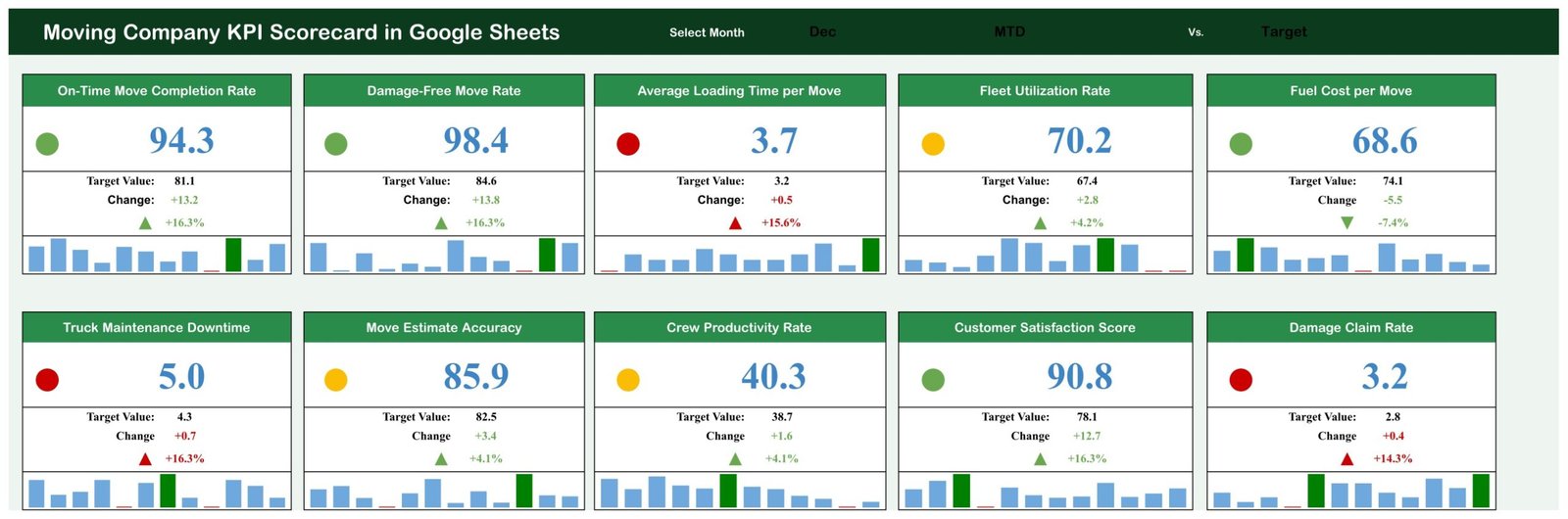
- Direction-aware scoring. Six KPIs are UTB (upper the better) and four are LTB (lower the better). Loading time, fuel cost, truck downtime and damage claims are LTB, so an increase there turns the arrow red.
- A 12-month mini bar chart per card. The strip under each card highlights the strongest month in green and the weakest in red.
- A KPI Trend page. Actual vs Target vs PY charts for MTD and YTD for any KPI.
- Documented formulas. The KPI Definition tab spells out each calculation, for example Damage Claim Rate = Moves With a Filed Claim / Total Moves x 100.
Scorecard Pages Explanation
The file has eight tabs: Read Me, Scorecard, KPI Trend, Input Data, KPI Definition, Color Settings, and two helper tabs (Support and Trend_Support). Here are the four pages you will actually use.
Page 1: Scorecard
Ten KPI cards in two rows of five, each with a light, value, target, change, change % and a monthly bar strip. With Dec, MTD and Target selected, the sample shows 4 green, 3 amber and 3 red cards. On-Time Move Completion Rate reads 94.3% against 81.1%, Customer Satisfaction Score 90.8% against 78.1%, Average Loading Time per Move 3.7 hours against 3.2 (red, because lower is better) and Damage Claim Rate 3.2% against 2.8% (red).
Page 2: KPI Trend
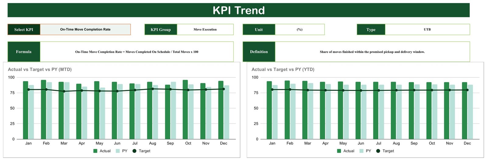
A Select KPI drop-down fills in KPI Group, Unit, Type, Formula and Definition. Below them, two charts show Actual vs Target vs PY by Month for MTD and the same comparison for YTD, with Actual and PY as bars and Target as a line. The screenshot shows On-Time Move Completion Rate, a Move Execution KPI measured in %, running above its roughly 80% target every month.
Page 3: KPI Definition
A reference table with one row per KPI: number, group, name, unit, formula, definition and type.

Page 4: Input Data
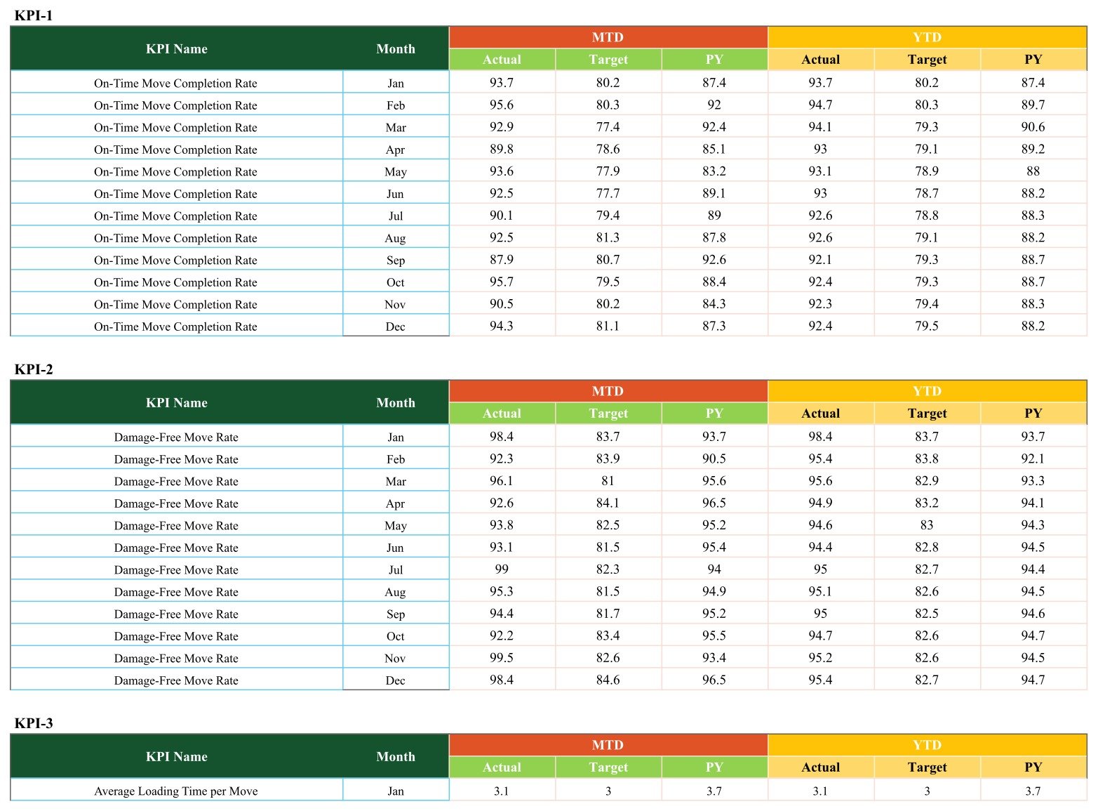
Ten blocks labelled KPI-1 to KPI-10. Each block holds twelve rows (Jan to Dec) with MTD Actual, Target and PY and YTD Actual, Target and PY.
Google Sheets KPI Scorecard vs. Excel Scorecard vs. Moving CRM Software — Feature Comparison
| Feature | This Google Sheets scorecard | Microsoft Excel KPI scorecard | Moving company CRM software |
|---|---|---|---|
| Cost | ✅ $8.99 one-time (sale price) | One-time template plus an Excel licence | Monthly subscription |
| Platform | ✅ Browser and Google Sheets mobile app | Excel desktop | Web and mobile apps |
| Setup time | ✅ Make a copy, replace sample data | Open on a PC with Excel | Account setup, onboarding, data import |
| Real-time team collaboration | ✅ Google Sheets sharing | Via OneDrive or SharePoint | ✅ Multi-user accounts |
| Customizable KPIs | ✅ Names, formulas and types in cells | ✅ Editable | Limited to the vendor’s reports |
| Month picker with traffic lights | ✅ 10 cards, MTD/YTD, vs Target or PY | Depends on the template | Varies by plan |
| Booking, estimates, dispatch and invoicing | ❌ Not included | ❌ Not included | ✅ Core features |
| Year-1 cost at 5 users | ✅ $8.99 total | Template plus 5 Excel licences | Subscription for 12 months |
For owners who already book and dispatch moves in another tool and simply want one monthly page of service, fleet and claims numbers, a one-time Google Sheets scorecard is the lighter choice.
Who Should Use This Template
Perfect for:
- Owners of local and long-distance moving companies who review results monthly
- Bookkeepers and consultants who prepare monthly KPI packs for relocation clients
Not a fit if:
- You need booking, estimates, dispatch, route planning, invoicing or a customer database
- You need a claims register or insurance record – Damage Claim Rate here is a management indicator only
Real-World Use Cases
Carlos runs a six-truck local moving company. Each month he reads Damage-Free Move Rate next to Damage Claim Rate and treats a red light as the cue for a packing refresher.
Aisha manages operations for a long-distance mover. Before quarterly reviews she flips to YTD vs PY and opens KPI Trend on Truck Maintenance Downtime.
Tom keeps the books for several relocation firms. He reviews Move Estimate Accuracy with each owner and points to KPI Definition when someone asks how a number was calculated.
Advantages of This Scorecard
- One-time cost. No monthly fee and no per-user pricing for sharing the file with a partner or manager.
- Clear priorities. Lights and arrows respect whether higher or lower is better, so the page points straight at problem areas such as claims or downtime.
- Works anywhere. Google Sheets runs in any modern browser and on phones; see Google’s guide on how to use Google Sheets if your team is new to it.
Opportunities for Improvement
We tested the live file tab by tab before writing this post. These are the real limits of the current build, stated plainly so you can decide with full information.
- June and July need a one-minute fix. The Select Month drop-down lists “June” and “July” in full, while Input Data stores “Jun” and “Jul”. The cards look up the month with an exact-text SUMIFS, so choosing June or July returns zeros on all ten cards and breaks the change and light cells. The other ten months work. To fix it, edit the drop-down list in cell N1 to use Jun and Jul; Google explains how to edit an in-cell drop-down list.
- The Read Me tab is empty. Setup guidance lives in the PDF and in this post instead.
- Color Settings does not drive the lights. Nothing in the workbook reads that tab. The bands actually used sit in the Support helper tab, cells Z4:AD6.
- The light bands are not symmetrical. For upper-the-better KPIs, a variance at or below 0% is red, up to 10% above target is amber and more than 10% is green, so a KPI that exactly hits target shows red and one that beats it by 4% shows amber (Fleet Utilization Rate, Move Estimate Accuracy and Crew Productivity Rate in the December sample). For lower-the-better KPIs, at or below target is green, up to 10% over is amber and more than 10% over is red.
- YTD figures are typed, not calculated. You enter YTD Actual, Target and PY yourself; the sample uses a running average.
- Small wording and sample-data mismatches. Customer Satisfaction Score’s formula is a share of satisfied responses, while its definition calls it an averaged rating. In the December sample, Damage-Free Move Rate (98.4%) and Damage Claim Rate (3.2%) do not reconcile, because the demo numbers were generated per KPI. Your own data will line up.
- Header selectors are hard to read (dark text on the dark title bar).
- Monthly totals only. There is no move-level log.
Best Practices
- Fix the June and July list first, right after making your copy, so the peak summer moving season is covered.
- Agree targets before the year starts. Enter Target for all twelve months up front so the lights mean something from January.
- Check each KPI type. If you rename a KPI, confirm its UTB or LTB flag on KPI Definition, or the arrows will point the wrong way.
- Review with KPI Trend. A single red month is noise; three months drifting on the MTD chart is a pattern worth acting on.
Explore Relevant Templates
If you like this format, see how other fleet-based businesses use it in our walkthroughs of the Equipment Rental Business KPI Scorecard in Google Sheets, the Crane Rental KPI Scorecard in Google Sheets and the Excavation Contractor KPI Scorecard in Google Sheets. Logistics teams can also read about the Freight Forwarding Management System Web App.
On the store you will also find the Moving Company Dashboard in Google Sheets and the Septic Tank Service KPI Scorecard in Google Sheets, plus the full Google Sheets KPI dashboard and scorecard collection. A Moving Company KPI Scorecard in Excel and a Moving Company KPI Dashboard in Excel are in preparation as separate products.
Frequently Asked Questions
What KPIs are in this moving company scorecard?
Ten KPIs: On-Time Move Completion Rate, Damage-Free Move Rate, Average Loading Time per Move, Fleet Utilization Rate, Fuel Cost per Move, Truck Maintenance Downtime, Move Estimate Accuracy, Crew Productivity Rate, Customer Satisfaction Score and Damage Claim Rate, organised into Move Execution, Fleet and Logistics, Scheduling and Estimating, and Customer and Claims groups.
How long does setup take?
Copying takes seconds and the June/July fix a minute. With monthly totals to hand, the 120 input rows usually take well under an hour.
How does it compare with moving CRM software?
Moving CRM platforms handle booking, estimates, dispatch and invoicing on a subscription. This scorecard does none of those jobs. It is a one-time Google Sheets file that turns the monthly totals you already have into ten scored KPI cards and trend charts.
Can I compare against last year instead of target?
Yes. The third selector on the Scorecard switches every card between Target and PY. With MTD/YTD that gives four views of each month.
Can I change the KPIs?
Yes, on KPI Definition. Keep names on Input Data identical, because cards match rows by exact name.
Does it plan routes or manage claims?
No. The file has no routing, dispatch or claims workflow. Damage Claim Rate is a simple management ratio you calculate and enter yourself, and the template makes no insurance or regulatory claim.
About the Author
Built by PK — Microsoft Certified Professional with 15+ years of Excel, Google Sheets and Power BI experience. Founder of NextGenTemplates, reaching 300K+ subscribers across YouTube channels. Every template is hand-built and tested before release.
Conclusion
If you want a monthly view of on-time moves, damage, fleet cost and customer satisfaction without another subscription, this scorecard gives you ten scored KPIs, clear lights and a trend page in a file you own. Apply the one-minute June and July fix after copying and it is ready for a full year of reviews.
👉 Click here to Purchase Moving Company KPI Scorecard in Google Sheets
✅ Instant download · One-time payment · No subscription
🎥 Watch more tutorials at Youtube.com/@NeoTechNavigators
Last updated: September 2026