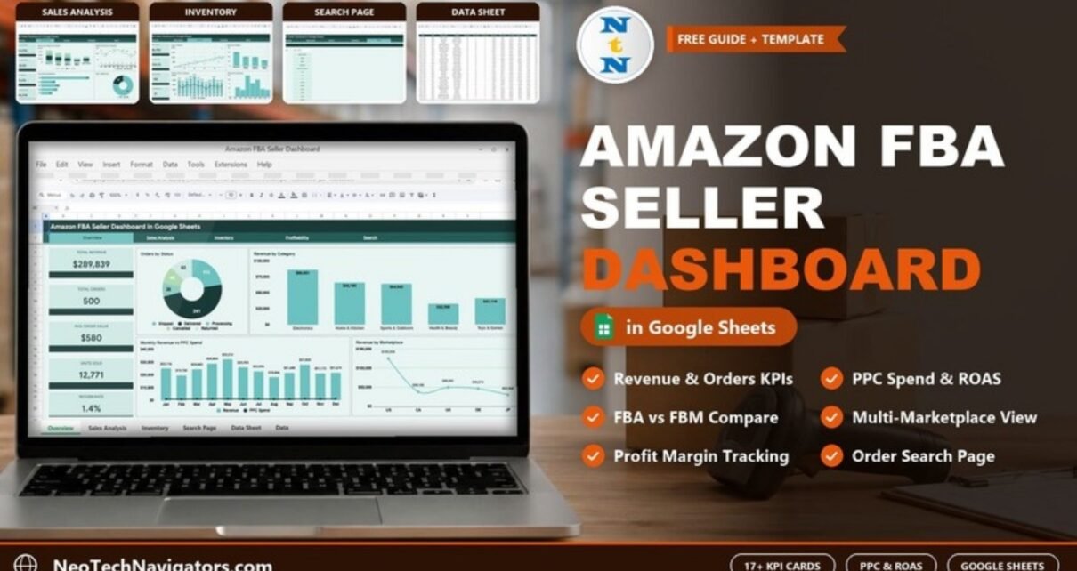
The Amazon FBA Seller Dashboard in Google Sheets turns a plain list of Amazon orders into a clear picture of revenue, units, returns, PPC spend, fees and profit. It is built for private label, wholesale and arbitrage sellers who want to know which products and marketplaces actually make money, without paying for another monthly analytics tool.
The workbook has six tabs: four dashboard pages (Overview, Sales Analysis, Inventory and Profitability), a Search page for looking up a single order, and a Data Sheet where your order rows live. Seventeen KPI cards and sixteen charts read from that one data sheet, and slicers let you filter by category, marketplace, fulfillment method and more.
Below you will find what each page shows, how the main KPIs are calculated, how to load your own Seller Central data, and where this template is (and is not) a good fit.
🎥 Watch the Video Tutorial
Get the Amazon FBA Seller Dashboard
What Problem Does This Amazon FBA Dashboard Solve?
Seller Central gives you plenty of reports, but they live in separate places: business reports, advertising reports, fee previews, returns and inventory. Putting them side by side to answer a simple question such as “is my Home & Kitchen line profitable after PPC?” usually means a weekend of copying and pasting.
This dashboard keeps every order in one table and calculates the answers for you. Each row carries the selling price, units ordered and returned, Amazon fees, cost of goods, shipping cost and PPC spend, so the profit view is built from the same records as the sales view. Nothing has to be reconciled by hand.
It is most useful for:
- Solo sellers and small brands who want a weekly profit check without a paid SaaS tool.
- Sellers active on more than one Amazon marketplace (the sample covers US, CA, UK, DE and JP) who need to compare regions.
- Teams that mix FBA and FBM and want to see which fulfillment method works better.
- Virtual assistants and accountants who need a shared, browser-based report.
Dashboard Pages Explained
1. Overview
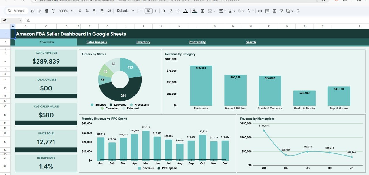
The Overview page answers “how is the business doing?” in one screen. Five KPI cards sit on the left: Total Revenue, Total Orders, Avg Order Value, Units Sold and Return Rate. With the sample data they read $289,839, 500 orders, $580, 12,771 units and 1.4%.
Next to them are four charts: Orders by Status (Shipped, Delivered, Processing, Cancelled and Returned), Revenue by Category (Electronics, Home & Kitchen, Sports & Outdoors, Health & Beauty, Toys & Games), Monthly Revenue vs PPC Spend and Revenue by Marketplace. The revenue-versus-PPC chart is the one to watch: if ad spend climbs month after month while revenue stays flat, your campaigns need attention.
2. Sales Analysis
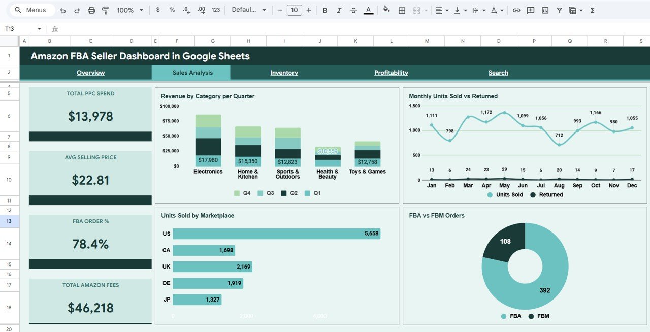
This page focuses on how you sell. The KPI cards show Total PPC Spend, Avg Selling Price, FBA Order % and Total Amazon Fees.
The charts are Revenue by Category per Quarter (useful for spotting seasonality), Monthly Units Sold vs Returned, Units Sold by Marketplace and FBA vs FBM Orders. If returns rise in the same month you changed a listing or a supplier, this is where it shows up first.
3. Inventory
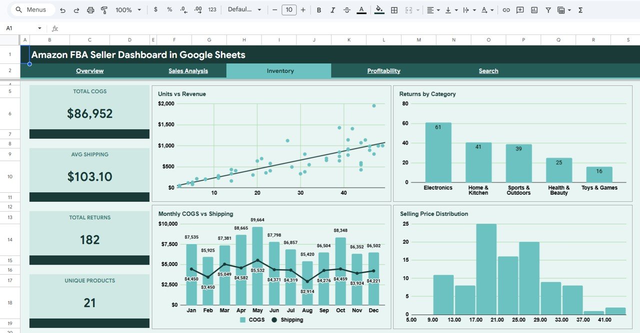
The Inventory page is about cost and product mix. Its cards show Total COGS, Avg Shipping, Total Returns and Unique Products (the number of distinct products in your data; 21 in the sample).
Charts include Units vs Revenue, Returns by Category, Monthly COGS vs Shipping and Selling Price Distribution. The price distribution chart helps you see whether your catalogue is clustered in one price band, which matters when you plan new launches.
4. Profitability
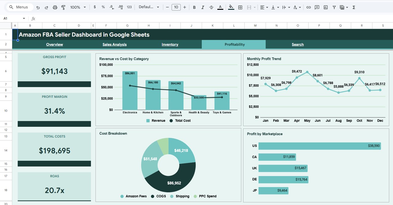
This is the page most sellers open first once the data is in. The cards show Gross Profit, Profit Margin, Total Costs and ROAS. Total Costs adds up Amazon fees, COGS, shipping and PPC spend, so the margin you see is after advertising.
The charts are Revenue vs Cost by Category, Monthly Profit Trend, Cost Breakdown (Amazon Fees, COGS, Shipping and PPC Spend as a donut) and Profit by Marketplace. A category with high revenue but a thin gap between the revenue bar and the cost line is a warning sign, not a success.
5. Search Page
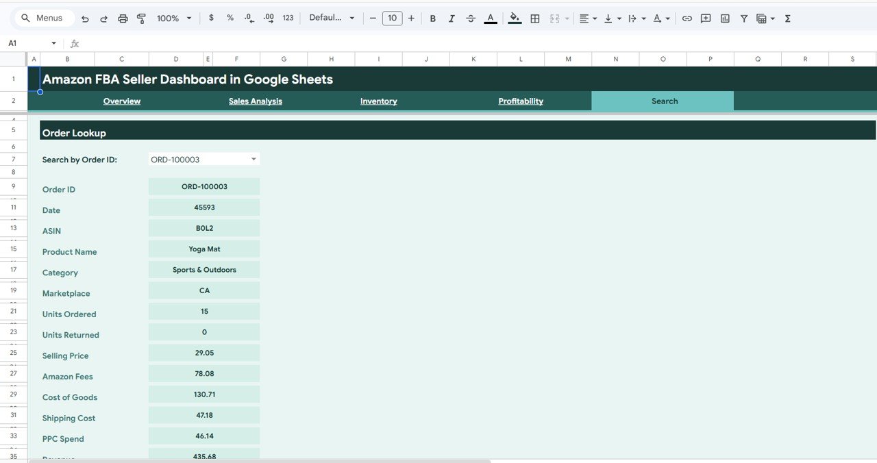
Pick an Order ID from the dropdown and the Search page (Order Lookup) shows the fields for that order: Order ID, Date, ASIN, Product Name, Category, Marketplace, Units Ordered, Units Returned, Selling Price, Amazon Fees, Cost of Goods, Shipping Cost, PPC Spend and Revenue. It is handy for checking a disputed order or a refund without scrolling through hundreds of rows.
6. Data Sheet
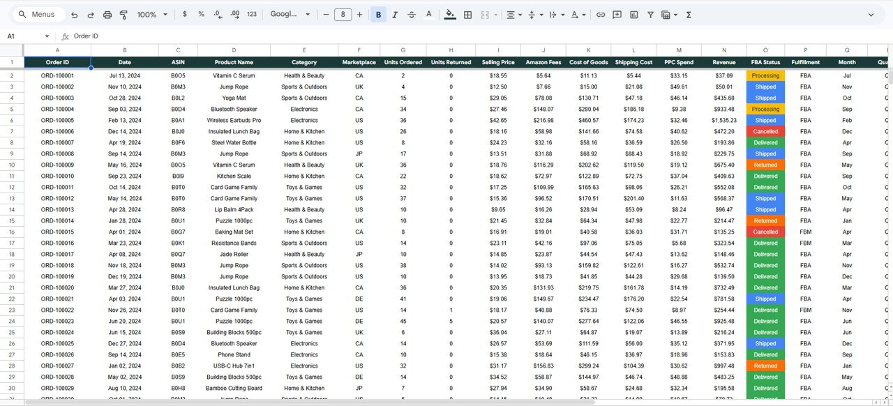
Every chart and card reads from this tab. Its columns start with Order ID, Date, ASIN, Product Name, Category, Marketplace, Units Ordered, Units Returned, Selling Price, Amazon Fees, Cost of Goods, Shipping Cost, PPC Spend and Revenue, followed by FBA Status, Fulfillment (FBA or FBM), Month and Quarter. It ships with 500 sample orders so you can explore the dashboard straight away, then replace them with your own rows in the same column order.
Key Amazon FBA KPIs and How They Are Calculated
Knowing how each number is built makes it much easier to trust the dashboard and to explain it to a partner or accountant.
| KPI | What it measures | Formula | Better when |
|---|---|---|---|
| Total Revenue | Sales income from all orders in the filter | Sum of Revenue | Higher |
| Avg Order Value | Revenue earned per order | Total Revenue ÷ Total Orders | Higher |
| Return Rate | Share of sold units that came back | Units Returned ÷ Units Ordered | Lower |
| FBA Order % | Share of orders fulfilled by Amazon | FBA orders ÷ Total Orders | Depends on your strategy |
| Total Costs | All variable costs tracked per order | Amazon Fees + COGS + Shipping + PPC Spend | Lower (relative to revenue) |
| Gross Profit | What is left after those costs | Total Revenue − Total Costs | Higher |
| Profit Margin | Profit as a share of revenue | Gross Profit ÷ Total Revenue | Higher |
| ROAS | Revenue generated per unit of ad spend | Total Revenue ÷ PPC Spend | Higher |
A worked example with the sample data in the screenshots: Total Revenue is $289,839. Total Costs are $198,695 (Amazon fees $46,218 + COGS $86,952 + shipping $51,548 + PPC $13,978), so Gross Profit is $91,143 and Profit Margin is 91,143 ÷ 289,839 = 31.4%. ROAS is 289,839 ÷ 13,978 ≈ 20.7x, Avg Order Value is 289,839 ÷ 500 ≈ $580, Return Rate is 182 ÷ 12,771 ≈ 1.4%, and FBA Order % is 392 ÷ 500 = 78.4%. Note that the dashboard’s ROAS uses total revenue, not only ad-attributed sales, so it reads higher than the ROAS figure in Amazon Ads.
If you want to check a card against your own sheet, the same logic in plain Google Sheets formulas looks like this (column letters match the Data Sheet: G Units Ordered, H Units Returned, J to M the four costs, N Revenue):
Gross Profit:  =SUM(N2:N)-SUM(J2:J)-SUM(K2:K)-SUM(L2:L)-SUM(M2:M)
Profit Margin: =(SUM(N2:N)-SUM(J2:M))/SUM(N2:N)
ROAS:          =SUM(N2:N)/SUM(M2:M)
Return Rate:   =SUM(H2:H)/SUM(G2:G)
How to Use It with Your Own Data
- Open the PDF guide that comes with your purchase and use the link to Make a copy of the sheet in your own Google Drive.
- Explore the sample data first so you understand which filter changes which chart.
- Export your orders from Seller Central (an order report plus your fee and advertising figures) and arrange the columns in the same order as the Data Sheet.
- Paste your rows over the sample rows. Keep the header row untouched and use consistent names for categories and marketplaces.
- Return to the Overview page. The cards, charts and the Search dropdown pick up the new rows automatically.
- Use the slicers to compare a single marketplace, category or fulfillment method.
- Repeat weekly or monthly by appending new orders to the bottom of the Data Sheet.
Real-World Use Cases
- Monthly profit review: a private label seller filters to the last month, checks Profit Margin and the Cost Breakdown donut, and sees which cost is growing fastest.
- Marketplace expansion: a seller active in the US and UK compares Profit by Marketplace before sending more stock to Germany.
- Return investigation: a wholesale seller notices one category on the Returns by Category chart, uses the Search page to inspect individual orders, and fixes the listing images and size chart.
Best Practices
- Update on a schedule. A weekly or monthly import keeps trends meaningful; irregular updates create false dips.
- Include every cost per order. If PPC or shipping is missing for some rows, margin and ROAS will look better than reality.
- Keep labels consistent. “Home & Kitchen” and “Home and Kitchen” will appear as two categories in every chart.
- Read ROAS with margin. A high ROAS on a low-margin product can still lose money once fees and COGS are included.
- Compare FBA and FBM on profit, not orders. Use the Profitability page with the fulfillment slicer applied.
Limitations and Who Should Not Use It
- There is no live connection to Seller Central or the Amazon Ads API; data is pasted in manually.
- It analyses order-level profitability. It is not a stock replenishment or reorder-point tool.
- Storage fees, long-term storage fees and other account-level charges are not split per order unless you add them to your data yourself.
- Sellers with tens of thousands of orders a month may find Google Sheets slow; the Power BI version is a better fit for that volume.
Google Sheets, Excel, Power BI or HTML?
The same Amazon FBA analysis is available in several formats. Choose the one that matches how your team already works:
| Version | Best for | Trade-off |
|---|---|---|
| Google Sheets | Shared access in the browser, VAs and accountants | Slower with very large datasets |
| Excel | Desktop users who prefer pivot tables | Needs Microsoft Excel; sharing is file-based |
| Power BI | Larger catalogues and deeper drill-down | Steeper learning curve |
If you prefer a single-file browser report, see our walkthrough of the Amazon FBA Seller Dashboard in HTML. Selling on other platforms too? The Etsy Seller Analytics Dashboard in Google Sheets, the Shopify Store Dashboard in Google Sheets and the multi-platform Online Marketplaces Dashboard in Google Sheets follow a similar layout, and the E-Commerce Sales Performance Dashboard covers general online store reporting.
If you would like to build dashboards like this from scratch, the Excel Pivot Tables & Dashboards course on NextGenTemplates Academy walks through the same KPI-card and chart techniques step by step.
Frequently Asked Questions
Can I import my Amazon Seller Central reports directly?
Not automatically. Download your order, fee and advertising data from Seller Central, arrange the columns to match the Data Sheet, and paste them in. All pages update as soon as the rows are in place.
Does the dashboard calculate ROAS?
Yes. The Profitability page shows ROAS as total revenue divided by PPC spend (20.7x in the sample), and the Overview page charts Monthly Revenue vs PPC Spend so you can see the trend.
Can I compare FBA and FBM orders?
Yes. The Sales Analysis page has an FBA Order % card and an FBA vs FBM Orders chart, and the slicers let you filter the pages by fulfillment method.
Does it support multiple Amazon marketplaces?
Yes. Revenue, units and profit are each broken down by marketplace, so you can compare regions such as US, CA, UK, DE and JP side by side.
Do I need formulas or scripts to use it?
No. The calculations are already built in. You only paste data in the expected format and use the slicers and the Order ID dropdown.
Is my data shared with anyone?
No. You work in your own copy in your Google Drive, and only the people you share it with can see it.
Wrapping Up
The Amazon FBA Seller Dashboard in Google Sheets gives you one place to see revenue, returns, PPC, fees and real profit by category and marketplace. Start with the sample data, paste in last month’s orders, and look at the Profitability page first: it usually tells you where to cut ad spend or raise prices.
Get the Amazon FBA Seller Dashboard in Google Sheets
📅 Last updated: October 2026