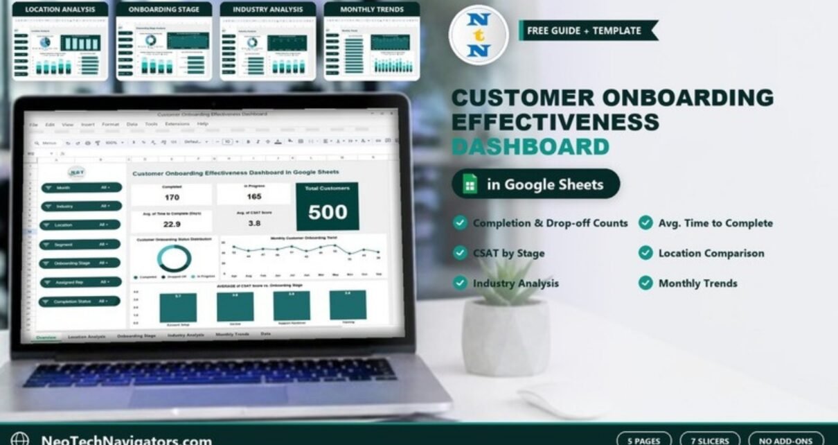
The Customer Onboarding Effectiveness Dashboard in Google Sheets shows, on one screen, how many customers finished onboarding, how many are still in progress, how many dropped off, how long onboarding takes and how satisfied customers felt along the way. It is built for customer success managers, onboarding and implementation leads, and SaaS or service teams who already collect onboarding records in a spreadsheet but have no clear view of what is working.
Inside you get five pages: Overview, Location Analysis, Onboarding Stage Analysis, Industry Analysis and Monthly Trends. Every page shares the same seven slicers (Month, Industry, Location, Segment, Onboarding Stage, Assigned Rep and Completion Status), so you can narrow every chart to one rep, one city or one stage in a couple of clicks. Nothing needs to be installed and there are no macros or add-ons.
🎥 Watch the Video Tutorial
Get the Customer Onboarding Effectiveness Dashboard
What Problem Does This Onboarding Dashboard Solve?
Most onboarding teams can tell you how many accounts they are working on. Far fewer can answer the questions that actually matter: Which stage loses the most customers? Is one city slower than the others? Do healthcare clients take longer than retail clients? Did satisfaction dip last month?
When the answers live in a raw sheet of rows, someone has to build pivot tables every week. This dashboard does that work for you. Each onboarding record is counted by its completion status (Completed, In Progress or Dropped Off), and the averages for time to complete and CSAT score are summarised across every dimension the template tracks.
The Five Dashboard Pages Explained
1. Overview
The Overview page is the summary screen. In the sample data it shows 500 Total Customers, 170 Completed, 165 In Progress, an Avg. of Time to Complete (Days) of 22.9 and an Avg. of CSAT Score of 3.8. Below the cards are three charts:
- Customer Onboarding Status Distribution – a donut split into Completed, Dropped Off and In Progress.
- Monthly Customer Onboarding Trend – a line chart of customer counts per month (for example 52 in April and 36 in November).
- AVERAGE of CSAT Score vs. Onboarding Stage – columns for Account Setup (3.7), Go-live (3.8), Support Handover (3.8) and Training (3.8).

2. Location Analysis
This page compares five locations: Chicago, Houston, Los Angeles, Miami and New York. It includes Customer Onboarding by Location (pie chart), Avg. of Duration (Days) by Location, a stacked Completed, Dropped Off and In Progress by Location chart and Avg. of CSAT Score by Location. In the sample, Chicago and Houston average 24.2 days while New York averages 21.4, and Houston has the highest CSAT at 3.9.

3. Onboarding Stage Analysis
The stage page breaks results down by the four onboarding stages: Account Setup, Go-live, Support Handover and Training. You see customer count by stage (Account Setup has the most at 141), average duration by stage (Support Handover is the slowest at 24.2 days), the completed / dropped off / in progress mix per stage and average CSAT per stage. This is the page to open when you want to find a bottleneck.

4. Industry Analysis
The industry page compares Finance, Healthcare, Manufacturing, Retail and Technology using the same four views: customer split, Avg. of Duration (Days) by Industry, Avg. of CSAT Score by Industry and the status mix by industry. In the sample, Technology takes the longest (23.9 days) yet also has the highest CSAT (3.9) and the most completions (40).

5. Monthly Trends
The last page tracks performance month by month with Avg. of CSAT Score by Month, Avg. of Duration (Days) by Month and Completed, Dropped Off and In Progress by Month. In the sample, average duration ranges from 20.1 days (February) to 24.9 days (October), which makes seasonal slowdowns easy to spot.

Customer Onboarding Effectiveness Metrics at a Glance
The table below lists the measures shown on the dashboard, how each one is worked out from the onboarding records, and which direction is better. The sample values come from the Overview page.
| Metric | What it measures | How it is calculated | Sample value | Better when |
|---|---|---|---|---|
| Total Customers | Customers in the onboarding data | Count of records | 500 | Context only |
| Completed | Customers who finished onboarding | Count where status = Completed | 170 | Higher |
| In Progress | Customers still being onboarded | Count where status = In Progress | 165 | Context only |
| Dropped Off | Customers who left before finishing | Count where status = Dropped Off | 165 (500 − 170 − 165) | Lower |
| Avg. of Time to Complete (Days) | Speed of onboarding | Average of the duration (days) column | 22.9 | Lower |
| Avg. of CSAT Score | Customer satisfaction during onboarding | Average of the CSAT score column | 3.8 | Higher |
If you want a quick completion rate, divide Completed by Total Customers. With the sample data that is:
=170/500   → 34% completion rate
=165/500   → 33% drop-off rate
How to Use the Dashboard With Your Own Data
- Make your own copy. Open the template link and use File > Make a copy so you have an editable version in your Google Drive.
- Review the sample data. Look at the data sheet first so you understand each column before replacing anything, especially the status, stage, location and industry values.
- Paste your records. Replace the sample rows with your own onboarding records, one row per customer. Keep the same column order and headers.
- Use consistent labels. Status values should match Completed, In Progress and Dropped Off exactly, and stage names should be spelled the same way every time, or they will appear as separate categories.
- Check the Overview page. Confirm that Total Customers equals your row count and that Completed, In Progress and Dropped Off add up to it.
- Filter and review. Use the slicers to look at one rep, one segment or one month, then move through the Location, Stage, Industry and Monthly pages.
- Update on a schedule. Add new rows weekly or monthly so the trend charts stay meaningful.
Three Real-World Use Cases
SaaS customer success team
A customer success lead reviews the Stage page every Monday. If Support Handover keeps showing the longest average duration, the team can add a handover checklist or schedule the handover call earlier.
Multi-city service business
An operations manager uses the Location page to compare offices. A city with a high drop-off count and low CSAT is a clear sign that the local team needs training or extra staff.
Implementation consultancy
A consultancy that serves several industries filters by Assigned Rep and Industry to see which consultants handle complex clients well. That helps with workload planning and with setting realistic timelines in proposals.
Best Practices for Tracking Onboarding Effectiveness
- Record the CSAT score at the same point in the journey for every customer, otherwise averages are not comparable.
- Measure time to complete in calendar days from a fixed start event, such as contract signed or kickoff call.
- Mark drop-offs promptly instead of leaving stalled customers as In Progress for months.
- Review the Monthly Trends page before quarterly planning to size your onboarding team.
- Look at counts and averages together: a stage with few customers can show an unusually high or low average.
Limitations and Who Should Not Use It
This is a reporting dashboard, not an onboarding workflow tool. It does not send reminders, assign tasks or connect automatically to your CRM; you paste or import the data yourself. Teams that onboard thousands of customers a month and need live CRM syncing will be better served by a BI tool connected to their database. Very small teams onboarding a handful of clients a month may find a simple tracker is enough.
Related Templates and Guides
If you prefer a simpler layout, see the Customer Onboarding Dashboard in Google Sheets. Software companies can compare it with the SaaS Onboarding Dashboard in Google Sheets and the SaaS Customer Success Dashboard. For satisfaction tracking beyond onboarding, the Customer Satisfaction Dashboard in Google Sheets is a good companion, and the Customer Churn KPI Dashboard helps once customers are live.
Related templates on NextGenTemplates: the Customer Onboarding Dashboard in Excel.
If you want to build dashboards like this yourself, the Excel Pivot Tables & Dashboards course on NextGenTemplates Academy walks through summarising data and laying out charts step by step.
Frequently Asked Questions
What is a customer onboarding effectiveness dashboard?
It is a report that shows how well new customers move through onboarding: how many complete it, how many drop off, how long it takes and how satisfied they are. This template presents those results by location, stage, industry and month.
Which slicers are included?
Month, Industry, Location, Segment, Onboarding Stage, Assigned Rep and Completion Status. They appear on every page.
What onboarding stages does the template use?
The sample data uses four stages: Account Setup, Go-live, Support Handover and Training. You can rename them in your data as long as you use the same spelling throughout.
Do I need Excel or any add-on?
No. It runs in Google Sheets in a browser. There are no macros, scripts or add-ons to install.
How is the drop-off number calculated?
It is the count of customers whose completion status is Dropped Off. In the sample, 500 total minus 170 completed and 165 in progress leaves 165 dropped off.
Can several team members use it at the same time?
Yes. Because it is a Google Sheets file, you can share it with your team and work on it together, using Google’s normal sharing permissions.
Wrapping Up
The Customer Onboarding Effectiveness Dashboard in Google Sheets turns a list of onboarding records into five clear pages that show where customers finish, where they stall and how they feel about the process. Start by loading last quarter’s data, look at the Stage and Location pages, and pick one bottleneck to fix this month.
Get the Onboarding Effectiveness Dashboard
📅 Last updated: October 2026