Most knowledge-sharing programmes are measured in four places at once and reported in none. Article counts sit in the wiki export, page views in intranet analytics, answer rates in the Q&A tool, completion rates in the LMS, and the helpfulness rating arrives as a monthly CSV somebody forwards. By the time all of it is pasted into a deck the quarter has moved on, and nobody can say whether a 92% reuse rate is a problem or simply what August looks like.
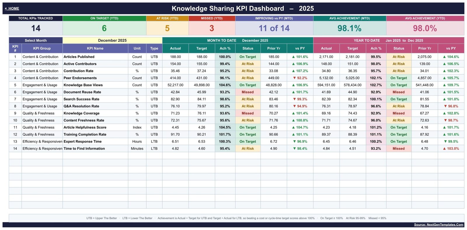
The Knowledge Sharing KPI Dashboard in Google Sheets is a scorecard that solves the assembly problem. It holds 14 knowledge sharing KPIs in four groups, shows each one at MTD and YTD against Target and Prior Year, and drives the whole pack from a single month dropdown. It is built entirely on native Google Sheets formulas and charts – no add-on, no Apps Script, no connector and no refresh step – so you can be reading your own numbers within an hour of downloading it.
Two things to be clear about before we go further. First, this is the KPI scorecard family – month picker, traffic lights, a KPI Trend page and a KPI Analysis page – not the analytical, pivot-and-slicer style dashboard that slices raw article-level records. Near-identically-named templates exist in both families and on other platforms, and they are different products. Second, the template does not collect anything. You type the monthly totals in. That is the trade: no IT review, no admin consent, and your raw numbers never leave your own Google Drive.
Get the Knowledge Sharing KPI Dashboard in Google Sheets
Key Features of the Knowledge Sharing KPI Dashboard
- 14 KPIs across four groups. Content & Contribution (Articles Published, Active Contributors, Contribution Rate, Peer Endorsements), Engagement & Usage (Knowledge Base Views, Document Reuse Rate, Search Success Rate, Q&A Resolution Rate), Quality & Freshness (Knowledge Coverage, Content Freshness Rate, Article Helpfulness Score, Training Completion Rate) and Efficiency & Responsiveness (Expert Response Time, Time to Find Information).
- One dropdown drives everything. Change Select Month on the KPI Dashboard sheet and the seven header cards, all 14 rows, the KPI Trend page and the KPI Analysis page move with it.
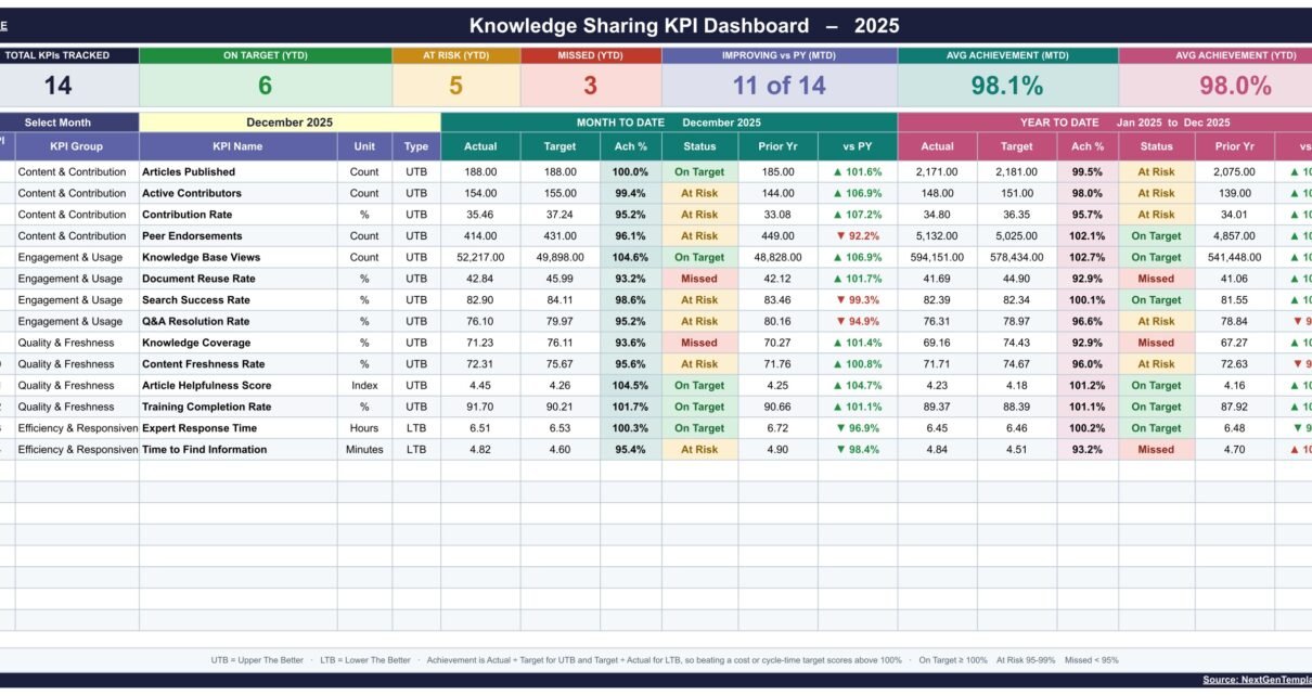
- MTD and YTD, side by side. Each period gets its own six columns: Actual, Target, Ach %, Status, Prior Yr and vs PY.
- Traffic lights you control. On Target from 100%, At Risk 95% to 99%, Missed below 95% – and the thresholds sit in the Status formulas, so you can move them.
- Upper-the-better and lower-the-better both handled. Achievement is Actual over Target for UTB KPIs and Target over Actual for LTB ones, so beating a response-time target scores above 100% rather than below it.
- YTD that matches the metric. Rates roll up as an average; counts such as Articles Published and Knowledge Base Views roll up as a sum.
- Owner, priority and frequency per KPI. The shipped list names a Knowledge Manager, a Community Lead, a Platform Owner and an L&D Lead, so every red row has a person attached to it.
- Ten tabs, three of them for typing. Home, KPI Dashboard, KPI Trend, KPI Analysis, three KPI Input sheets, KPI Definition, Read Me and Get More Templates.
Dashboard Pages Explanation
Home
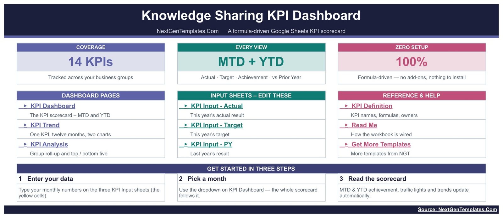
The index page. Three coloured blocks send you to the dashboard pages, the input sheets and the reference sheets, and a Get Started In Three Steps strip states the whole method: enter your data, pick a month, read the scorecard. Header cards confirm the shape of the build – 14 KPIs, MTD + YTD in every view, and 100% formula-driven with nothing to install.
KPI Dashboard
The scorecard, and the page you will screenshot for the monthly review. Seven header cards run across the top: Total KPIs Tracked, On Target (YTD), At Risk (YTD), Missed (YTD), Improving vs PY (MTD), Avg Achievement (MTD) and Avg Achievement (YTD). Below them, Select Month – the sample ships on December 2025 – and then the 14 rows, each carrying KPI Group, KPI Name, Unit and Type, a Month-to-Date block and a Year-to-Date block covering January to the selected month. A legend along the bottom restates the UTB/LTB rule and the three thresholds so a first-time reader does not have to ask.
KPI Trend
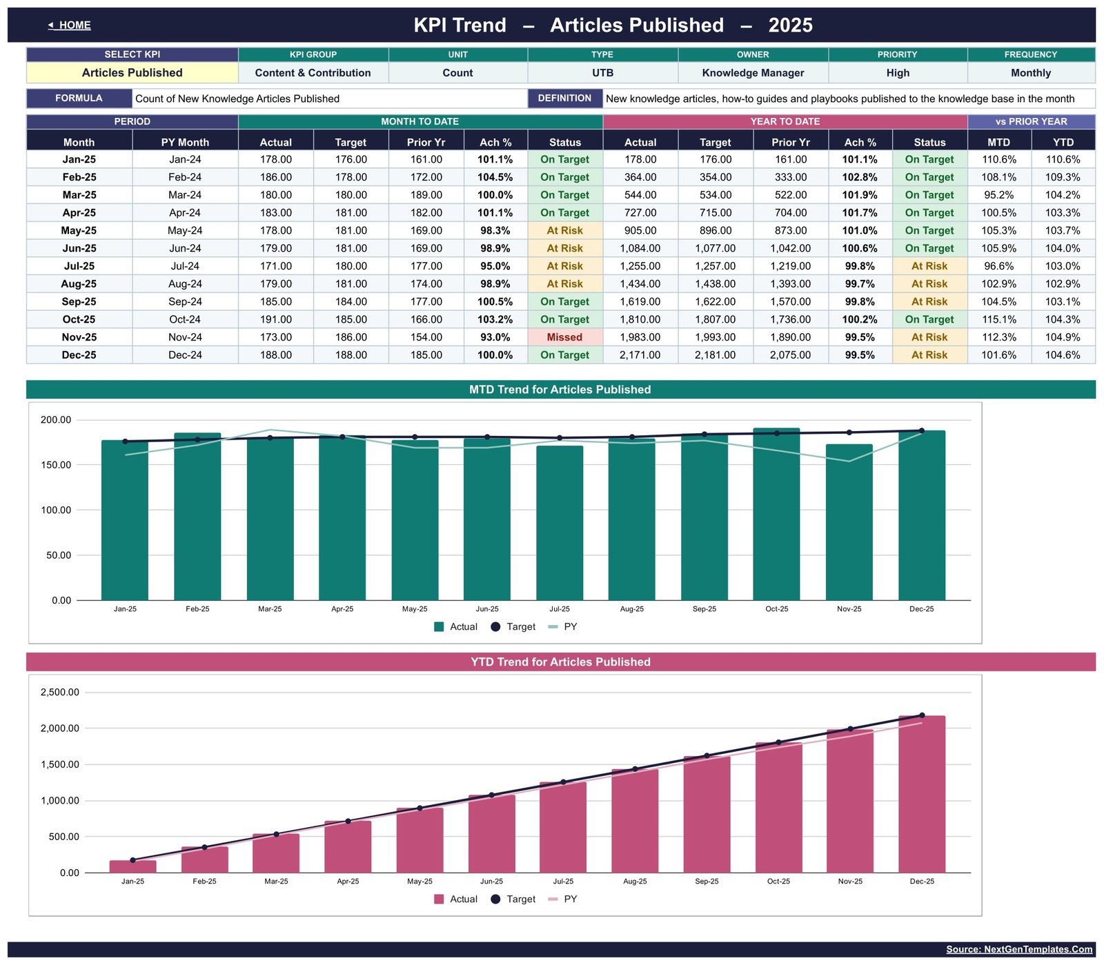
Pick one KPI from the Select KPI dropdown and the page rebuilds around it. The header restates that KPI’s group, unit, type, owner, priority, frequency, formula and definition – in the shipped sample, Articles Published is a Content & Contribution count, UTB, owned by the Knowledge Manager, high priority, reported monthly. The table then gives twelve months against the matching prior-year month: MTD Actual, Target, Prior Yr, Ach % and Status, the same five for YTD, and vs Prior Year for both. Two charts sit underneath – MTD Trend for Articles Published and YTD Trend for Articles Published – each plotting Actual as bars with Target and PY as lines.
KPI Analysis
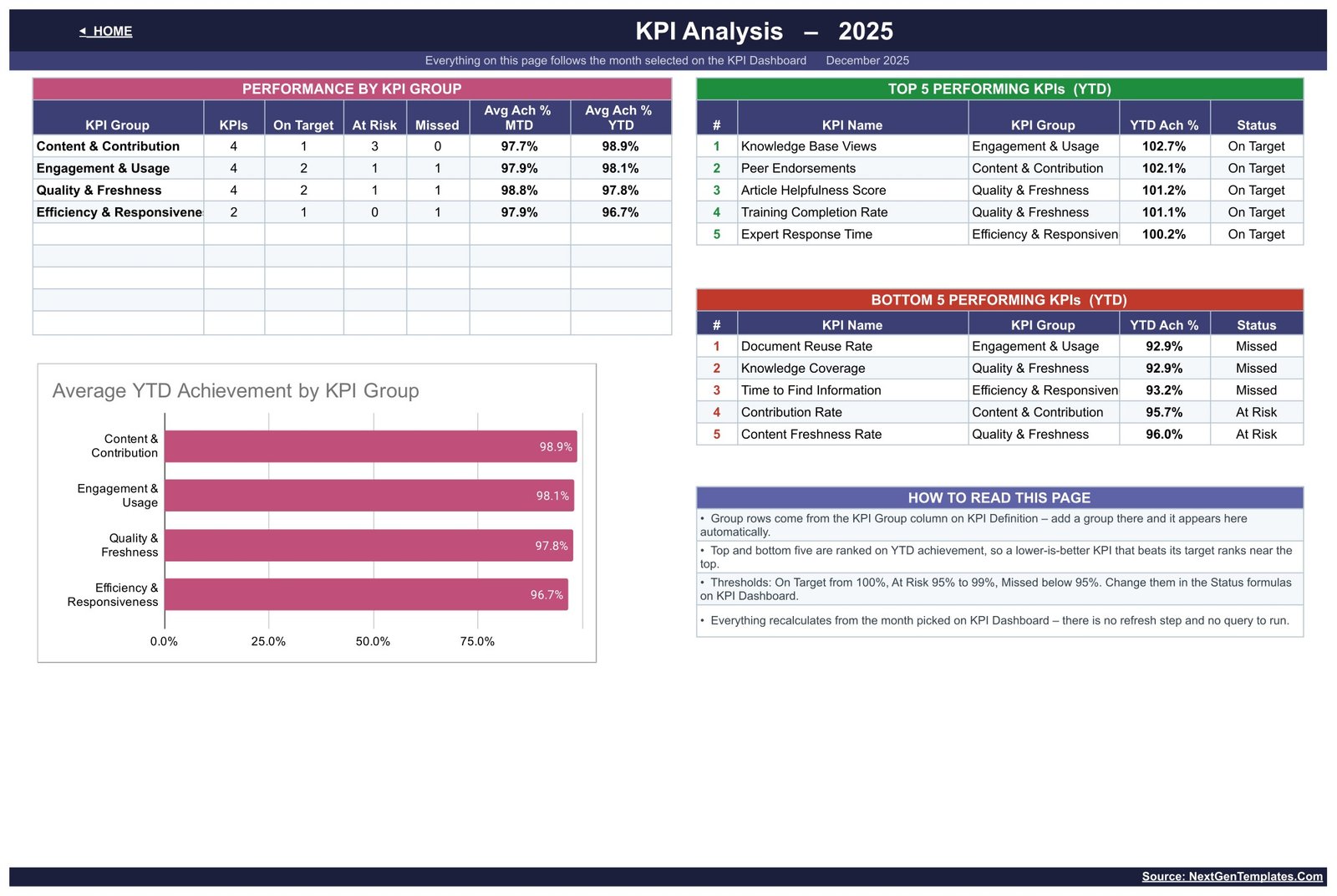
This is the page that answers “which group is dragging?”. Performance by KPI Group counts the KPIs, On Target, At Risk and Missed in each of the four groups and averages MTD and YTD achievement. Top 5 and Bottom 5 Performing KPIs are ranked on YTD achievement beside it. An Average YTD Achievement by KPI Group bar chart sits below, and a How To Read This Page box explains that the group rows come from the KPI Definition sheet, that the ranking is on YTD achievement so a lower-is-better KPI beating its target ranks near the top, and that everything recalculates from the month picked on KPI Dashboard.
KPI Input – Actual, Target and PY
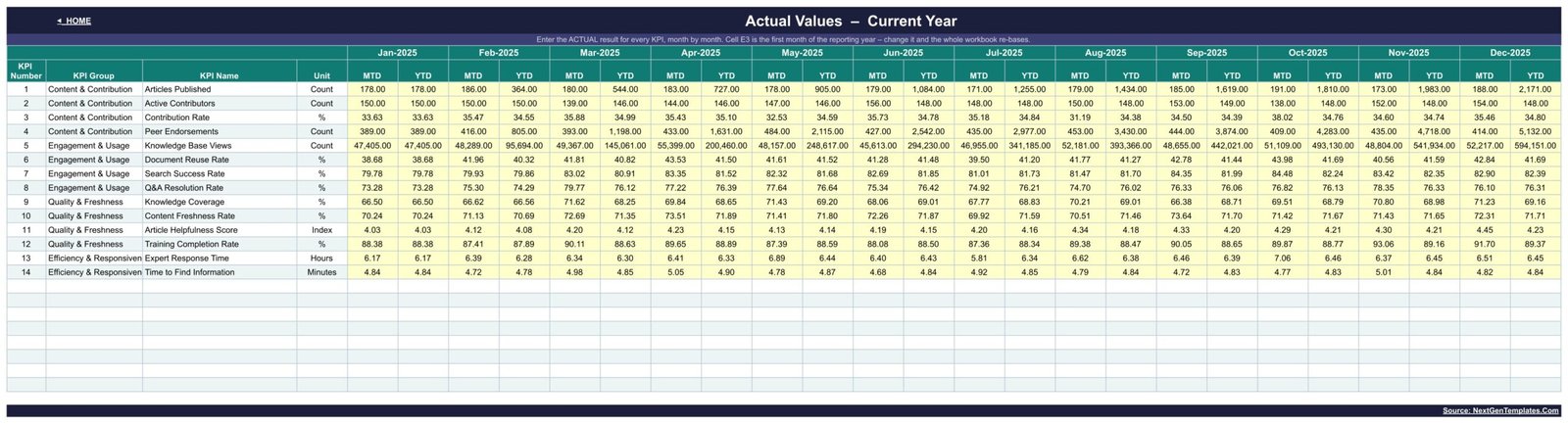
Three identical grids. Every KPI is a row; every month is an MTD column with its YTD column calculated beside it, Jan through Dec. Only the yellow cells take input. Cell E3 on KPI Input – Actual holds the first month of the reporting year, so an April-to-March year is a single edit rather than a rebuild.
KPI Definition
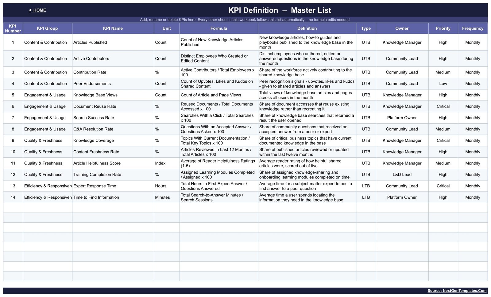
The master list, and the sheet that makes the template yours. Each row carries KPI Number, KPI Group, KPI Name, Unit, Formula, Definition, Type, Owner, Priority and Frequency. Add, rename or delete a KPI here and every other sheet follows automatically – no formula editing anywhere. It doubles as documentation: Document Reuse Rate is defined as reused documents over total documents accessed, Knowledge Coverage as topics with current documentation over total key topics, and so on, so a new starter can read what a number means without asking.
Google Sheets vs. Excel vs. Paid Knowledge Platforms – Feature Comparison
| This template (Google Sheets) | Excel KPI dashboard | Paid knowledge platform | |
|---|---|---|---|
| Cost | $8.99 one time | $14.99 one time | Per-user monthly licence, billed annually |
| Platform | Browser, any device with Google Sheets | Microsoft Excel desktop | Vendor web app plus browser extension |
| Setup time | Under an hour | Under an hour | Weeks – content migration, SSO, permissions |
| Real-time team collaboration | Yes, native multi-user editing | Only via OneDrive co-authoring | Yes |
| Mobile access | Yes, Google Sheets app | Limited | Yes |
| Customisable KPIs | Yes – edit the KPI Definition list | Yes | Fixed to the vendor’s analytics set |
| Share with a link | Yes | File must be sent or synced | Yes, inside the platform |
| Year-1 cost at 5 users | $8.99 | $14.99 | Typically four figures and up |
| Covers KPIs from more than one system | Yes – wiki, LMS, Q&A tool and survey together | Yes | Only what that platform hosts |
| Who holds the raw numbers | You, in your own Drive | You, on your machine | The vendor |
| Collects the data for you | No – you type it in | No | Yes, for content it hosts |
Who Should Use This Template
A knowledge manager who already exports article counts and views from the wiki, search success from intranet analytics and answer rates from the forum, and needs one monthly pack instead of four. A community lead running an internal expert network, reporting Active Contributors, Contribution Rate and Peer Endorsements to a sponsor. An L&D lead who owns Training Completion Rate and Article Helpfulness Score and would rather they were read next to the content metrics than in a separate slide. A digital workplace or platform owner accountable for Search Success Rate and Time to Find Information. And any organisation that wants the raw numbers to stay in its own Drive.
It is not for you if you expect the template to collect the data – it does not connect to Confluence, SharePoint, Notion, Guru, Zendesk Guide, Stack Overflow for Teams or an LMS. It is also the wrong shape if you need article-level drill-down, daily numbers, or well over 30 KPIs. For record-level slicing, the analytical Knowledge Management Dashboard in Google Sheets is the better fit.
Real-World Use Cases
Anita, Knowledge Manager at a 1,200-person software company. On the second working day of the month she pastes article counts and page views from the wiki export, search success from intranet analytics, and Q&A resolution from the internal forum. She sets Select Month, screenshots the KPI Dashboard, and takes it to the knowledge council. When Document Reuse Rate turns red she opens KPI Trend for it and shows whether it is one bad month or a four-month slide.
Marcus, Community Lead for an internal expert network. Active Contributors, Contribution Rate and Peer Endorsements are his three sponsor metrics. He keeps a stretch number in KPI Input – Target and uses the vs PY columns to show the steering group how far participation has moved against last year.
Ella, L&D Lead at a 90-person consultancy. She owns Training Completion Rate and Article Helpfulness Score. She hides the rows she does not own, keeps her two in the same workbook the knowledge team uses, and drops the quarterly slide she used to rebuild by hand.
Advantages of the Knowledge Sharing KPI Dashboard
- One place for metrics that live in four systems. Because entry is manual, the wiki, the LMS, the forum and the survey all land on the same 14 rows – something a single-platform analytics screen cannot do.
- Nothing to install and nothing to approve. No add-on, no Apps Script, no API keys, no admin consent. It runs on a free personal Google account.
- The month picker removes the rebuild. Last month’s pack is this month’s pack with one dropdown changed.
- Definitions travel with the numbers. The KPI Definition sheet means the formula behind Knowledge Coverage is one click away from the red cell, which shortens most review-meeting arguments.
- Cycle-time KPIs are scored correctly. Expert Response Time and Time to Find Information use Target over Actual, so faster is genuinely better.
- Your data stays yours. The workbook lives in your Drive, shared on your terms.
Opportunities for Improvement
Being honest about the edges is more useful than a feature list. Entry is manual, so somebody has to spend twenty minutes a month pasting numbers; if you need that automated, an IMPORTRANGE or an export-to-Sheets job on your side is the usual answer. The grain is monthly – there is no weekly or daily view, and no per-article or per-search drill-down. The comfortable ceiling is around 30 KPIs; beyond that the scorecard stops being readable, whatever the formulas can handle. The sample data is illustrative, not a benchmark – the 98.1% average achievement in the screenshots is made up, and no industry standard for any of these 14 KPIs is implied. And the template does not score content quality or run aKnowledge Sharing KPI Dashboard in Google Sheets survey: Article Helpfulness Score and Knowledge Coverage are places to record what your own rating or audit produced.Knowledge Sharing KPI Dashboard in Google Sheets
Best Practices
- Fix the KPI list before the first month. Trim to the KPIs you can actually source each month. Ten rows you fill beats fourteen you half-fill.
- Set E3 first. Get the reporting year right on KPI Input – Actual before you type anything, so the YTD roll-up never has to be redone.
- Fill Prior Year even if it is an estimate. The vs PY columns are what turn “92.9%” into “92.9% and falling”, and half the value of the pack is in them.
- Put a real name in the Owner column. A red row with an owner gets an action; a red row without one gets a discussion.
- Move the thresholds if 95% is wrong for you. They are ordinary formulas on the KPI Dashboard sheet, not settings.Knowledge Sharing KPI Dashboard in Google Sheets
- Read Bottom 5 before Top 5. Then open KPI Trend for each of those KPIs before deciding anything – one month is not a trend.Knowledge Sharing KPI Dashboard in Google Sheets
- Share the input sheets, protect the dashboard. Let each owner type their own rows; keep the calculated pages read-only.Knowledge Sharing KPI Dashboard in Google Sheets
Explore Relevant Templates
- Internal Communications KPI Dashboard in Google Sheets – the same scorecard build for reach, channel adoption and employee sentiment.
- Leadership Development KPI Dashboard in Google Sheets – programme completion, succession cover and promotion readiness.
- Data Warehouse KPI Dashboard in Google Sheets – the platform-side companion when the knowledge base runs on your own stack.
- Operational Efficiency KPI Dashboard in Google Sheets – cycle time and throughput on the same month-picker pattern.
- Knowledge Management Dashboard in Google Sheets – the analytical, pivot-and-slicer companion to this scorecard.
Want to go deeper on reporting like this? The Excel Pivot Tables & Dashboards course on NextGenTemplates Academy covers dashboards and KPI reporting step by step, with practice files.
Get the Knowledge Sharing KPI Dashboard in Google Sheets
Frequently Asked Questions
Does this connect to Confluence, SharePoint, Notion or my LMS?
No. It is a manual-entry template – you type or paste the monthly totals from whatever tools you already use. That is what lets one sheet hold KPIs from four different systems, and it means no API keys and no IT review before you start.
Can I change the 14 KPIs to my own?
Yes, and it is the normal thing to do. Edit the KPI Definition sheet: add, rename or delete rows there and the dashboard, trend page, analysis page and all three input sheets follow automatically.
My financial year starts in April. Will that work?
Yes. Cell E3 on KPI Input – Actual holds the first month of the reporting year. Change it and every month column, the YTD roll-up and the prior-year comparison re-base.
How are Expert Response Time and Time to Find Information scored?
Both are lower-the-better, so achievement is Target divided by Actual. Answering faster than target scores above 100% and shows green, which is the behaviour you want from a cycle-time metric.Knowledge Sharing KPI Dashboard in Google Sheets
What exactly do On Target, At Risk and Missed mean?
On Target is 100% achievement and above, At Risk is 95% to 99%, Missed is below 95%. All three thresholds live in the Status formulas and can be changed.Knowledge Sharing KPI Dashboard in Google Sheets
Do I need an add-on, Apps Script or a paid Google Workspace plan?
No. Built-in Google Sheets formulas and charts only, and it works on a free personal account.
Is this the same as the Knowledge Sharing KPI Dashboard in Excel?
No – same subject, different build and a different KPI list, made for a different platform. If your team is on Microsoft, the Excel and Power BI versions cover the same ground there. They are separate products, not copies of this one.
How is it delivered?
As a PDF that carries the Make a copy link. Open it, click the link, and an editable copy of the workbook is created in your own Google Drive.
About the Author
Built by PK – Microsoft Certified Professional with 15+ years of Excel, Google Sheets, and Power BI experience. Founder of NextGenTemplates, reaching 300K+ subscribers across YouTube channels. Every template is hand-built and tested before release.
Conclusion
Knowledge sharing has never really had a measurement problem – it has an assembly problem. The numbers exist; they just live in four systems and arrive too late to act on. This template does the assembly once, in a tool your organisation already has, and then gets out of the way: one month dropdown, 14 rows, MTD and YTD side by side, and two supporting pages that answer “is this a trend?” and “which group is dragging?” in about a minute each.Knowledge Sharing KPI Dashboard in Google Sheets
Get the Knowledge Sharing KPI Dashboard in Google Sheets for $8.99 (regular $13.99) – instant download, one-time payment, lifetime access.Knowledge Sharing KPI Dashboard in Google Sheets