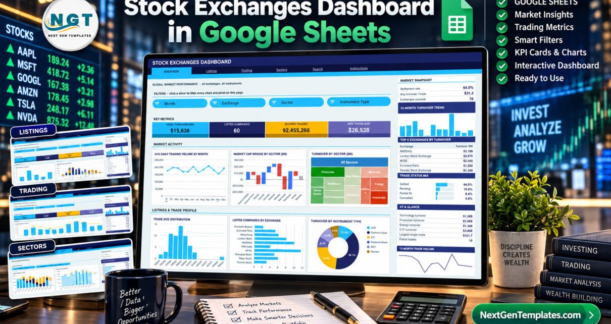
The Stock Exchanges Dashboard in Google Sheets summarises 500 fictional sample trades from 2024 across 10 exchanges, 60 listed companies, 10 sectors and 6 instrument types. It spreads them over four analysis pages with 16 KPI cards, 18 chart panels and 15 slicers, plus a Trade ID Search page and an Instructions sheet. Pivots and formulas already cover 1,000 data rows, so a growing trade log needs no rebuild.
Exchange and brokerage teams often have the raw material (an exported trade log) but no quick way to see turnover by exchange, listing tier, broker or sector without a paid BI licence. This template fills that gap inside Google Sheets. Paste your records, click a slicer, and every chart on the page follows. It is a reporting template only. It has no live market data feed, places no orders and gives no investment advice.
Key Features of Stock Exchanges Dashboard in Google Sheets
- Four slicer-driven analysis pages. Overview (Month, Exchange, Sector, Instrument Type), Listings (Exchange, Listing Tier, Instrument Type, Region), Trading (Order Type, Broker, Status) and Sectors (Sector, Region, Month, Exchange). Slicers work per page, so each page keeps its own filters.
- 16 KPI cards. Total Turnover ($M), Listed Companies, Shares Traded, Avg Trade Size, Main Board Listings, ETF Turnover, Premium Tier Trades, Instrument Types, Total Trades, Block Trade Value, Settled Trades, Failed Rate, Tech Turnover, Sectors Traded, Net Mkt Cap and APAC Turnover.
- A consistent sidebar. Every analysis page carries snapshot ratios, a 12-month turnover trend and a Top 5 table. It also has a percentage mix panel, an At a Glance list and a 12-month trade volume line.
- Native pivot tables and slicers. Each chart reads a pivot table parked to the right of its page. There are no helper formulas behind the charts, so the file stays responsive as rows are added.
- Trade-level search. The Search page returns a 16-field record for any Trade ID, from exchange and company to broker, order type, status and market cap change.
- Auto-expanding ranges. Paste new trades anywhere up to row 1001 and the whole dashboard updates automatically.
Dashboard Pages Explanation
Overview Page: Global Market Performance
The Overview page shows Total Turnover ($15,636M in the sample), Listed Companies (60), Shares Traded (92,455,266) and Avg Trade Size ($26,538). Charts include Avg Daily Trading Volume by Month, Market Cap Bridge by Sector, Turnover by Sector, Trade Size Distribution, Listed Companies by Exchange and Turnover by Instrument Type. The sidebar ranks the Top 5 Exchanges by Turnover (NASDAQ leads the sample) and breaks down the Trade Status Mix into Settled, Pending, Partial fill and Cancelled.

Listings Page: Tiers, Instrument Mix and Regional Spread
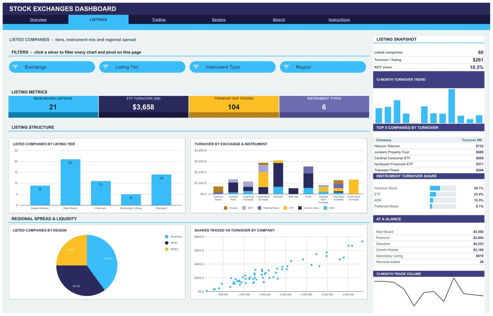
KPI cards show Main Board Listings (21), ETF Turnover ($3,658M), Premium Tier Trades (104) and Instrument Types (6). Charts include Listed Companies by Listing Tier (Growth Market, Main Board, Premium, Secondary Listing and Standard), Turnover by Exchange and Instrument, Listed Companies by Region, and Shares Traded vs Turnover by Company. The sidebar lists the Top 5 Companies by Turnover and Instrument Turnover Share.
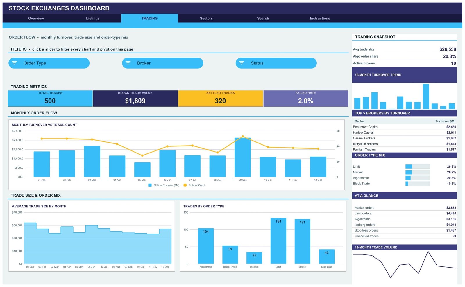
Trading Page: Order Flow
KPI cards show Total Trades (500), Block Trade Value ($1,609M), Settled Trades (320) and Failed Rate (2.0%). Charts include Monthly Turnover vs Trade Count, Average Trade Size by Month and Trades by Order Type across Algorithmic, Block Trade, Iceberg, Limit, Market and Stop-Loss orders. The sidebar ranks the Top 5 Brokers by Turnover and shows the Order Type Mix.
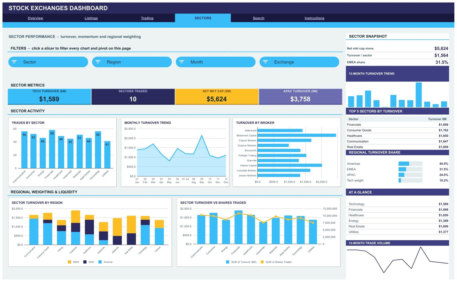
Sectors Page: Turnover, Momentum and Regional Weighting
KPI cards show Tech Turnover ($1,589M), Sectors Traded (10), Net Mkt Cap ($5,624M) and APAC Turnover ($3,758M). Charts include Trades by Sector, Monthly Turnover Trend, Turnover by Broker, Sector Turnover by Region, and Sector Turnover vs Shares Traded. The sidebar ranks the Top 5 Sectors by Turnover and shows Regional Turnover Share for the Americas, EMEA and APAC.
Search Page: Trade Lookup
Pick a Trade ID such as TRD-0001 to read its full record. The record covers date, exchange, sector, instrument type, company, listing tier, turnover, shares traded, avg trade size, broker, order type, status, region, month and market cap change.

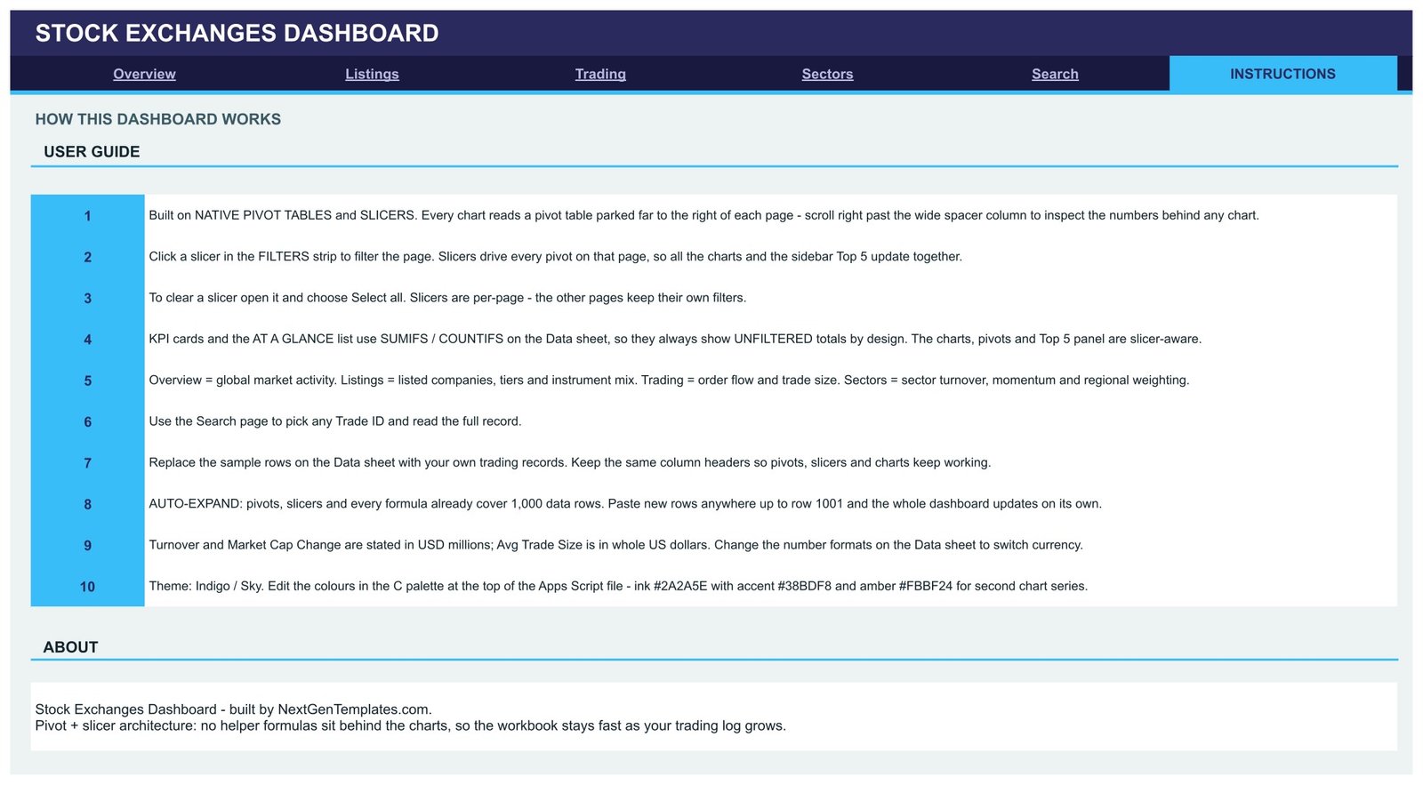
Instructions Page: User Guide
Ten numbered notes explain the pivot-and-slicer design, how to clear a slicer and why KPI cards stay unfiltered. They also cover how to replace sample rows, the 1,000-row auto-expand range, the currency units and where to change the Indigo / Sky colour palette.
Stock Exchanges Dashboard vs. Microsoft Excel Dashboard vs. Paid BI Platforms: Feature Comparison
| Feature | Stock Exchanges Dashboard in Google Sheets | Microsoft Excel Dashboard | Paid BI Platforms (Tableau / Looker Studio Pro) |
|---|---|---|---|
| Cost | ✅ $9.99 one-time | Template fee plus a Microsoft 365 or Office licence | Recurring per-user subscription |
| Platform | ✅ Google Sheets in any browser | Excel desktop or Excel for the web | Vendor web app, often with desktop authoring |
| Setup time | ✅ Minutes: copy and paste your trade log | Minutes, then share the file separately | Data connections, modelling and licences first |
| Real-time team collaboration | ✅ Built in | Through OneDrive or SharePoint | ✅ With paid seats |
| Mobile access | ✅ Google Sheets app | ✅ Excel mobile app | ✅ Vendor mobile app |
| Customizable fields | ✅ Edit headers, pivots and colours | ✅ Editable | Needs a report author |
| Share with link | ✅ View-only or edit link | Through OneDrive links | Depends on licence tier |
| Year-1 cost at 5 users | ✅ $9.99 total | Licence per user | Per-seat fees × 5 users × 12 months |
| Live market data feed | ❌ No. It reports on records you paste | ❌ No | ✅ Through paid connectors and data vendors |
If you want exchange, listing and order-flow reporting from your own trade records without per-seat fees, this dashboard is a good fit. If you need live quotes, choose a data vendor instead.
Who Should Use This Template
Perfect for:
- Brokerage operations and back-office reporting teams working from exported trade logs
- Finance lecturers and students who need a realistic, fictional exchange dataset
- Fintech and market-data analysts prototyping an exchange-comparison report
- Small teams already working in Google Workspace who want link-based sharing
Not a fit if:
- You need live or delayed quotes. There is no market data connection
- You need order execution, trade surveillance, listing-rule compliance or regulatory filings
- You want buy, sell or return guidance. The dashboard summarises records only
- Your log runs well past 1,000 rows and you do not want to extend the ranges
Real-World Use Cases
Daniel runs reporting for a small brokerage back office. Every month he pastes the exported trade log into the Data sheet. On the Trading page he checks the Failed Rate card, the Order Type Mix and the Top 5 Brokers by Turnover before his operations meeting. Filtering by Status shows him which brokers carry the most pending or partially filled trades.
Priya teaches a capital-markets module at a business school. She shares a view-only link to the fictional sample. Students filter the Listings page by region and instrument type, then explain why ETF and common-stock turnover split differently across the Americas, EMEA and APAC.
Mei is an analyst at a fintech startup. Before committing engineering time, she uses the Sectors page to agree a sector-by-region turnover layout with stakeholders. The pivots behind each chart show her exactly which fields the production report will need.
Advantages of Stock Exchanges Dashboard
- One-time cost. $9.99 on sale replaces a recurring per-seat BI subscription for this kind of report.
- Transparent numbers. Because every chart reads a visible pivot table, anyone can audit a figure by scrolling right.
- Fast filtering. 15 slicers across four pages answer exchange, tier, broker, sector and region questions in a click.
- Easy sharing. Google Sheets view-only links let managers read the dashboard without edit rights. Google explains the options in its file sharing guide.
- Room to grow. Ranges already cover 1,000 rows, so monthly additions need no maintenance.
Opportunities for Improvement
- KPI cards ignore slicers. Cards and At a Glance lists always show unfiltered totals by design. Only the charts, pivots and Top 5 tables respond to filters.
- Mix panels show the top rows only. For example, Instrument Turnover Share lists four instruments, so its bars do not add up to 100%. The Regional Turnover Share panel also includes a Tech weight line alongside the three regions.
- Sample columns are independent. Turnover, shares traded and avg trade size in the fictional data are not derived from one another. Your own records will reconcile only as well as your source system does.
- No data connection. Records must be pasted or imported manually. There is no exchange or vendor feed.
Best Practices
- Keep the Data sheet headers exactly as supplied so the pivots, slicers and charts keep working. Google’s help pages on pivot tables and slicers are useful if you extend them.
- Use consistent exchange, broker and sector names. A spelling variant creates a new category in every chart.
- Clear slicers (Select all) before sharing a link so readers start from the full view.
- Store turnover and market cap change in USD millions, or change the number formats on the Data sheet if you report in another currency.
- Pair it with a holdings view such as our Stock Portfolio Tracker in Google Sheets if you also record your own positions.
Explore Relevant Templates
More finance dashboards on this blog: the Investor Relations Dashboard in Google Sheets, the Banking Dashboard in Google Sheets, the Fintech Dashboard in Google Sheets and the Investment Management KPI Dashboard in Google Sheets.
On NextGenTemplates: the Investment Management Dashboard in Google Sheets, the Investor Relations Dashboard in Google Sheets and the full Google Sheets Dashboards collection.
Separate KPI-dashboard builds on the same topic (month-picker scorecards with different pages): the Stock Exchanges KPI Dashboard in Excel (walkthrough on PK: An Excel Expert) and the Stock Exchanges KPI Dashboard in Power BI.
Frequently Asked Questions
What does the Stock Exchanges Dashboard in Google Sheets track?
It tracks turnover, listed companies, shares traded, trade size, listing tiers, order types, settlement status, brokers, sectors and regions through 16 KPI cards and 18 chart panels. The fictional sample holds 500 trades across 10 exchanges and 60 companies, and everything updates when you paste your own records.
Does it show live stock prices?
No. The dashboard has no live or delayed market data feed and does not connect to any exchange or data vendor. It reports only on the trade records in its Data sheet, which ships with fictional sample data for 2024.
How long does setup take?
Usually under 10 minutes. Make a copy from the link in the PDF, paste your trades into the Data sheet using the same headers, and the pivots, slicers and charts refresh automatically for up to 1,000 rows.
Why don’t the KPI cards change when I click a slicer?
The KPI cards and At a Glance lists use SUMIFS and COUNTIFS on the Data sheet, so they deliberately show unfiltered totals. The charts, pivot tables and Top 5 tables are the slicer-aware parts of each page.
How does it compare to Tableau or other paid BI tools?
Paid BI platforms add live connectors, governance and large-scale data handling, but bill per user each month. This dashboard costs $9.99 once and suits teams reporting from exported trade logs inside Google Sheets.
Is it a trading, surveillance or compliance system?
No. It is a reporting template. It does not execute orders, monitor market abuse, check listing rules or produce regulatory filings, and it offers no investment advice or return promises.
About the Author
Built by PK, a Microsoft Certified Professional with 15+ years of Excel, Google Sheets and Power BI experience. PK is the founder of NextGenTemplates, reaching 300K+ subscribers across YouTube channels. Every template is hand-built and tested before release.
Conclusion
The Stock Exchanges Dashboard gives brokerage, teaching and analytics teams a clear, filterable view of turnover, listings, order flow and sectors from their own trade records, without a live-data subscription or per-seat BI fees. Paste your log, click a slicer and read the story behind the numbers.
👉 Click here to Purchase Stock Exchanges Dashboard in Google Sheets
✅ Instant download · One-time payment · No subscription
🎥 Watch more tutorials on Youtube.com/@NeoTechNavigators
Last updated: September 2026