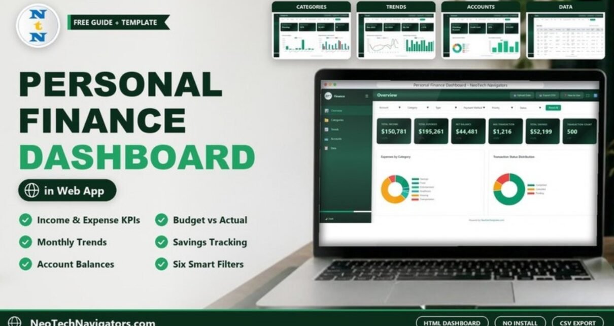
The Personal Finance Dashboard in HTML is a browser-based template that shows where your money comes from, where it goes and how much you are saving. It turns a list of transactions into KPI cards and charts for income, expenses, budgets, savings, accounts and payment methods, all on five pages that open in any modern web browser.
It is meant for individuals and families who want a clearer picture than a bank app gives, for freelancers with income from several sources, and for financial coaches who want a visual report to walk clients through. There is no software to install: open index.html in Chrome, Edge, Firefox or Safari and the dashboard is ready.
🎥 Watch the Video Tutorial
Get the Personal Finance Dashboard in HTML
What Problem Does This Dashboard Solve?
Most people know roughly what they earn but have only a vague idea of what they spend on housing, food, transport or subscriptions, and even less idea how that changes month to month. Bank statements list transactions; they do not tell you whether you stayed within budget or whether your savings are growing.
This dashboard groups every transaction by category, account, payment method and month, and compares spending against the budget you set. Five pages answer five questions: How am I doing overall? Where does my money go? How does it change over time? Which accounts and payment methods do I use? And what exactly is behind each number?
Key Metrics on the Personal Finance Dashboard in HTML
The values below are from the included sample data of 500 transactions with no filters applied.
| Page | KPI card | Sample value | What it tells you |
|---|---|---|---|
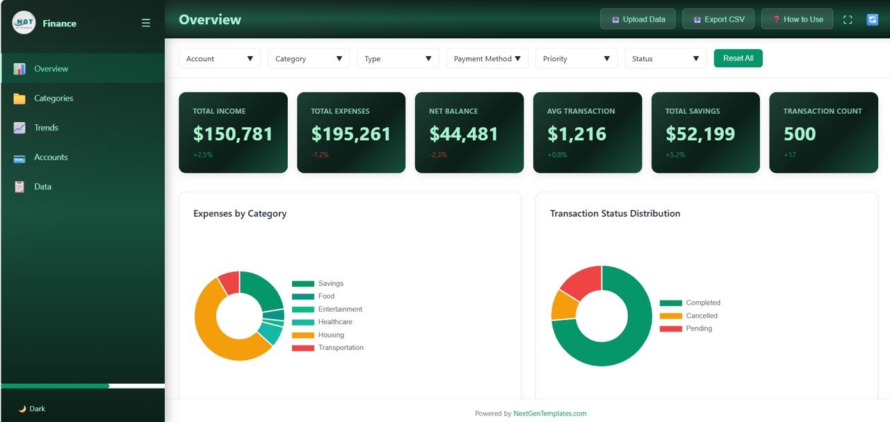
| Overview | Total Income | $150,781 | All income in the current filter |
| Overview | Total Expenses | $195,261 | All spending in the current filter |
| Overview | Net Balance | $44,481 | The gap between income and expenses (in the sample, expenses exceed income by about $44,480) |
| Overview | Avg Transaction | $1,216 | Average transaction value |
| Overview | Total Savings | $52,199 | Total savings contributions |
| Overview | Transaction Count | 500 | Number of transactions in view |
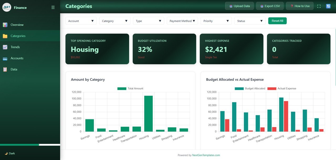
| Categories | Top Spending Category | Housing ($93,002) | Where most money goes |
| Categories | Budget Utilization / Highest Expense | 32% / $2,421 | Share of budget used and the largest single transaction |
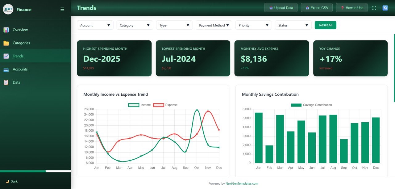
| Trends | Highest / Lowest Spending Month | Dec-2025 ($14,019) / Jul-2024 ($2,730) | Your most and least expensive months |
| Trends | Monthly Avg Expense / YoY Change | $8,136 / +17% | Typical monthly spend and change versus the prior year |
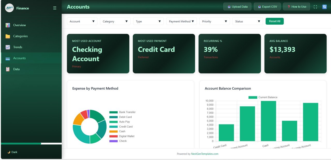
| Accounts | Most Used Account / Most Used Payment | Checking Account / Credit Card | Your main account and payment method |
| Accounts | Recurring % / Avg Balance | 39% / $13,393 | Share of recurring transactions and average account balance |
Filters and Toolbar
Every page shares six dropdown filters: Account, Category, Type, Payment Method, Priority and Status, plus a Reset All button. The header has Upload Data, Export CSV and How to Use buttons and a full-screen icon, and a Dark switch at the bottom of the sidebar changes the theme.
Dashboard Pages Explained
1. Overview
The six KPI cards sit above two charts. Expenses by Category is a donut chart showing how spending splits across categories such as Housing, Savings, Food, Entertainment, Healthcare and Transportation. Transaction Status Distribution shows the share of Completed, Cancelled and Pending transactions.
2. Categories
Cards show the Top Spending Category, Budget Utilization, Highest Expense and Categories Tracked. Amount by Category ranks nine categories (Savings, Food, Entertainment, Healthcare, Transportation, Housing, Utilities, Shopping and Insurance), and Budget Allocated vs Actual Expense puts your budget and your real spending side by side for each one. This is the page to open when you want to know where you overspent.
3. Trends
Cards show the highest and lowest spending months, the monthly average expense and the year-over-year change. Monthly Income vs Expense Trend draws income and expense as two lines from January to December, so you can see which months spending ran ahead of income. Monthly Savings Contribution shows how much you put aside each month.
4. Accounts
Cards show the most used account, the most used payment method, the recurring transaction percentage and the average balance. Expense by Payment Method splits spending across Bank Transfer, Debit Card, Auto Pay, Credit Card, Cash, Digital Wallet and Check. Account Balance Comparison shows the current balance of each account, such as Checking, Savings, Investment, Credit Card and Cash.
5. Data
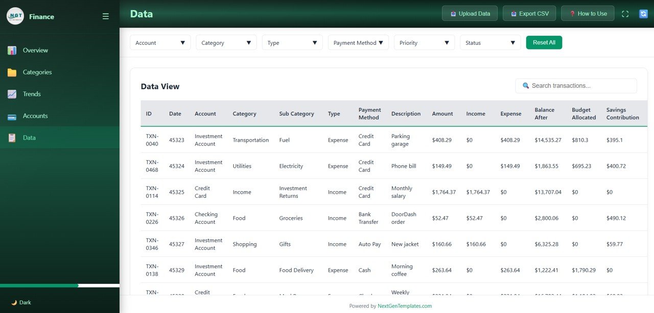
The Data View table lists every transaction with a Search transactions box. Columns include ID, Date, Account, Category, Sub Category, Type, Payment Method, Description, Amount, Income, Expense, Balance After, Budget Allocated and Savings Contribution. Use it to check the transactions behind any number on the other pages.
How to Use It with Your Own Data
- Unzip the download and open index.html in your browser.
- Explore the five pages with the sample data so you know what each chart needs.
- Export transactions from your bank or budgeting app and arrange them in the same columns as the sample data (account, category, sub category, type, payment method, amount, budget allocated and so on).
- Replace the sample data with your own, either through Upload Data or by updating the included data file. The cards, charts and table refresh automatically.
- Start on Categories and compare Budget Allocated with Actual Expense for each category.
- Use the filters (for example Category = Housing or Payment Method = Credit Card) to dig into anything unexpected, then click Reset All.
If you are new to working with your own financial data in spreadsheets, the learning paths on NextGenTemplates Academy are a good place to build the basics step by step.
Three Real-World Use Cases
- Monthly money check-in for a household: a couple loads the month’s transactions and spends ten minutes on the Categories and Trends pages to agree next month’s budget.
- Freelancer with irregular income: the Monthly Income vs Expense Trend shows which months income dipped below spending, so the freelancer knows how big a cash buffer to keep.
- Financial coach: a coach loads a client’s anonymised transactions and uses the Budget Allocated vs Actual Expense chart in the session instead of a printed spreadsheet.
Best Practices
- Use a fixed set of categories and stick to them, or trends will not be comparable from month to month.
- Update on a set day, weekly or monthly, so you catch overspending early.
- Set a budget for every category, even small ones; otherwise Budget Utilization is hard to interpret.
- Track savings as their own category so Monthly Savings Contribution reflects what you really set aside.
- Keep your data file private. It contains personal financial information; store it securely and share it only with people you trust.
Limitations: Who Should Not Use It
- It does not connect to your bank. You load data yourself, so the dashboard is only as up to date as your last import.
- It reports on transactions; it does not give investment, tax or financial advice.
- Changing the layout or adding new charts requires some HTML, CSS and JavaScript knowledge.
- If you prefer working inside a spreadsheet, a Google Sheets or Excel version will feel more natural.
Related Templates and Guides
If you want the same idea in a spreadsheet, read about the Personal Finance Dashboard in Google Sheets and the Personal Finance KPI Dashboard. For day-to-day tracking, see the Personal Monthly Budget Tracker, the Personal Expense Tracker and the Personal Finance Net Worth Tracker. There is also a Personal Finance Dashboard in Excel for Excel users.
Frequently Asked Questions
Do I need Excel or any other software?
No. Open index.html in Chrome, Edge, Firefox or Safari. Nothing needs to be installed.
Can I use my own bank transactions?
Yes. Replace the sample data with your own records in the same column layout, using Upload Data or the included data file, and every page updates.
How many pages does the Personal Finance Dashboard in HTML have?
Five: Overview, Categories, Trends, Accounts and Data.
Which filters can I use?
Account, Category, Type, Payment Method, Priority and Status. Reset All clears them in one click.
Can I export my data?
Yes. The header includes an Export CSV button, so you can save the transaction records and open them in Excel or Google Sheets.
Is my financial data uploaded to a server?
The dashboard is a set of files you open in your own browser; it does not need an account or a login. Still, keep your data file somewhere secure, as you would any personal financial document.
Wrapping Up
The Personal Finance Dashboard in HTML gives you a clear, visual view of income, spending, budgets, savings and accounts without installing anything. Load last month’s transactions, start on the Categories page, and use what you see to set a realistic budget for the month ahead.
Get the Personal Finance Dashboard in HTML
📅 Last updated: October 2026