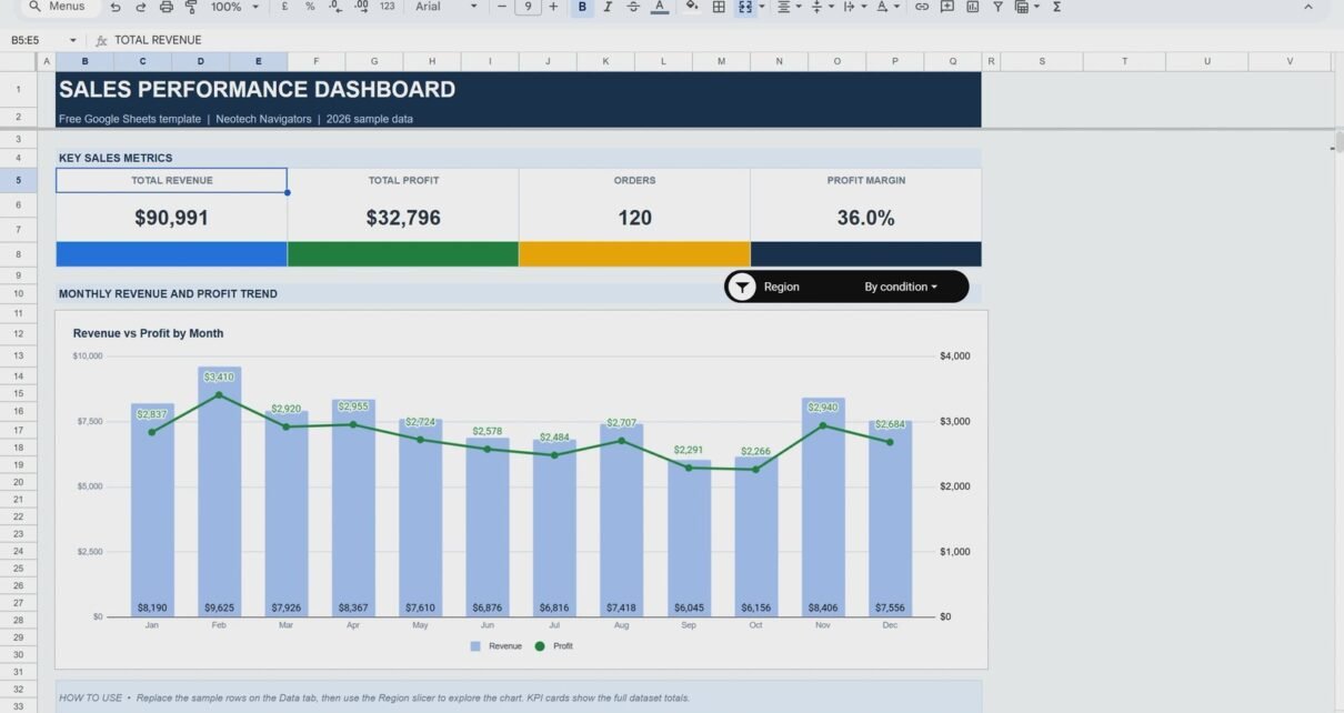
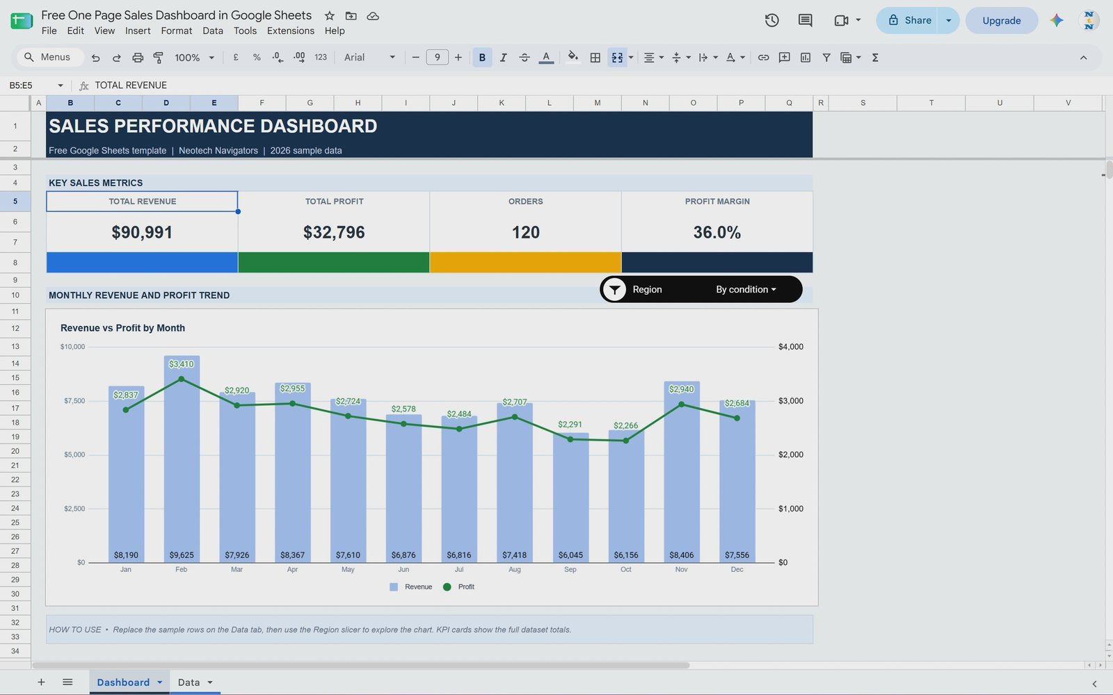
A one page sales dashboard in Google Sheets lets you see total revenue, total profit, orders and profit margin at a glance, and follow the monthly trend without opening a single report. In this tutorial you will build exactly that from 120 sample orders: four KPI cards showing $90,991 revenue, $32,796 profit, 120 orders and a 36.0% profit margin, a monthly Revenue vs Profit combo chart and a Region slicer that filters everything in one click. No add-ons, no Apps Script, only built-in Google Sheets features.
📥 Get the free Google Sheets template
Download the finished dashboard and the practice tab for free: One Page Sales Dashboard in Google Sheets (Free). Open it, choose File > Make a copy and follow along.
Download the free One Page Sales Dashboard in Google Sheets
Watch the Video Tutorial
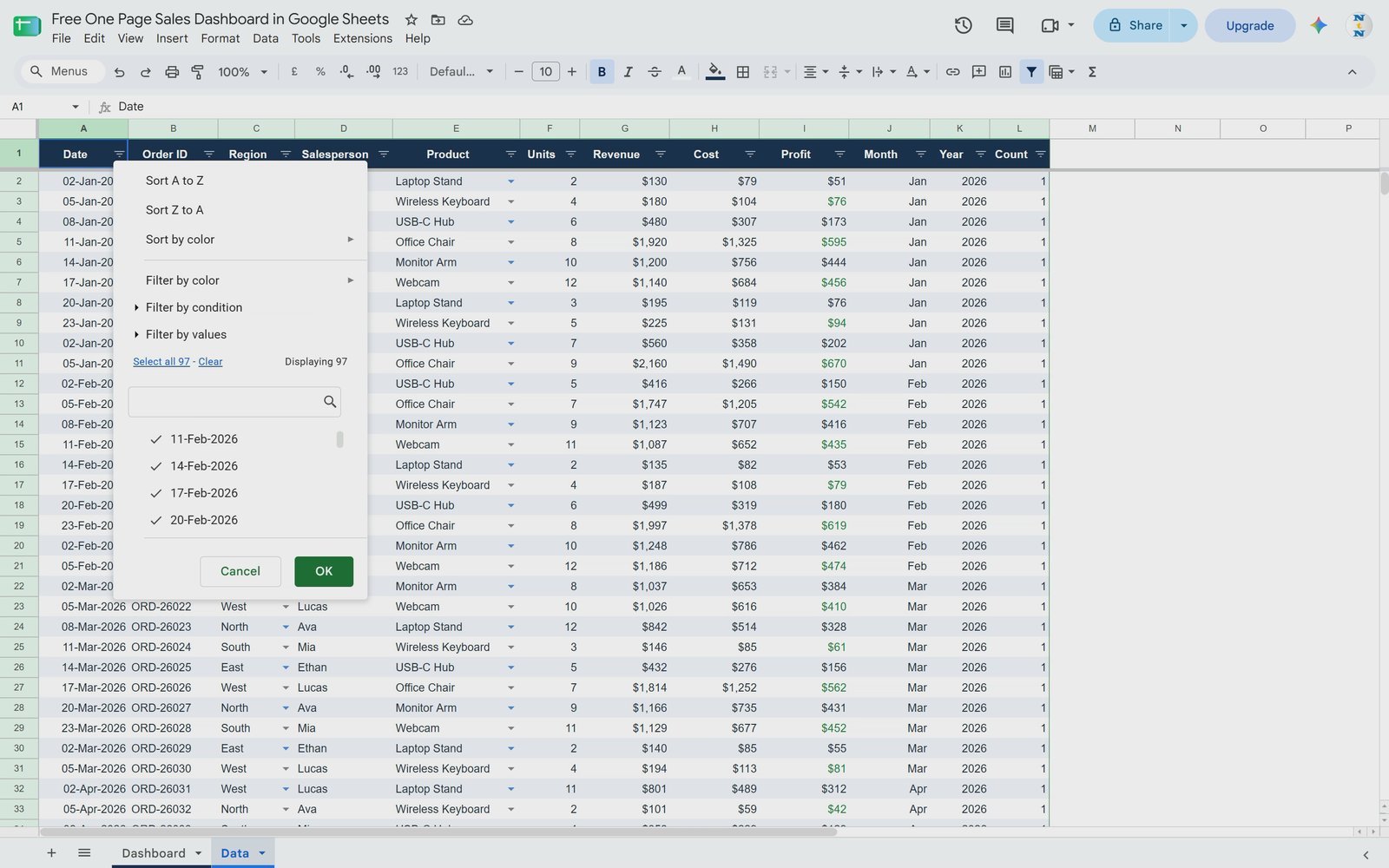
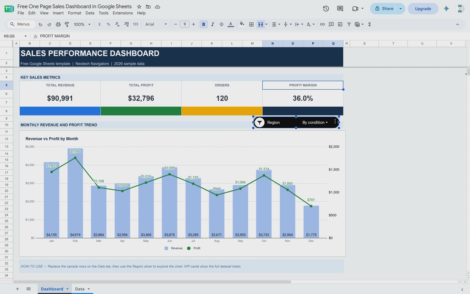
Video Overview: In this 14-minute NeoTech Navigators tutorial, PK first walks through the finished one page sales dashboard and shows how the Region slicer filters the chart for East, and then for East and South together. He checks the source data (dates, Order ID, Region, Salesperson, Product, Units, Revenue, Cost, Profit, Month, Year and a Count column), then rebuilds the dashboard on a blank Practice Dashboard tab. You will see how to remove gridlines and apply a light background, merge cells for the header and the KPI cards, calculate Total Revenue, Total Profit, Orders and Profit Margin with SUM formulas, insert a pivot table by month, turn it into a Revenue vs Profit combo chart with Profit on the right axis, and finally add a Region slicer and style it to match your theme.
What You Will Build
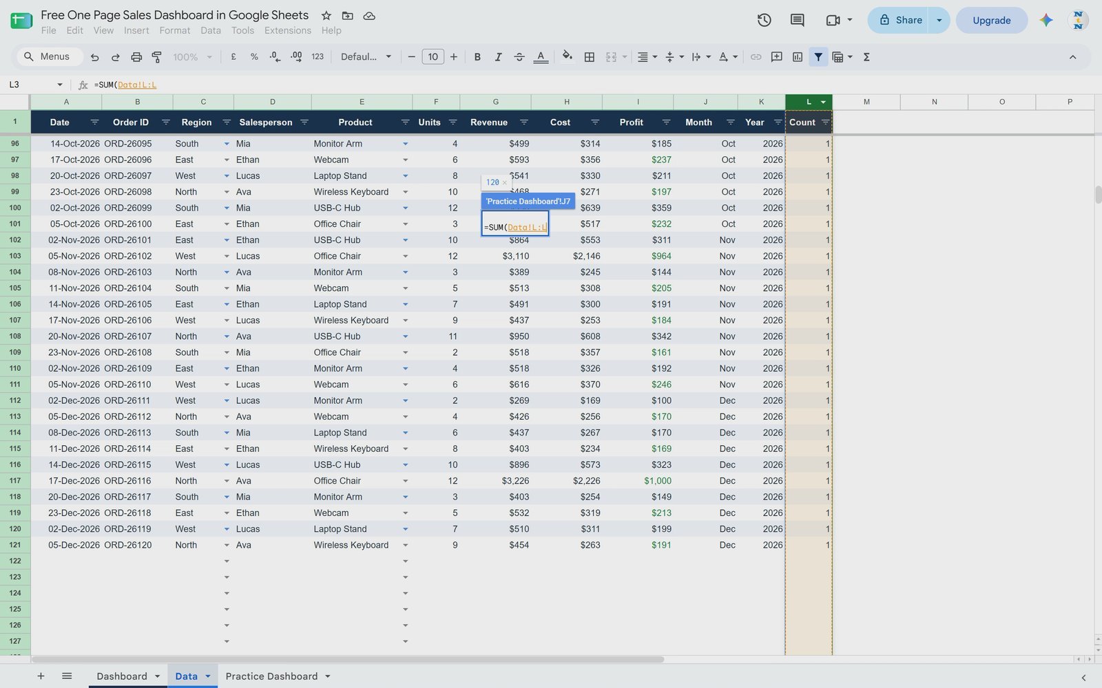
- Header bar – a merged, dark blue title row reading SALES PERFORMANCE DASHBOARD.
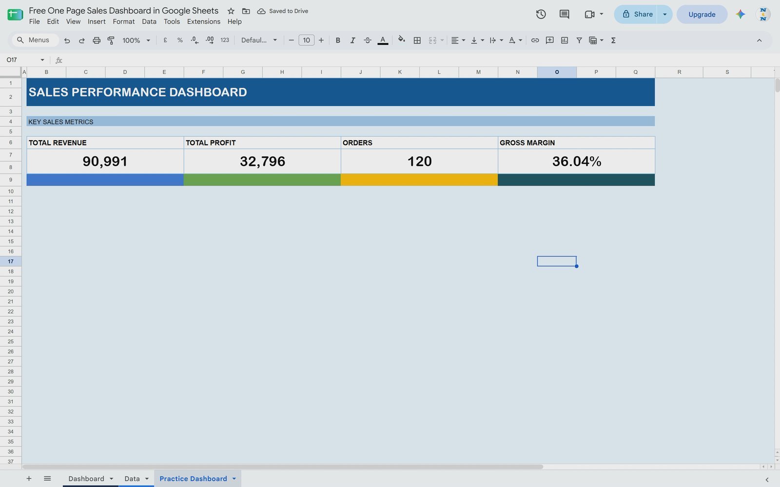
- 4 KPI cards – Total Revenue, Total Profit, Orders and Profit Margin, each with its own colour bar.
- Monthly Revenue and Profit Trend – a combo chart with revenue as columns and profit as a line on a secondary axis.
- Region slicer – filter the pivot table and chart by North, South, East or West, or any combination.
- A clean one page layout – no gridlines, a light background and everything visible without scrolling.
The Sample Data
The Data tab holds 120 orders from January to December 2026. Each row is one order, and there is no blank column anywhere in the range – that matters, because a clean table is what makes the formulas, pivot table and slicer work without surprises.
| Column | What it contains |
|---|---|
| Date / Order ID | Order date (02-Jan-2026 to 05-Dec-2026) and a unique ID such as ORD-26001 |
| Region | North, South, East, West – 30 orders each |
| Salesperson | Ava, Mia, Ethan, Lucas |
| Product | Laptop Stand, Wireless Keyboard, USB-C Hub, Office Chair, Monitor Arm, Webcam |
| Units, Revenue, Cost, Profit | Quantity and dollar values per order |
| Month, Year | Helper columns used by the pivot table |
| Count | 1 on every row, so each line is counted as one order |
How the Finished Dashboard Works
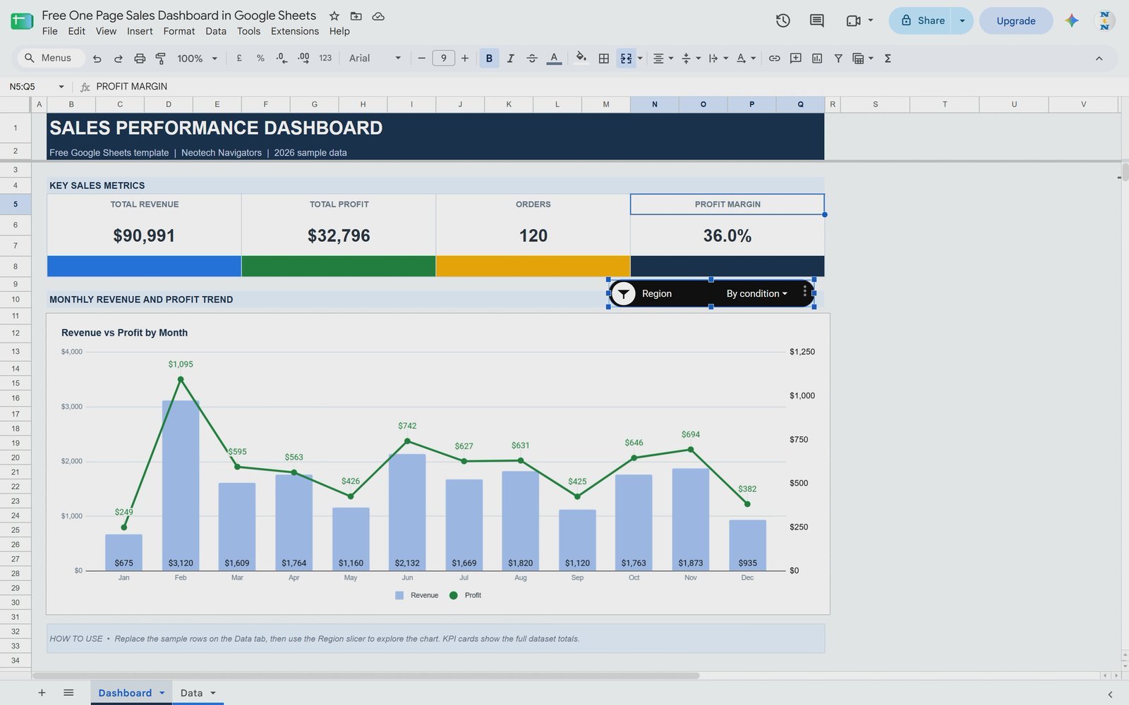
Before building, look at how the dashboard behaves. Open the Region slicer, click Clear, tick East and click OK – the chart now shows only East. Tick East and South together and the chart combines both regions. That is what makes it dynamic and interactive.
Step 1: Prepare a Clean Canvas
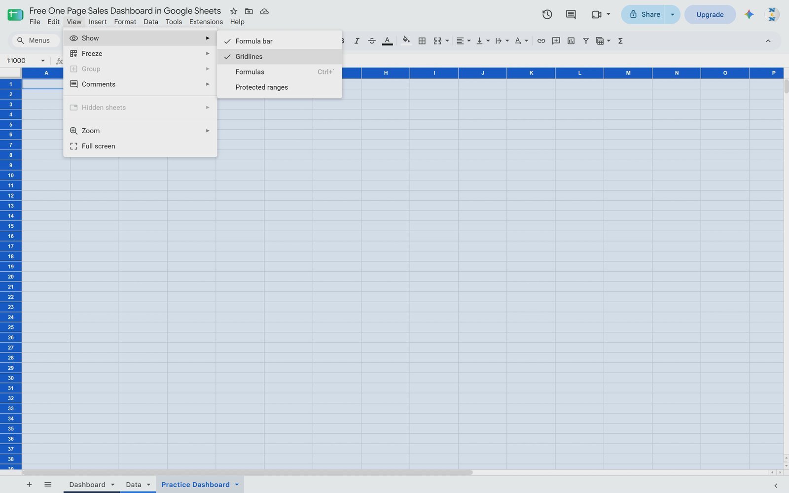
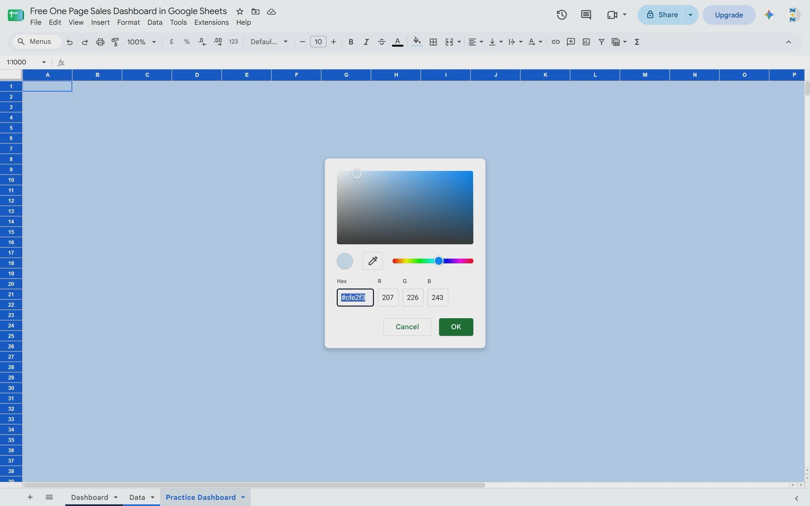
Add a new sheet (the video calls it Practice Dashboard). Select all cells, then go to View > Show > Gridlines and untick it. With everything still selected, open the fill colour and pick a light shade. If the palette colours are too dark, click Add a custom color and drag the picker towards white until you get a soft background. Finally, reduce the width of column A so the dashboard has a small left margin.
Step 2: Add the Dashboard Header
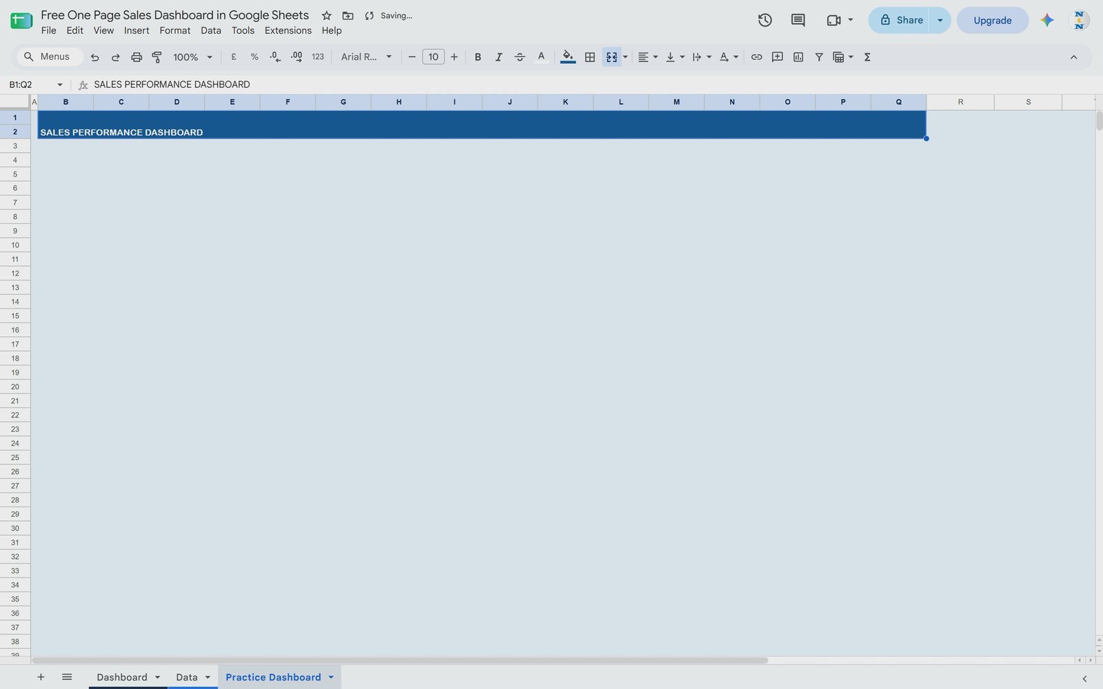
Select two rows from column B to column Q, click Merge cells, fill them with dark blue and set the font to white. Type SALES PERFORMANCE DASHBOARD in capitals, increase the font size (the video uses Arial Rounded, but any clean font works) and set the vertical alignment to Middle. You can add a year or month next to the title if you like.
Step 3: Add the Key Sales Metrics Bar
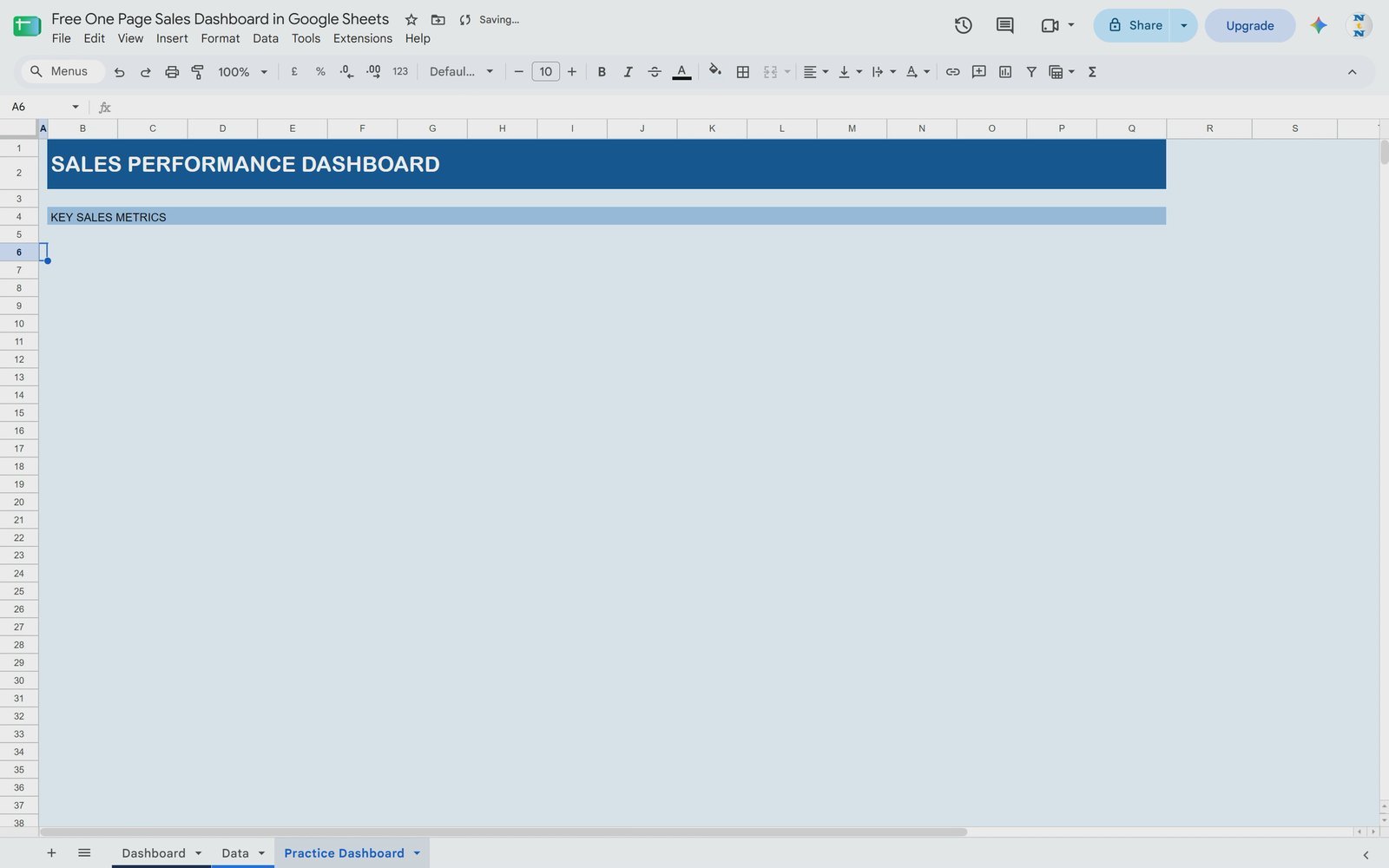
Leave one empty row, increase its height slightly, and create a thinner merged bar across the same columns. Fill it with a slightly darker tint of your background and type KEY SALES METRICS. This label separates the header from the KPI cards.
Step 4: Build the KPI Card Layout
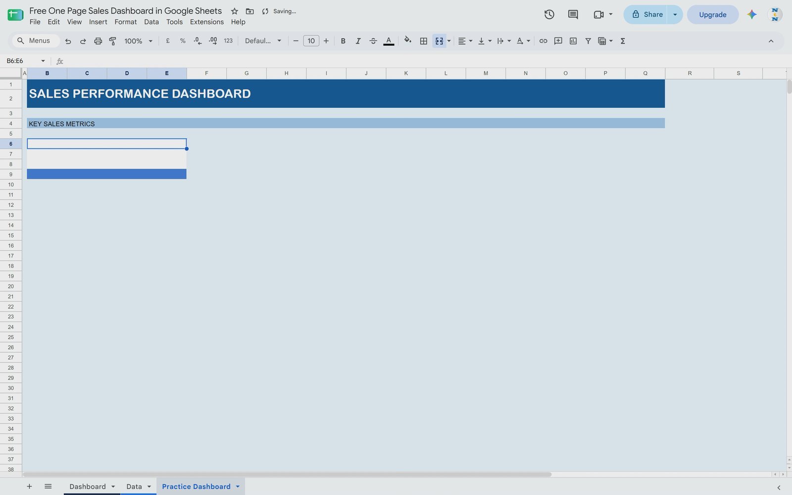
Each card uses four columns. For the first card, merge the four cells of the label row and fill them white, then merge the two value rows below and fill them white, and finally merge the bottom row and give it a colour (blue for the first card). Type TOTAL REVENUE as the label, make it bold, a little bigger and vertically centred.
Step 5: Calculate Total Revenue with SUM
In the value cell of the first card, type =SUM(, switch to the Data tab and click the column letter G (Revenue). The formula becomes:
=SUM(Data!G:G)
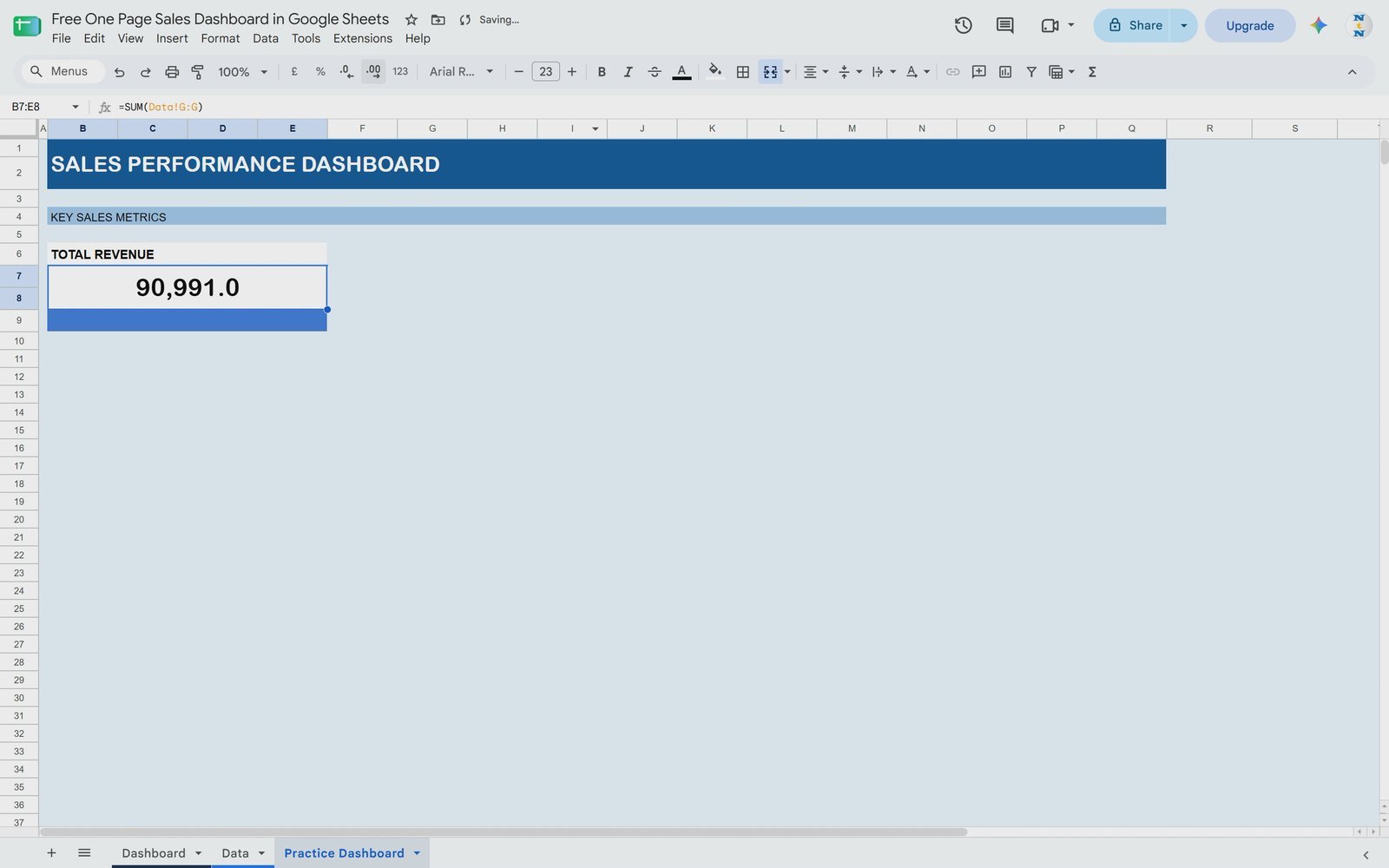
Centre the result, choose a font such as Arial, make it larger, and use Format > Number without decimals. The card now shows 90,991. Add a light sky-blue border around the card to finish it.
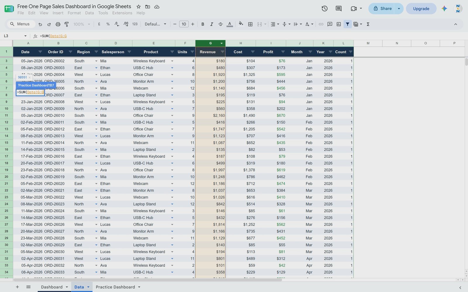
💡 Tip: select the whole column. You can reference a fixed range such as Data!G2:G501 with spare rows, or the whole column Data!G:G. With the whole column, any new order you add to the Data tab appears in the total straight away.
Step 6: Copy the Card and Add Total Profit
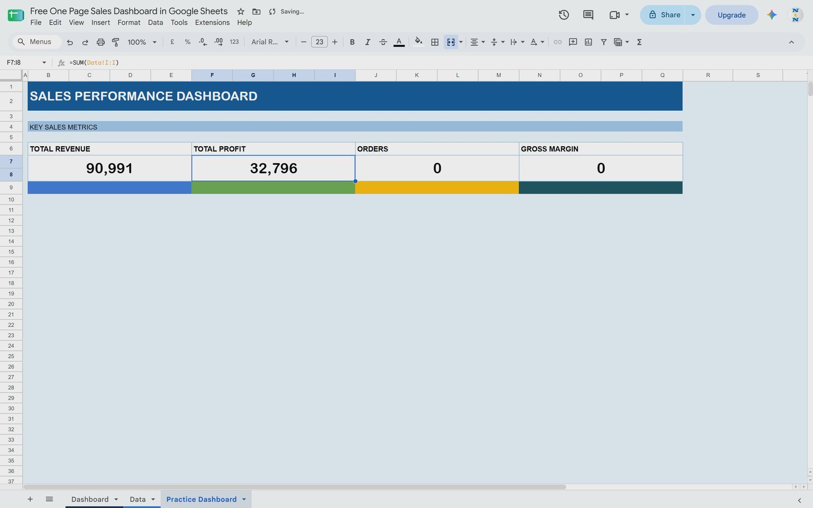
Copy the finished card and paste it three times to the right, then change the bottom colours (green for profit, amber for orders, dark navy for margin). Rename the labels to TOTAL PROFIT, ORDERS and GROSS MARGIN. For Total Profit use:
=SUM(Data!I:I)
which returns 32,796. You can keep the border or remove it – both variations are in the free file.
Step 7: Count the Orders
There are two easy ways to count orders. Because every row in the Count column is 1, you can simply add it up:
=SUM(Data!L:L)
Or count the Order IDs, which is what the finished Dashboard tab uses:
=COUNTA(Data!B2:B501)
Both return 120.
Step 8: Calculate the Profit Margin
Profit margin is total profit divided by total revenue. You can calculate it from the data, as the finished Dashboard does with an error guard:
=IFERROR(SUM(Data!I2:I501)/SUM(Data!G2:G501),0)
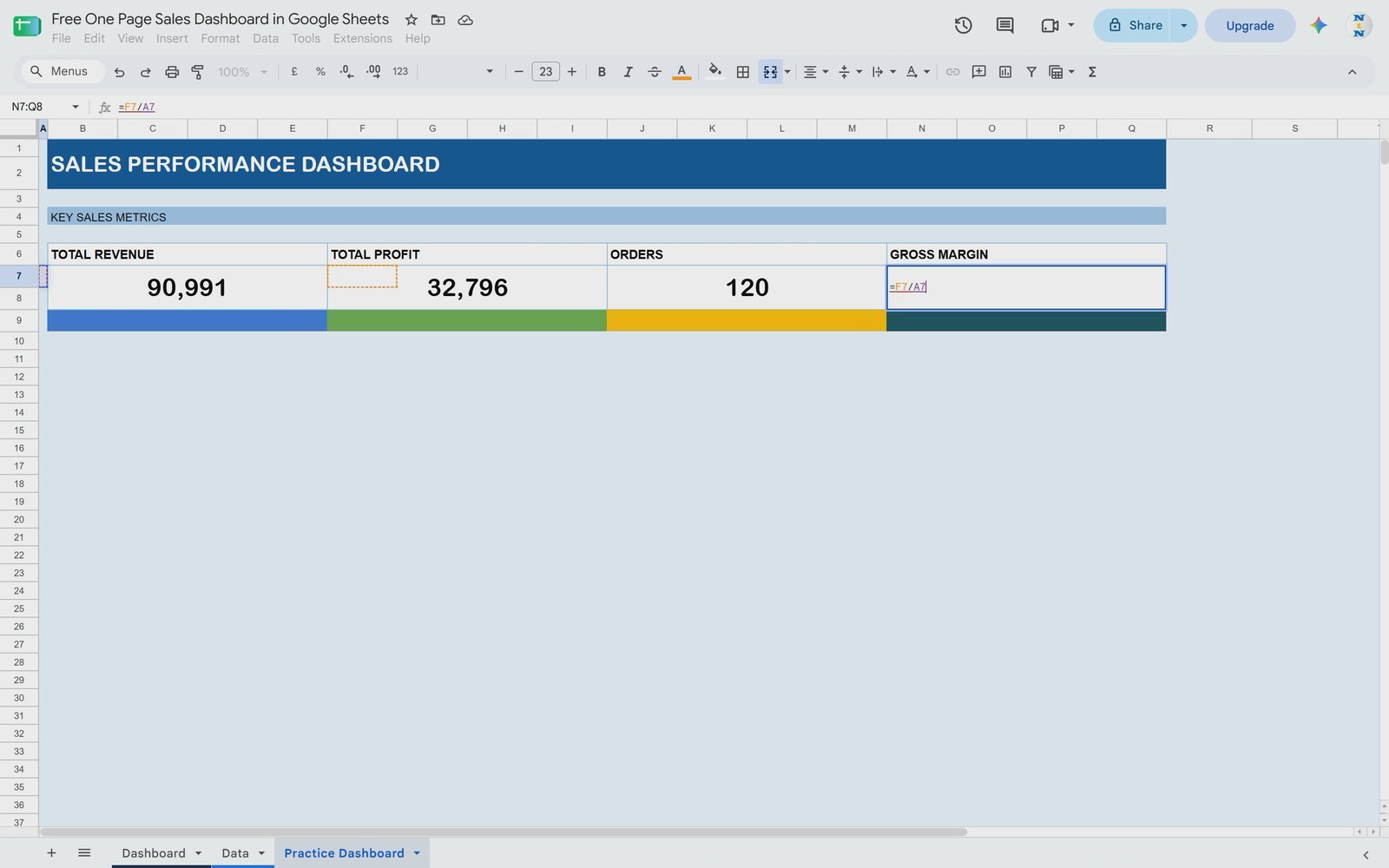
or simply divide the two KPI cards you already built:
=F7/B7
Then click Format as percent. The card shows 36.04% and the top section is complete.
Step 9: Add the Monthly Trend Section
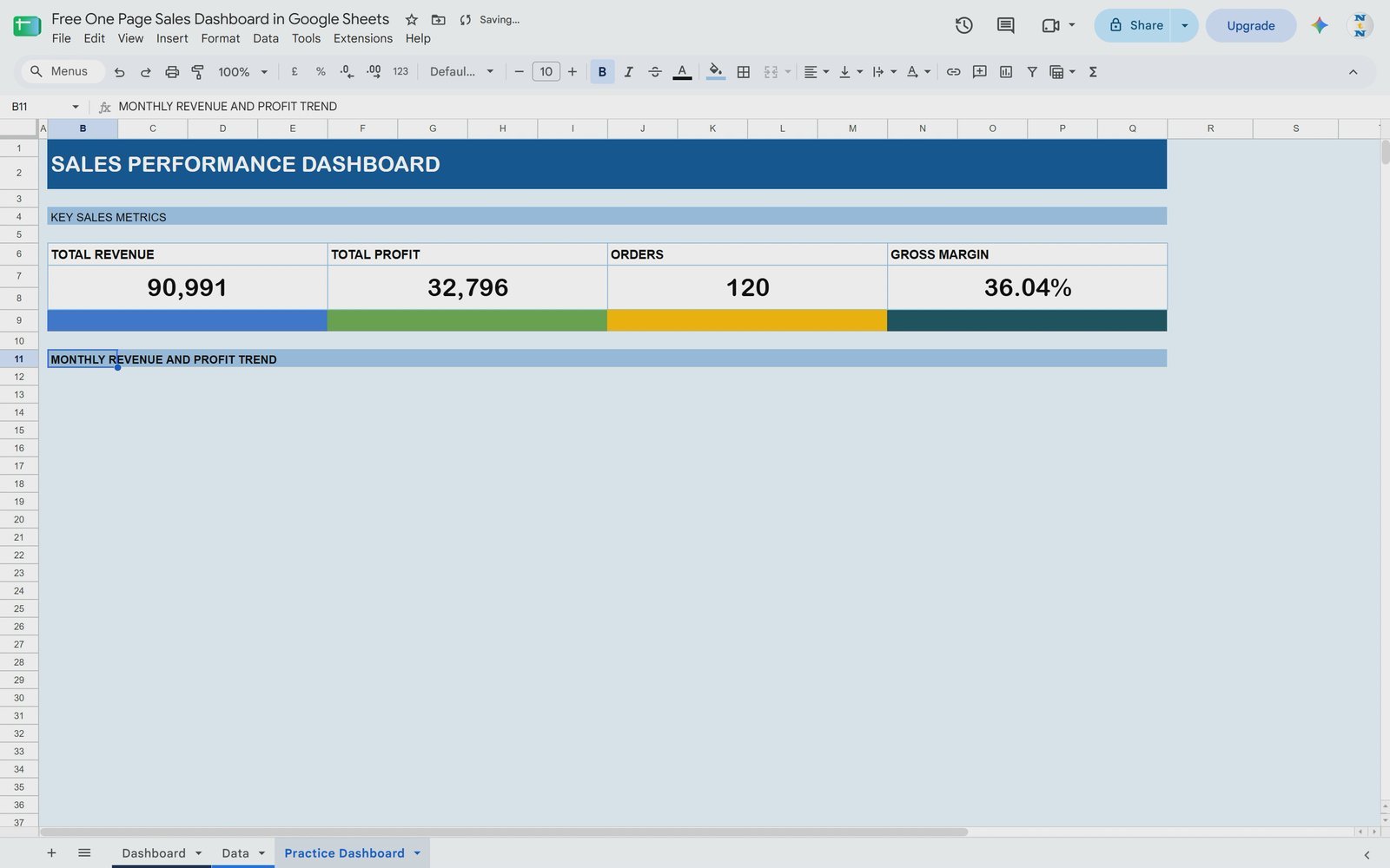
Copy the Key Sales Metrics bar, paste it below the cards and change the text to MONTHLY REVENUE AND PROFIT TREND. The chart will sit under this bar.
Step 10: Insert a Pivot Table
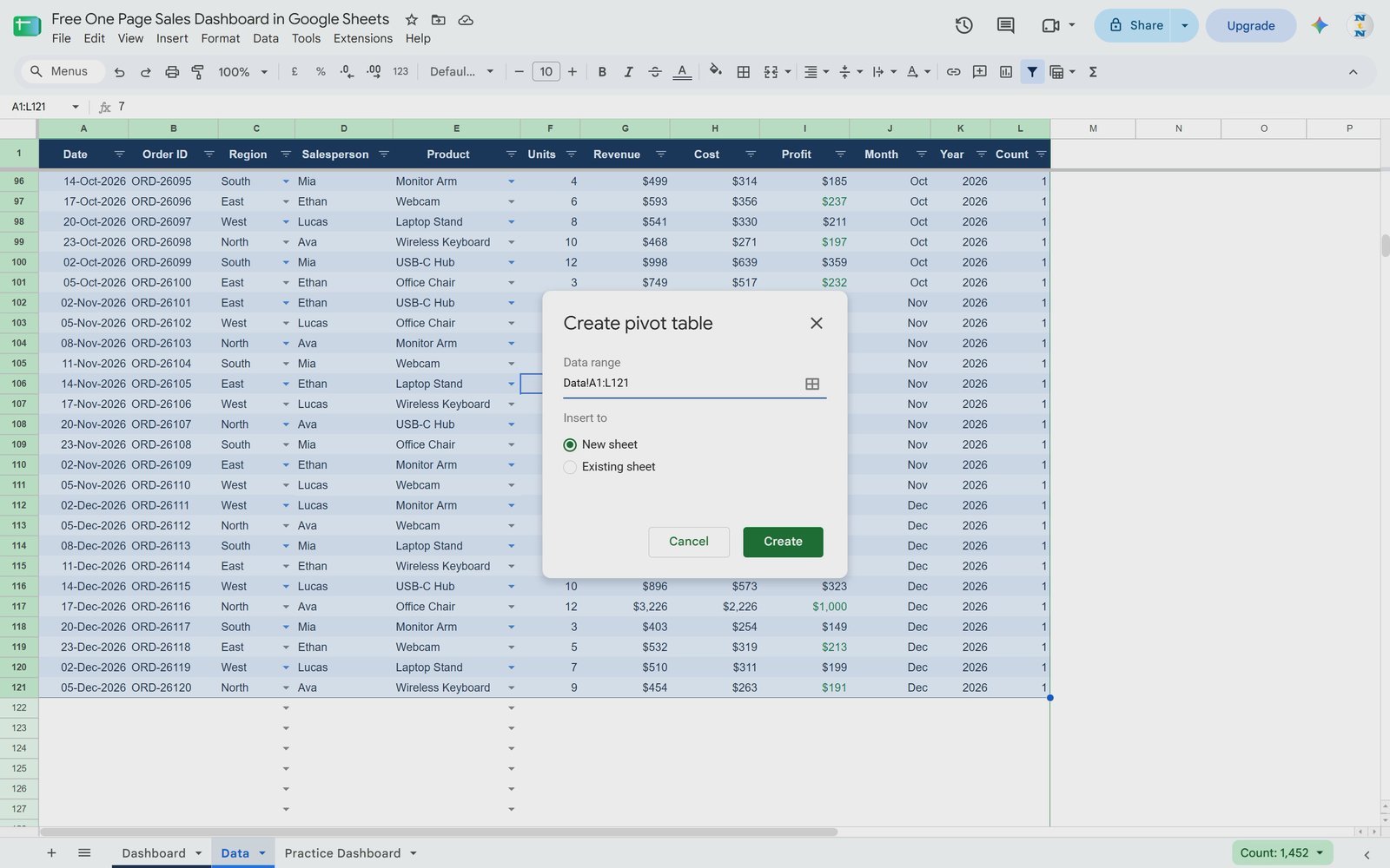
Go to the Data tab, select the data and choose Insert > Pivot table. You can extend the range (for example to row 1000) so future rows are included. Under Insert to, choose Existing sheet, pick an empty cell to the right of the dashboard on the Practice Dashboard tab and click Create.
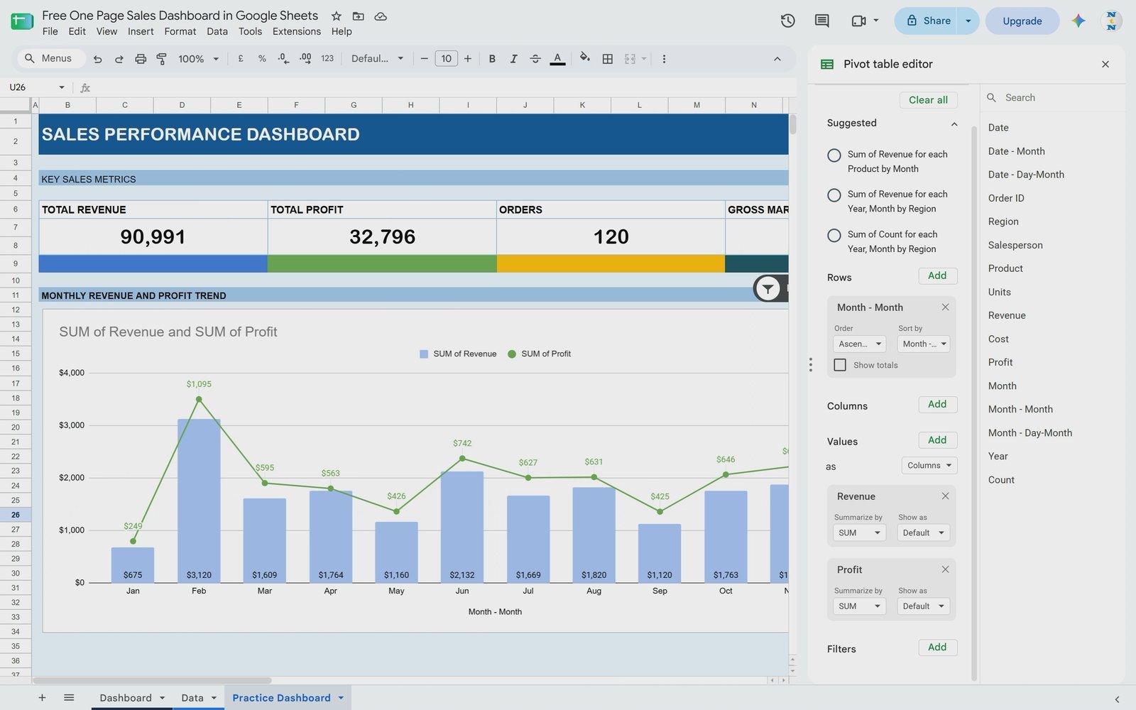
Step 11: Set Rows, Values and Remove Totals
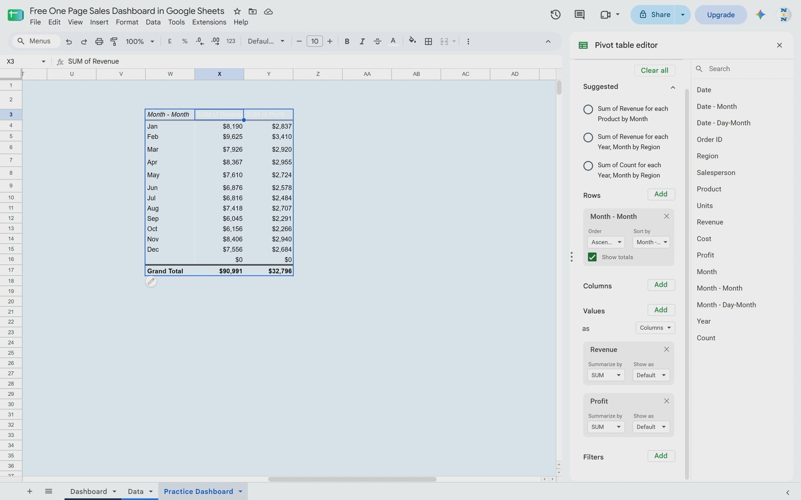
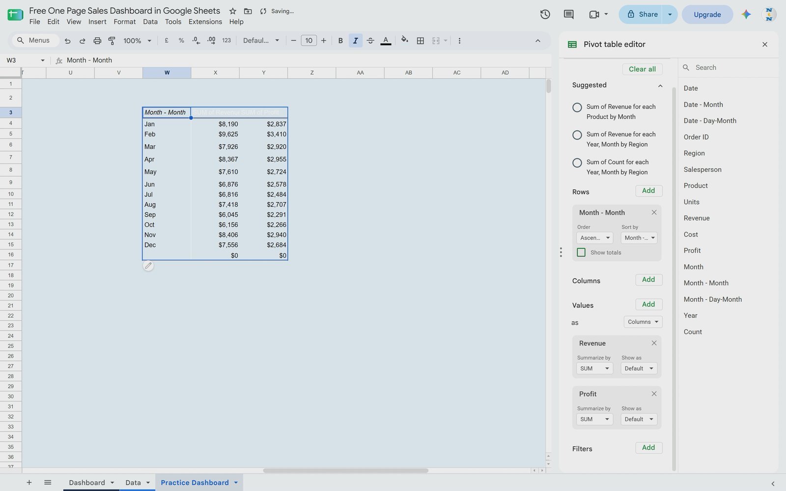
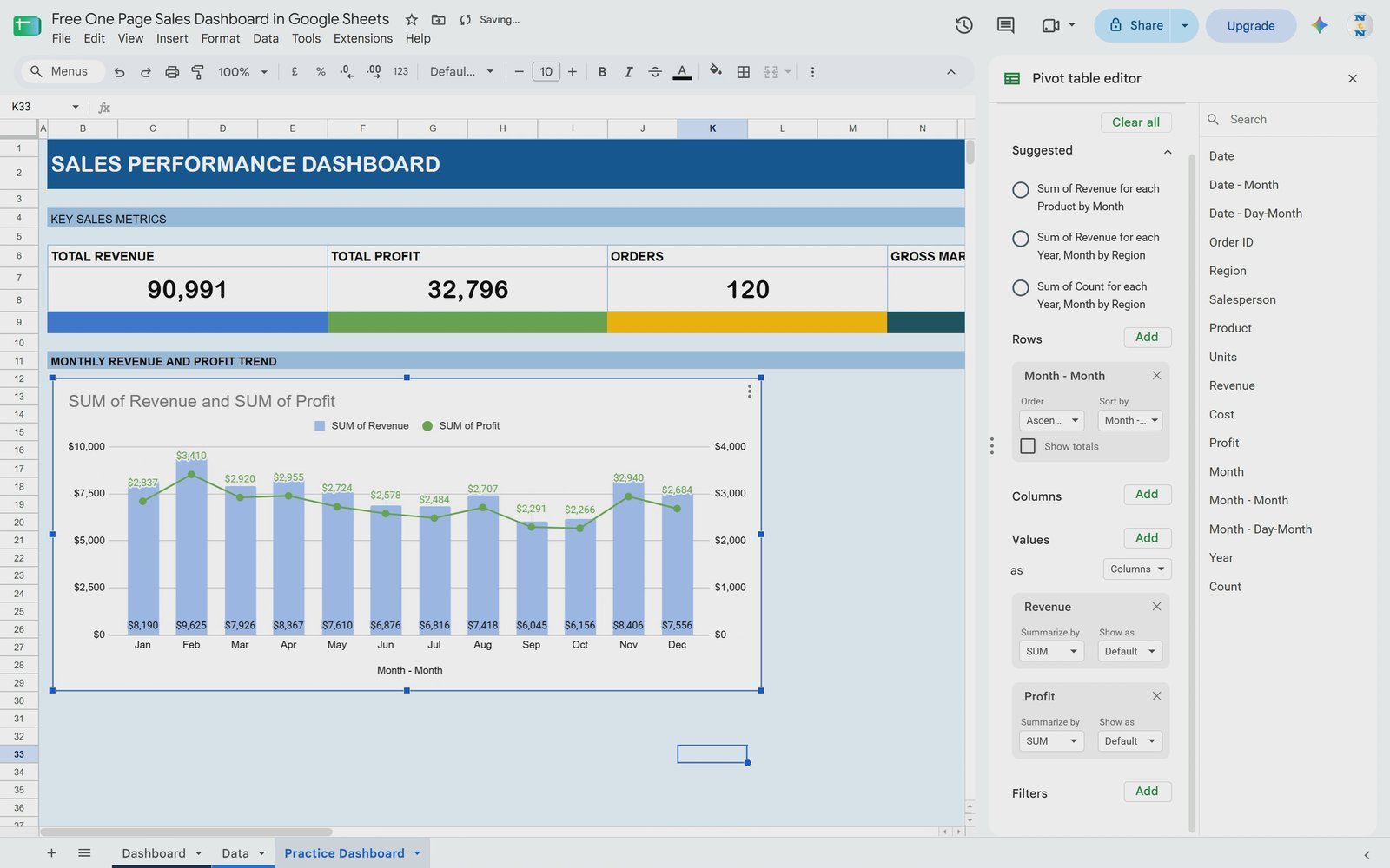
In the Pivot table editor, add Month to Rows (the video uses the Date > Month grouping), and add Revenue and Profit to Values. The dashboard does not need a grand total, so untick Show totals. If you extended the range, you may see one extra blank month showing $0 – that comes from the empty rows and is nothing to worry about.
Step 12: Insert the Chart and Convert It to a Combo Chart
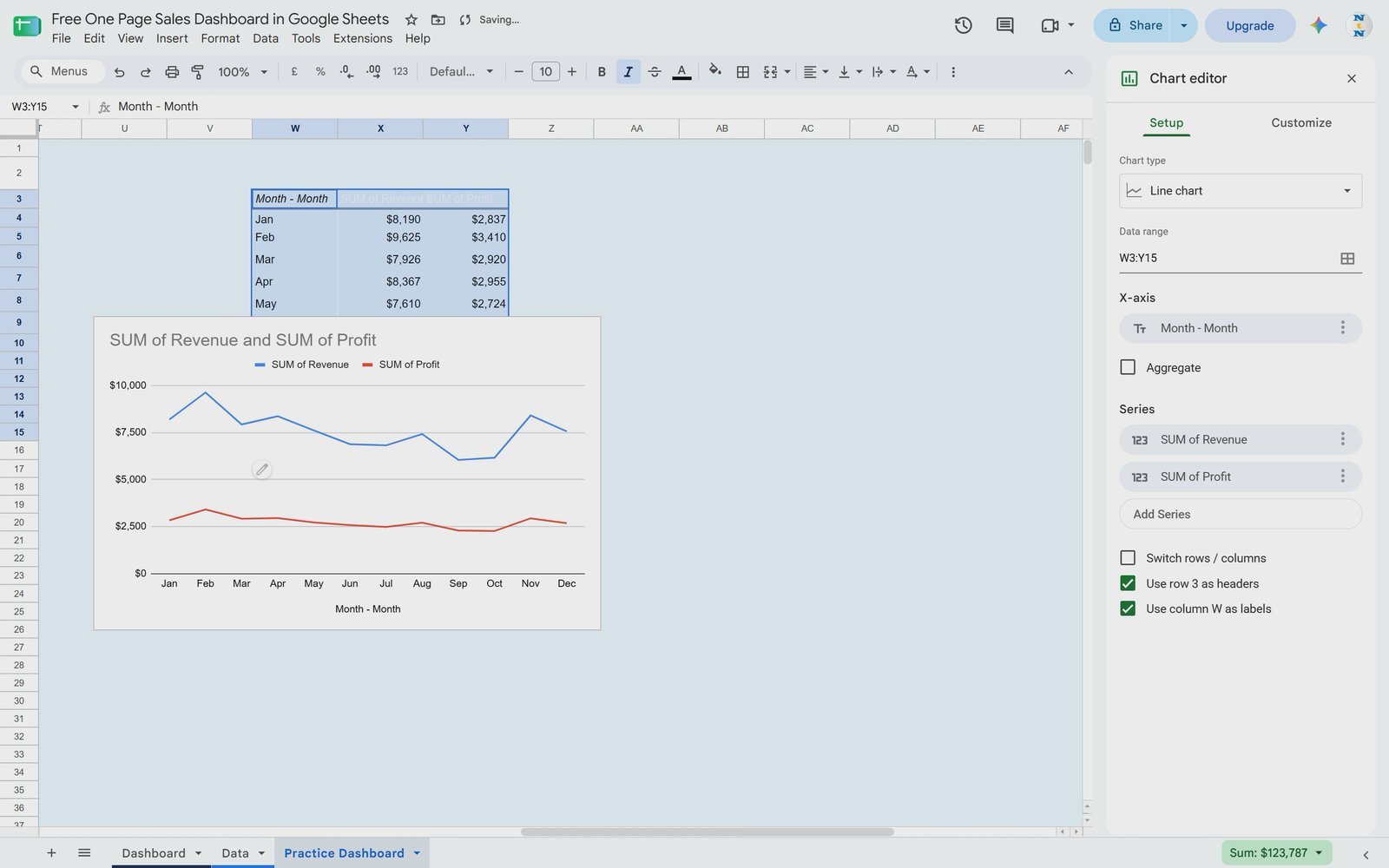
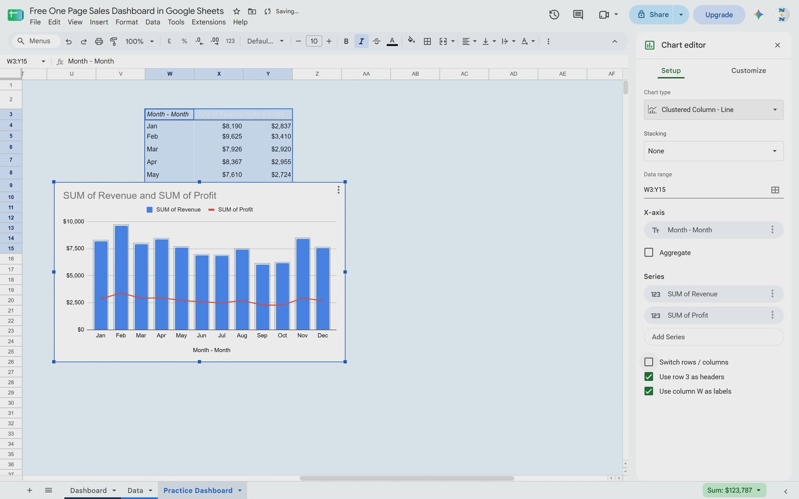
Select the pivot table and choose Insert > Chart. Google Sheets suggests a line chart. In the Chart editor, stay on the Setup tab, open Chart type and choose the first Combo chart – revenue becomes columns and profit a line.
Step 13: Format the Series, Axis and Data Labels
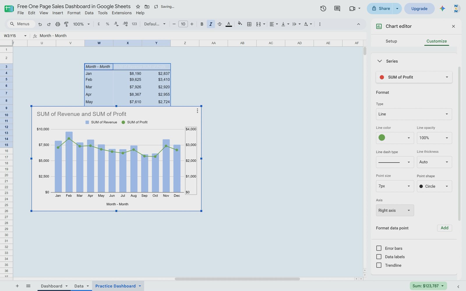
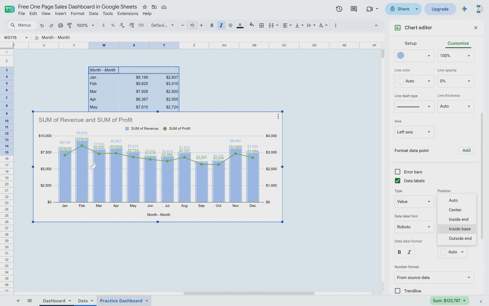
Switch to Customize > Series. Select SUM of Revenue and give it a lighter colour. Select SUM of Profit, choose green, set a point size so the markers show, and change Axis to Right axis so profit sits on the secondary axis. Tick Data labels for both series and set the column labels’ position to Inside base. Customize the chart title if you want, then move the chart under the Monthly Revenue and Profit Trend bar.
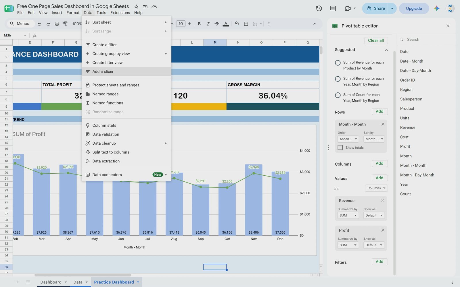
Step 14: Add a Region Slicer
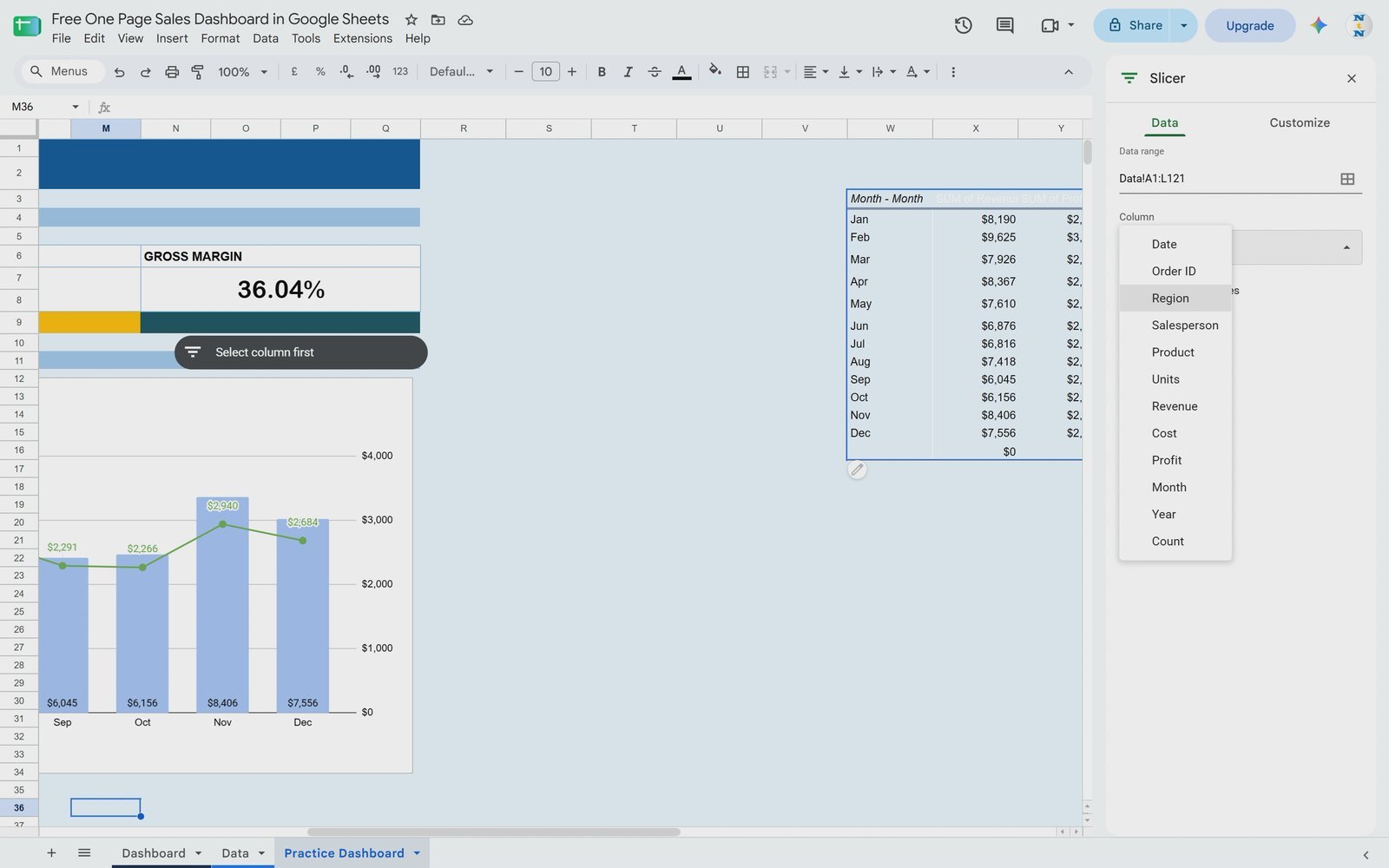
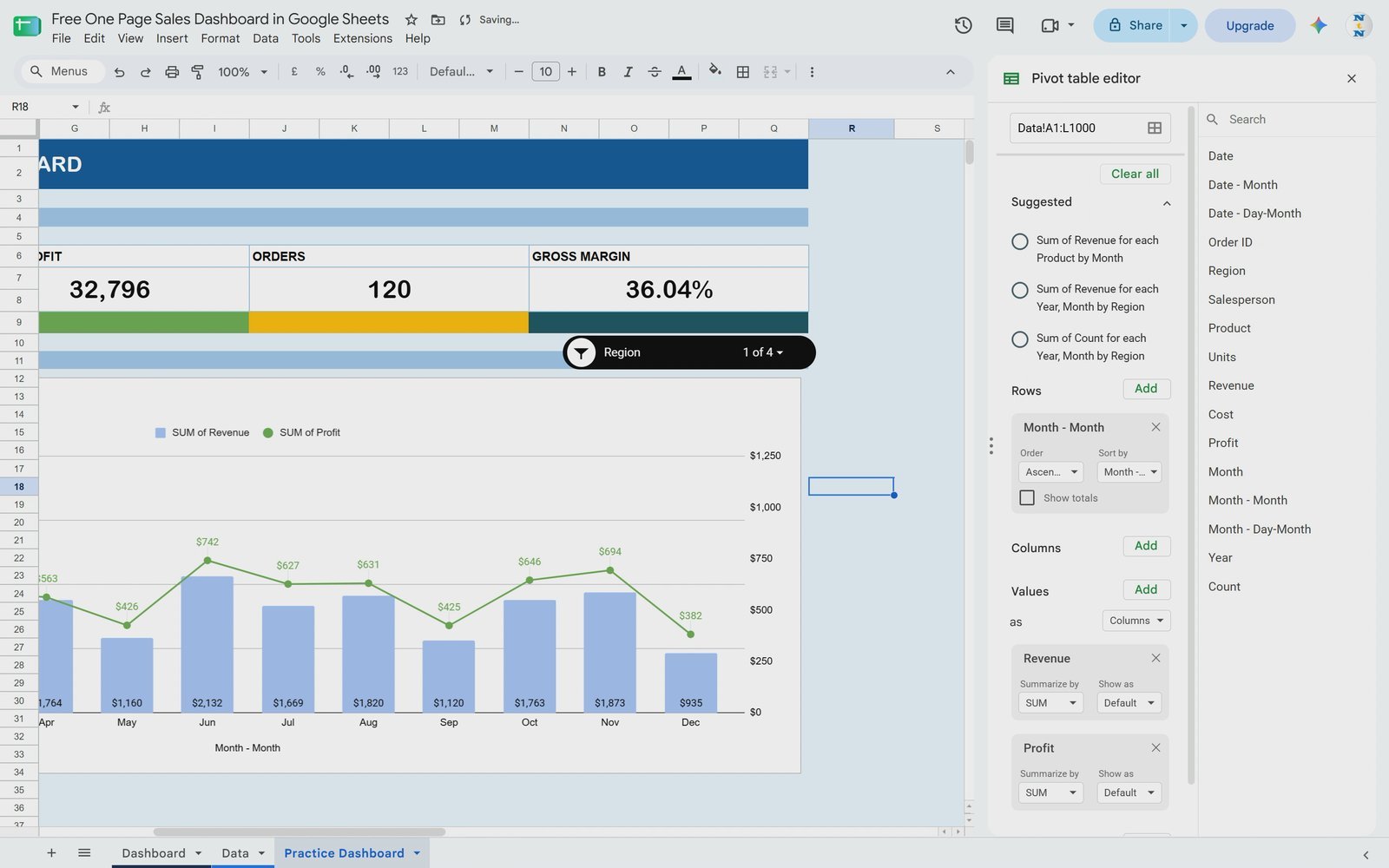
Go to Data > Add a slicer (not the Insert menu). Select the full data range from the Data tab and click OK. In the Slicer panel choose Region as the column. You can add more slicers later for Salesperson or Product. Place the slicer next to the section bar, open it, click Clear under Filter by values and tick only East – the chart updates immediately.
Step 15: Match the Slicer to Your Theme
Select the slicer, click the three dots and choose Edit slicer. On the Customize tab change the Background color – the video uses black so it matches the dark header. Your one page sales dashboard is ready to use.
Formulas Used in This Dashboard
| KPI | Practice tab formula | Finished Dashboard formula | Result |
|---|---|---|---|
| Total Revenue | =SUM(Data!G:G) |
=SUM(Data!G2:G501) |
$90,991 |
| Total Profit | =SUM(Data!I:I) |
=SUM(Data!I2:I501) |
$32,796 |
| Orders | =SUM(Data!L:L) |
=COUNTA(Data!B2:B501) |
120 |
| Profit Margin | =F7/B7 |
=IFERROR(SUM(Data!I2:I501)/SUM(Data!G2:G501),0) |
36.0% |
Google Sheets Dashboard vs. Excel Dashboard vs. Static Report
| Feature | This Google Sheets dashboard | Excel dashboard | Static report |
|---|---|---|---|
| Cost | Free with a Google account | Needs Microsoft 365 / Excel | Free |
| Interactive filtering | Yes – slicer | Yes – slicers and timelines | No |
| Live sharing | Share a link, edit together | OneDrive / SharePoint | Send a file or PDF |
| Updates with new data | Automatic with whole-column formulas and a wide pivot range | Automatic with tables and refresh | Rebuild manually |
| Skill needed | Beginner – SUM, pivot table, chart | Beginner to intermediate | Beginner |
Tips and Best Practices
- Keep the data clean. No blank columns, one header row, real dates and consistent region names.
- Add a Count column. A column of 1s makes order counts a simple SUM and works nicely in pivot tables.
- Leave room for growth. Use whole columns in formulas and extend the pivot table range beyond your current rows.
- Use Data > Add a slicer. Slicers live under the Data menu in Google Sheets, not under Insert.
- Put the secondary metric on the right axis. Profit is much smaller than revenue, so a right axis keeps the line readable.
- Keep the pivot table off the visible page. Place it to the right of the dashboard so only the cards, chart and slicer are on screen.
Want to go further? Read the official guide to creating and using pivot tables in Google Sheets, or explore our ready-made Sales Performance Management Dashboard in Google Sheets, Sales Target Dashboard in Google Sheets and Sales KPI Dashboard in Google Sheets.
Once the basics click, the Excel Pivot Tables & Dashboards course on NextGenTemplates Academy takes the same pivot-and-chart approach further, with practice files you can work through.
Download the free One Page Sales Dashboard in Google Sheets
Frequently Asked Questions
Is this sales dashboard template really free?
Yes. The One Page Sales Dashboard in Google Sheets is a free download on NextGenTemplates.com. You get a view-only link and make your own editable copy with File > Make a copy.
Do I need any add-ons or Apps Script?
No. The dashboard uses only built-in features: SUM, COUNTA and IFERROR formulas, a pivot table, a combo chart and a slicer.
How do I add my own sales data?
Paste your orders into the Data tab under the same headers. The whole-column formulas and the wider pivot range pick up the new rows automatically.
Why do I see a blank month with $0 in the pivot table?
It appears when the pivot range includes empty rows. It does not affect the totals; you can ignore it or filter out blanks.
Where is the slicer option in Google Sheets?
Go to Data > Add a slicer, choose the data range, then pick the column (Region in this tutorial) in the Slicer panel.
How is profit margin calculated?
Total profit divided by total revenue: $32,796 ÷ $90,991 = 36.0%, formatted as a percentage.
Can I add more slicers, for example by Salesperson or Product?
Yes. Repeat Data > Add a slicer and choose Salesperson or Product as the column; each slicer filters the pivot table and chart.
Why can’t I see “Make a copy”?
Sign in to your Google account first and reload the link. The master file is view-only on purpose so every user works on their own copy.
Download the Free Sales Dashboard Template
Get the finished Dashboard, the Data tab with 120 sample orders and the Practice Dashboard tab in one Google Sheet: Download the One Page Sales Dashboard in Google Sheets (Free). For more ready-to-use templates, browse the Google Sheets dashboard collection.
About the Author
PK is the founder of NeoTech Navigators, PK: An Excel Expert and NextGenTemplates.com and a Microsoft Certified Professional. He builds Excel, Google Sheets and Power BI dashboards and teaches data analysis on the NeoTech Navigators and PK: An Excel Expert YouTube channels.
Conclusion
With four SUM-based KPI cards, one pivot table, a combo chart and a slicer, you can turn 120 rows of orders into a clean, interactive one page sales dashboard in Google Sheets in under 15 minutes. Use the same pattern for any sales data: keep the table clean, calculate the headline numbers, summarise by month and let a slicer do the filtering. Download the free template, make a copy and start building your own version today.