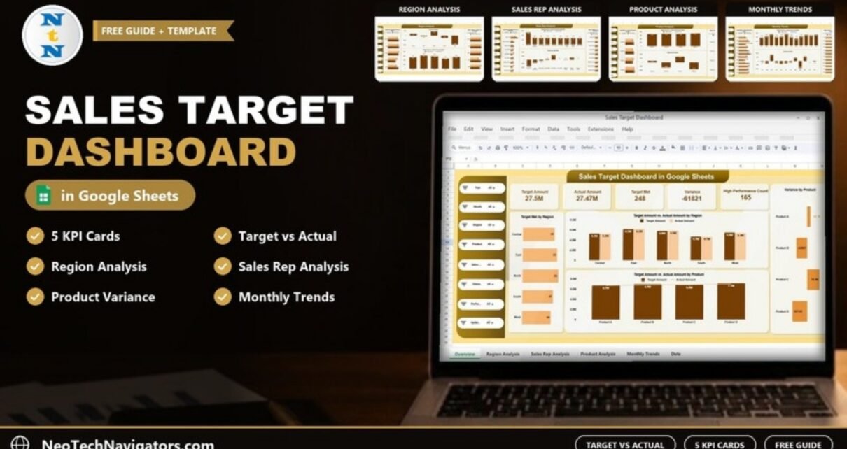
A Sales Target Dashboard in Google Sheets answers the question every sales manager asks on Monday morning: are we on target, and if not, where exactly is the gap? This guide walks through a ready-made dashboard that compares target amount with actual sales across regions, sales reps, products and months, and shows you how each page helps you act on the numbers.
It is written for sales managers, regional heads, product managers and business owners who track targets in spreadsheets today and want one shared, visual view instead of scattered reports. You will see the five KPI cards, the filter panel, every analysis page, the target vs actual logic behind the charts, and step-by-step instructions for loading your own data.
Get the Sales Target Dashboard in Google Sheets
What Is a Sales Target Dashboard in Google Sheets?
A sales target dashboard is a single report that puts the assigned target next to the actual result for every slice of the business you care about. Instead of opening one file per region or waiting for a month-end deck, you look at one screen and see target achievement, shortfalls and the areas that are performing above plan.
Building it in Google Sheets has practical advantages for small and mid-sized sales teams:
- Everyone works on the same live file, so there is no "which version is latest" problem.
- Charts and KPI cards recalculate as soon as new rows are added.
- It runs in a browser on any device, with no BI licence to buy.
- Sharing permissions let you give reps view access while managers edit.
The Filter Panel
Every page has the same filter panel down the left side. The visible filters are Year, Month, Region, Product, Sales Rep and Status, followed by two more filters for the performance and update fields. All of them are set to All by default, and changing one filter recalculates the KPI cards and charts on that page.
The Five KPI Cards on the Overview Page
The Overview sheet opens with five KPI cards that summarise sales health at a glance. In the sample data they read Target Amount 27.5M, Actual Amount 27.47M, Target Met 248, Variance -61821 and High Performance Count 165. The table below explains what each card measures.
| KPI card | What it measures | How it is worked out | Better when |
|---|---|---|---|
| Target Amount | Total sales target assigned for the filtered records | Sum of the target amount of every record | Realistic, not simply higher |
| Actual Amount | Total sales achieved | Sum of the actual amount of every record | Higher |
| Target Met | Number of records where the target was achieved | Count of records marked as target met (248 in the sample, against 252 not achieved) | Higher |
| Variance | Gap between actual and target | Actual Amount minus Target Amount (negative means behind plan) | Higher (positive means ahead of plan) |
| High Performance Count | Number of records flagged as high performance | Count of records with the high performance flag | Higher |
The template already contains its own formulas, so you do not need to type anything. The descriptions are shown so you understand what each number means before you present it. You can check the logic yourself: the five region variances on the Region Analysis page (20.7K, -7484, 45.4K, -25836 and -94540) add up to roughly the -61821 shown on the Variance card.
Charts on the Overview Page
- Target Met by Region – how many targets were achieved in each region (Central 49, East 53, North 55, South 47, West 44 in the sample).
- Target Amount vs. Actual Amount by Region – planned against actual sales, region by region.
- Variance by Product – which products push the total variance up or down.
- Target Amount vs. Actual Amount by Product – product-wise target performance.

Region Analysis
The Region Analysis page shows which markets are carrying the number and which are falling behind across Central, East, North, South and West. It contains four charts:
- Target Met vs. Not Achieved by Region
- Variance by Region
- Below Target vs. Above Target by Region
- Target Amount vs. Actual Amount by Region
Read the variance chart first. In the sample, North is 45.4K ahead of plan while West is 94,540 behind, even though West still met 44 targets. A region with a large negative variance but a reasonable count of targets met usually has one or two big misses, while a region with many small misses points to a wider pipeline or pricing problem.

Sales Rep Analysis
This page moves from markets to people. It uses the same four views, broken down by representative:
- Target Met vs. Not Achieved by Sales Rep
- Variance by Sales Rep
- Below Target vs. Above Target by Sales Rep
- Target Amount vs. Actual Amount by Sales Rep
It is the page to open before one-to-one reviews, incentive calculations and coaching plans, because it shows both the size of each rep’s gap and how consistently they hit their numbers. In the sample, Allison Hill carries the largest target (5.2M) and also the largest shortfall (-180180), while Lisa Hensley is 129.8K ahead of plan.

Product Analysis
The Product Analysis page applies the same logic to Product A, Product B, Product C and Product D:
- Target Met vs. Not Achieved by Product
- Variance by Product
- Below Target vs. Above Target by Product
- Target Amount vs. Actual Amount by Product
Product managers use it to decide where to adjust pricing, promotion or stock. A product that is consistently above target may deserve a higher target next quarter; one that is always below may need a closer look at demand or positioning.

Monthly Trends
The Monthly Trends page shows how performance moves over time:
- Target Met vs. Not Achieved by Month
- Target Amount vs. Actual Amount by Month
- Variance by Month
- Below Target vs. Above Target by Month
Use it to spot seasonality and momentum. If variance turns negative for two months in a row, that is your early warning to review the pipeline before the quarter closes.

How to Use the Dashboard with Your Own Data
- Make your own copy of the Google Sheets file so you can edit it.
- Open the data sheet and look at the sample rows to understand the column order. Each row is one record with its year, month, region, product, sales rep, target amount, actual amount and status, which is what the filters and charts read.
- Delete the sample rows and paste your own records in exactly the same column order. Keep region, rep and product names consistent, because "North" and "north " will be counted as two regions.
- Return to the Overview sheet. The KPI cards and charts recalculate automatically.
- Check the Target Amount and Actual Amount cards against a total you already trust (for example your CRM report). If they match, the dashboard is ready to share.
- Share the file with view-only access for reps and edit access for the people who maintain the data.
If you want to build similar logic yourself, our guide on checking sales targets automatically with the IF function in Google Sheets shows how a simple Met / Not Met status column works.
Real-World Use Cases
- Weekly sales stand-up: a regional manager opens the Region and Sales Rep pages and spends the meeting only on the reps with the largest negative variance.
- Quarterly incentive planning: HR and sales leadership use Target Met and High Performance Count to see who qualifies before payouts are calculated.
- Product range review: a product manager compares Variance by Product with Monthly Trends to decide which lines need a promotion and which targets were set too low.
Best Practices
- Update actual sales on a fixed schedule, weekly at minimum, so trends are comparable.
- Set targets that are realistic and measurable; a dashboard cannot fix an unrealistic plan.
- Review variance, not just totals. Two regions with the same achievement percentage can have very different absolute gaps.
- Focus coaching on consistent under-performance rather than a single bad month.
- Protect the data sheet and formula ranges so only data owners can edit them.
Who Should Not Use This Template
Be honest about fit before you buy. This dashboard is built for target vs actual tracking from a structured sales list. It is not a CRM, does not pull data automatically from Salesforce or HubSpot, and does not calculate commissions. Very large teams with hundreds of thousands of transactions a month will be better served by a database plus Power BI. If you only need lead-stage tracking, a pipeline dashboard is a better fit.
Free Spreadsheet vs. This Template vs. BI Tools
| Option | Setup time | Cost | Best for |
|---|---|---|---|
| Build your own sheet | Hours to days | Free | Simple single-region tracking |
| Sales Target Dashboard in Google Sheets | Minutes (paste data) | One-time template price | Small to mid-sized teams wanting region, rep, product and monthly views |
| Power BI or similar BI tool | Days, needs data modelling skills | Licence plus setup | Large data volumes and automated data feeds |
Related templates: the same dashboard is also available as a Sales Target Dashboard in Excel and a Sales Target Dashboard in Power BI.
For broader sales reporting, compare it with the Sales KPI Dashboard in Google Sheets, the Sales Performance Management Dashboard and the Sales KPI Scorecard in Google Sheets. If you prefer to build from scratch, start with our free one-page sales dashboard tutorial.
If you want to go further and build dashboards like this yourself, the Pivot Tables and Dashboards course on NextGenTemplates Academy covers summarising data, charting and dashboard layout step by step.
Frequently Asked Questions
How do I track sales targets in Google Sheets?
Keep one row per rep, region, product and month with a target and an actual column, add a status column that marks whether the target was met, and summarise it with SUM, COUNTIF and charts. The Sales Target Dashboard does this summarising for you once your data is pasted in.
What is the difference between target met and variance?
Target Met counts how many entries reached their target. Variance measures the size of the gap in currency. A team can meet many targets and still show a negative variance if one large target is badly missed, as West does in the sample data.
Can it handle many regions, products and sales reps?
Yes. The charts group whatever names appear in your data, so adding a new region, rep or product only requires adding rows with that name. Very large data sets will slow any Google Sheets file, so archive old years if the file grows heavy.
Is Google Sheets secure enough for sales data?
Google Sheets is suitable for most internal sales reporting when sharing is controlled. Share with named people rather than "anyone with the link", give view-only access to most users and protect the data ranges.
Do I need advanced Google Sheets skills?
No. Basic skills such as copying, pasting and using the filter panel are enough to use it. Understanding the formulas helps if you want to customise KPIs later.
Is there an Excel or Power BI version?
Yes, the same topic is available as Excel and Power BI templates on NextGenTemplates, linked in the related templates section above.
Wrapping Up
A Sales Target Dashboard in Google Sheets turns a list of targets and actuals into a clear picture of who and what is on plan. The five KPI cards give the headline, and the Region Analysis, Sales Rep Analysis, Product Analysis and Monthly Trends pages show where to act. Paste in last month’s data, check the totals against your CRM, and use the variance charts in your next sales review.
Get the Sales Target Dashboard in Google Sheets
📅 Last updated: October 2026