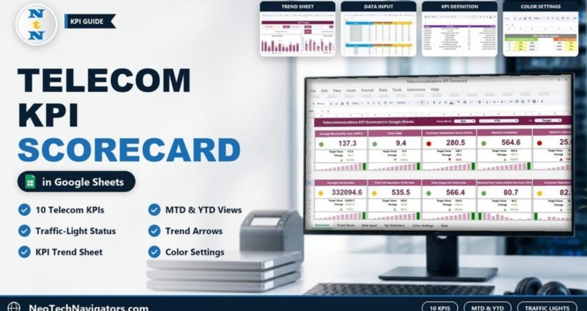
A Telecommunications KPI Scorecard in Google Sheets puts your most important telecom metrics on one page: 10 KPIs across financial performance, customer management, network performance, service quality and customer support. Each KPI card shows the actual value, the comparison value, the change and the % change, with a traffic light, an arrow and a small month-by-month bar chart.
Pick a month, switch between Month-to-Date (MTD) and Year-to-Date (YTD), and choose what to compare against in the Vs. drop-down. This guide is for telecom operations teams, network performance managers, customer service leads, finance teams and senior managers who review performance every month. We cover each part of the scorecard (KPI Scorecard, KPI Trend, KPI Definition, Data Input and the RAG colour table), the 10 KPIs with their formulas, a step-by-step setup and honest limitations.
🎥 Watch the Video Tutorial
Get the Telecommunications KPI Scorecard
What Is a Telecommunications KPI Scorecard?
A KPI scorecard lists each key performance indicator next to its actual value, its comparison value and the change between them. Unlike a chart-heavy dashboard, a scorecard is designed to be read card by card in a monthly review meeting: green cards are doing well, amber cards need watching and red cards need action.
Telecom teams handle a lot of data: ARPU and value-added service revenue come from billing, churn and retention from the CRM, latency and availability from the network team, and call duration and first call resolution from the contact centre. When these numbers live in separate reports, it is hard to see the whole picture. This scorecard brings 10 pre-configured telecom KPIs into one Google Sheets file, so everyone looks at the same numbers with the same definitions.
What Is Inside the Scorecard
| Sheet | What it shows | Who uses it |
|---|---|---|
| KPI Scorecard | 10 KPI cards with Select Month, MTD/YTD and Vs. drop-downs, actual vs target value, change, % change, traffic light, arrow and a monthly mini bar chart | Managers in monthly reviews |
| KPI Trend | One selected KPI with its group, unit, type, formula and definition, plus Target Vs Actual (MTD) and Actual Vs PY (MTD) charts | Analysts and team leads |
| KPI Definition | #, KPI Group, KPI Name, Unit, Formula, Definition and Type (UTB or LTB) | Everyone, as the single source of truth |
| Data Input | One block per KPI (KPI-1, KPI-2 …) with MTD and YTD columns for Actual, Target and PY, month by month | The person who updates the file |
| Color Settings | RAG Table for Change%: the thresholds that turn a card red, amber or green | The scorecard owner |
1. KPI Scorecard Sheet
The header has three drop-downs: Select Month (Jan to Dec), an MTD / YTD switch and a Vs. selector that sets the comparison basis (Target in the screenshot below). When you change any of them, every card refreshes automatically. MTD shows the selected month only; YTD shows the cumulative figure from January to the selected month.
Each of the 10 cards shows:
- The KPI name and the actual value in large type
- Target Value and Change (actual minus comparison value)
- An up or down arrow with the % change
- A traffic-light circle (green, amber or red)
- A mini bar chart of the monthly values, with the selected month highlighted
For example, in the October YTD view, Average Revenue Per User (ARPU) shows 137.3 against a target of 112.6: a change of +24.7, or +21.9%, so its light is green. Customer Satisfaction Score (CSAT) shows 280.5 against 305.7 (−8.2%), so it is red.

2. KPI Trend Sheet
The KPI Trend sheet focuses on one KPI at a time. Choose a KPI from the Select KPI drop-down in cell C3, and the sheet shows its KPI Group, Unit, Type (UTB = upper the better, LTB = lower the better), Formula and Definition. Two charts then show the monthly picture: Target Vs Actual (MTD) (actual bars with a dotted target line) and Actual Vs PY (MTD) (actual against the previous year). This is where you answer questions like “is network latency improving steadily, or was last month a one-off?”

3. KPI Definition Sheet
Every KPI is documented with its KPI Group, KPI Name, Unit, Formula, Definition and Type. The Type column (UTB or LTB) tells the scorecard which direction is good, so a fall in churn rate is treated as good news while a fall in ARPU is not. When the network team and the finance team read “availability” the same way, review meetings move faster.

4. Data Input Sheet
This is the sheet you update regularly. Each KPI has its own block (KPI-1, KPI-2 and so on) with one row per month and two column groups: MTD (Actual, Target, PY) and YTD (Actual, Target, PY). For example, ARPU’s October row holds an MTD actual of 19.3 and a YTD actual of 137.3 against a YTD target of 112.6, which is exactly what the October YTD card displays.

5. Color Settings (RAG Table for Change%)
The traffic lights are driven by the % change, using two small tables:
- For Upper the Better KPIs: change of 0% or less = Red, above 0% up to 10% = Amber, above 10% = Green.
- For Lower the Better KPIs: change above 10% = Red, above 0% up to 10% = Amber, 0% or less = Green.
That is why Churn Rate (LTB) at −18.3% is green, while Network Latency (LTB) at +28.2% is red. If your business wants a tighter or looser band, change the 0% and 10% values here once and every card follows the same rule.

The 10 Telecom KPIs in the Scorecard (with Formulas)
These are the KPIs exactly as they appear in the KPI Definition sheet.
| KPI | Group | What it measures | Formula | Better when |
|---|---|---|---|---|
| Average Revenue Per User (ARPU) | Financial Performance | Average revenue generated per user ($) | Total Revenue / Number of Subscribers | Higher |
| Churn Rate | Customer Management | Percentage of subscribers who cancel their service | (Customers Lost / Total Customers) × 100 | Lower |
| Customer Satisfaction Score (CSAT) | Customer Management | Percentage of customers satisfied with the services | (Satisfied Customers / Total Customers Surveyed) × 100 | Higher |
| Network Availability | Network Performance | Percentage of time the network is operational | (Total Uptime / Total Time) × 100 | Higher |
| Network Latency | Network Performance | Delay between sending a request and receiving a response (ms) | Total Round-Trip Time / Number of Tests | Lower |
| Average Call Duration | Service Quality | Average duration of voice calls made on the network | Total Call Duration / Total Calls | Higher |
| First Call Resolution (FCR) Rate | Customer Support | Percentage of issues resolved on the first call | (Issues Resolved on First Call / Total Issues) × 100 | Higher |
| Data Usage Per Subscriber | Service Quality | Average data consumption per user (GB) | Total Data Used / Number of Subscribers | Higher |
| Revenue from Value-Added Services (VAS) | Financial Performance | Revenue generated from value-added services such as ringtones ($) | Total Revenue from VAS / Total Subscribers | Higher |
| Customer Retention Rate | Customer Management | Percentage of customers who remain subscribed | (Customers Retained / Total Customers) × 100 | Higher |
“Better when” follows the Type column in the template: Churn Rate and Network Latency are LTB (lower the better); the other eight are UTB (upper the better). For LTB KPIs a downward arrow is good news, and the RAG table colours them accordingly.
Other telecom KPIs worth tracking
These are not in the template, but many telecom teams add them by editing the KPI Definition and Data Input sheets: call drop rate (dropped calls / total calls × 100), average ticket resolution time, and mean time to repair (MTTR) for network faults. All three are lower-the-better KPIs.
How to Use the Scorecard with Your Own Data
- Make your own copy of the Google Sheets file from the link included with your purchase.
- Open the KPI Definition sheet and review each KPI. Rename, adjust the formula text or swap a KPI so the list matches what your team actually reports, and set the Type to UTB or LTB.
- Check the RAG Table for Change% in Color Settings so red, amber and green reflect your own standards.
- Enter monthly MTD and YTD values (Actual, Target and PY) for each KPI block in the Data Input sheet. Start with the months you already have so the trend has history.
- On the KPI Scorecard sheet, choose the latest month in Select Month, review MTD, then switch to YTD.
- Use the KPI Trend sheet (cell C3) to investigate any KPI showing red.
- Share the file with reviewers through Share > Viewer so only the owner edits the inputs.
Real-World Use Cases
- Regional network operations: a NOC manager tracks Network Availability and Network Latency month by month and uses the Actual Vs PY chart to confirm whether a tower upgrade actually improved results.
- Customer service centre: a service lead watches First Call Resolution (FCR) Rate and CSAT side by side to see if faster handling is hurting satisfaction.
- Management review: a finance head opens the YTD view before the quarterly review to compare ARPU, VAS revenue and Churn Rate against the annual plan.
Best Practices
- Agree KPI definitions before the first review and keep them in the KPI Definition sheet.
- Update data on the same day every month so comparisons are fair.
- Look at MTD and YTD together; one bad month is not always a trend.
- Keep the KPI list short. Ten well-chosen KPIs beat thirty that nobody reads.
- Assign an owner to every red KPI and record the action agreed in the meeting.
Limitations: When This Scorecard Is Not the Right Fit
This is a monthly scorecard, not a live network monitoring system. It does not pull data from OSS/BSS platforms or network probes automatically, so someone has to enter or paste the figures, including the YTD and PY columns. If you need real-time alarms, per-cell drill-down or millions of call records, use a dedicated monitoring or BI tool and feed the monthly summary into this sheet. Very large operators may also prefer the chart-based dashboards listed below.
Related Telecom Templates and Guides
For a chart-based view, read about the Telecommunications KPI Dashboard in Google Sheets and the Telecom Network KPI Dashboard in Google Sheets. Infrastructure teams may prefer the Telecommunications Infrastructure KPI Dashboard, and support teams can compare this with the Call Center KPI Scorecard in Google Sheets.
Prefer Excel? The Telecommunications KPI Scorecard in Excel offers the same scorecard approach on the desktop.
If you want to learn how scorecards and dashboards like this are built, the Excel Pivot Tables and Dashboards course on NextGenTemplates Academy walks through the summary tables, charts and KPI layouts step by step.
Frequently Asked Questions
How many KPIs does the telecom scorecard track?
It comes with 10 pre-configured telecom KPIs, from ARPU and Churn Rate to Network Latency and Customer Retention Rate. You can rename them or change them in the KPI Definition and Data Input sheets.
What is the difference between MTD and YTD in the scorecard?
MTD shows performance for the selected month only. YTD shows the cumulative values from January to the selected month, taken from the YTD columns of the Data Input sheet, so you can see progress against the annual target.
How are the traffic-light colours decided?
By the % change and the KPI type. For upper-the-better KPIs, 0% or less is red, up to 10% is amber and above 10% is green. For lower-the-better KPIs the logic is reversed. You can edit these thresholds in the RAG Table for Change%.
Does the scorecard connect to my network systems automatically?
No. It is a Google Sheets template, so monthly values are entered or pasted into the Data Input sheet. That keeps it simple and works with any source system.
Can several people work on the scorecard at once?
Yes. Google Sheets supports real-time collaboration, so you can give editors and viewers different access through the Share button.
Is it suitable for small telecom providers and ISPs?
Yes. Small operators, ISPs and regional teams can use it as is, while larger operators often use it as the summary layer on top of their BI tools.
Wrapping Up
A good scorecard turns a pile of telecom reports into ten cards that answer “how are we doing this month?” The Telecommunications KPI Scorecard in Google Sheets gives you MTD and YTD views, a Vs. comparison selector, RAG traffic lights, a KPI Trend sheet and shared KPI definitions in one file. Start by reviewing the KPI definitions, check the RAG thresholds, load your last few months of data and bring the scorecard to your next monthly review.
Get the Telecommunications KPI Scorecard
📅 Last updated: October 2026