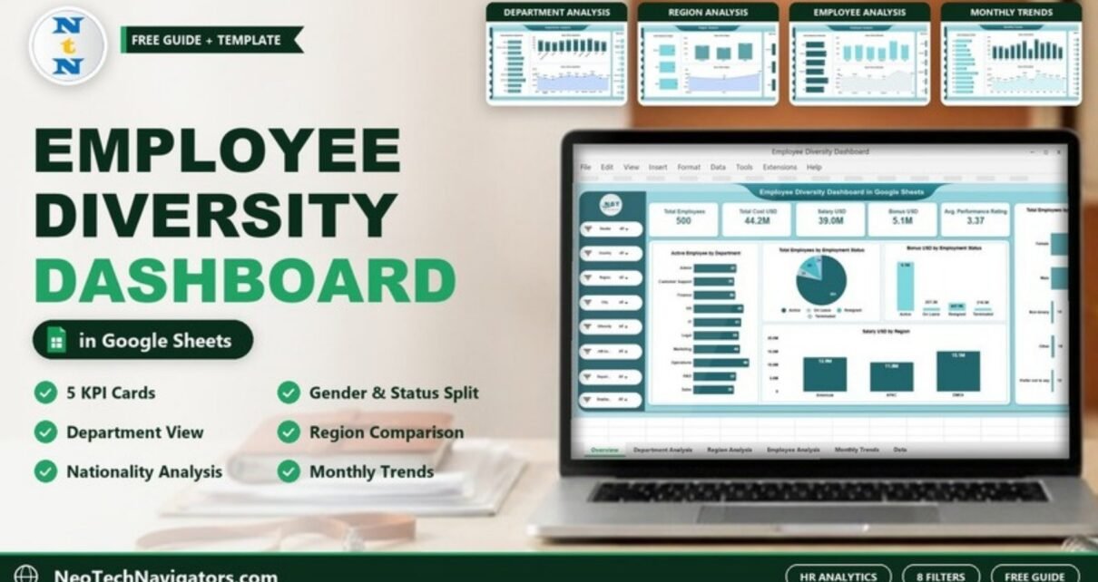
An Employee Diversity Dashboard in Google Sheets gives HR teams one place to see who works in the organisation and what the workforce costs. Instead of piecing together gender, region and nationality numbers from separate HR exports, you get KPI cards and charts that update from a single data sheet.
This guide walks through the ready-made dashboard from NextGenTemplates page by page: the five KPI cards, the gender and employment-status breakdowns, the Department, Region, Employee (nationality) and Monthly Trends pages, and the filter panel that drives them. It is written for HR managers, DEI leads, HR analysts and finance partners who already keep employee data in Google Sheets and want a clear, shareable view of it.
🎥 Watch the Video Tutorial
Get the Employee Diversity Dashboard
What Problem Does an Employee Diversity Dashboard Solve?
Most HR teams can answer “how many people do we employ?” quickly. Questions such as “how is headcount split by gender in EMEA?”, “which nationality group carries the highest bonus cost?” or “how does salary spend move month to month?” usually take a pivot table, a few filters and a lot of copying. When the answers live in different files, the numbers rarely match between reports.
The dashboard fixes that by reading every chart from one employee table. Diversity (gender, nationality, region, ethnicity filter) and cost (salary, bonus, total cost) sit side by side, so you can see representation and compensation in the same view, and every page responds to the same filters.
Dashboard Pages at a Glance
| Page | What it shows | Charts |
|---|---|---|
| Overview | Workforce snapshot with five KPI cards | Active Employee by Department, Total Employees by Employment Status, Bonus USD by Employment Status, Total Employees by Gender, Salary USD by Region |
| Department Analysis | Headcount and cost for each department | Active Employee, Salary USD, Bonus USD and Total Cost USD by Department |
| Region Analysis | Americas, APAC and EMEA compared | Active Employee, Salary USD, Bonus USD and Total Cost USD by Region |
| Employee Analysis | Nationality-based view | Active Employee, Salary USD, Bonus USD and Total Cost USD by Nationality |
| Monthly Trends | Month-by-month movement | Active Employee, Salary USD, Bonus USD and Total Cost USD by Month |
| Data | The employee table that feeds every page | None (input sheet) |
The Filter Panel
Every dashboard page has the same left-hand filter panel with eight drop-downs, all set to All by default: Gender, Country, Region, City, Ethnicity, Department, plus a job level filter and an employment filter (their labels are shortened in the panel). Pick a value and the cards and charts on that page recalculate for the selected group. This is where most of the diversity analysis happens: for example, set Gender to Female and Region to EMEA to see how many women are active in each EMEA department and what they are paid.
Overview Page: Workforce Snapshot

KPI cards
The top row holds five cards. The values below are from the sample data shown in the screenshot.
| KPI card | What it measures | Sample value |
|---|---|---|
| Total Employees | Count of employee records after filters | 500 |
| Total Cost USD | Overall employee cost in US dollars (in the sample it lines up with salary plus bonus) | 44.2M |
| Salary USD | Total salary paid | 39.0M |
| Bonus USD | Total bonus paid | 5.1M |
| Avg. Performance Rating | Average of the performance rating column | 3.37 |
Charts on the Overview page
- Total Employees by Gender – five categories: Female (226), Male (230), Non-binary (14), Other (18) and Prefer not to say (12). Including more than two options is what makes this useful for real diversity reporting.
- Total Employees by Employment Status – a pie of Active (391), On Leave (25), Resigned (60) and Terminated (24).
- Bonus USD by Employment Status – Active staff account for 4.1M of the bonus total, with smaller amounts for On Leave, Resigned and Terminated.
- Active Employee by Department – ten departments: Admin, Customer Support, Finance, HR, IT, Legal, Marketing, Operations, R&D and Sales. Operations is largest with 48 active employees.
- Salary USD by Region – Americas 12.9M, APAC 11.0M and EMEA 15.1M.
Note that the department chart counts only active employees, so its bars add up to 391 rather than the 500 shown on the Total Employees card.
Department Analysis

This page compares the ten departments on four measures: Active Employee, Salary USD (columns), Bonus USD (area line) and Total Cost USD (bars). In the sample data Operations has the highest salary bill (4.6M), the highest bonus (609.4K) and the highest total cost (5.2M), while Finance has the lowest salary total at 3.3M. Combine it with the Gender or Ethnicity filter to see whether representation differs from one department to another.
Region Analysis

The Region page splits the active workforce across Americas (123), APAC (124) and EMEA (144). EMEA leads on every cost measure in the sample: 15.1M salary, about 2.0M bonus and 17.1M total cost, against 14.5M for the Americas and 12.5M for APAC. It is a quick way to check whether pay and bonus spending track headcount in each region.
Employee Analysis (Nationality)
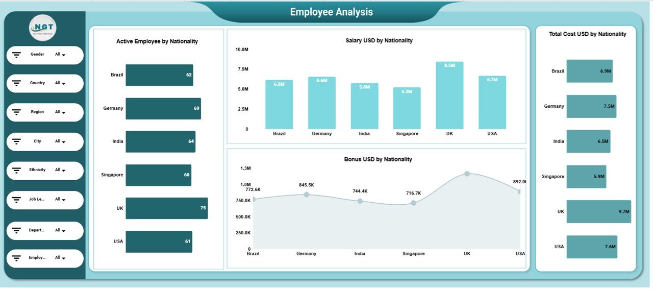
The Employee Analysis page looks at six nationalities: Brazil, Germany, India, Singapore, UK and USA. The UK group is the largest in the sample with 75 active employees, 8.5M salary and 9.7M total cost; Singapore is the smallest with 60 active employees and 5.2M salary. This page is where cultural diversity and pay patterns by nationality become visible.
Monthly Trends

The last page shows the same four measures by month. In the sample, March stands out with 44 active employees, 4.5M salary, 630.8K bonus and 5.1M total cost, while June and August are the quietest months with 22 active employees each. One thing to know: the months are sorted alphabetically (Apr, Aug, Dec, Feb…) rather than in calendar order, so read the trend line with that in mind or re-sort the summary if you need a true timeline.
The Data Sheet
All pages read from one data sheet. The product page lists these core columns: Employee ID, Department, Region, Nationality, Gender, Employment Status, Salary USD, Bonus USD, Performance Rating and Month. The filter panel also uses Country, City, Ethnicity and job level fields, so keep those columns filled in as well. Once you edit or add rows, the cards and charts refresh automatically.
How to Use It with Your Own Data
- Make your own copy of the template in Google Drive and open the Data sheet.
- Export your employee list from your HRIS or payroll file and match it to the existing column headers. Keep the headers exactly as they are.
- Paste your records over the sample rows. Convert salary and bonus to US dollars first if your payroll runs in other currencies.
- Standardise text values before pasting: one spelling per department, region, country and nationality, and the same status words (Active, On Leave, Resigned, Terminated).
- Open the Overview page and confirm that Total Employees matches your HR headcount and that Salary USD matches your payroll total.
- Use the filter panel to build the views you report on, then share the file with Viewer access for leadership.
Real-World Use Cases
- Quarterly DEI review: an HR business partner filters by Gender and Department to show leadership where representation is lowest and how pay compares for the same group.
- Regional budget planning: finance compares Total Cost USD by Region with active headcount to see which region carries the highest cost per employee.
- Bonus fairness check: a compensation analyst reviews Bonus USD by Nationality and by Employment Status to spot groups that receive a much larger or smaller share than their headcount suggests.
Best Practices
- Refresh the data on a fixed schedule, for example after each payroll run, so month figures stay comparable.
- Keep the “Prefer not to say” and “Other” gender options. Forcing a binary choice makes the data less accurate and less inclusive.
- Restrict edit access to the Data sheet. Salary and demographic data are sensitive, so share dashboards as view-only and limit who can see raw rows.
- Be careful with very small groups. A filter that returns two or three people can identify individuals, so avoid sharing those views widely.
- Read the charts together: a department with balanced headcount but uneven bonus spend is a better conversation starter than either chart alone.
Limitations and Who Should Not Use It
- It is a reporting dashboard, not an HR system. It does not store employee files, approve changes or run payroll.
- There is no built-in pay-gap calculation or diversity index; you see totals and counts and draw comparisons yourself.
- All money is in USD. Multi-currency payrolls need converting before you paste data.
- Very large organisations with tens of thousands of rows and strict audit needs will be better served by a BI tool connected to the HRIS.
Related Dashboards and Guides
If you want KPI-style targets rather than headcount and cost, see the Diversity and Inclusion KPI Dashboard in Google Sheets or the Cultural Diversity KPI Dashboard. To collect employees’ own views on inclusion, the Employee Diversity Survey Tracker pairs well with this dashboard. For wider HR reporting, look at the HR KPI Dashboard in Google Sheets and the Employee Satisfaction Dashboard.
Related templates: the same dashboard is also available as an Employee Diversity Dashboard in Excel and an Employee Diversity Dashboard in Power BI.
If you want to build dashboards like this yourself, the Pivot Tables and Dashboards course on NextGenTemplates Academy covers summarising data and laying out charts step by step.
Frequently Asked Questions
What does an employee diversity dashboard track?
This one tracks headcount and cost across diversity and organisational dimensions: gender, nationality, region, department, employment status and month, with filters for country, city, ethnicity and job level. It reports Total Employees, Total Cost USD, Salary USD, Bonus USD and average performance rating.
Can I filter the dashboard by gender and region at the same time?
Yes. The filters in the left panel work together, so you can set Gender, Region and Department in one go and every card and chart on the page updates for that combination.
Does it calculate the gender pay gap?
Not directly. You can compare Salary USD for each gender by using the Gender filter, but there is no ready-made pay-gap percentage. You can add one with an AVERAGEIFS formula on the Data sheet if you need it.
Is Google Sheets safe for employee salary and diversity data?
It can be, if you control sharing. Keep the file in a restricted Drive folder, give edit rights only to the HR owner, share dashboards as view-only, and avoid publishing views that show very small groups.
What if my company pays in several currencies?
The cost charts are labelled in USD, so convert salaries and bonuses to US dollars before pasting them into the Data sheet, using one exchange rate per period so months remain comparable.
Do I need formula skills to use it?
No. You paste data into the Data sheet with the same column headers and use the drop-down filters. Formula knowledge only helps if you want to add new charts or metrics.
Wrapping Up
The Employee Diversity Dashboard in Google Sheets puts representation and pay in one place: five KPI cards, a gender and employment-status overview, and dedicated pages for departments, regions, nationalities and months, all driven by one data sheet and one filter panel. Start by pasting your current headcount export into the Data sheet, check that the totals match your HR records, and use the Gender and Region filters to prepare your next diversity review.
Get the Employee Diversity Dashboard in Google Sheets
📅 Last updated: October 2026