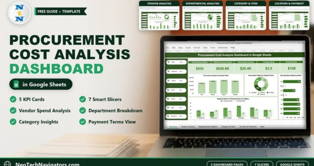
The Procurement Cost Analysis Dashboard in Google Sheets turns a list of purchase orders into one clear view of where your money goes: total spend, number of POs, quantity ordered, vendor rating and pending orders, broken down by vendor, department, category, location and payment terms.
It is built for procurement managers, finance teams, supply chain leads and owners of small and mid-sized businesses who track purchasing in spreadsheets and want answers without building pivot tables from scratch. Inside you get five dashboard pages (Overview, Vendor Analysis, Departmental Analysis, Category & Item Insights, and Location & Payment Terms) plus a data sheet, all controlled by the same seven slicers.
Below we walk through every page, the KPI cards and what they mean, how to load your own purchase data, and where this kind of dashboard helps (and where it does not).
🎥 Watch the Video Tutorial
Get the Procurement Cost Analysis Dashboard
What Problem Does a Procurement Cost Analysis Dashboard Solve?
Purchase data usually lives in a long table: PO number, date, department, vendor, category, location, quantity, amount, status and payment terms. That table answers almost nothing on its own. You cannot see at a glance which vendor takes the biggest share of spend, which department has the most open orders, or whether one payment term dominates your cash outflow.
A procurement cost analysis dashboard summarises that table into cards and charts that update when you filter. Instead of scrolling through hundreds of rows, you pick a month or a vendor in a slicer and every chart on the page responds. In the sample file, the dashboard summarises 500 purchase orders worth about $638.6K in total procurement spend.
The Seven Slicers That Control Every Page
Each page has the same slicer panel on the left side, so you can filter in the same way wherever you are:
- Month
- Department
- Category
- Vendor
- Location
- Status (order status)
- Payment Terms
Set a slicer to a single value (for example Vendor = Sexton-Jackson) and the KPI cards and charts on that page recalculate for that selection only.
1. Overview Page
The Overview page is the procurement snapshot. Five KPI cards sit across the top, followed by four charts.
KPI cards on the Overview page
| KPI card | What it measures | How it is calculated | Sample value | Better when |
|---|---|---|---|---|
| # of Purchase Orders | How many POs fall inside the current filter | Count of purchase order rows | 500 | Context metric (no fixed direction) |
| Total Procurement Spend | Money spent on the filtered orders | Sum of the value of each order | $638.6K | Lower, for the same volume |
| Total Quantity Ordered | Units ordered across those POs | Sum of quantity on each order | 25.4K | Context metric |
| Average Rating | Average vendor rating on the filtered orders | Average of the vendor rating on each order | 3.0 | Higher |
| Pending Orders | Orders not yet completed | Count of rows where status is Pending | 106 | Lower |
Charts on the Overview page
- Procurement Spend by Payment Terms (column chart): COD $138.2K, Net 30 $164.6K, Net 60 $172.3K and Prepaid $163.5K in the sample.
- Order status split (donut chart): the 500 orders split across Cancelled, Ordered, Pending and Received, with 106 pending.
- Total Quantity Ordered by Month (bar chart): shows which months carried the heaviest ordering.
- Received Orders Vs Pending Orders by Category: a side-by-side comparison for IT Equipment, Maintenance, Office Supplies, Packaging, Raw Materials and Services.

2. Vendor Analysis
The Vendor Analysis page compares your six sample suppliers: Davis-Castro, Edwards Ltd, Martin Inc, Sexton-Jackson, Smith-Tate and Weaver-Ramos. It includes four charts:
- Procurement Spend by Vendor
- # of Purchase Orders by Vendor
- Total Quantity Ordered by Vendor
- Received Orders Vs Pending Orders by Vendor
In the sample, Sexton-Jackson stands out with the highest spend ($174.9K), the largest quantity ordered (6.6K), the most received orders (39) and the most pending orders (22). That is exactly the kind of concentration a buyer wants to see before a contract review: one supplier carries a large share of spend, so its delivery performance and pricing deserve the most attention.

If vendor scoring is your main concern, the Vendor Performance Dashboard in Google Sheets goes deeper into supplier quality.
3. Departmental Analysis
This page shows how internal teams spend. The six sample departments are Admin, Finance, HR, IT, Operations and Production. Charts:
- Procurement Spend by Department: Finance is the highest in the sample, followed by IT ($111.8K), Admin ($106.5K) and HR ($105.2K).
- # of Purchase Orders by Department
- Total Quantity Ordered by Department: Finance reaches 5.0K units.
- Received Orders Vs Pending Orders by Department: Admin has 21 received against 20 pending, a near even split worth investigating.
Use this page in monthly budget meetings. A department with high spend and a high pending count often has approval bottlenecks, not just high demand.

4. Category & Item Insights
The category page answers “what are we buying?” It covers the same six categories seen on the Overview: IT Equipment, Maintenance, Office Supplies, Packaging, Raw Materials and Services.
- Procurement Spend by Category: Office Supplies is the highest point on the line in the sample, followed by Raw Materials ($125.9K) and Services ($112.2K).
- # of Purchase Orders by Category: Office Supplies has the most orders (94).
- Total Quantity Ordered by Category: Office Supplies also leads on quantity (5.0K).
- Received Orders Vs Pending Orders by Category: Raw Materials shows 23 pending orders.
Many small, frequent Office Supplies orders are a classic candidate for consolidation into fewer, larger orders or a blanket agreement.

5. Location & Payment Terms
The last page combines two finance-related views:
- Procurement Spend by Payment Terms (COD, Net 30, Net 60, Prepaid)
- # of Purchase Orders by Payment Terms: 113 COD, 130 Net 30, 131 Net 60 and 126 Prepaid, which adds up to the 500 orders on the Overview.
- Total Quantity Ordered by Location: Factory (5.8K), Warehouse B (5.4K), Branch Office (5.1K), Head Office (4.8K) and Warehouse A (4.4K).
- Received Orders Vs Pending Orders by Location
Finance teams use the payment terms split for cash flow planning: more Net 60 spend means more room before cash leaves the business, while a large Prepaid share ties up cash early.

Page Summary at a Glance
| Page | Main question it answers | Charts |
|---|---|---|
| Overview | How is procurement doing overall? | 5 KPI cards + 4 charts |
| Vendor Analysis | Which suppliers take the most spend and have the most open orders? | 4 |
| Departmental Analysis | Which teams spend the most and where do orders get stuck? | 4 |
| Category & Item Insights | What are we buying, and how often? | 4 |
| Location & Payment Terms | Where do goods go, and how are we paying? | 4 |
How to Use the Procurement Cost Analysis Dashboard in Google Sheets with Your Own Data
- Make your own copy of the Google Sheets file so you can edit it.
- Open the data sheet and look at the column headers and the sample rows before deleting anything.
- Export your purchase orders from your ERP, accounting tool or PO register, and arrange the columns in the same order as the sample.
- Paste your rows over the sample rows. Keep the header row unchanged.
- Check that dates are real dates, amounts and quantities are numbers, and that status values use the same wording as the sample (Ordered, Received, Pending, Cancelled).
- Go back to the Overview page and confirm the # of Purchase Orders card matches the number of rows you pasted.
- Use the slicers to review one month, one vendor or one department at a time.
Dashboards like this one rest on pivot-style summaries of a data table. If you want to understand how these summaries work, or build your own pages, the Pivot Tables & Dashboards course on NextGenTemplates Academy teaches the same ideas step by step.
Real-World Use Cases
Monthly spend review for a finance team
Set the Month slicer to the last closed month, note total spend and the payment terms split, then compare with the previous month. It takes a few minutes and gives finance a consistent story for the management pack.
Vendor negotiation preparation
Before a supplier meeting, filter by that vendor. You get their spend, number of orders, quantity and open orders on one screen, which is solid ground for discussing volume discounts or delivery performance.
Clearing a backlog of pending orders
Set Status to Pending and walk through the Departmental and Location pages. You quickly see which team or site holds most of the 106 open orders and who to follow up with. For day-to-day PO follow-up, a Purchase Order Tracker in Google Sheets pairs well with this dashboard.
Best Practices
- Keep names consistent. “Edwards Ltd” and “Edwards Limited” become two vendors in every chart. Use data validation lists for vendor, department and category.
- Update on a fixed schedule, such as every Monday or after each month-end close.
- Check number formats. In the sample file, some count cards (such as # of Purchase Orders and Pending Orders) display a currency symbol. If you see this in your copy, select the card cell and set Format > Number > Number so counts read correctly.
- Review pending orders weekly rather than at month end, when it is too late to chase them.
- Use filters before conclusions. A high total can hide one unusual order; filter down before acting.
Who Should Not Use This Template (Limitations)
- It is an analysis dashboard, not a purchasing system. It does not raise POs, run approvals or send orders to suppliers.
- Data is loaded manually. If you need live sync with an ERP, you will need an integration or script on top.
- It reports spend, quantity and status. It does not track savings against budget or contract price out of the box.
- Very large datasets (tens of thousands of rows) can make any Google Sheets dashboard slower; archive older years in a separate file.
Prefer working offline? There is also an Excel version, the Procurement Cost Analysis Dashboard in Excel. For a wider procurement view, see the Procurement Management Dashboard in Google Sheets, the Supply Chain Procurement Dashboard in Google Sheets or the Purchase Order Management Dashboard in Google Sheets.
Frequently Asked Questions
What is a procurement cost analysis dashboard?
It is a report that summarises purchase order data into KPIs and charts so you can see total spend, order volume, vendor share, department spend and order status without reading every row.
Which KPIs does this Google Sheets dashboard show?
Five cards on the Overview page: # of Purchase Orders, Total Procurement Spend, Total Quantity Ordered, Average Rating and Pending Orders.
Can I filter the dashboard by vendor or department?
Yes. Every page has slicers for Month, Department, Category, Vendor, Location, Status and Payment Terms.
Do I need coding skills to use it?
No. You filter the pages with the slicers on the left and work with the file in Google Sheets in your browser. Updating it means pasting your purchase order rows into the data sheet.
Can I change the categories, vendors or locations?
Yes. The charts read whatever values are in your data, so your own vendor, department, category and location names will appear once you paste your rows.
Is there an Excel version?
Yes, a separate Procurement Cost Analysis Dashboard in Excel is available for teams that work in desktop Excel.
Wrapping Up
The Procurement Cost Analysis Dashboard in Google Sheets gives you five focused pages, five KPI cards and seven slicers to understand spend by vendor, department, category, location and payment terms. Load your purchase orders, check that the order count matches, and start with the Overview page each week.
Get the Procurement Cost Analysis Dashboard
📅 Last updated: October 2026